Two books by one of my favorite illustrators, sit on my bookshelf, well aged and nearly worn out from decades of use. I can’t begin to fathom how many times I have looked at those illustrations, and to this day they remain an inspiration to me in every respect. Their timelessness never ceases to amaze me. I am referring to Norman Rockwell’s illustrations commissioned for Mark Twain’s classic novels, ‘The Adventures of Tom Sawyer’ and ‘The Adventures of Huckleberry Finn’. As far back as I can remember, those two beautifully illustrated books were part of my fife, and was a major factor in my choice to become an illustrator, over 50 years ago.
They were originally part of my parent’s small collection of treasured classic American novels, and symbolize a part of my past. My parents loved Mark Twain’s writings and they loved Norman Rockwell’s illustrations, whether on the cover of The Saturday Evening Post or on the pages of Mark Twain's two classic novels. The combination of two of America’s most popular and beloved icons in literature and art, could only produce what I consider, one of the all time great illustrated stories in print... the perfect combination, Twain and Rockwell.
I am certain that Norman Rockwell was destined to
illustrate Tom Sawyer and Huckleberry Finn, and the only scenario that could never come to be, was to get Mark Twain’s reaction to Rockwell’s depiction of scenes from the novels. My instincts tell me he would have been completely delighted, as many readers have been by the combination of Mark Twain’s storytelling genius with literary pen and pad, and Norman Rockwell’s storytelling genius with pallet and brush.
Let’s first take a close look at the illustrations for ‘The Adventures Of Tom Sawyer’. Norman Rockwell did eight major illustrations for Tom Sawyer, published by Heritage Press in 1936.
They were all painted in oils on canvas, which was Rockwell’s typical medium. He pulled no punches in taking on what must have been an enormous awareness of illustrating such a famous and revered storyteller as Mark Twain. That must have been intimidating, even for the seasoned veteran that Rockwell was at the time. Like virtually all of his major illustration assignments, he dove into the project with both feet, and even made a trip to Hannibal, Missouri, to make sketches, buy tattered old clothes and hats from the locals and soak up the atmosphere where Mark Twain and “Tom Sawyer” grew up. Of all the illustrators (and there
were quite a few) that illustrated those novels in the past, Rockwell was the first to visit Mark Twain’s home town. In typical Rockwell fashion, no amount of detail or research was ignored, faked or quickly glossed over. Simply stated, he created visual reality to a charming study of characters, their dress, mannerisms and physical appearance, so humorously and eloquently described in the words of Mark Twain. And, no one could interpret and illustrate the human condition like Norman Rockwell. However, he gave Mark Twain full credit for making his stories easy to illustrate, by providing plenty of visual detail in his writing.
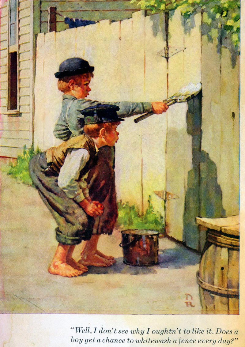
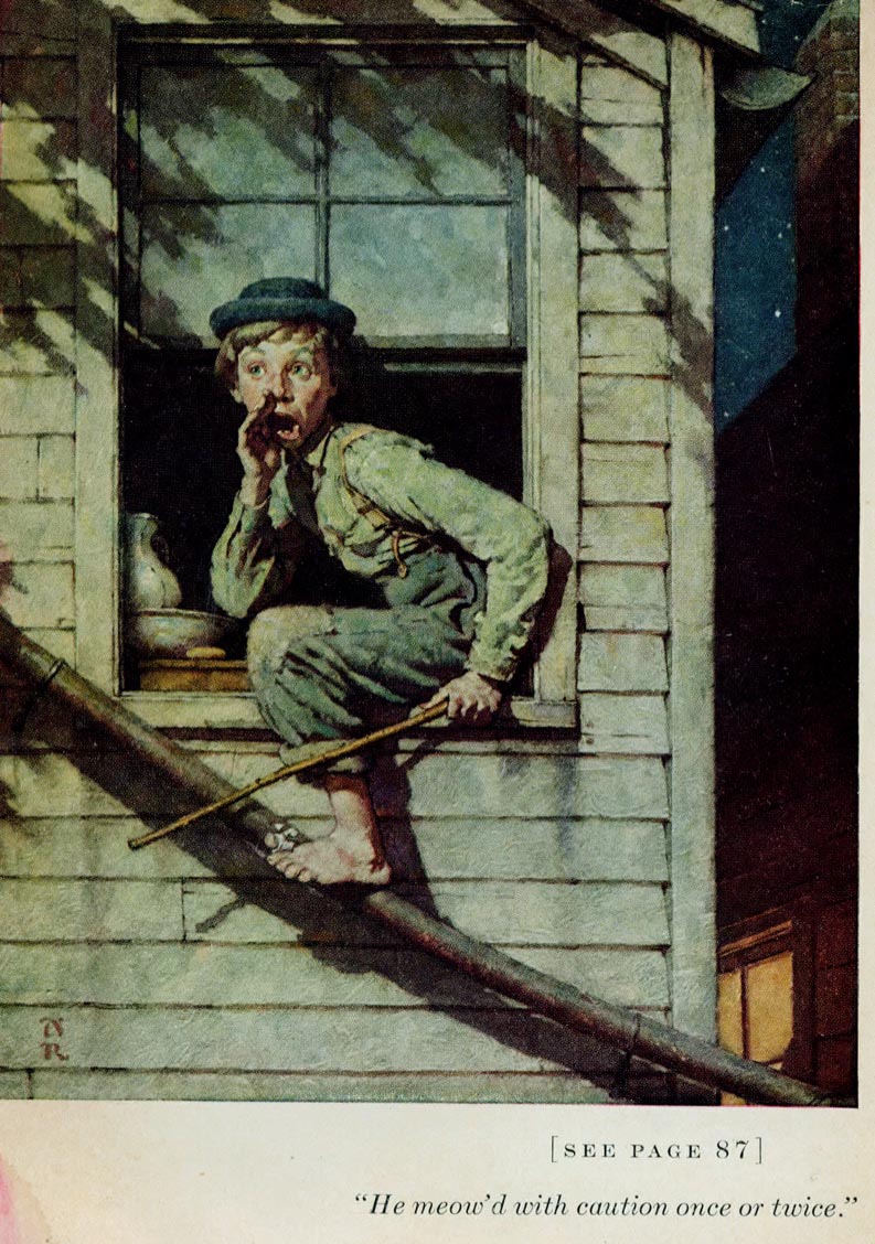
Illustration #1.
The first painting in the book epitomizes the entire book, and is fitting to be the frontispiece. It is a tight-knit perfectly balanced composition typical of Rockwell’s style in the 1930’s. I can’t imagine this scene being portrayed in any other way, and be more effective.
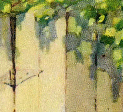
Using an interesting combination of theatrical straight ahead profile for the figures, contrasted by a three dimensional linear perspective foreground and background, Rockwell cleverly and effectively stages a compelling and important opening illustration . The background is deceptively simple, suggesting a corner of a rustic small town clap board house, attached to the house is a crude homemade planked fence and just a little suggestion of clothes drying on the line in the backyard.
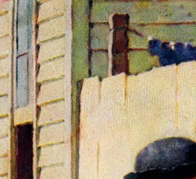
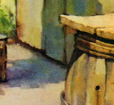
To stop the eye on the right side of the composition, is a corner of an old wooden barrel with a board covering the top. These simple yet charming touches are quite important in depicting period and location, yet not taking away attention from the main subject. No illustrator did that better than Norman Rockwell. He researched and selected props that not only tie together his finely tuned compositions, but created just the right atmosphere of time and place.
Rockwell knew the mannerisms and attitudes that kids normally display . Both Tom and his friend are convincing as typical boys, with convincing typical boy gestures. Rockwell’s powers of observation was truly remarkable, always finding the characters and the perfect gestures for a given situation. He was not afraid to exaggerate a pose or attitude of the character, in order to communicate his idea as clearly as possible. Throughout his career, he had a constant gnawing concern with virtually every illustration he did, worrying whether or not his concept would be clear to the viewer, which drove him to often correct, revise, change and even redo an illustration.
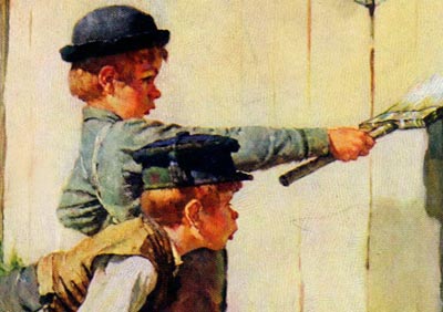
In profile, the two boys overlap creating one combined shape that dominates most of the painting. The extended direction of the arm and paintbrush in Tom’s hand holding the paintbrush, is emphasized by the two boys looking directing down Tom’s arm. Both are concentrating and looking very serious. Their body language complements each other, giving a strong design to the combination of the two figures, one semi-crouched and the other standing with his back arched, and both boy’s heads are perfectly level. It is certain that Rockwell planned every inch of his composition for design, balance and effective use of directional devices.
The background and foreground, for the most part is in full bright sunlight, depicting pale soft tones. And, the two boys are in a full range of rich tones that draws our attention to them. The freshly whitewashed fence directly behind the figures is very light in contrast to the deeper rich tones of the figures, adding even more emphasis on the boys. The shadow on the fence under the paint brush, cleverly leads down to the shadow on the ground, which leads to the boy’s feet. Even the corner of the board covering the barrel points to the two boys like an arrow. There is a nice balance of vertical, horizontal and diagonal lines and shapes, all working together to create interest, reality and strong compositional devices.

Rockwell effectively painted the figures in a more literal fashion while leaving the rest of the painting more simply implied. He applied semi-loosely painted strokes, with just enough detail to satisfy most lovers of literal realistic illustrations. Rockwell’s paint strokes are consistent and accurate, yet free from tight over-rendered polished realism.
As with many of Rockwell’s paintings, they convincingly dispel the myth that illustration and fine art (museum art) can not blend and be on the same level.
* Tom Watson is a retired West Coast illustrator, art director and educator. He has been a frequent contributor to Today's Inspiration and his storyboard work for film was a subject of a post on my other blog, Storyboard Central.
This week's images are © MBI/Heritage Press, Date (1936 or 1940) and are used with the permission of the Norman Rockwell Museum. This past weekend the museum featured the grand opening of a traveling exhibition, American Chronicles: The Art of Norman Rockwell.
Stephanie Plunkett, Chief Curator of the Museum would like readers to know that the Museum does travel an exhibition of signed lithographic prints from the Tom and Huck series to other museums and cultural centers. Stephanie writes, "We do have two upcoming bookings for that exhibition are listed below, so perhaps your readers will have the opportunity to visit if they live in the region."
Here is the information about the traveling exhibition:
Norman Rockwell's Tom Sawyer and Huckleberry Finn
Nova Southeastern University, Fort Lauderdale-Davie, Florida
November 14, 2009 through January 29, 2010
Averitt Center for the Arts, Statesboro, Georgia
March 12, 2010 through May 7, 2010
"It also might be interesting to note that the original paintings for the series are in the collection of the Mark Twain Museum in Hannibal, Missouri. The originals are beautiful. A study from the series will be on view in our upcoming exhibition, Norman Rockwell: Behind the Camera, which opens on November 7, 2009."
Thanks for recognizing this important work. I am also fortunate enough to own a copy of the Heritage Club 1937 edition illustrated by Rockwell and I'm look forward to this weeks posts.
ReplyDeleteOne question if Tom or anyone else knows. Tom says "They were all painted in oils on canvas, which was Rockwell’s typical medium."
But in addition to the color plates, each of the 35 chapters is also accompanied by an unsigned pencil sketch. No other illustration credit is given on the title page so I'm assuming NR also did those pencils. Is that correct?
very usefull, thanks for this!
ReplyDeleteThese are just fabulous and from my favourite period in N.R.'s career, before he allowed photo reference to dominate the look of his work - there is so much life in these ones, I can't wait for more.
ReplyDeleteThis comment has been removed by the author.
ReplyDeleteWhen I was young, about ten or eleven I think, I came across a book of Norman Rockwell’s illustrations in a second hand book store. I read that thing till the covers fell of and the pages dropped out. Even then I kept the loose pages pinned up on the wall. My style has always been a million miles away from what Rockwell was doing but perhaps that's why I loved his work so much.
ReplyDeleteThanks for this wonderful essay. Mr. Rockwell inspires me every single day, and I enjoyed this insightful analysis.
ReplyDeleteLarry, I believe you are correct. It is my understanding that Rockwell also did the pencil sketches (spot illustrations), probably in charcoal, carbon pencil or conte crayon.. his three typical drawing mediums.
ReplyDeleteLarry McDougall, I agree that when Rockwell started using photography instead of live models to paint from, he lost that fresh, direct, painterly appearance that I admired so much. Also, illustration in general during the 1940's became more hard edged and photographic looking, and not as colorful. Rockwell was very concerned about his illustrations becoming out of date and obsolete. That seemed to have driven him to try and keep up with changing trends, and I think it weakened the technique of some of his later work. But, they still had that degree of Rockwell magic and sensitivity to most of them.
Tom Watson
Having been to Hannibal, I believe the fence in the illustration is the very fence that Hannibal has marked as being the inspiration for that part of the story. Rockwell must have been there. If he was, I wonder if the cave illustration was done in the cave there?
ReplyDeleteFrom the Heritage Club Sandglass, "Then he (Norman Rockwell)made a series of thirty-five charcoal drawings to decorate the beginnings of the chapters,..."
ReplyDeleteI just picked up a copy of Huck Finn at a book sale a few days ago. (50 cents!) I noticed the tipped in plates and the book was in nice condition, so I put it in the box I was quickly filling. I'm ashamed to say I didn't really even look at the illustrations at the time and didn't realize they were by Rockwell. I got home with my box and sat down to check out my new treasure. I open the book, flip the first page and read an inscription handwritten in green pen: "To George Gordon Monks, Sincerely, Norman Rockwell"!!!!! In shock I turned the page and realized that the book was illustrated by Rockwell. It is the treasure of my collection. Lucky me!
ReplyDeleteThanks for the posting, very enjoyable!