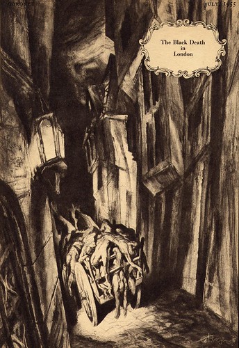
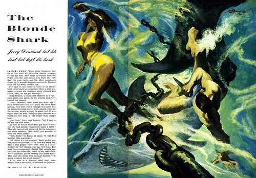
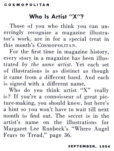
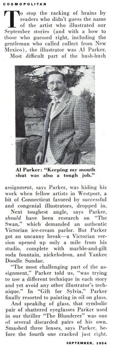
In September of 1954,
Cosmopolitan magazine AD, Robert C. Atherton conducted a daring experiment: ignoring his usual roster of well known and respected illustrators, he handed out every story assignment in that issue to a completely unknown artist.
The results were nothing short of spectacular.
This should have been the launching point of a half a dozen careers...but here's the really strange part: after completing their first ever high profile magazine illustration assignments, Karl Reap, Charles Kirkpatrick, Ed Robertson, Lloyd Viehman, Chuck Eubanks, and Otto Bender were never heard from again. What became of this talented group of unknowns... and why did they never again illustrate a story for a major national magazine?
Amazingly, I was able to unearth their stories:
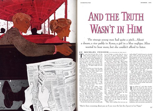
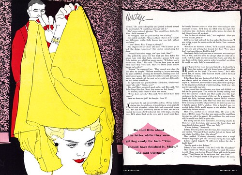
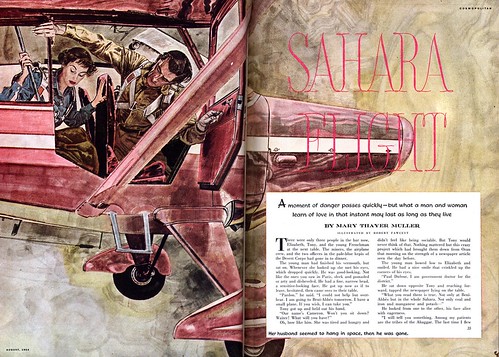
Karl Reap began his career as an in-house layout man at various New York advertising agencies. His artwork was only used for presentation purposes at client meetings - then discarded. Reap had always wanted to do finished art so people would finally recognize his talents. Robert Atherton was married to Reap's cousin and the two men had met at many family functions over the years. When Atherton decided to undertake his bold experiment, Reap jumped at the chance to illustrate the first and longest of that issue's stories.
Karl Reap enjoyed seeing his work in print at last, but he found the time and attention one had to devote to creating finished art did not suit him. The roughness of his work here is a result of him struggling to meet the deadline after spending too much time on the initial painting. Frustrated, Reap returned to doing layout work and from then on only did finished paintings as gifts for family members in his spare time.
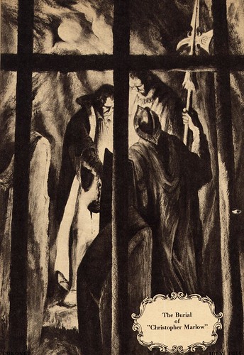
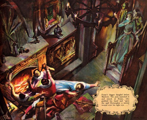
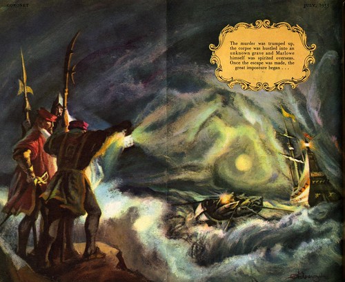
Charles Kirkpatrick, the oldest of that issue's unknowns, had actually painted many illustrations anonymously in the 20's and 30's for the pulp magazines in England. He had semi-retired but still taught part-time at a prestigous art college in London. Atherton had studied under Kirkpatrick and thought it might be fun to call on his old teacher for one of the stories. The older man agreed... and we might have seen more work by him in future issues of
Cosmo but, sadly, he passed away the following month. His former student's assignment would be the last painting of Charles Kirkpatrick's career.

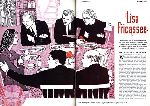
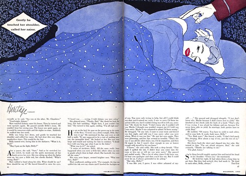
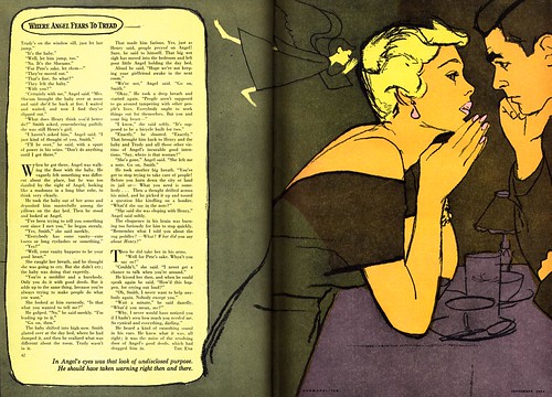
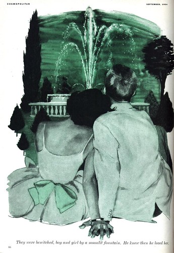
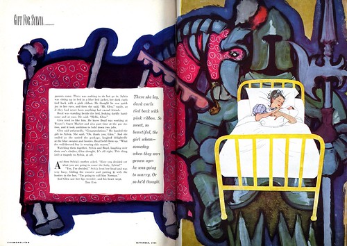
Ed Robertson was working as an art director when Atherton approached him to illustrate "Gift for Sylvia". The two men knew each other from attending meetings at the New York Art Directors Club. Atherton had always wondered why Robertson had never made use of his illustrative talents, and offered him the chance to do one of the longer, multiple image stories.
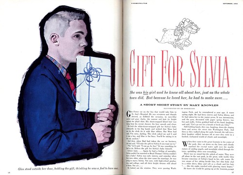
As you can see from the results, Robertson was tremendously accomplished and could easily have switched careers to full time illustration. But shortly after completing his first ever story assignment, Robertson was offered the Creative Director position with a large Wisconsin ad agency.
Robertson left New York shortly thereafter and we must assume he spent the rest of his days happily immersed in creating advertising for the cheese industry.
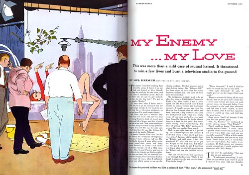
Lloyd Viehman was actually an animator at MGM Studios in Burbank, California. Viehman was in New York on a leave of absence from work, caring for his ailing mother. While in town he heard through the grapevine that Robert Atherton was looking for talented unknowns to fill an issue of
Cosmopolitan, and thought it might be a good opportunity to earn a little extra money while away from the West Coast.
His art for "My Enemy... My Love" certainly reflects his animation background, and its been said that the illustration was actually done on a sheet of acetate, mimicking the process used to creat animation 'cels'.
After Viehman's mother passed away the artist returned to California where he got in on the ground floor of the Hanna Barbera studios. He eventually became a director with that company, and is credited with lending his nickname, "Auggie" to the HB character "Auggie Doggy".
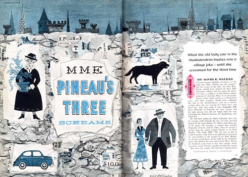
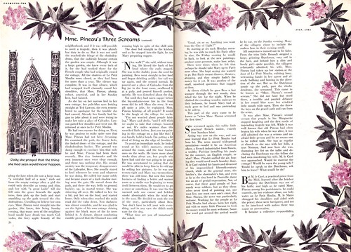
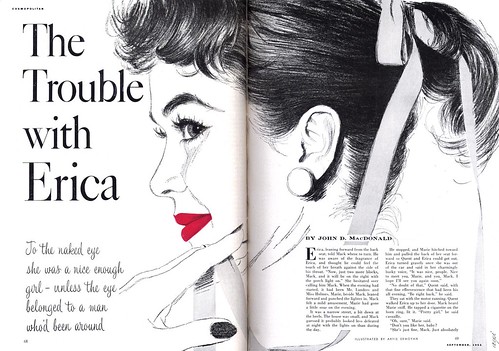
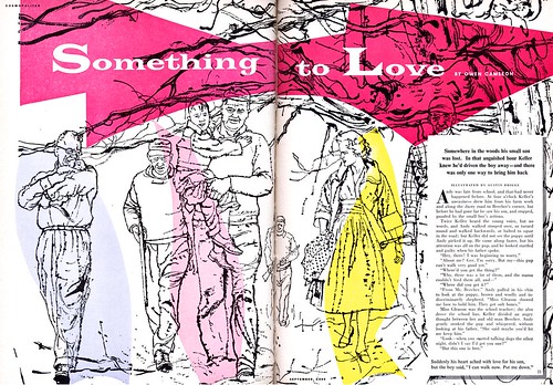
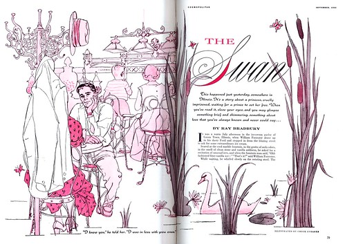
Chuck Eubanks, the artist on "The Swan", was one of
Cosmo's best fashion illustrators. He took up Atherton's challenge to produce a story illustration, and the results are very pleasing indeed. But for reasons of his own, he returned to doing strictly fashion illustrations after this one foray into story art.
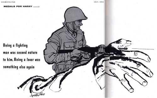
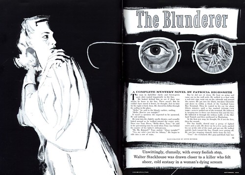
And finally, Otto Bender, who was actually a comic book artist - though he had never made a name for himself in that area of the industry. Bender worked for many years as a "ghost", doing the artwork for other artists who then signed their names to the artwork. Years later, when asked why he had chosen to spend his entire career in anonymity, the now elderly Bender replied that he had been embarrassed to be working in the "illegitimate" field of comics. "I didn't want people to know," said Bender when he appeared on a panel at the 1997 San Diego Comics Convention. "Those Senate hearings and that Dr. Wertham... they made me feel ashamed of the work."
Bender said that this one piece he did for
Cosmo was a highlight in his career and he proudly put his signature to it, but he found it easier to get assignments in the comic book field. "Little could I have imagined then," said Bender, "that the great American illustrators would fade into obscurity and that
comic book artists would one day be treated like royalty!"
If you've been wondering how I managed to find out so much about such an obscure group of illustrators, its because I made it all up.