Monday, January 30, 2012

Ronald Searle (1920 - 2011)

The legendary cartoonist/illustrator, Ronald Searle, passed away late last year.

Searle04

I received a note from Chuck Pyle shortly after Searle's death:

"As archivist of our illustrated world, I was hoping that you might be able to pop up a post on Ronald Searle, who just passed away. One of my great heroes. There is a BIG hole in the fabric with his loss."

Searle06

How true. No doubt hundreds, perhaps thousands of artists and certainly many millions of fans worldwide, who have been touched by Searle's work, are saddened by the loss of this brilliant and prolific creator.

Searle01

A quick search on Flickr turns up hundreds of scans of Searle's work, many from publications and books long out of print - all of them wonderful and inspiring.

Searle07

To that collection, I have added a few more, presented here today for your viewing pleasure.

Searle05

Searle02

Searle03.detail01


Searle03

Searle had no bigger fan than Matt Jones, a story artist at Disney, who has created an extensive Ronald Searle blog site.

Searle04.detail01

His touching tribute to Searle contains links to many obituaries for the artist from major media outlets.

Friday, January 27, 2012

Bradshaw Crandell: Man of Distinction

By guest author Kent Steine

By the late 1940's Bradshaw Crandell had turned over the reigns of producing the covers at Cosmopolitan to Jon Whitcomb. Crandell himself had been Harrison Fisher's beneficiary in the 1930's. However the decade of the 1950's brought a new direction for Crandell. Throughout his career, Crandell had used pastel as his primary media for it's spontaneity and managing deadlines. He was ready for a change. He had taught himself to paint with oils, and with his unwavering dedication was producing work that would rival his magnificent pastel illustrations.

Crandell21
(Above: "Red Head", was also one of the featured pieces in the Bottoms Up collection. A "Red Head" was: 1 jigger Seagram's 7 Crown; 1 barspoon of kirschwasser; 1 barspoon raspberry cordial; Juice 1/2 lemon; Ice. Shake well. Strain in to cocktail glass. Drop twist of orange peel in to glass.)

Crandell22
(Above: Although Brad worked with oils throughout his career, by the 1950's that medium dominated his work. "Time on My Hands", painted in 1960, displays a lifetime of study. His draughtsmanship, and manipulation of light and shadow are what every artist strives to duplicate.)

Crandell was now in his preferred element. Although he achieved immense success as a cover artist, it was only after he left the commercial field and began to concentrate on painting portraits, that he truly felt happy. He loved working with people directly. Crandell's models sat for him. He would work from photo reference as a backup to the original sitting. He instinctively knew that was the only way to make a great picture. Crandell never analyzed a subject to bring out the true nature of the sitter. He painted what he saw, where the real person came to life. Choosing to only see the good in people, he would capture his subjects at their best.

Crandell31.detail01

In 1954, Crandell made Madison, Connecticut his permanent residence. It had been his summer home and retreat for many years. He would maintain the East 52nd Street studio in New York for another eleven years. It was during this time that his status as a renowned portrait artist was established. Now instead of movie stars, his commissions were numerous Governors; heads of state; and society women. His career had come full circle. He was now fulfilled, producing art in the tradition of the masters he had long admired.

Crandell31

Throughout his life and career, Crandell had been at the top of his field. He received many of the accolades due a man and artist of his caliber (among other things you could walk into The 21 Club, or The Stork Club and order concoctions entitled "Red Head" and "Bachelor Girl", inspired by Crandell's work). Along with many associations, he was an active member of The Society of Illustrators, and was recently elected to their Hall of Fame. Crandell was very active within the "Society", contributing art, and goodwill throughout the membership. He was also a member of the Artists and Writers Association; and the Dutch Treat Club. Crandell was also an excellent and skilled chef. He was a member of the American Society of Amateur Chefs; as well as serving as President of the Property Owners Association in his hometown of Madison, Connecticut.

Crandell32
(Above: 1952 Dutch Treat Club Yearbook illustration by Bradshaw Crandell, featuring names and numbers of fellow club members)

Sadly, by 1965 Bradshaw Crandell had contracted cancer. Reviewing letters written by him at this time, one finds no remorse or bitterness as a result of his condition. There is merely grateful appreciation for the innumerable admirers of his work. He passed away in the comfort of his home January 25, 1966 at the age of 69.

(Below: John Bradshaw Crandell's NYT obituary, from Wednesday, January 26 1966.)
Crandell24

(Below: This original keepsake from Bradshaw Crandell's memorial was written by his wife, Myra.)
Crandell25

Today the measure of beauty has a different ideal in life and imagery. What likely appeals to the public in general during the year 2012, was a very different ideal in 1942. We are fortunate to have had likes of Brad Crandell to record a most unique period in history, when beauty was attractive, appealing, and refreshing.

Crandell25a
(Above: Upon closer inspection, this example represents one of Bradshaw Crandell's very best pastel illustrations. Crandell preceded in scope and stature, nearly all of the illustrators associated with painting a pretty face or even pinup art . . . in some cases by twenty years. This masterfully simple, and perfectly rendered illustration presents an idealized and stylized face that set a standard for all who followed.)

* Kent Steine is an artist, author and teacher. His renowned series of "Masters" articles for Step-By-Step magazine remain some of the best ever written on the history of illustration. With this week being the anniversary of Bradshaw Crandell's death, I'm very grateful to Kent for sharing the story of this fabulous artist with us. An abridged version of this week's series of posts originally appeared as an article in SXS magazine. ~ Leif

Kent Steine's website

* Several of today's (and this past week's) images are courtesy of the Heritage Auctions website

Bradshaw Crandell: Artist of the Stars

By guest author Kent Steine

By 1930 Bradshaw Crandell was producing covers for many of the major periodicals of the time like The Saturday Evening Post, Collier's and
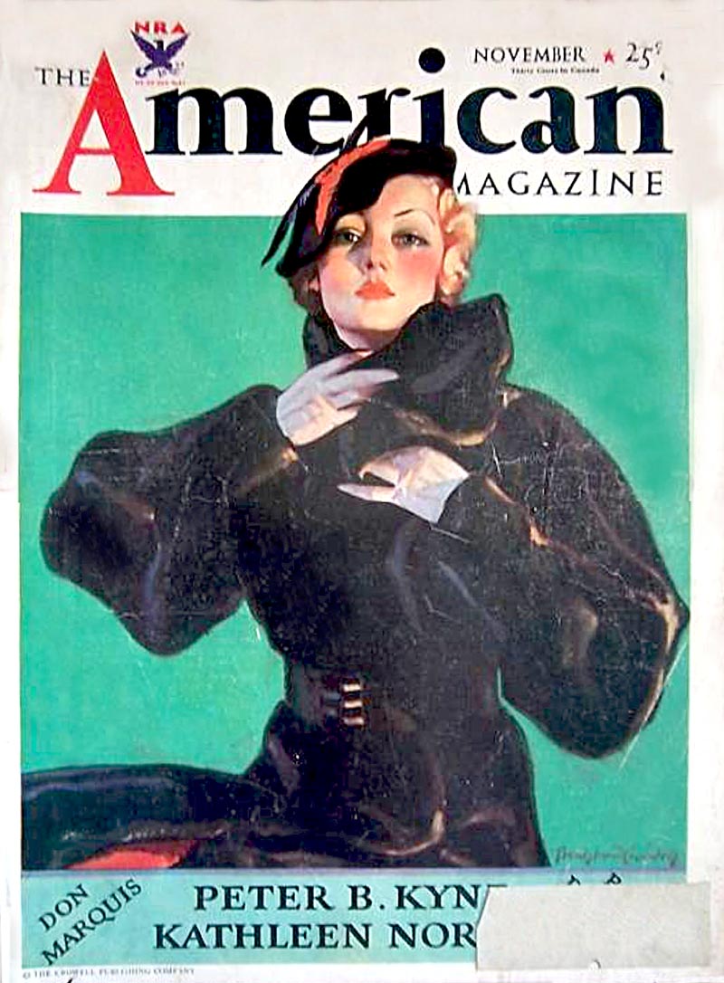
 American.

Crandell28

In 1925 he opened a "shop" at 405 Lexington Avenue and simply called it John Bradshaw Crandell Studios. Crandell himself only recalled producing one editorial or story illustration. That was produced for 
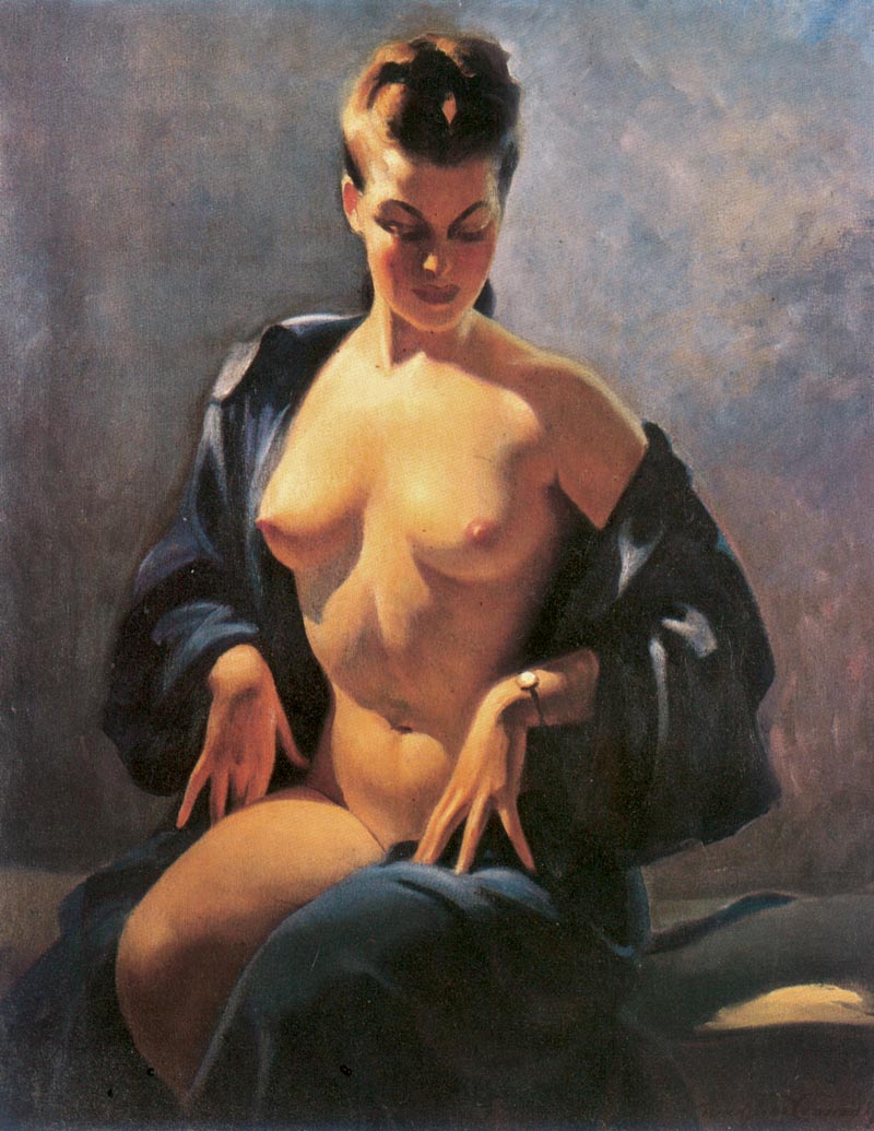
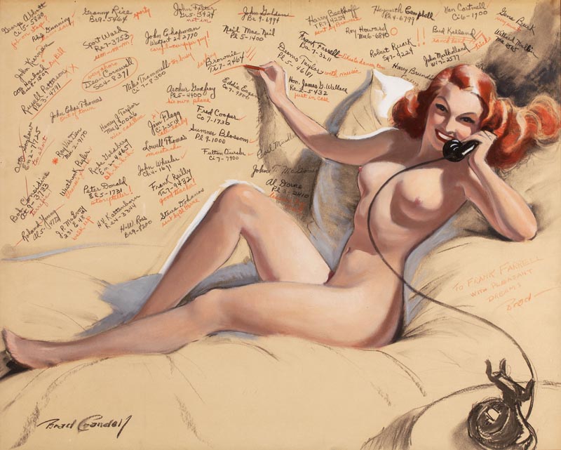
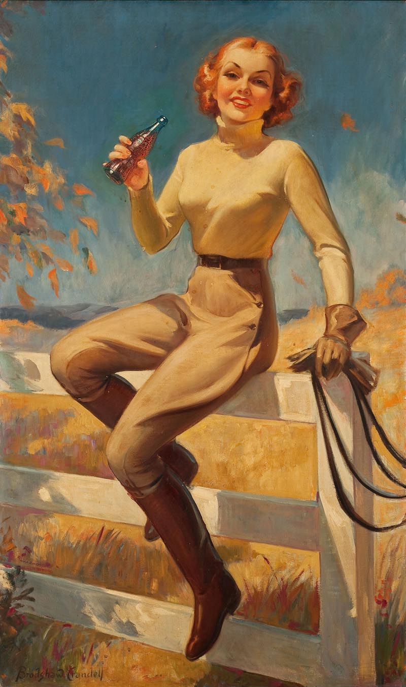
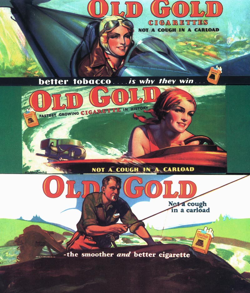
Redbook magazine early in his career. There were countless advertising illustrations produced for a variety of elite clients and products. The images usually depicted an attractive woman or couple engaged in some glamorous or exciting activity. He became widely recognized for his Old Gold ads and point of purchase displays. Crandell's depictions of beautiful women were the staple for Palmolive skin soap advertising campaigns during the early 1930's. However, it was his 
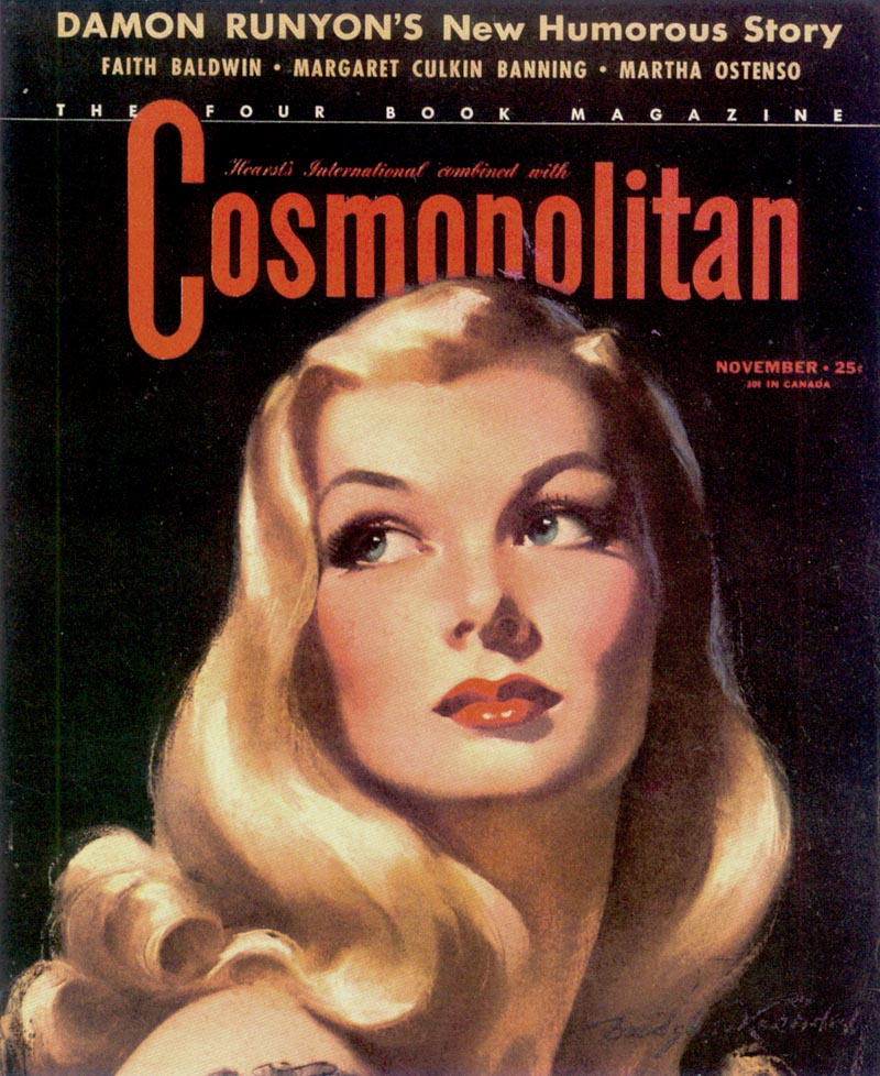
Cosmopolitan magazine covers that made Bradshaw Crandell a household name.

Crandell30

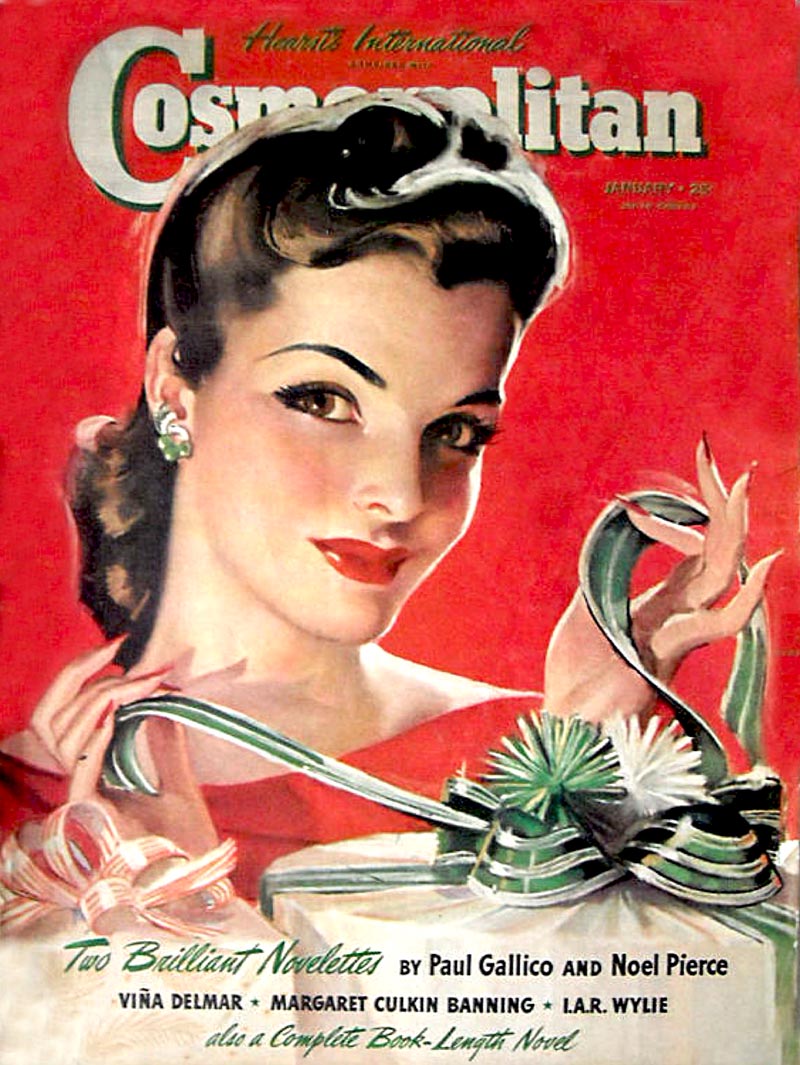
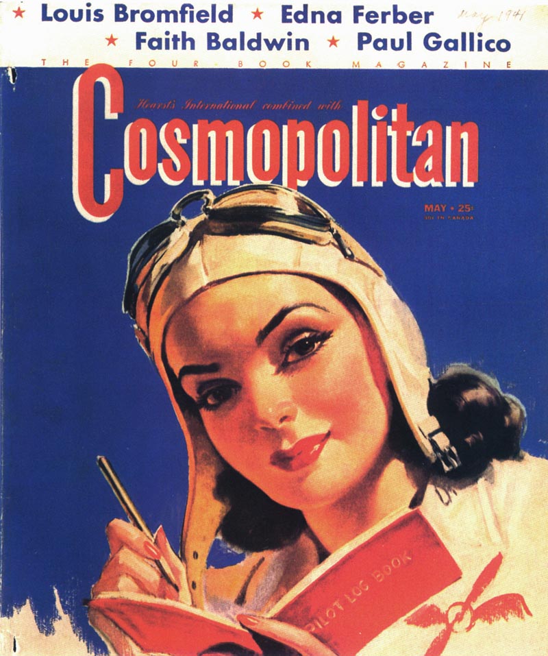
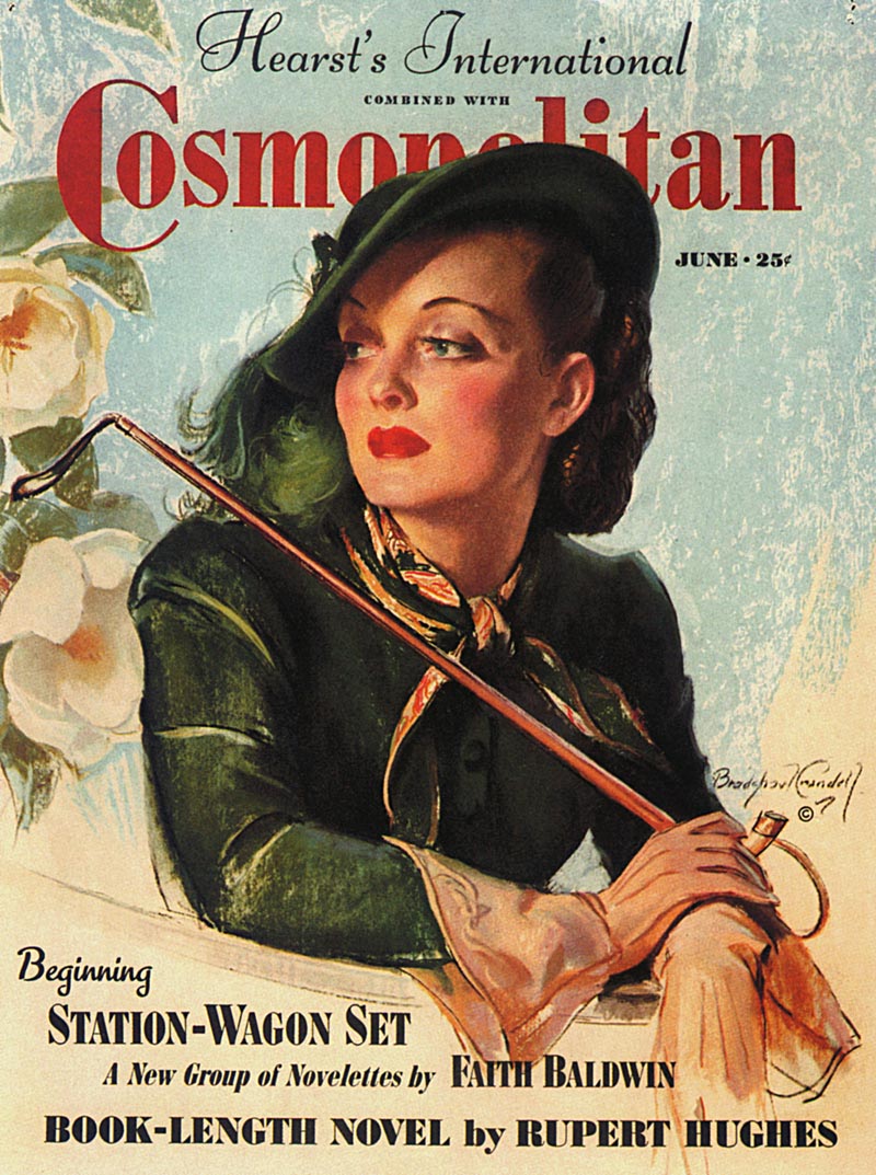
By 1935, Crandell dropped the 'John' from his name, moved to a new penthouse studio at 400 East 52nd Street (he would maintain this location until August of 1965), and was at the beginning of his 12 year run as the cover artist for Cosmopolitan. He also produced covers for 
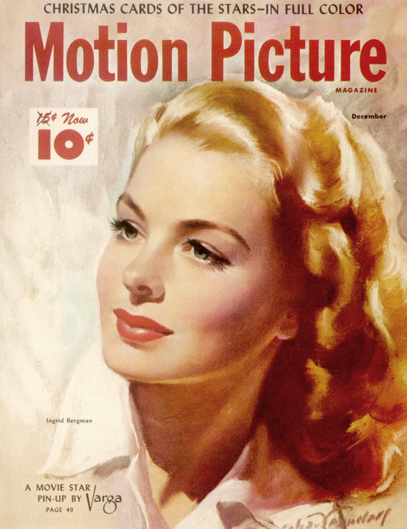
Ladies' Home Journal and various other "Curtis" publications. During WWII Crandell produced a variety of war effort illustration art. In 1939 he provided the artwork for the Salvation Army fund drive, and also produced numerous illustrations for General Motors Pontiac Division, depicting workers and their roles in producing aircraft.

Crandell27

Cosmopolitan 
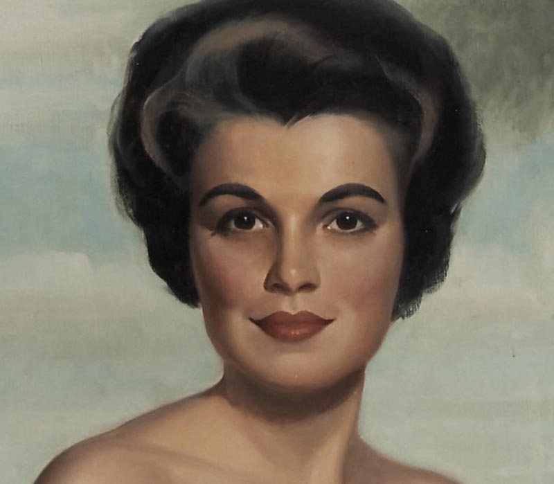
was known for it's beautiful covers portraying Hollywood's most popular and attractive movie stars. It was imperative that these depictions not only be recognizable, but more beautiful and glamorous than the camera or "real life" could present. There was an abundance of infinitely skilled illustrators in those days. Few however had the ability to draw and paint a pretty face like those produced by Bradshaw Crandell. Over the years there have been but few artists with this uniquely aesthetic ability.

Crandell16
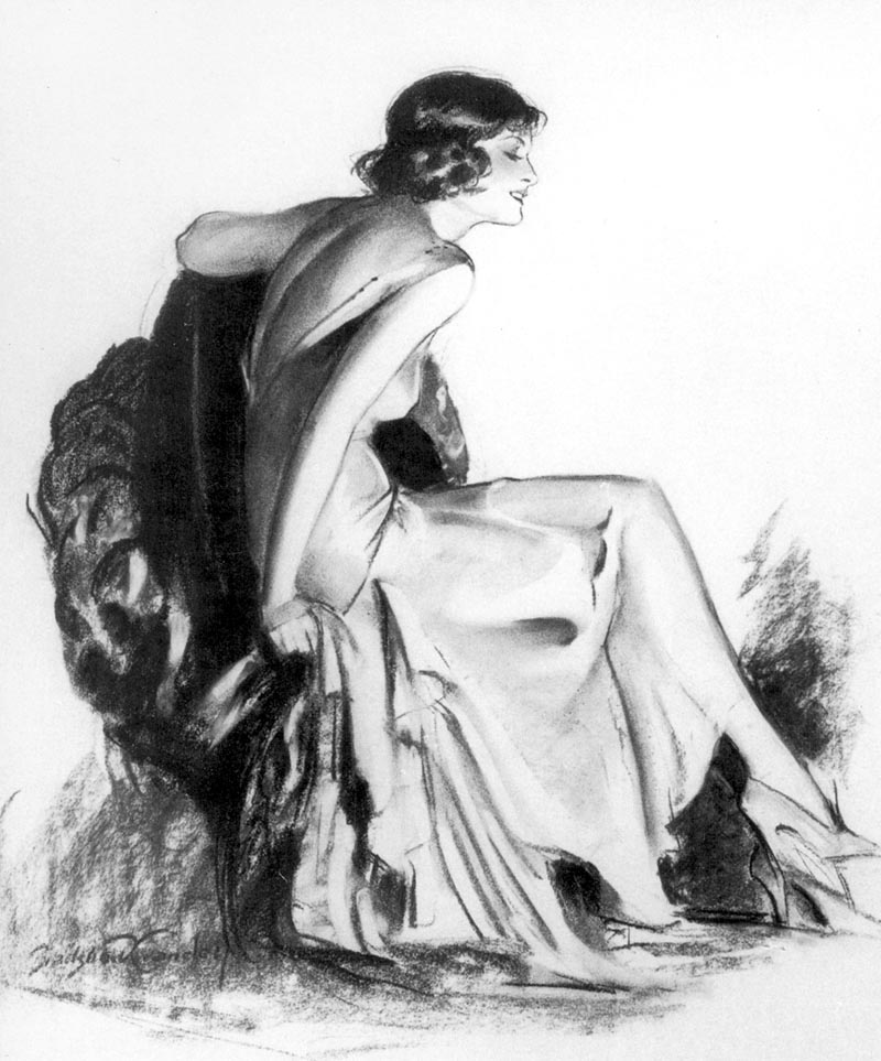
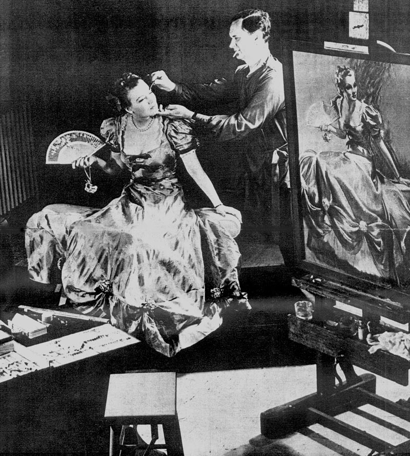
(Above: This feature in FOCUS magazine from the 1940's nicely represents a typical Crandell model sitting, in addition to his notoriety during the time.)

When Carole Lombard posed for Crandell in 1935, she was at the height of her acting career and popularity. In the image conscious movie industry of the 1930's to the 1950's, anything less than perfect would not be tolerated or accepted. This alone is a testament to Crandell's considerable abilities and influence within the studio system of yesterday. Movie stars of today are forced to embrace the public's fascination with the candid reality of photography. Somewhere along the line, the elements of fantasy and innocence have been lost.

Crandell18
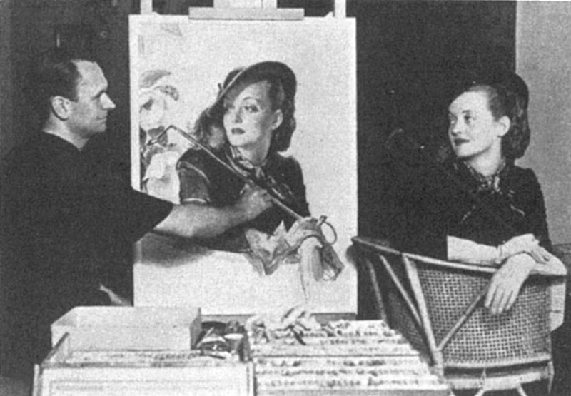
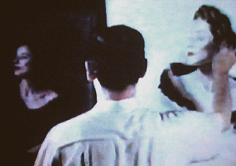
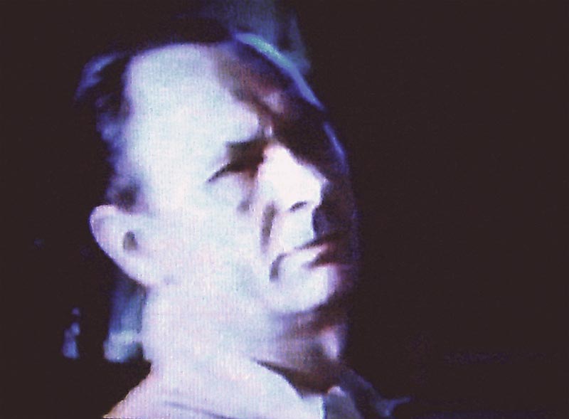
(Above and below: These "Screen shots" of Bradshaw Crandell working, are from the historical movies produced by Frank Reilly. Filmed in 16mm between 1949 and 1952, they included many of Mr. Reilly's friends and fellow artists. Some of the finest illustrators of the last century participated in the project, and included: Crandell; Arthur William Brown (who documented everything in triplicate); William "Obie" Oberhart; John Falter; James Montgomery Flagg; Harvey Dunn; and featured Dean Cornwell's introduction and incredible demonstration. Here, Crandell begins a live portrait in pastel, and is shown looking back at his easel, drawing from memory.)

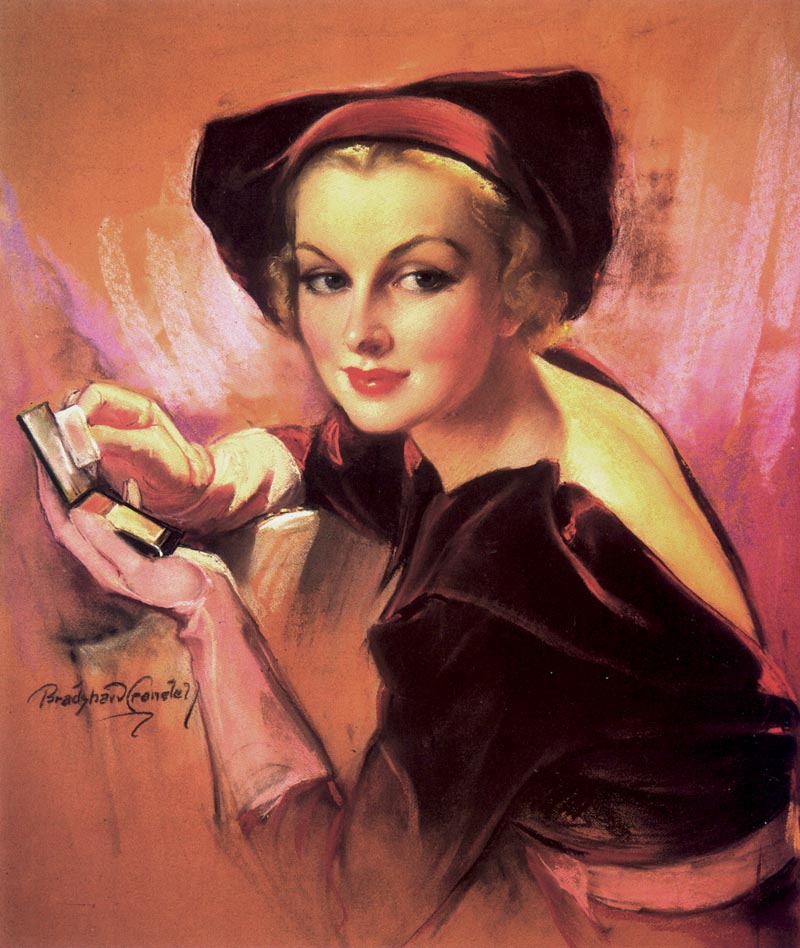
Bradshaw Crandell's approach, or technique to producing a pastel picture was in effect, quite laborious. The process gave his finished pastel pictures a deeper, richer appearance than a direct application. The first stage was to draw his model from life with charcoal. For a portrait bust he worked large, approximately 22" x 30", on white heavyweight paper attached to a board, and locked in an easel. He employed all of the various blending and rubbing techniques common to pastel and charcoal drawing, and with a mouth atomizer, would apply a fixative at various stages. After the initial drawing was adjusted and corrected, he would then begin to add whites and lighter values to the drawing with pastel.

Crandell19
(Above: Brad has already begun to establish the color and refinement process of the picture, and here we see the the artist, drawing, and model in each position of perspective.)

Now with a fully rendered B&W en grisaille drawing, he would apply a fixative with a mouth atomizer, and remove the drawing from the easel. Laying the work flat, Crandell applied a varnish/medium, to the entire working surface with a 2" sable brush. Once the surface was dry, he would begin to add the color with pastel.

Crandell20
(Above: A close up of Brad Crandell refining the details of the face. Like all well trained artists, he worked from the large to the small, from the simple to the complex.)

This approach is similar to an undertone (verdaccio) used when oil painting. He worked in the same manner one might when painting with oil, ie: dark to light, establishing all of the dark values and passages first with a corresponding value of color. He created new hues, by blending the colors as they were applied one over the other. As the medium dictates, this was a process of refinement and polish. After the trademark Bradshaw Crandell signature, he would spray fixative over the entire surface, and the picture was complete.

Although there are visual records of how Crandell created his pastel pictures, it would seem none of his working methods are available after he transitioned to painting with oils. However, it would be reasonable to presume his fundamental approach was similar.

* Kent Steine is an artist, author and teacher. His renowned series of "Masters" articles for Step-By-Step magazine remain some of the best ever written on the history of illustration. With this week being the anniversary of Bradshaw Crandell's death, I'm very grateful to Kent for sharing the story of this fabulous artist with us. An abridged version of this week's series of posts originally appeared as an article in SXS magazine. ~ Leif

Kent Steine's website

Wednesday, January 25, 2012

Bradshaw Crandell: The Natural

By guest author Kent Steine

Anxious to return to his studies, he enrolled at the Art Students League. However, again he only attended for a few short months. This was undoubtedly due to the fact that he had already begun to receive commercial commissions and had never stopped independently studying.

Crandell11
(Above: In addition to his glamorous magazine covers created during the 1930's and 40's, Brad Crandell painted advertising art for many high profile accounts. Along with Haddon Sundblom, and Harry Anderson, Crandell also made pictures for Coca-Cola. These were typically done in oil, and likely reflected the art director's preference, or perhaps Crandell's fee. Oil on canvas: 50" x 36")

Crandell truly studied all of his life. At the Art Institute; and the Art Students League, he never advanced beyond the basics of working in charcoal as well as drawing and sketching from life and sculpted casts. For Crandell the sound fundamentals he had been taught would carry him far.

Crandell12
(Above: Veronica Lake's appearance in Preston Sturgis' Sullivan's Travels made her an overnight sensation. When Crandell was tapped to produce this portrait for the November 1941 cover of Cosmopolitan, the movie studio brass instructed him to avoid portraying her trademark peek-a-boo hairstyle, being copied by women around the country. Many were working in factories contributing to the war effort, and Uncle Sam considered the look a safety hazard.)

He was amazed at the work of the "Old Masters", and diligently studied them. He would have loved to live in the era when apprentices studied under the great masters of art. Learning first how to draw, then to paint.

Crandell13
(Above: The pastel illustration of Ingrid Bergman for the December 1942 cover of Motion Picture, showcases Crandell's considerable abilities. Bergman is completely idealized, yet maintains an absolute on-model likeness of the famed actress.)

Crandell felt that nothing truly great could be achieved or accomplished without hard work in any field. He deplored careless work. "Unskilled painting over inaccurate drawing." He truly felt it was an illness of the times - a desire to slide through life without working.

Crandell01
(Above: Bradshaw Crandell, Oct 24, 1949. At the time, he was enjoying celebrity status that rivaled the movie stars of the era. Seen here in an advertisement for Lord Calvert.)

Although he had been producing advertising illustration for various clients, his first major contract was to produce a cover illustration for Judge magazine, in 1921. This event, a mere four years after graduating from high school, would set in motion a career that would take him to the top of his field as a magazine cover artist.

Crandell15
(Above: At 39.5" x 29.5", and masterfully rendered, "Fine Feather", a pastel illustration produced for Gerlach - Barklow, becomes difficult to discern whether it was produced as an oil painting, or pastel picture.)

* Kent Steine is an artist, author and teacher. His renowned series of "Masters" articles for Step-By-Step magazine remain some of the best ever written on the history of illustration. With this week being the anniversary of Bradshaw Crandell's death, I'm very grateful to Kent for sharing the story of this fabulous artist with us. An abridged version of this week's series of posts originally appeared as an article in SXS magazine.

Tuesday, January 24, 2012

Bradshaw Crandell: Impressionable


By guest authorKent Steine


He was born John Bradshaw Crandell, June 14, 1896 in Glen Falls, New York.

Crandell06
(Above: Of Bette Davis, Crandell remarked, "She was a swell model, and was always on time." Davis sat for Crandell on three separate occasions, with each session lasting about 2 hours. He encouraged his models to talk while he worked, claiming, "It helps make the picture interesting.")

Brad, as friends knew him, became interested with art through the majestic covers of the various periodicals of the time. Magazines like Colliers, The Saturday Evening Post, Century and others were the forms of entertainment. They were as recognizable and accessible as the nightly news on television is today. And like this modern day parallel, the person who delivered this product was as important as the product itself.

Crandell07
(Above: This charcoal study was produced during the 1930's, and was a variation of several images ultimately used by Palmolive.)

By the time Crandell graduated from high school, he knew that he wanted to produce artwork for the covers of these great publications. After graduation, he moved to Chicago and began attending classes at the Art Institute. Although his stay there would be brief (6 months), he most likely had the opportunity to study with Vanderpoel.

Crandell09
(Above: Although the precise date of this little editorial piece in the NYT is unknown, the reference to Crandell taking over for Harrison Fisher at Cosmopolitan, and McClelland Barclay, respectively place this between 1935 and 1943.)


Famed anatomist John H. Vanderpoel was the drawing instructor at the Institute, and various students of his were contemporaries of Crandell's. Artists such as Rolf Armstrong and George Petty studied under Vanderpoel. The great J.C. Leyendecker himself credited Vanderpoel with much of his success as a draughtsman and illustrator.

Crandell10
(Above: The study presented here, was produced around 1938. It was unsigned, and possibly a preliminary sketch for a calendar reproduction. Characteristically large, at 20" x 33", it was undoubtedly drawn from life, and lighted with absolute precision.)

For reasons unknown, Crandell stopped attending classes at the "Institute", and enrolled at Wesleyan University. While he was at Wesleyan, World War I erupted in Europe. Crandell interrupted his education and enlisted in the Navy serving as a Machinist's 1st mate.

Crandell08
(Above: At 25 1/2" x 18 3/4", the 1940 cover of Cosmopolitan typified Brad's working dimensions for his pastel pictures. Using a variety of boards and papers, some were as large as 30" x 40".)

After a medical discharge, he returned to New York and worked in the canteen at the Bryant Park YMCA as a cashier. It was during this period he met and married Myra Clarke.

* Kent Steine is an artist, author and teacher. His renowned series of "Masters" articles for Step-By-Step magazine remain some of the best ever written on the history of illustration. With this week being the anniversary of Bradshaw Crandell's death, I'm very grateful to Kent for sharing the story of this fabulous artist with us. An abridged version of this week's series of posts originally appeared as an article in SXS magazine.

Monday, January 23, 2012

Bradshaw Crandell and the Art of Glamour


By guest author Kent Steine

Hollywood glamour portraits, the creation of idols in paintings and sketches rose with the star system in the motion picture industry of the 1920's. Studio publicity departments created an image of the star, artists fabricated that image with dramatic lighting, costumes and props. They used traditional methods of portraiture to achieve an on-model likeness, and added the veneer of Hollywood's glamour and idealism, drawn from the worlds of fashion and advertising.

Crandell02
(Above: The July 1936 cover of Cosmopolitan featured actress Carole Lombard at height of her career. Produced with his refined pastel technique, this example of idealized beauty presented Bradshaw Crandell at the top of his form.)

Bradshaw Crandell was one of the first and most recognizable artists to portray the essence of Hollywood glamour. Beginning with his first cover for Judge, in 1921, he embarked upon a career that would ultimately make him one of the most influential men in the motion picture industry.

1 crandell JBC logo design

(Above: This was Bradshaw Crandell's original concept for a logo design, as hand rendered at the top of letter sized piece of paper. ca 1921. Below: The May 1941 cover of Cosmopolitan represents Crandell's ability to create an exciting and interesting picture with a minimal amount of information. He understood how to make a good cover.)


Crandell03

The list of stars that eagerly sat for Crandell is like reading a who's who list of movie greats from the 1920's to the 1950's.

Crandell05

(Above: "The June 1938 cover of Cosmopolitan was an idealized representation of one of Hollywood's most recognizable stars, Bette Davis.)

In this highly competitive and specialized field of illustration, he captured the elements of beauty, and the feeling of life.

Crandell04

(Above: These point of purchase displays for Old Gold cigarettes were extremely popular in the 1930's. They set a standard for the company's advertising campaigns by representing excitement, youth, and healthy lifestyle.

* Kent Steine is an artist, author and teacher.  His reknowned series of "Masters" articles for Step-By-Step magazine remain some of the best ever written on the history of illustration. With this week being the anniversary of Bradshaw Crandell's death, I'm very grateful to Kent for sharing the story of this fabulous artist with us. An abridged version of this week's series of posts originally appeared as an article in SXS magazine. ~ Leif

Kent Steine's website

Thursday, January 19, 2012

Susan Perl... for Grown-Ups

As much as Susan Perl will always be remembered for her prolific contribution to the world of children's books, as much as she is loved for her keen and sensitive observations of 'the secret world of children'...

Perl34

...there was another more mischievous side to Susan Perl's art...

Perl49.detail01

You could call it "Susan Perl for Grown-ups".

Perl49

Perl's sense of humour and her skill at observing and interpreting didn't stop with children.

Perl42

Her hilarious (and accurate) delineations of the many real characters (of all ages) who walk among us made her a valued contributor to many publications aimed at an older audience.

Perl38

Her work regularly appeared in The New York Times, she did illustrations for Life and Ladies Home Journal (above). Perl even wrote a humorous book for adults, The Sex Life of the American Female.

That 1964 book was, perhaps, inspired in part by an adventure in reportage commissioned by legendary Mad magazine creator, Harvey Kurtzman. For the April 1961 issue of the humour magazine, Help!, editor Kurtzman sent "our agents, Susan Perl (famous artist) and X9 Steinem (assistant editor)" on a mission "to invade the Fifth Avenue headquarters of a famous international beauty ring... and record its secret rites."

Perl45.detail01

The resulting article contained some of the most hilarious - and rarest - Perl illustrations I have ever seen.

Perl45

Perl48

Perl47

Perl46

Susan Perl was an observer. From her apartment on the 24th floor, overlooking the Hudson River, she worked at her drawing table next to her living room window. She kept a pair of binoculars nearby. When she needed a break, she would focus her binoculars on the activity down below. Perl said, "I truly love to see the ships pass by; they come from all over the world."

Perl10

Susan Perl died in 1983 of kidney failure. She was just 60 years old.

* Most of the information for this series of posts came from an article in the January 1968 issue of American Artist magazine.

* Many thanks to Bill Peckmann, Daniel Zalkus, Isle of Lucy and Blue Coat, all of whom provided image scans that appeared in these posts.

* Next month I'll be at The Nook presenting a lecture on Female Illustrators of the Mid-20th Century.

* Information and ticket reservations available here.