Tuesday, July 31, 2012

Denver Gillen, Landscape Painter

Denver Gillen is another mid-century illustrator whose work I have always admired. Gillen often incorporated compelling, atmospheric and distinctively stylized landscapes in his illustrations.

Gillen05.JPG

Gillen02.JPG

Gillen06.JPG

Gillen was a favourite of sport fishing and hunting magazine editors, creating many interior illustrations and covers.

Gillen35.jpg

Because Gillen himself had no interest in hunting, he consciously focused on the grace and nobility of the animals in his illustrations...

Gillen34.jpg

... and of course, looking beyond the subject matter, we see once again Gillen's beautifully realized landscapes.

Gillen36.jpg

Other artists might find tricks or shortcuts to represent the background landscape in their work as a symbolic prop. But even when creating textbook illustrations like the one below (which Gillen's daughter told me he found tedious to do) he cut no corners.

Gillen33.jpg

Later in his life, after moving to Mexico to semi-retire, Gillen created remarkable gallery paintings celebrating the people and landscapes of his adopted home.

Gillen40.jpg

Monday, July 30, 2012

James R. Bingham, Landscape Painter

I just returned from a week of plein air painting in Northern Ontario so landscapes are very much on my mind. I hope you'll indulge me while I continue with this theme, as it's what currently is really inspiring my own creative efforts!

Many of the great mid-century illustrators had a real knack for painting landscapes, even if it was in service to an advertising campaign or incidental to the story they were illustrating.

One such artist whose work I've always truly admired was James R. Bingham. Here are a few examples of his prowess in painting landscapes. Set aside the subject or purpose of each of these images and just study these amazing landscape interpretations. In each case, you'll see how Bingham truly captured the setting in form, light and colour!

Bingham10.JPG

Bingham36.jpg

Bingham56

Bingham58

Bingham83

Bingham61

Friday, July 27, 2012

Christopher Davis Describes His Method

Once agin in the Grumbacher Library edition, The Art of Oil Painting, Albert Pucci is joined by Christopher Davis, another master of the palette knife technique.

Davis16

Here, Davis describes his process...

Davis16.detail01

Davis16.detail02

Davis16.detail03

Davis16.detail04

Davis16.detail07

Davis16.detail05

Davis16.detail06

Like to see more of Christopher Davis' work? I wrote about him last year around this time - you can read that post at this link.

Wednesday, July 25, 2012

Albert Pucci Describes His Method

While I'm away plein air painting this week, I'm always referring to my recently acquired Grumbacher Library "Art of Oil Painting" book - especially the pages by Albert Pucci.

Pucci17.detail05

For anyone who shares my interest and might want to try this yourself, here is one of Pucci's demonstrations...

Pucci17.detail04

Pucci17.detail01

Pucci17.detail02

Pucci17.detail03

Pucci17

More about Albert Pucci

Monday, July 23, 2012

The Art of Oil Painting ... Landscapes

I'm taking a week off to do some plein air painting in "Group of Seven Country", so while I'm gone, I'll share a few scans from another Grumbacher Library "How to" book I found earlier this year at a thrift shop.

Pucci15.detail03

Once again, this sequence is a demonstration by Albert Pucci, who was featured in some other Grumbacher books I showed you last year.

Pucci15.detail01

Pucci15.detail02

Pucci16

I'll be adding a few more pages from this 1975 Grumbacher book as time allows this week.

Thursday, July 19, 2012

In Praise of the Little Things, Part 4

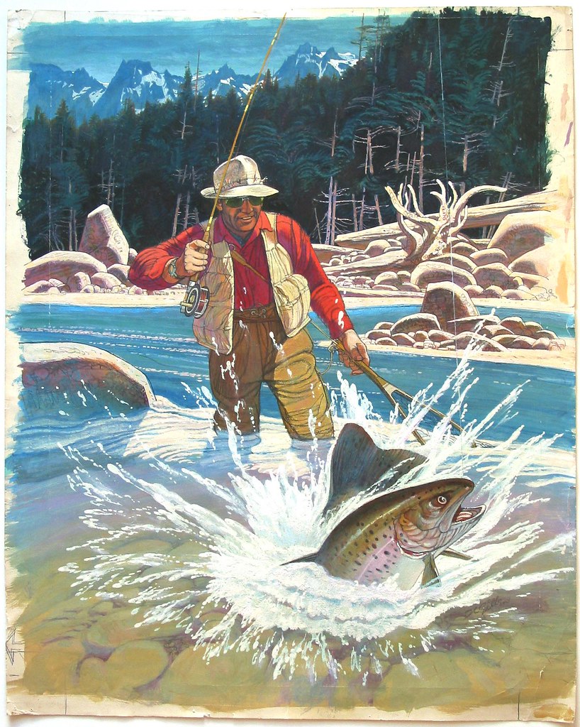
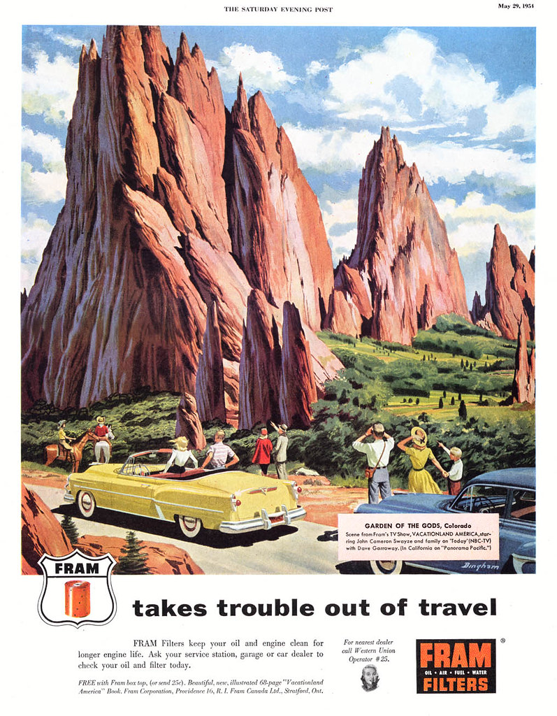
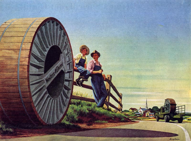
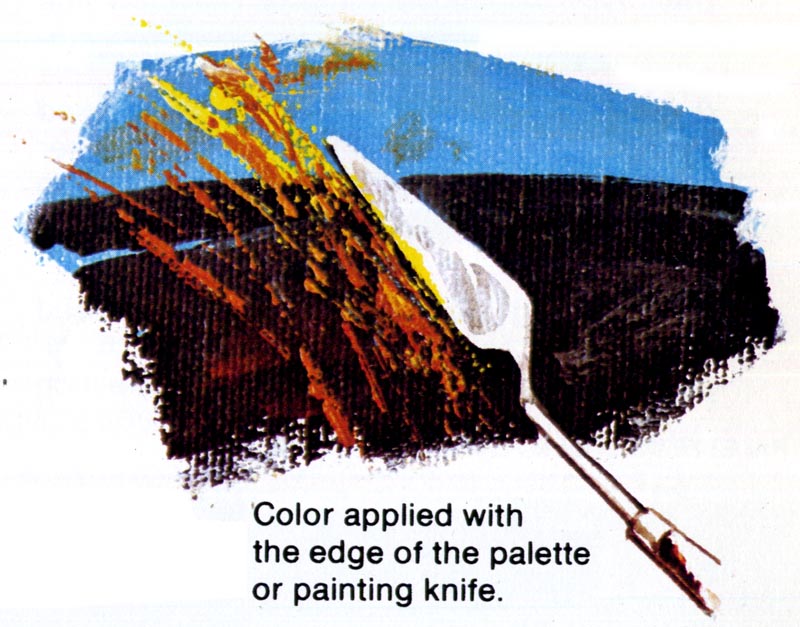
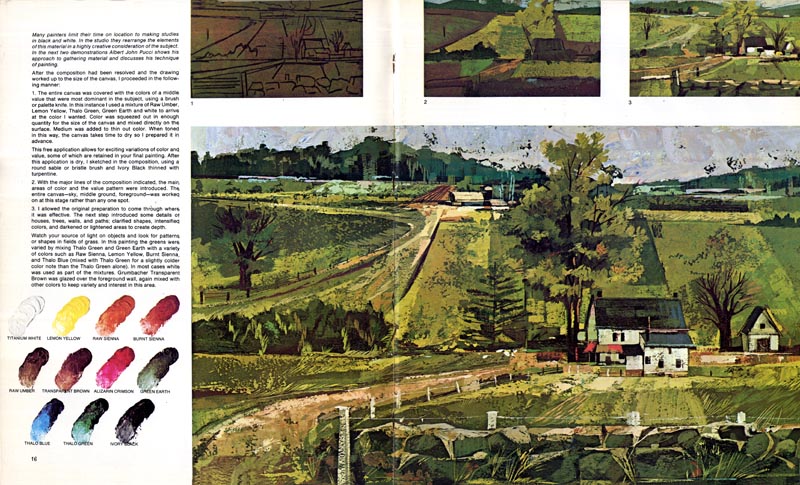
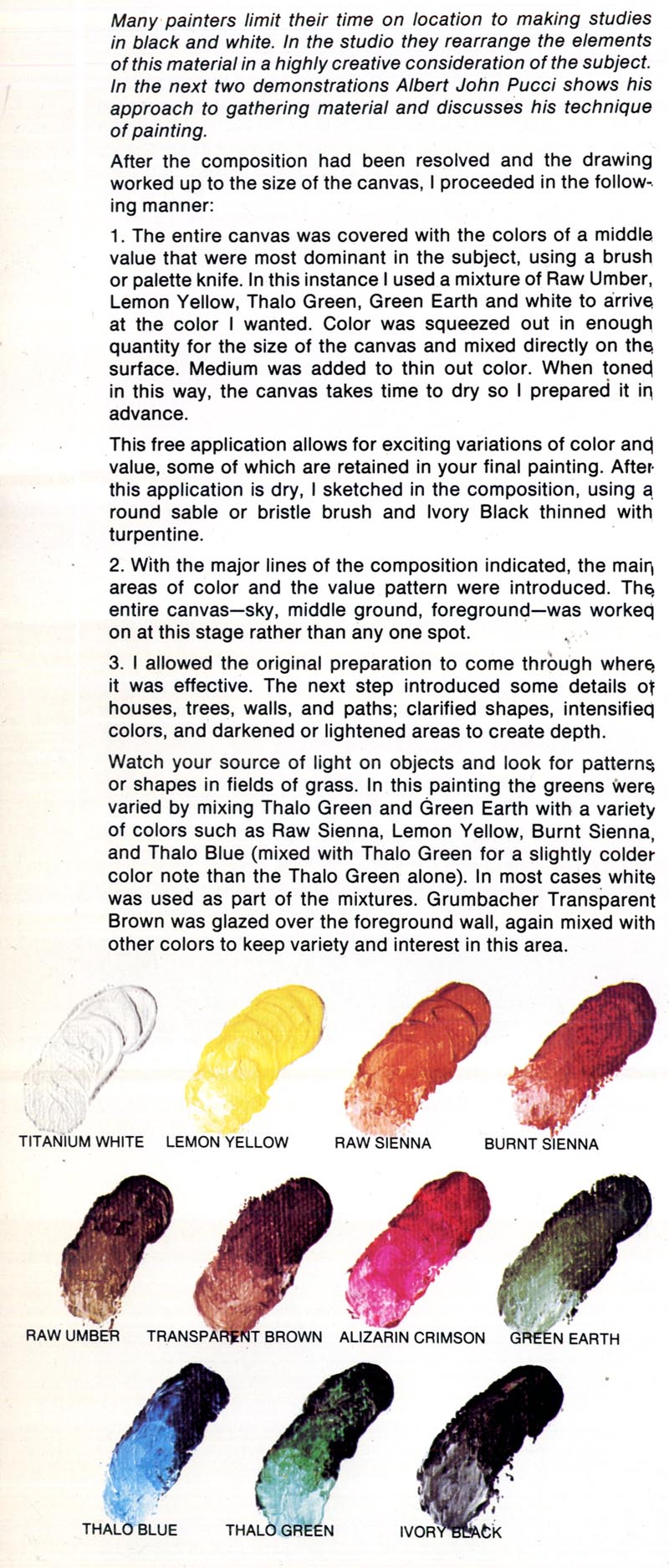
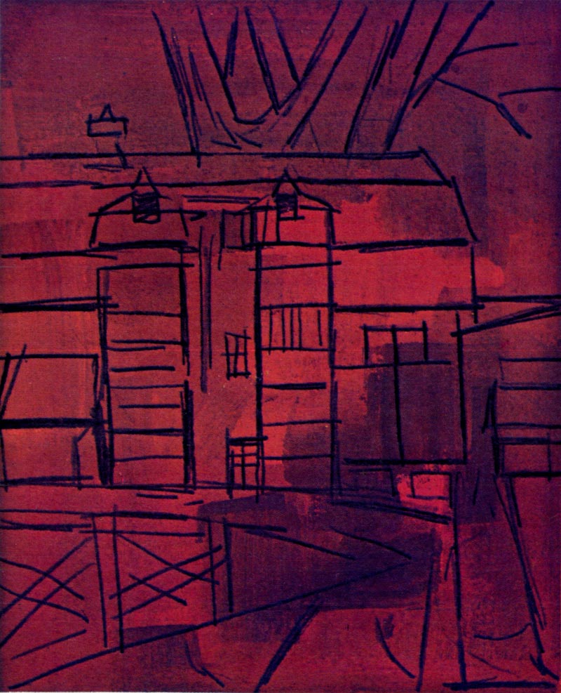
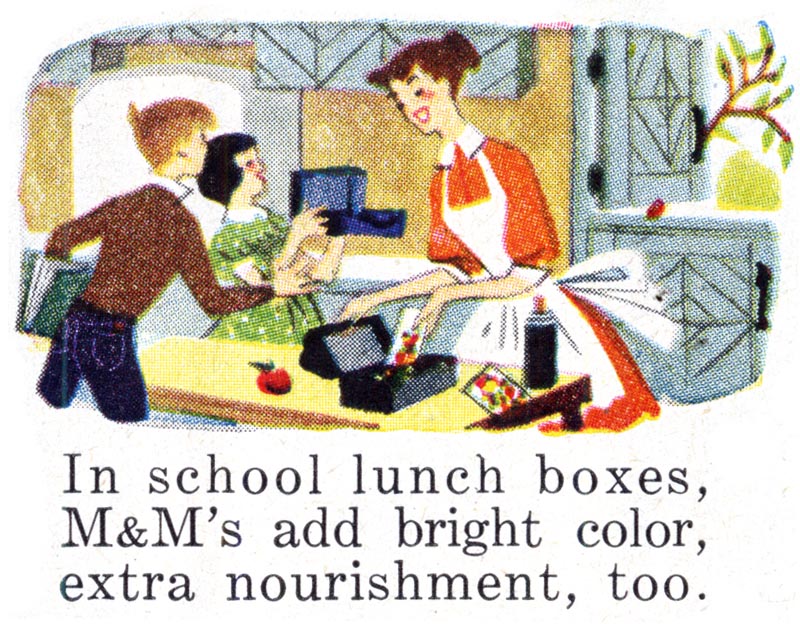
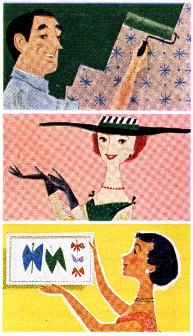
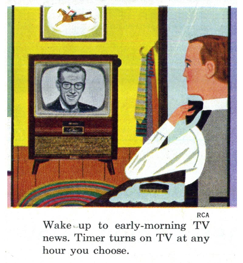
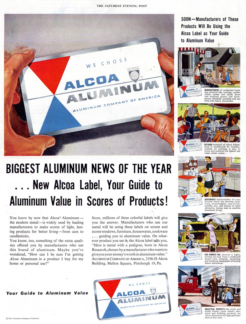
We've seen a wide variety of small spots this week that demonstrate just how conscientious mid-century illustrators were about doing their best work - despite knowing that work would be printed at a size far too small to be properly appreciated with the naked eye.

Nowhere is this more evident than in the remarkable full colour paintings done for many mid-'50s magazine ads. These miniature scenes were reproduced at about the size of a postage stamp...

Unknown1150

... but just look at the effort that went into rendering them.

Unknown1150.detail01
Unknown1150.detail02

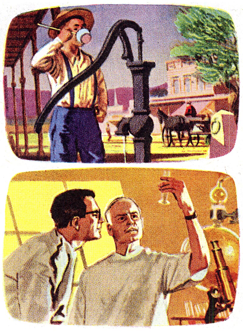
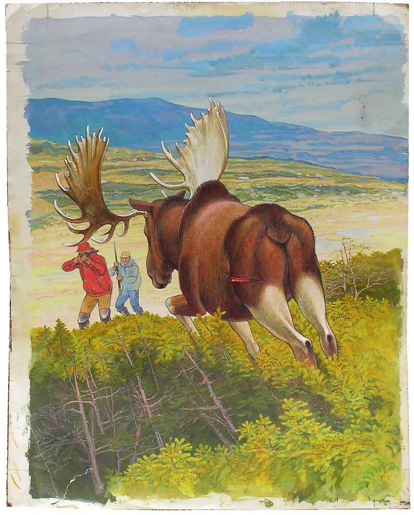
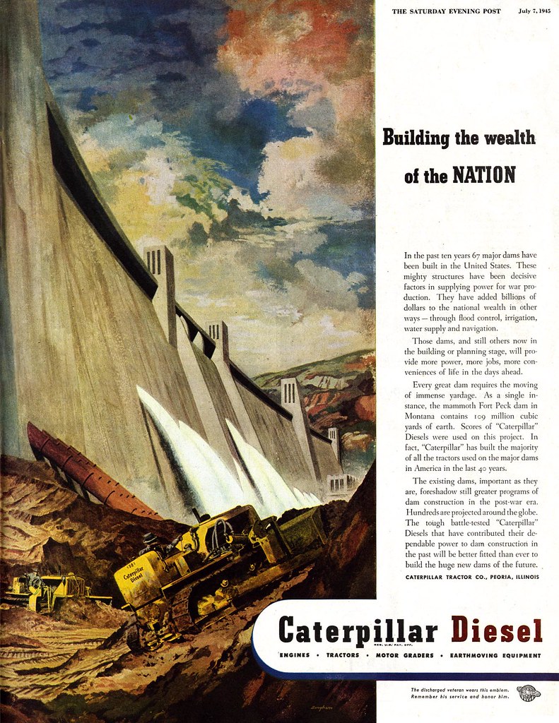
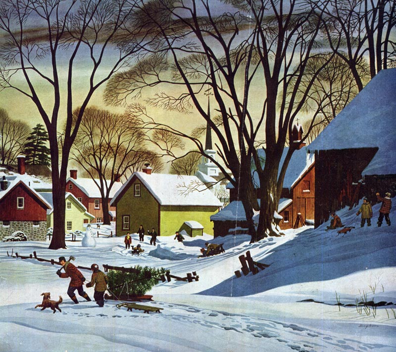
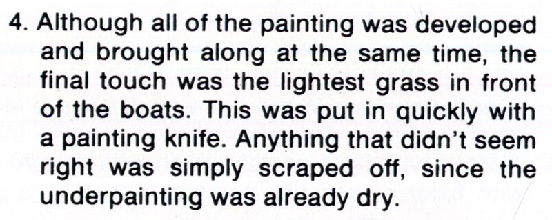
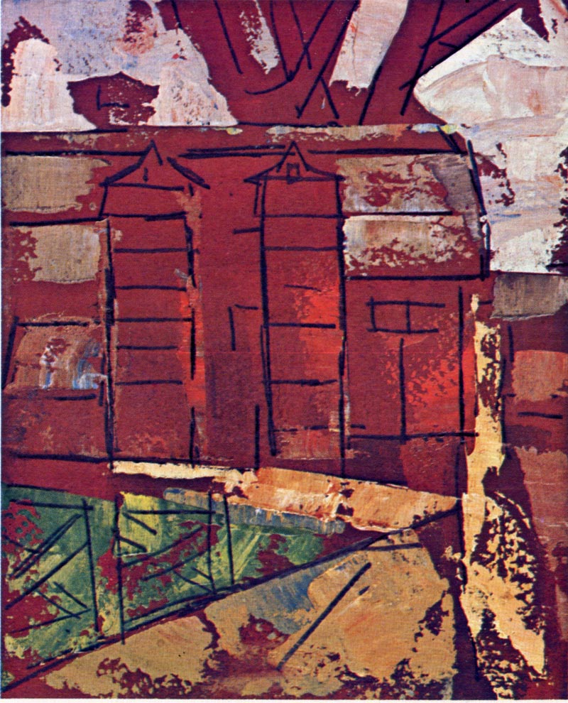
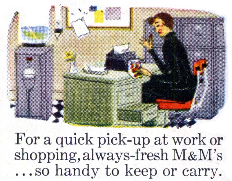
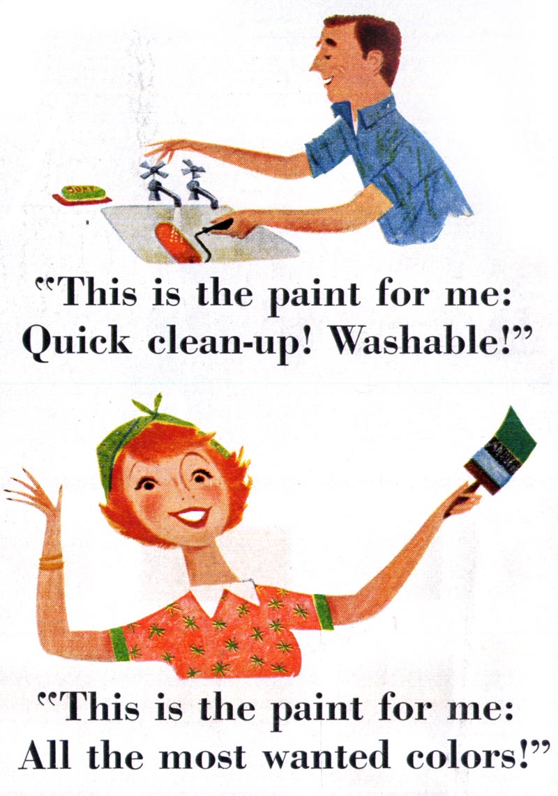
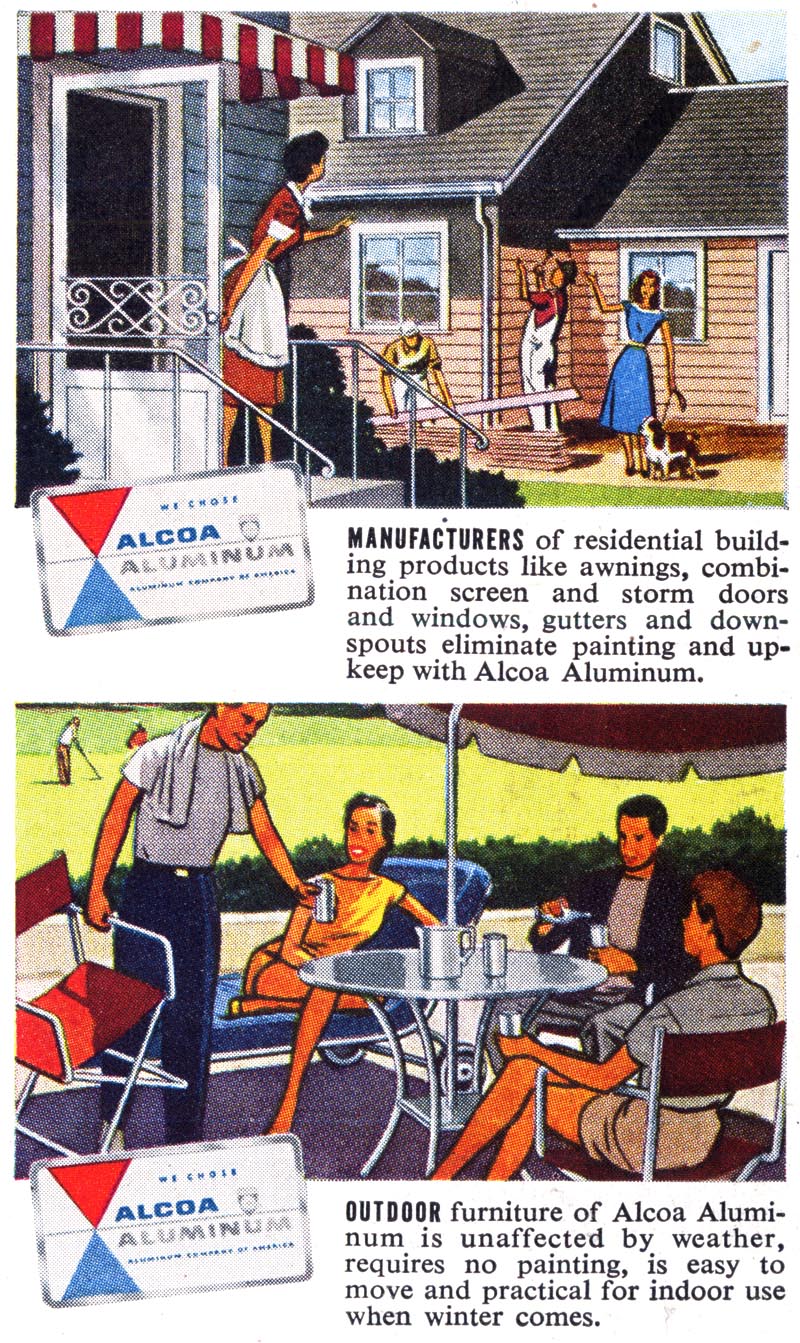
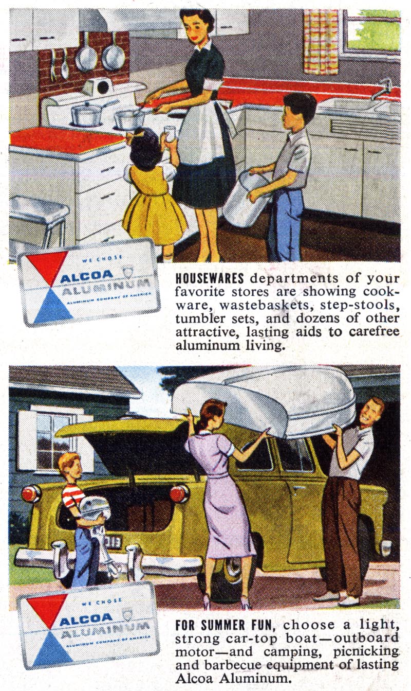
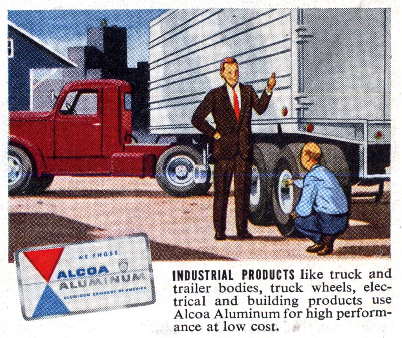
Here's another ad - several small full colour spots done in a somewhat different technique...

Unknown1151

... but still remarkably detailed for such a small canvas.

Unknown1151.detail01
Unknown1151.detail02
Unknown1151.detail03

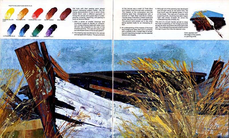
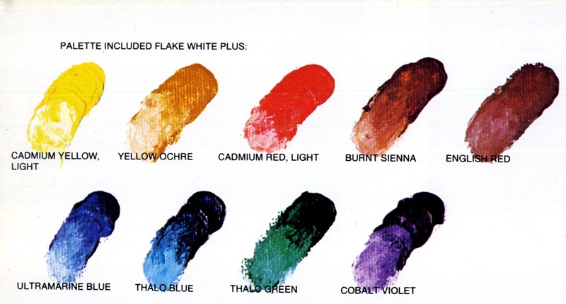
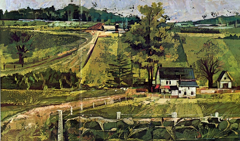
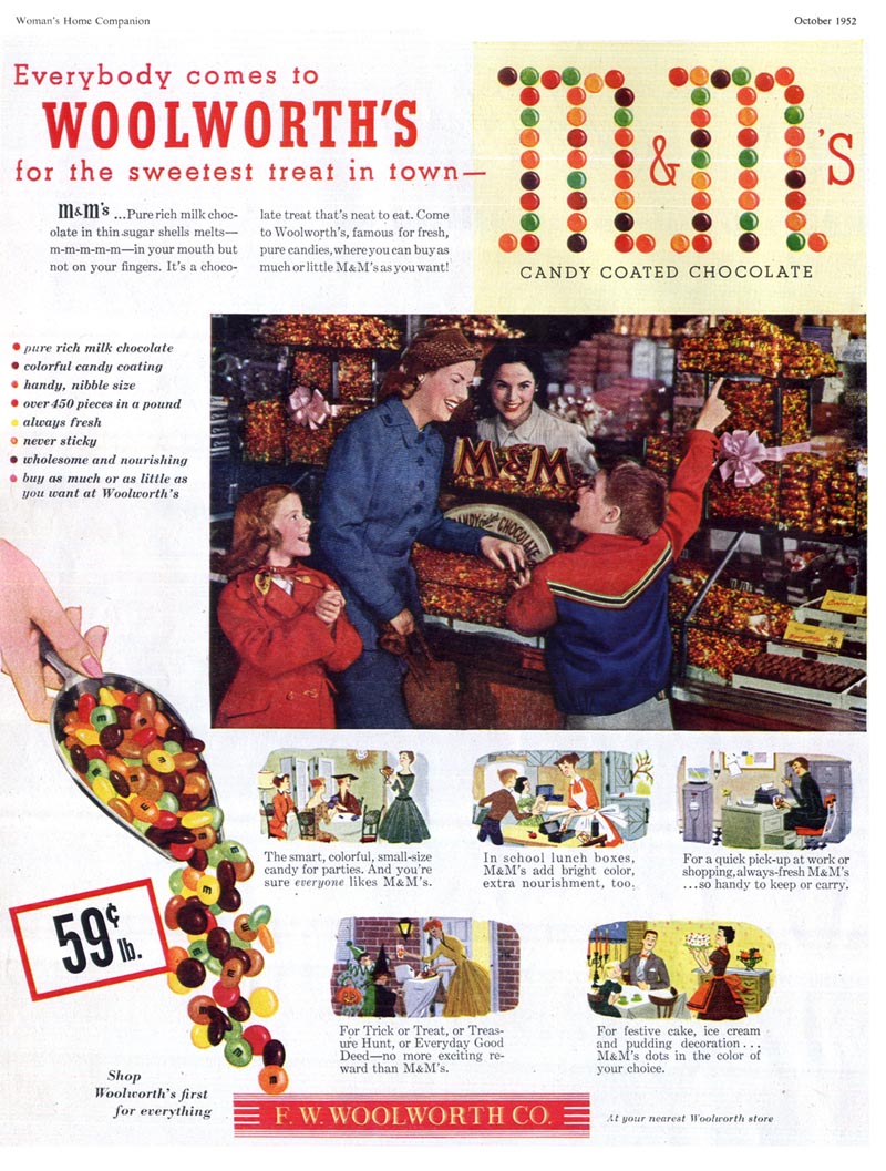
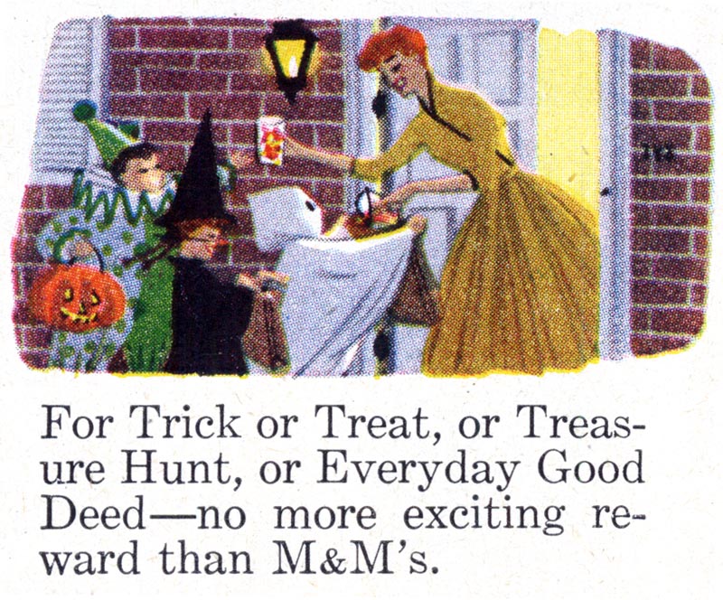
Who were the artists who created such proficient work? They were probably among the ranks of talented but largely anonymous illustrators like Charlie Allen, who did many fully painted ads of this type for Kaiser Aluminum.

Allen194

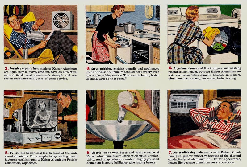
Charlie described these assignments (which he painted in gouache at just two or three times up) as being "considered by agencies and by illustrators as a real 'plum' account on which to work."

Allen196.detail01

"[The client] seemed to me remarkably relaxed about product details," wrote Charlie. "The scenes and product details were very much left to the artist to create."

Allen194.detail01

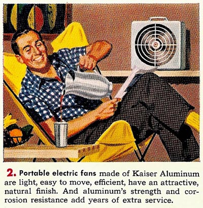
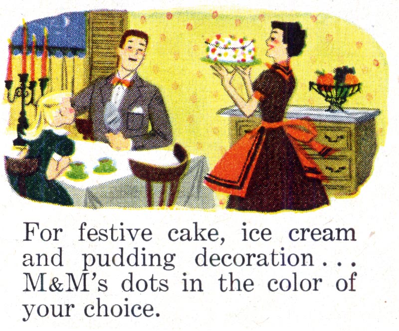
For Charlie, not only were these fun and lucrative assignments, they provided a young west coast artist more used to working on regional assignments the rare opportunity of sharing the stage with his 'celebrity' peers because Kaiser's ads ran in wide circulation national magazines like the Saturday Evening Post, Newsweek, Time, etc.

Allen194.detail02

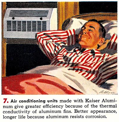
I'll just bet Charlie got a kick from seeing his signature on those ads in those publications. Although, of course, being ever the humble practitioner of his art, you'd hardly know the work was signed if you didn't have our ability to blow up those tiny panels to a decent size. (See it in the bottom RH corner of the image above?)

Wednesday, July 18, 2012

In Praise of the Little Things, Part 3

Yesterday we saw some tiny black & white battle scenes, originally published at just one by two inches. Today let's look at some more miniature illustrations - this time in colour and in what I'll describe broadly as a variety of "1950s storybook styles."

Unknown1146

First, here are five vignettes from a 1952 ad for M&Ms, also published at about one by two inches.

Unknown1146.detail01

Unknown1146.detail02

Unknown1146.detail03

Unknown1146.detail04

Unknown1146.detail05

Here's a 1957 ad for Dutch Boy Paints with some terrific little stylized spots...

Unknown1147

Unknown1147.detail01

Unknown1147.detail02

A 1950s ad for Telechron Timers...

Unknown1149

Unknown1149.detail01

Unknown1149.detail02

Unknown1149.detail03

Unknown1149.detail04

One of a series of ads by an artist named Calle (I have another one here). Does anyone know any more about him/her?

Calle02

Calle02.detail01

Finally, a sweet little cartoony spot signed "W. Fitch" from this 1957 Dial soap ad...

Unknown1148

Unknown1148.detail01

*If mid-century artwork of this type is your cup of tea, I have two sets on Flickr you'll want to explore:

Ads with Story Book Styles and Ads with Cartoon Elements

Enjoy!