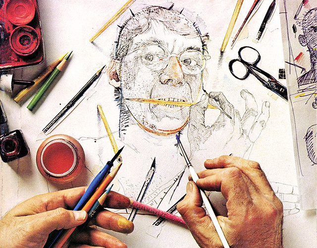
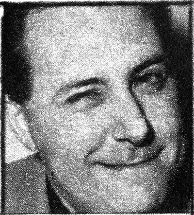
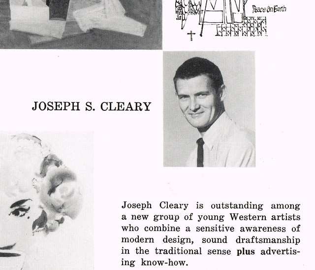
Here's a photo of young Joe Cleary, from the December 1953 issue of
Art Director & Studio News. Cleary was 27 at the time and being showcased in AD&SN as the "Upcoming Artist" of that issue. But Cleary had been demonstrating great artistic prowess for many years before that.
When he was just six years old, everyone in Joe Cleary's grammar school class had to design a Christmas tree. Cleary's design was chosen as the best and the class built a full-size version under his supervision. Recalling that incident years later, Cleary would joke that it was his first experience as an art director.
At the conclusion of high school Cleary earned a scholarship to attend the California College of Arts and Crafts in Oakland. Unfortunately his father was the sort of manly man who didn't think art was an appropriately masculine pursuit, so Clearly had to take his classes on the sly.
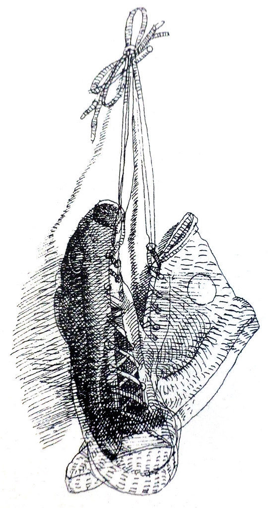
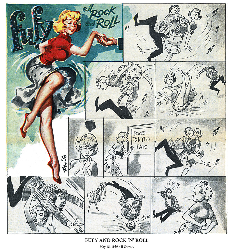
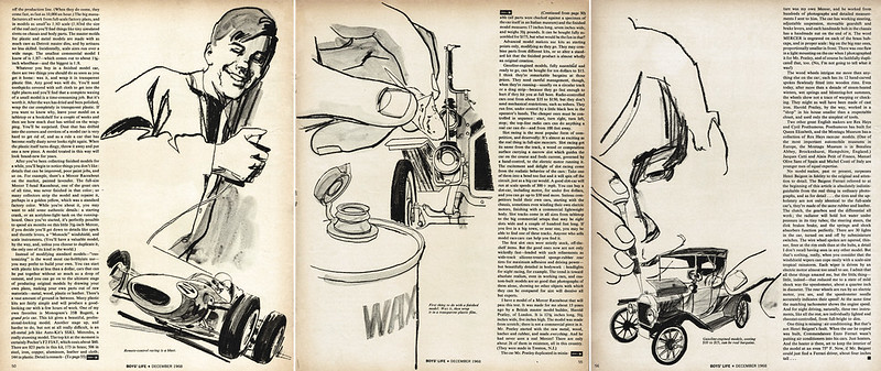
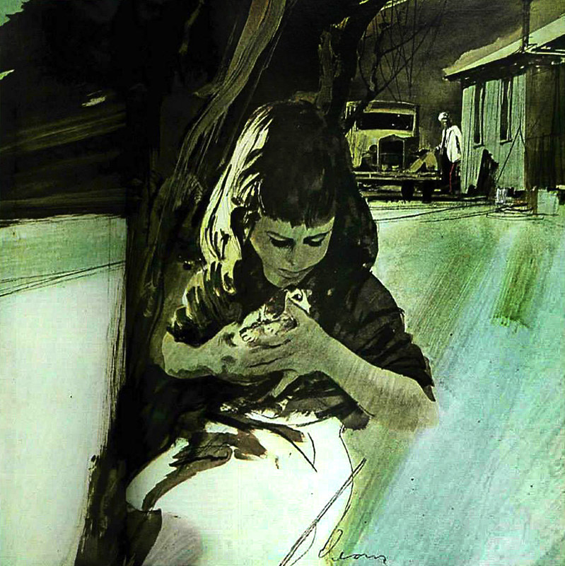
 (Detail from a spread in Boys' Life magazine, April 1967)
Ultimately his studies were interrupted by a three-year stint in the Merchant Marines during WWII.
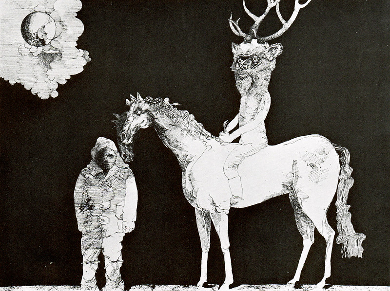
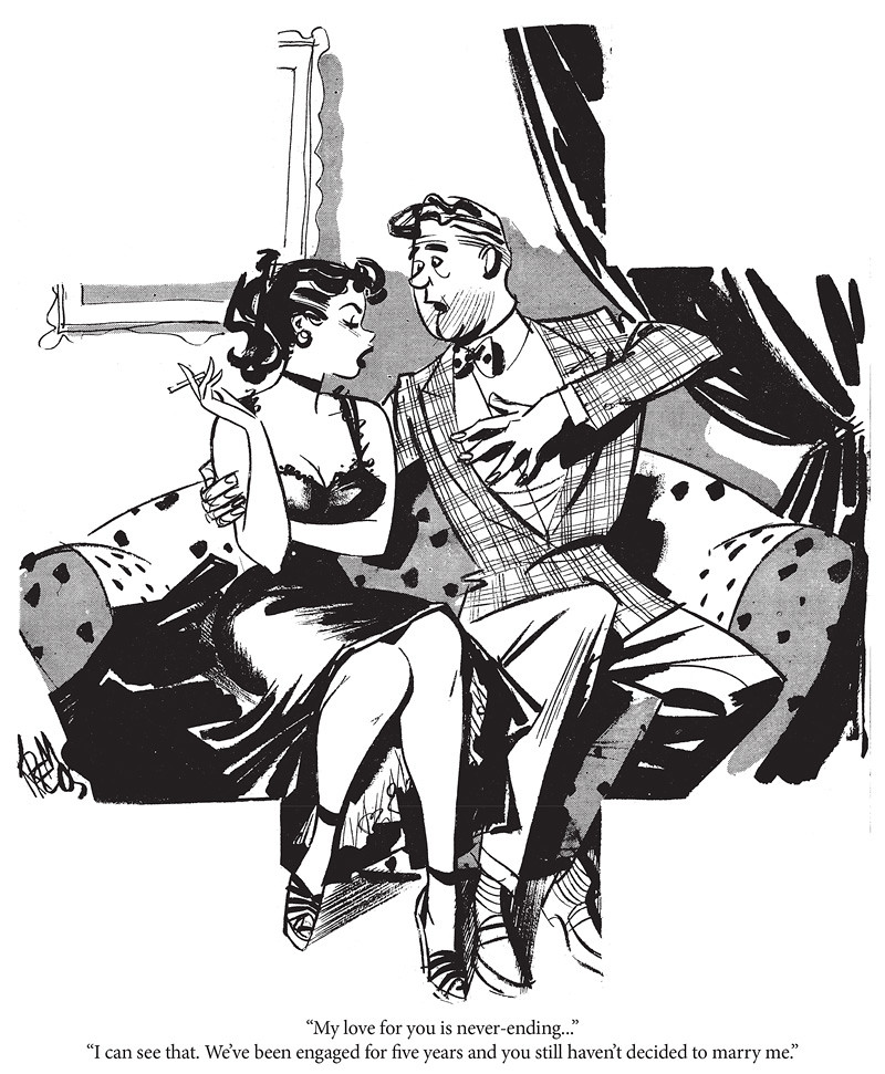
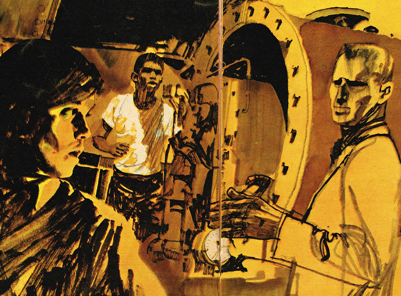
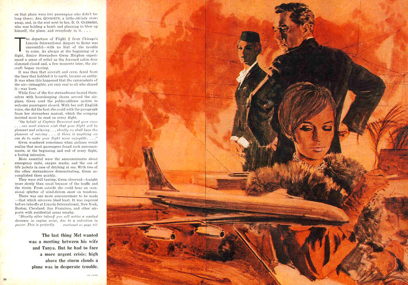
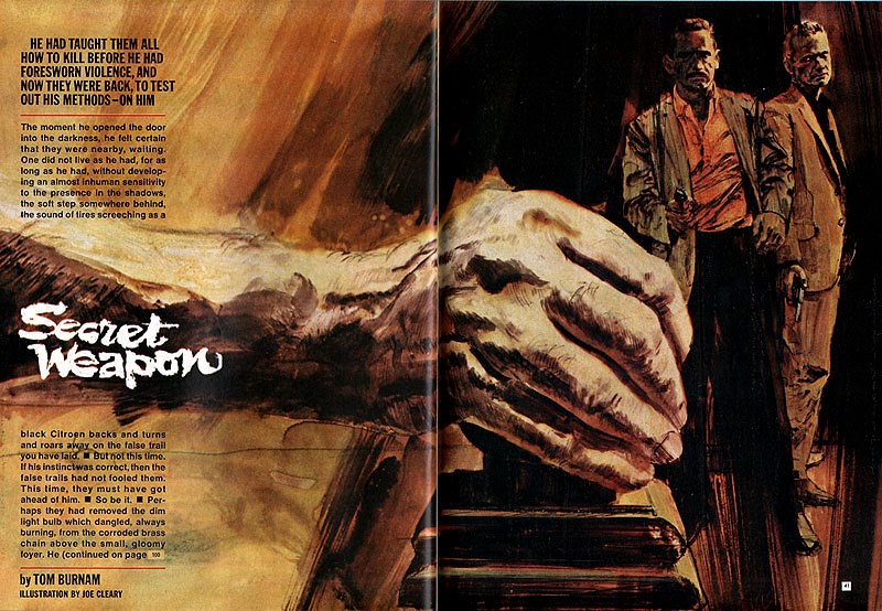
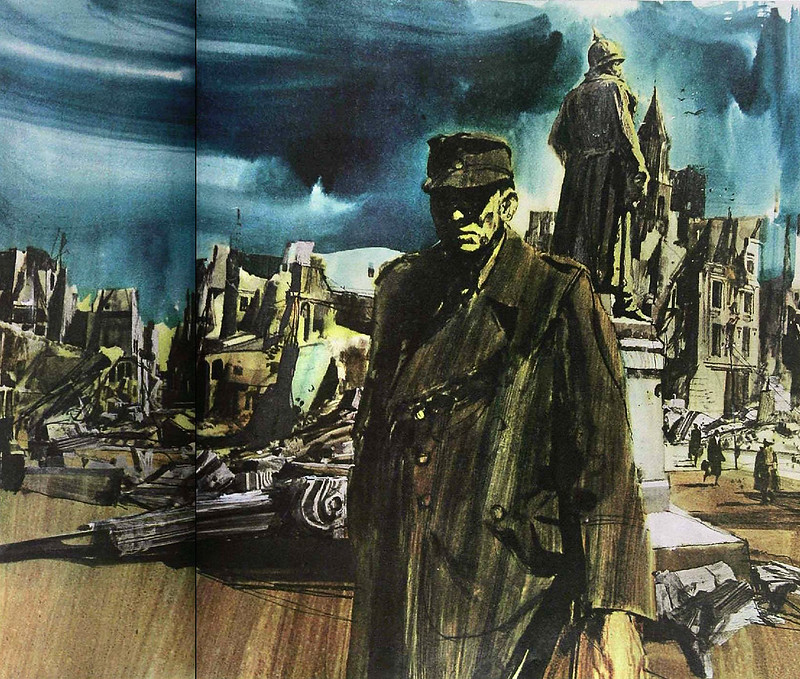 (Saturday Evening Post, 1965)
Thanks to a chance discovery of some canvas scraps while serving onboard a Maritimes vessel, Cleary decided to take advantage of his artistic abilities to make a little pocket money. Using a box of Crayola crayons and these canvas scraps, Cleary would sketch nudie girls in whatever poses were requested by the other sailors. Who knew there were so many patrons of the arts in the Merchant Marines?
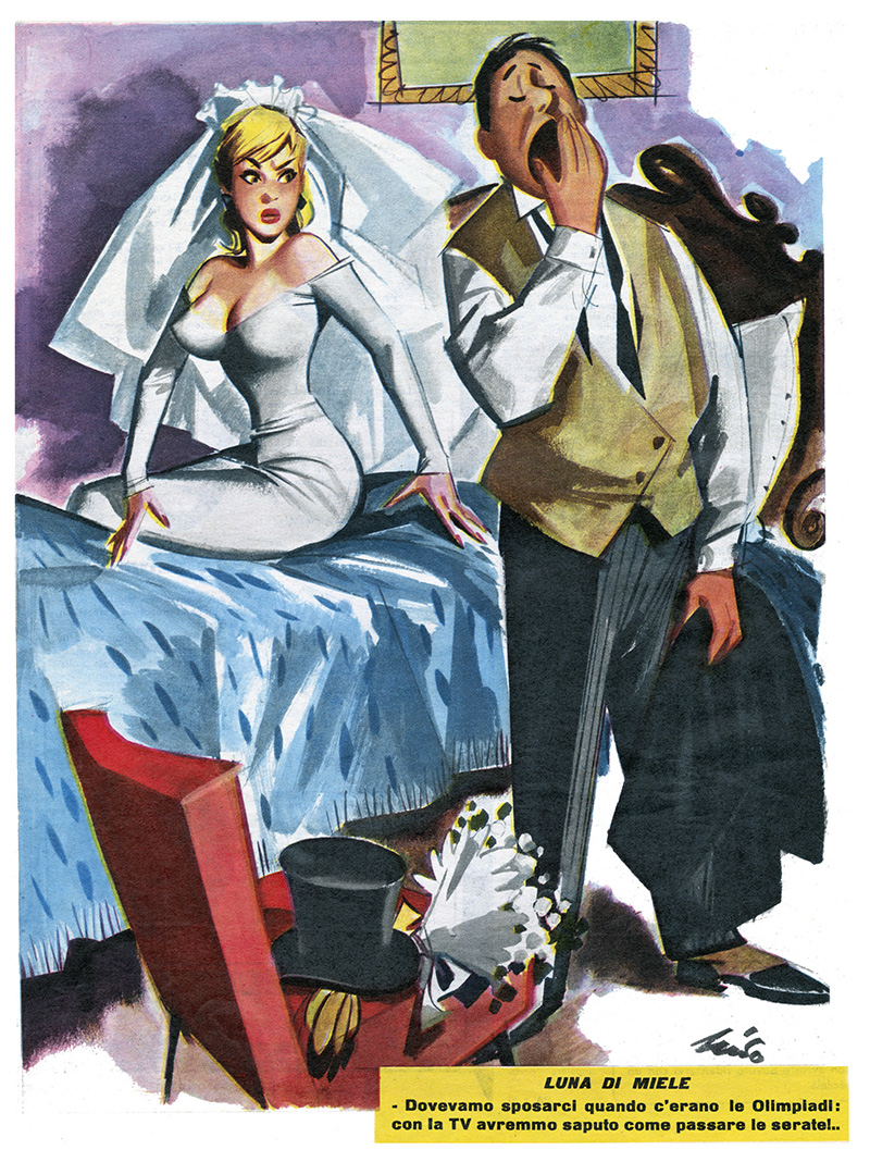
 (Harold's Club Reno pinup calendar page,December 1965)
This foray into commissioned work earned Cleary a tidy sum, and upon being discharged he returned to CCAC with renewed fervour. One this second go he won first prizes in both a student painting competition and at the California State Fair. He was also awarded another scholarship for further study, but before he could finish school he was picked up by the Logan & Cox agency in San Francisco. By the time he was featured in
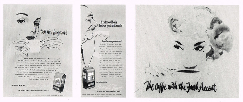
AD&SN as an "Upcoming Artist," Cleary had completed professional work for an impressive list of clients: Standard Oil, Knob Hill Coffee, Rainier Beer and many others.
Cleary's career chugged along nicely for the rest of the '50s. He had established himself as a top-rate West Coast commercial artist - but then came a call even this now-seasoned professional wasn't expecting. The
Saturday Evening Post had taken notice of his work and was offering a story assignment. Thinking the call was surely a prank being played by one of his colleagues, Cleary turned down the job.
"Well, maybe we'll try you again later," said the caller. Only after hanging up the phone did Cleary realize the call had been real. Happily, the
Post did call back, and soon others were calling as well. Like a handful of West Coast artists before him - Fred Ludekens, Stan Galli, Bruce Bomberger and a few others - Cleary had made the leap to the national stage.
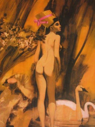
 (Ladies Home Journal, 1964)
 (Saturday Evening Post, 1965)
 (Good Housekeeping, 1968)
During these years Cleary continued to keep busy with advertising work as well. He was now associated with the
Patterson & Hall studio in San Francisco. Fellow P&H artist
Charlie Allen recalled,
"I 'directed' this shot for a booze ad in the P&H photo studio of my friend, Joe Cleary, (one heck of an artist and sculptor). Joe posed for the guy with guitar."
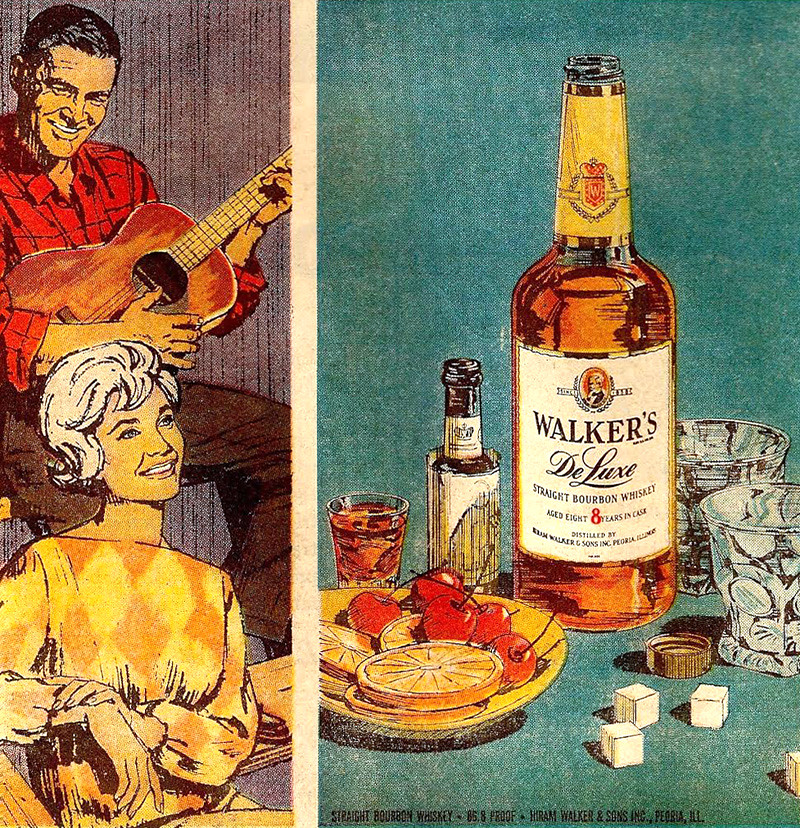 (Charlie Allen artwork featuring Joe Cleary as the model w/ the guitar)
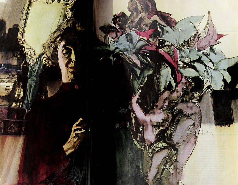
Cleary's work always presented an intriguing mix of realism and expressionism, evidence of the artist's life-long passion for creative exploration and artistic expression. The mood and the materials of the 1960s encouraged experimentation, and Cleary, like many others, did not shirk from the opportunity to place one foot in the camp of fine art while keeping the other in the commercial.
 (Painting by Joe Cleary, year unknown)
Years later, when Cleary had returned to his alma mater, the California College of Arts and Crafts - now as an instructor - he would share his fascinating experimental techniques with his students. Famed comic book painter/illustrator
Dan Brereton studied with Cleary and recalls,
"He had this wonderful technique... he would do a painting in Doc Martin watercolor dyes, then cover it with a layer of white glue. It created this wonderful soft and vibrant texture. [Joe] was very thoughtful and positive, low key. His work was so damn gorgeous. He was a big influence on me then."
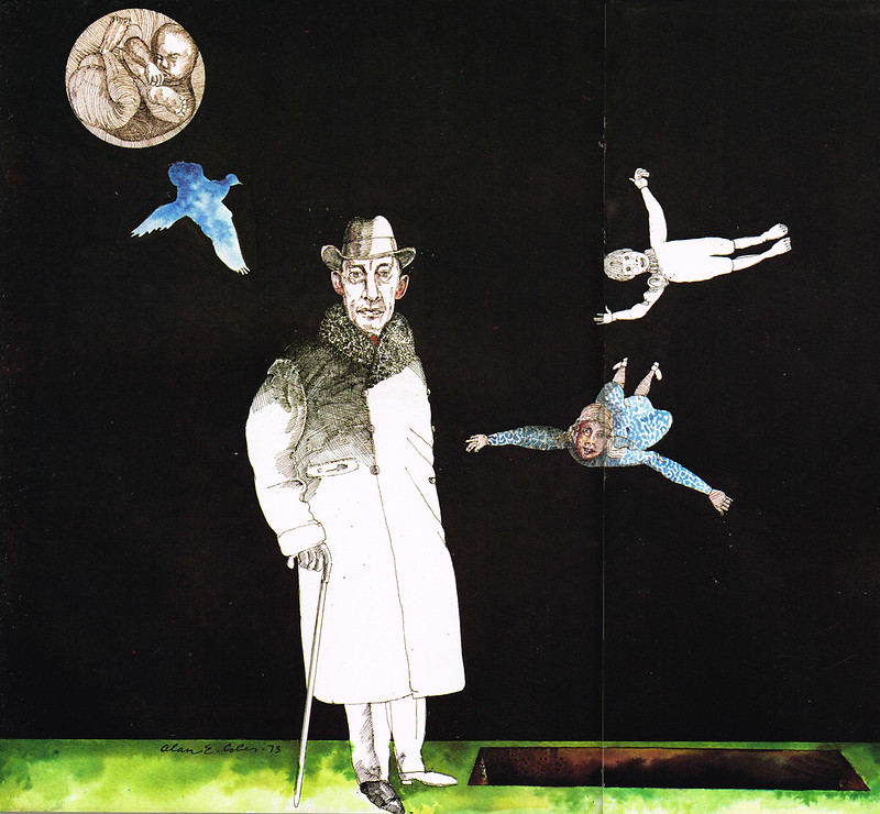
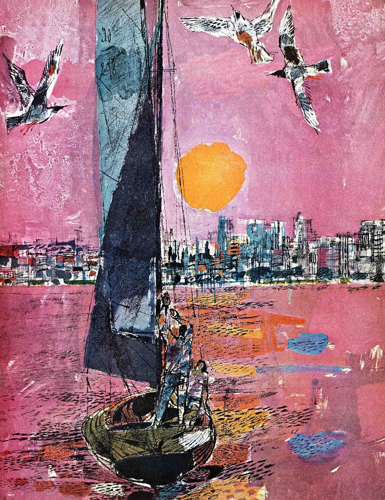
 (Argosy magazine, 1965)
Renowned illustrator
Greg Manchess was also one of Cleary's students and wrote about him on his blog
muddycolors.com:
"Joe laid down a loose wash of colorful and rich dyes, then poured on a layer of Elmer’s glue. The glue made a strange and soft blur of the first washes, running them together. He would wait for it to dry into a glassy layer, then painted the shapes and lines in acrylic strokes on top of it. More dye washes, Elmer’s, and acrylics repeated until sometimes the illustration board was a quarter inch thick of glue and paint. It was luminous and seemed otherworldly on it’s own."
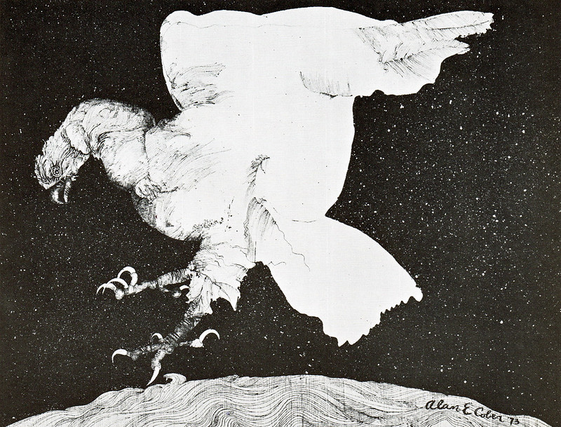
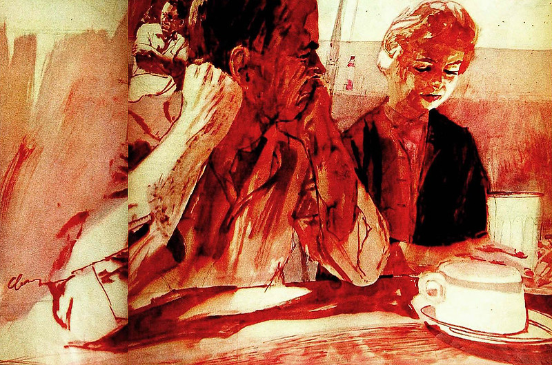 (Saturday Evening Post, 1963)
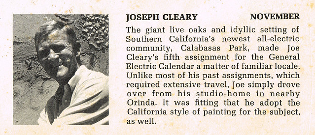
Over time, like so many other mid-century illustrators chasing fewer and fewer assignments, Cleary began to pursue other creative avenues. I suspect that he felt encouraged to do so by assignments like this one for the 1969 General Electric calendar.
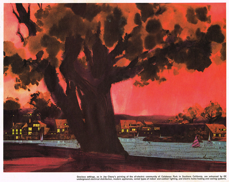
Cleary's credit box on the back cover of the calendar even hints at the path that lay ahead for the artist...
 Chuck Pyle
, director of
the Illustration Program at the Academy of Art University, told me,
"[Joe Cleary is a] fellow Bohemian Club member and I have always admired his inventive use of design, outstanding draftsmanship, and cool elegance."
Chuck Pyle continues,
"Joe has turned his love of the female form from brilliant illustration work in such diverse mediums as glue and acrylics (glue before the acrylics) to bronze sculpture, where he creates beautiful evocations of the women around him."
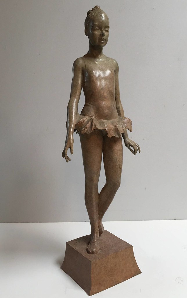 (Sculpture by Joe Cleary, "Young Dancer," year unknown)
One of the most impressive pieces I was able to locate is the
"Mother River Memorial," which Cleary created in 2001. It stands on the Mississippi river front in downtown New Orleans, Louisiana and miraculously survived the ravages of Hurricane Katrina.
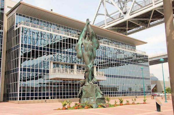 (Mother River Memorial, New Orleans, 2001 by Joe Cleary)
We'll leave the last word on Joe Cleary to Chuck Pyle:
"Behind his sculpture work, which like Bruce Wolfe, is Joe's great strength, is his almost impish sense of humor. Joe always has a twinkle in his eye,in tandem with his gentlemanly manner, and his sculpted walking stick of his own design. Joe is worthy of more acclaim - I'm a fan!"
* It can be challenging finding many examples of Joe Cleary's illustration work online, but thanks to the generosity of several Today's Inspiration Facebook Group members; David Clemons, Lawrence Levine & Dave Groff I was able to present a substantial selection today.