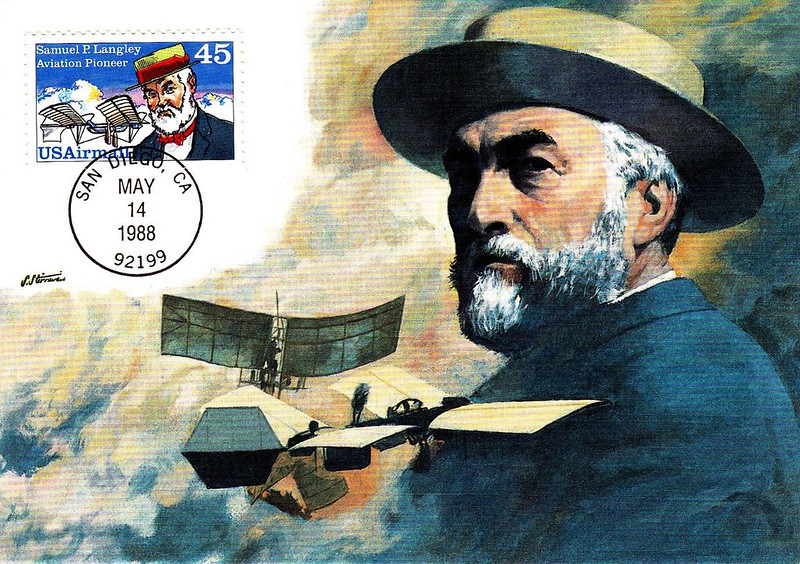
Continuing my conversation with Shannon Stirnweis, we begin discussing his professional career... ~ Leif Peng
Leif Peng: So after the army and after art college, did you try looking for work in a commercial art studio on the West Coast?
Shannon Stirnweis: No. There was virtually nothing out west. The two hotspots at the time were Detroit and New York. So I picked New York because I didn't want to have to do cars all the time. It was the middle of the Eisenhower recession and I'd take my portfolio around to some of these greats like
Bob McCall... but they weren't working full time either, so there was very little chance they'd take me on as an apprentice or do anything with me. So after two or three months of walking the streets I got a job as an apprentice at Norcross, the greeting card company.
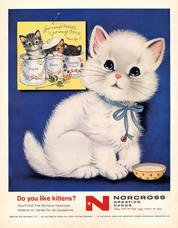 (Norcross Greeting Cards ad, artist unknown, 1958)
LP:
(Norcross Greeting Cards ad, artist unknown, 1958)
LP: No kidding! That's very interesting. If I'm not mistaken that's where
Murray Tinkelman started out as well!
SS: Huh. Well, my position at Norcross was not a professional job. I spent about two months in their apprentice program and then I went to Compton Advertising on Madison Avenue as a sketch man in their studio. I had a good friend from Art Center named Bill Kiazawa who was at that point an art director at Compton's and he recommended me for the job.
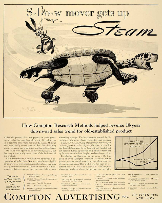 (Compton Advertising trade ad, artist unknown, 1940)
LP:
(Compton Advertising trade ad, artist unknown, 1940)
LP: Now were you married at the time or... ?
SS: No, but that position gave me the confidence to even think about it. It was double my previous salary and sort of the direction I had wanted to go into.
LP: So what kind of work did a sketch man do at Compton's?
SS: Largely storyboards and comps. The art director gives you a scribble and you sketch the picture up so it's good enough for an illustrator or photographer to do the final version for the ad.
LP: Did they already use markers for that type of work when you started as a sketch man?
SS: Chalks!
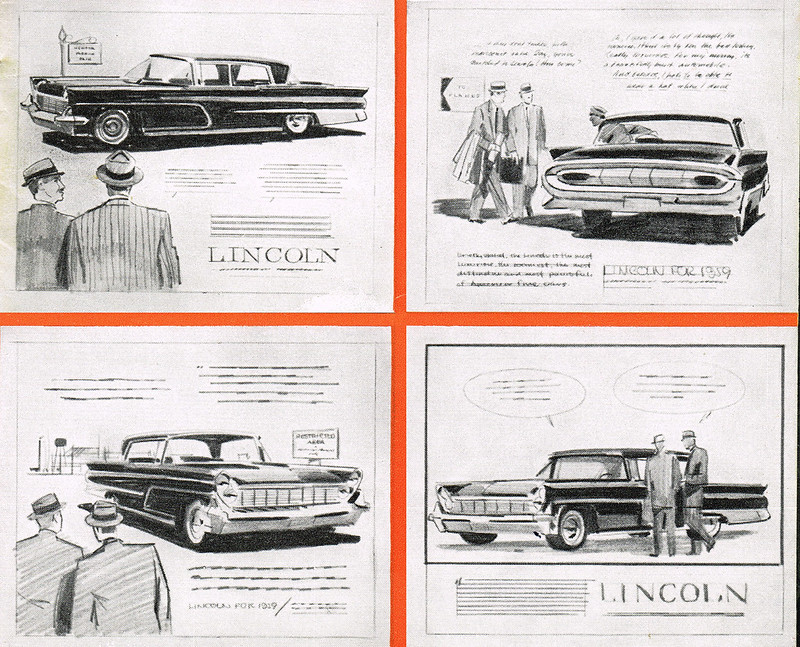 (Though not by Stirnweis, these examples from a 1959 ad campaign are typical of the kind of work done by an agency "sketch man.")
LP:
(Though not by Stirnweis, these examples from a 1959 ad campaign are typical of the kind of work done by an agency "sketch man.")
LP: Right! I thought that might be the case. Was that a new experience for you, working with chalks?
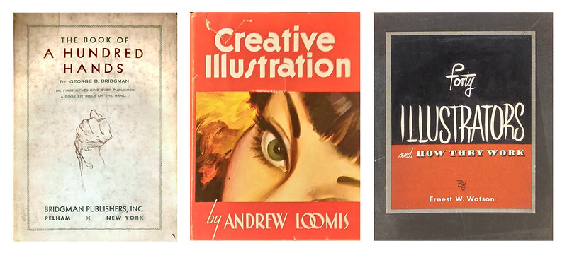
SS: Actually at Art Center I started out as an advertising designer for the first year. I didn't know the difference, I just wanted to be a commercial artist. The jobs were already beginning to disappear for illustrators so they pushed me that way and I liked it... but after the first year it was kind of a tumultuous decision... was this really what I wanted to do or did I want to do illustrations. So I made a list for both sides and advertising design came out way ahead... and I decided to be an illustrator anyway.
(we both chuckle) Because there were a bunch of guys who had gone to Art Center who went on to do illustration and I figured, if they can do it, why not me.
LP: So of that group, did most of them go to the East as well?
SS: Most of them did but I don't think any of them made it. Even though Art Center has a big reputation for getting jobs for everybody, it was not so in their cases. A lot of them went into associated fields like technical illustration and so on.
LP: Ok, let's get back to you working at Compton's as a sketch artist. Your bio says you began to freelance for adventure pulps. I'm very curious to hear how you made that transition from working on staff at the agency to getting your first freelance gigs for adventure pulps.
SS: Well, that was kinda 'extracurricular.' I did the paintings on weekends because I was still fully employed at the agency. So it wouldn't be fair to use their time to do that kind of work. How that started was I had lunch with Chuck McVicar, another Art Center guy, and a friend of his named
Gerry McConnell. I was saying I wish there was some way I could get into doing illustration work and McConnell said well, if you want to do black and white or two-colour men's magazine art, just go see Larry Graber at Magazine Management. And he said,
"Don't try to do better than what they're doing - just do exactly what they're doing." (We both laugh)
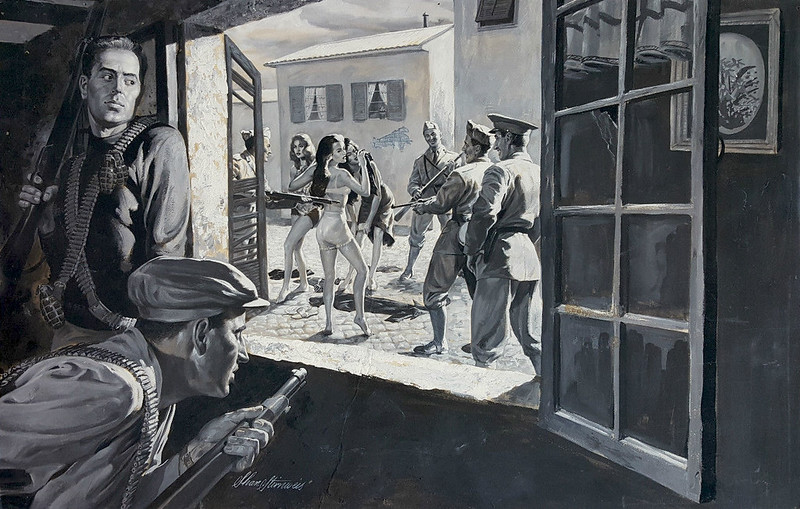
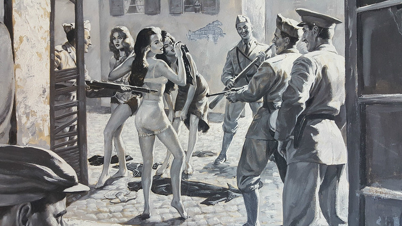
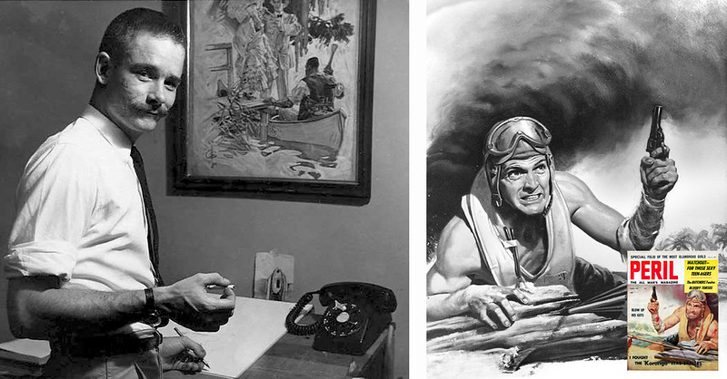 (Above left: photo of Gerry McConnell, year unknown, R: original art by McConnell and printed cover, Peril magazine,March 1958)
SS:
(Above left: photo of Gerry McConnell, year unknown, R: original art by McConnell and printed cover, Peril magazine,March 1958)
SS: So I did a couple of samples and went up there and walked out with a bunch of spots, did them, brought them back and got a painting to do.
LP: So when you got those initial spots, do you remember what they paid for those.
SS: I don't remember... seems there were four or five of them and I got around... $500 or $750 for the bunch of them.
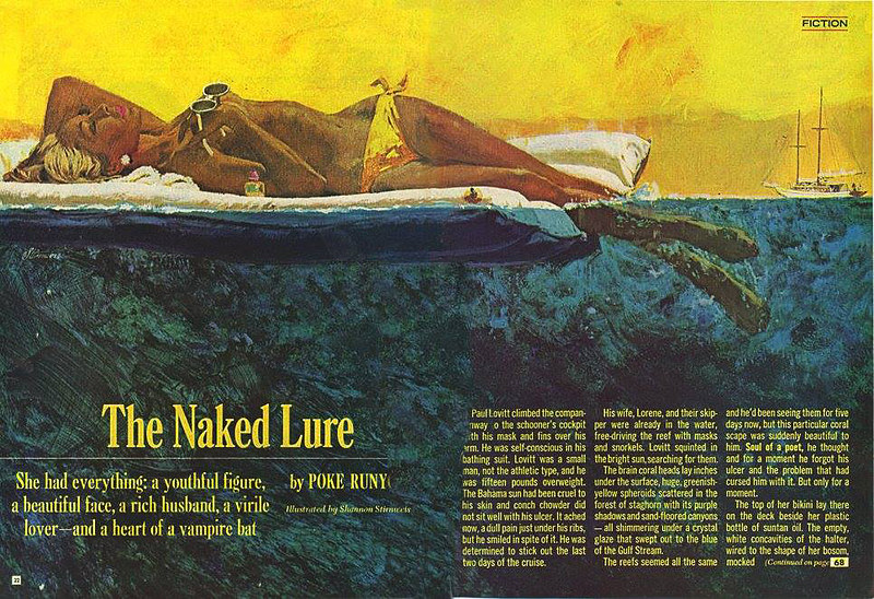
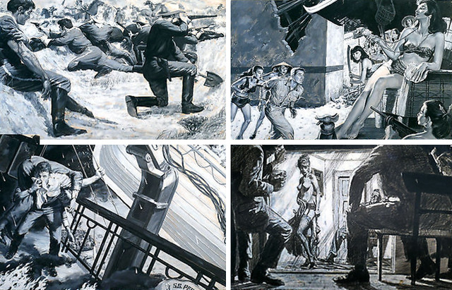 (Four of Shannon's men's adventure illustrations, year and publication(s) unknown)
LP:
(Four of Shannon's men's adventure illustrations, year and publication(s) unknown)
LP: Now did that seem like a pretty good paycheque to you at the time?
SS: Oh yeah! Because my paycheque at Compton's was a hundred dollars a week, which was decent pay at the time... and double what I was getting at Norcross.
LP: So going from Norcross to Compton's to making five hundred bucks for a handful of black and white spots.. that must have been pretty nice!
SS: Oh yeah.
LP: How did your first painting for them come about, do you remember?
 (A men's adventure interior illustration by Shannon Stirnweis, date and publication unknown)
SS:
(A men's adventure interior illustration by Shannon Stirnweis, date and publication unknown)
SS: Oh, since I proved myself by doing those spots they immediately moved me up to spreads. It was all spelled out for you: they'd give you a paper with the scene they wanted done and anything that was pertinent. That was it! I went home and did some sketches and they okayed one.
LP: Once they okayed a sketch, was it up to you to go and find models?
SS: Oh sure.
LP: And what was that like for you initially... was that a big expense or did you use friends as models?
 SS:
SS: Yeah, pretty much friends, although models were not expensive at the time... fifteen or twenty-five dollars for a session.
LP: So it was well within the budget on an illustration job.
SS: Yeah, because if I recall for their middle grade book they paid... oh, $175 for a spread. So, like I said, getting a hundred dollars a week at Compton's... well, within about two years I could quit the agency and my main source of revenue was the pulp magazines - and I'd doubled my income.
LP: When they required you to do a period piece, were they very fussy about costuming and weaponry and that sort of stuff? Did you have to do a lot of historical research?
SS: Not an awful lot because it was usually the Nazis or headhunters or something you could be pretty liberal in interpreting. Minimal research. Not a whole lot.
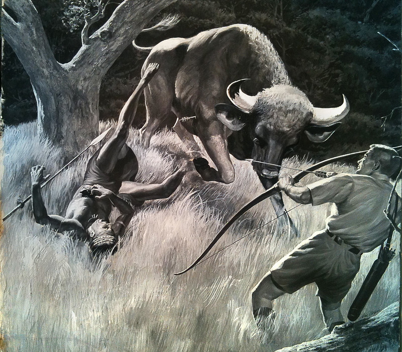 (A men's adventure interior illustration by Shannon Stirnweis, possibly for Sportsman magazine, date unknown, found at comicartfans.com)
LP:
(A men's adventure interior illustration by Shannon Stirnweis, possibly for Sportsman magazine, date unknown, found at comicartfans.com)
LP: So you didn't have to go out and rent a lot of costumes or whatever.
SS: No, you could usually figure out something that looked pretty close. I used my wife for a model now and then... posed for a few of them myself. Whatever it took to get the job done.
LP: Ok, let me ask you about a specific cover I found on the internet... for
"Real" magazine. It's from October 1962 and there's a blonde-haired gal and she's wearing a pith helmet and she's wearing shorts and a sort of halter top and -
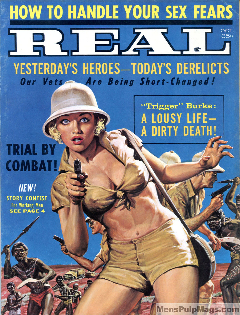 (Cover by Shannon Stirnweis for Real magazine, October 1962 - image courtesy of MensPulpMags.com)
SS:
(Cover by Shannon Stirnweis for Real magazine, October 1962 - image courtesy of MensPulpMags.com)
SS: And she's pointing a gun right at you. Yeah... uh,
"Real" was not part of Magazine Management. That would have been somebody else that contacted me. I did a fair number of covers for them and some of them were just... you know,
millions of people, like the battle of Iwo Jima
(Shannon chuckles) just hundreds of these little bitty figures! But, you know, they all paid money.
LP: What did they pay for a cover? Do you remember?
SS: Uhh... it seems like it was $450 or $500...
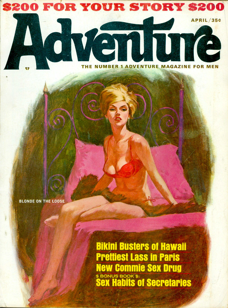 (Cover by Shannon Stirnweis for Adventure magazine, April 1966)
LP:
(Cover by Shannon Stirnweis for Adventure magazine, April 1966)
LP: The reason I ask is because you arrived on the magazine illustration scene around the time when a lot of that seemed to be ending. You know,
Collier's was already gone, the
Saturday Evening Post was cutting back on the amount of illustration it was using,
Cosmopolitan had a miniscule art budget compared to the previous years. So for you to get a fair amount of work from the men's adventure magazines is great, but did you also try showing your portfolio to some of those 'mainstream' magazines like the
Post and
Good Housekeeping and so on?
SS: I did sort of arrive as those magazines were on their last gasp. Yeah, those two years in the army really cost me some precious time in that regard. It really made the timing bad for me. On the other hand, I got a lot of memories and met a lot of people I never would have met so... I dunno who came out ahead.
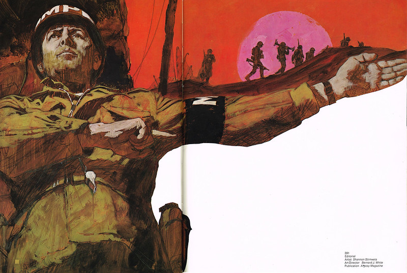
 (Interior spread by Shannon Stirnweis for Argosy magazine, December 1966 - image courtesy of Dave Groff)
LP:
(Interior spread by Shannon Stirnweis for Argosy magazine, December 1966 - image courtesy of Dave Groff)
LP: Yeah, well, I mean for me as someone who looks back at those timelines and has heard or read about a lot of different people's careers, you're arriving on the scene at a very interesting time because, you have, for instance, the guys who were at the Cooper studio during the '50s - Coby Whitmore, Joe DeMers, Joe Bowler and so on - they were all starting to think about moving away because the Cooper studio was a shadow of its former self by then.
SS: Yup.
LP: And meanwhile, here you are, young and eager and ready to get going...
SS: Right!
(chuckling) R.G. Harris, I think it was... you ever hear of him?
LP: Absolutely.
SS: Yeah, well, I don't know if this is absolutely true but... Joe DeMers had just moved into town. This must have been a while before (I think the story was related by DeMers) but he went to see Harris to buy his house... and Harris had a five-car garage! All with these relatively spectacular cars in it!
LP: Wow...
SS: (chuckling) Yeah. And DeMers was fresh from the west coast and he thought, wow, you can really make a living here!
 (Interior illustration by R.G. Harris for McCall's magazine, 1952)
LP:
(Interior illustration by R.G. Harris for McCall's magazine, 1952)
LP: Yeah, well from talking to some of the guys who were there in the '50s, they were getting say, fifteen hundred to two thousand for a spread in the
Post, for example. So you know, that was a very lucrative time for all those guys to be making a living in illustration.
SS: As far as lucrative goes, there's a history of that in illustration. For instance,
John LaGatta, in one of his talks to us at Art Center - that was the main value of Lagatta, some of the things he said - told us about one time he was having a barbeque in the back yard and he had to excuse himself because he had a job to finish - or rather to
start and finish - for the next day... and it was only a two thousand dollar job.
LP: Hah!
"Only!"
SS: And that was in the middle of the depression - like, '32 or so!
(he laughs)
LP: Absolutely incredible.
SS: Yeah. So... yes, there was a big difference when I came along.
Continued tomorrow...
Read Part 1 of the Shannon Stirnweis interview here