Showing posts sorted by date for query ermoyan. Sort by relevance Show all posts

Tuesday, January 22, 2013

Joe Bowler Interview, Part 4: Influences and Art Process

Last week, in Parts 1, 2 and 3 of this interview, Joe described the early years of his life, the beginning of his professional career, and his days at the Charles E. Cooper studio. Today Joe shares his thoughts on some of those who impacted his work in one way or another during the 1950s and into the '60s... ~ Leif Peng

LP: The guy who seems to have been a huge influence on everybody at the time was Al Parker.

JB: Oh yeah.

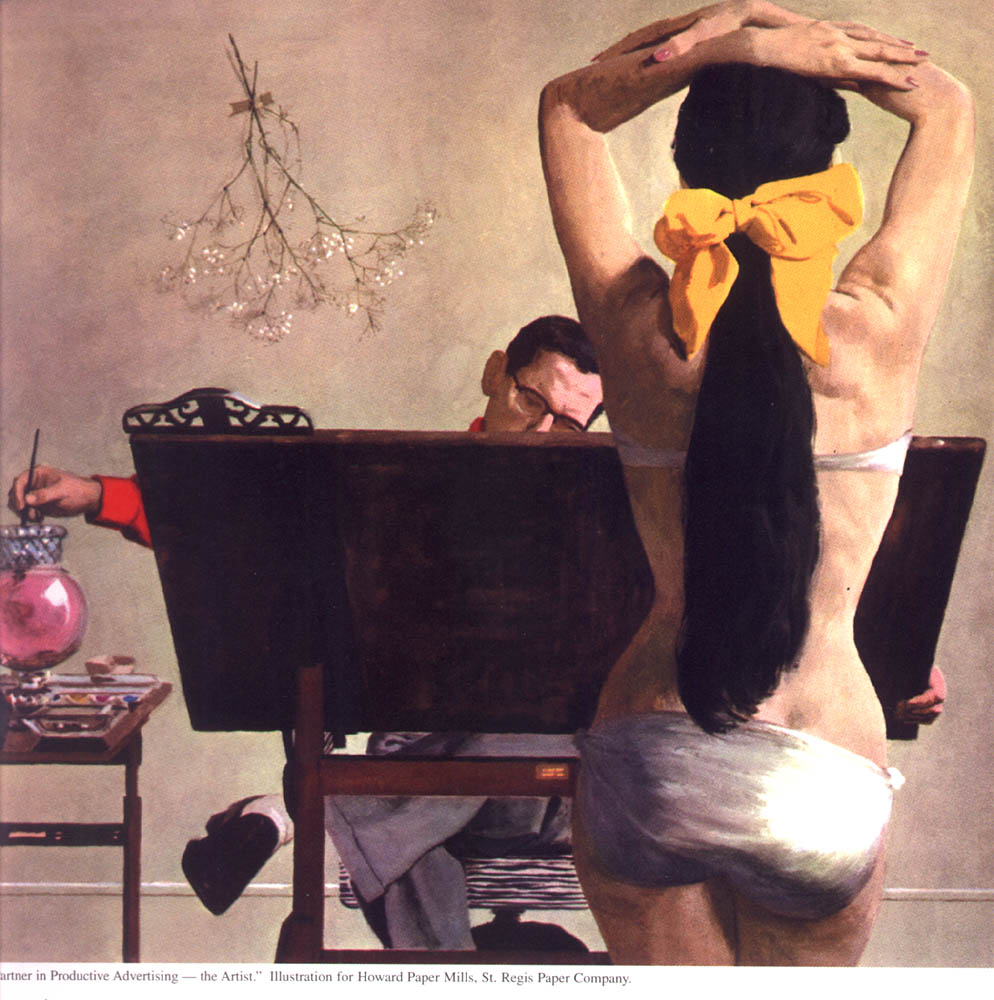
(Below, Al Parker promo illustration for Howard Paper Mills, year unknown)
parker33color

LP: Was he someone whose work you were looking at?

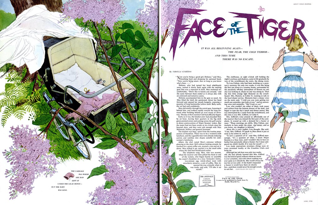
JB: Absolutely. Al Parker was the favourite of all the artists at Cooper's. In fact we went to the old book stores and bought the old magazines and kept an incredible file on Parker. He was the major changer of the way illustration looked, from the oil painting period to the whole 'designed double page spread' type of thing.

(Below, Al Parker DPS from Ladies Home Journal, June 1958)
Parker70.jpg

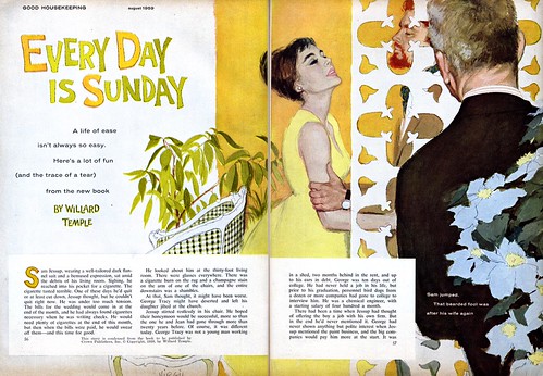
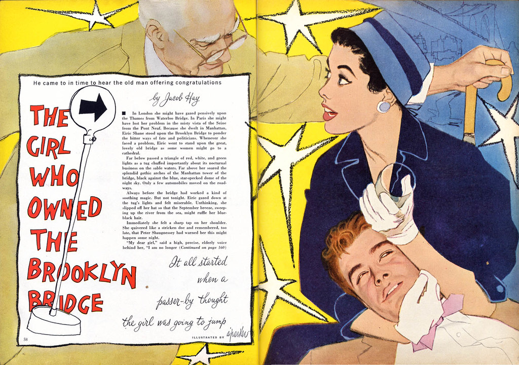
I remember one time I delivered a job to, I think it was John English - he was the art director at Good Housekeeping before Suran Ermoyan - and another package came in while he was looking at mine and he says, "Oh, that's from Parker." And my mouth was watering as he opened it. (we both chuckle)

(Below, Al Parker illustration from Good Housekeeping, 1950s)
Parker04

And he opened it and I said, "Oh man, look at that." and he shook his head. I said, "What's the matter?" and he said, "You know; I love it, you love it, all the artists love it... but I get very little reaction from the public to Parker's work."

And he never really had that 'mass-appeal'. Even though he did those beautiful mother-daughter covers for Ladies Home Journal for all those years...
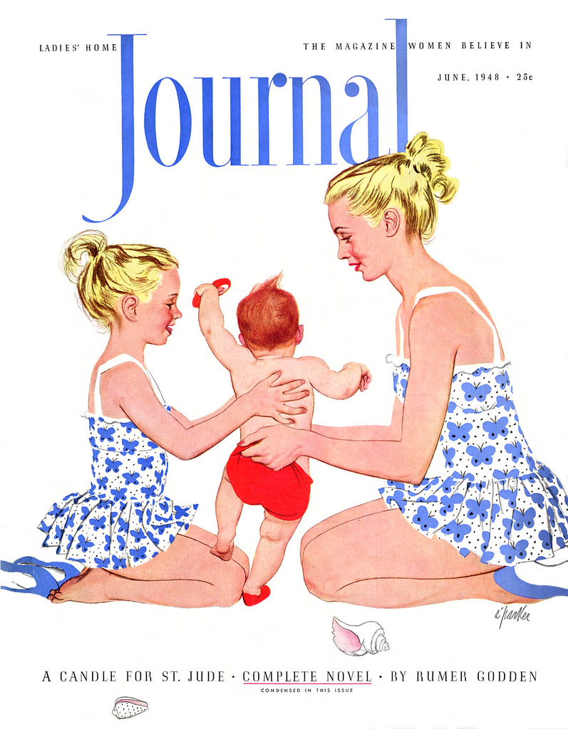
Parker12

... he never really had the sort of name where you could go out on the street and ask anybody. They'd tell you Coby and Jon Whitcomb and Norman Rockwell, but if you said, "What about Al Parker?" they'd say, "Who?"

(Below, Al Parker illustration, year and publication unknown)
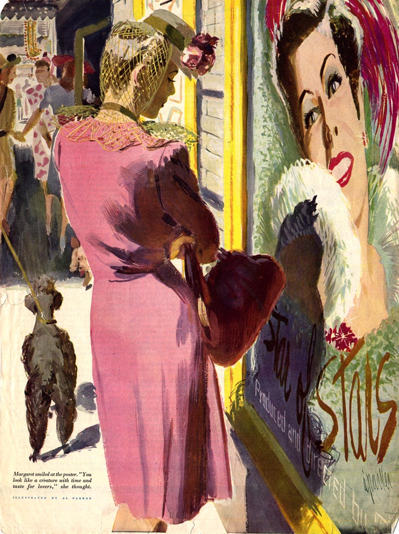
Parker132

LP: Do you think that was because Parker's women weren't so idealized as Jon Whitcomb's or Coby's?

JB: Yes. Very much so. He wasn't a glamour illustrator and that's what they [the public] were looking for.

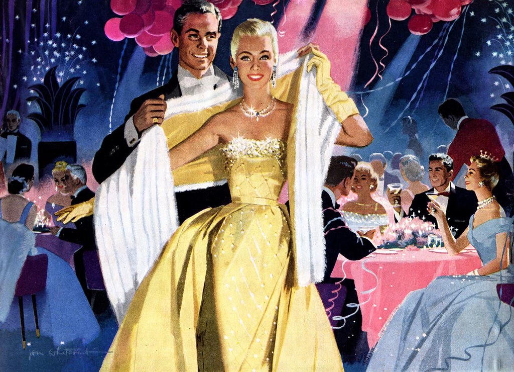
(Below, Jon Whitcomb illustration, Saturday Evening Post, 1956)
Whitcomb39.detail01.jpg

JB: Rockwell was all homespun and small town and Jon Whitcomb was the premier glamour illustrator, as was Coby and a bunch of them. Because of my relationship with Coby, I just gravitated towards that.

(Below, Joe Bowler DPS from Ladies Home Journal, March 1953)
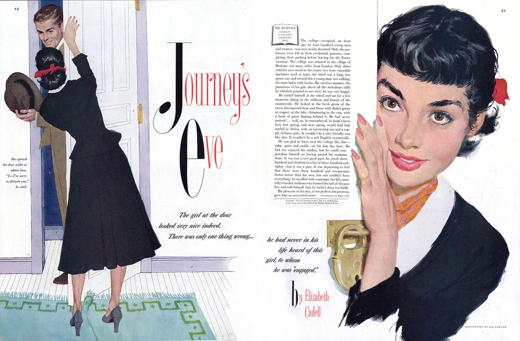
Bowler03

JB: Parker was one of the most creative minds in the business. Every time he did an illustration you just went, "Wow!"

LP: Did you ever have a chance to meet Al Parker?

JB: Oh yeah, sure. At the Society of Illustrators. I didn't know him well but every now and then he'd be up for lunch. In fact one time I was having a drink at the club after lunch and it got to be the cocktail hour and all these famous guys happened to be up there... Al Dorne and Parker and a bunch of others. And they all decided to go out to eat and I decided to trail along. And I remember we were all standing at a light at 61st and Lexington Avenue when Al Dorne stopped and said, "You know, we oughta start a correspondence school." And they all said, yeah, and started to talk about it. And I realized later that that was the first time they seriously talked about it. I always sort of thought, "Wow, I was standing there at the beginning of the Famous Artists School!"
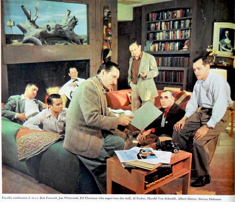
Dorne159.detail01

LP: Wow. And to think; at that moment you were standing there, nobody would have imagined that it would go on to generate millions upon millions of dollars.

JB: Yeah.

LP: Now, there's a passage in Neil Shapiro's article on the Cooper studio - and I've heard this directly from Murray Tinkelman as well - that late in the 1950s there was one of these 'bounced jobs' that came in for corrections. And that everybody gathered around this painting and that you looked at it and said, "I dunno who did this but the business is never gonna be the same."

JB: Oh I remember that... it was for Ford. We'd done the Ford cars in the studio, plus the figures - I would do the figures and Al Baxter was the car man. Then all of a sudden this thing showed up. And that was Bernie Fuchs.

(Below, auto ad by Bernie Fuchs, 1959/'60)
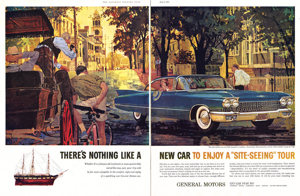
Fuchs01.JPG

LP: And what was it about that painting that made you - ?

JB: It was the way he portrayed the attitudes of the people. They were... 'real'. They were not posing. We always had expressions and hands flying and doing all this kinda stuff. But he would just go out and photograph a bunch of people 'hangin' around!' (Joe laughs) And then he'd paint 'em that way and it looked so great. That was really the big difference.

(Below, Bernie Fuchs advertising illo, 1960)
Fuchs100

LP: So did Fuchs' work influence you at that point? Did you start looking for it?

JB: Well, I looked for it because I loved it - but that was when I started to see a bunch of people imitating Bernie Fuchs. I think I said it in an interview once, after that, every month it was like, "Can you top this?" and somebody'd come up with a new technique. And all of a sudden everybody was trying to be Bernie Fuchs.

LP: Right.

JB: And I couldn't be. I went the other way. I went more and more traditional. The influence was to do consistently wonderful work, but he didn't influence me on my style.

(Below, Joe Bowler DPS from the Saturday Evening Post, June 1962)
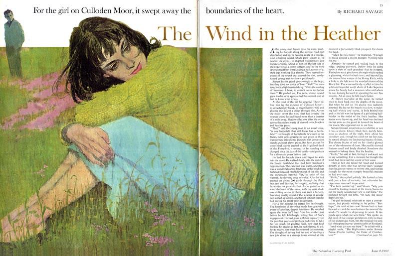
Bowler59

LP: I know exactly where you made that statement: it was in a 1967 interview in American Artist magazine.

JB: Oh yes!

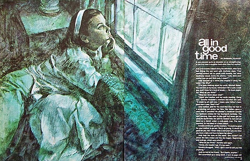
LP: In there you said, "I keep up with all the new media, the new techniques. Like everybody else, I use acrylics. I experiment with collage and all sorts of accidental effects. I use cameras and projection equipment. But I'm always myself. I don't let any of this take over and become technique for it's own sake."

(Below, Joe Bowler DPS from McCall's, January 1967)
Bowler43

LP: I think what you were saying is you were willing to try new things but never willing to sacrifice the basics for the sake of gimmicks.

JB: Exactly right.

LP: So having said that; another guy came along around the same time as Bernie Fuchs and made a big splash: Bob Peak.

JB: Oh wow...

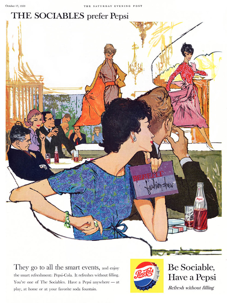
(Below, Bob Peak Pepsi ad, October 1959)
Peak11

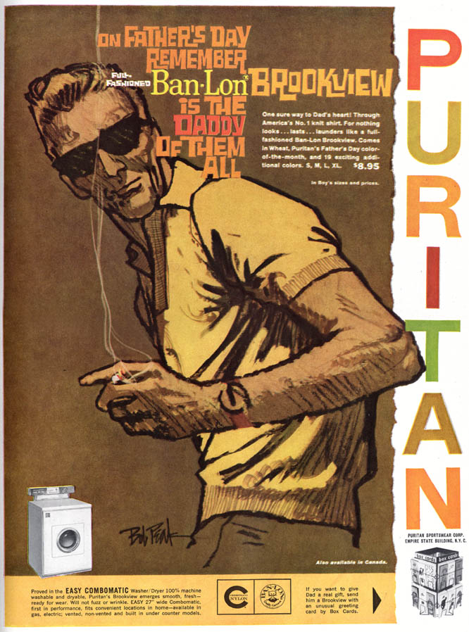
LP: So what I'm wondering is, did you notice Bob Peak's work and what did you think about it?

JB: Well, I liked the work very much. It was all his own. I just said to myself, this has got to be the best commercial illustrator I've ever seen. This guy could do anything and do it well. But as far as anybody I looked to for inspiration; no. Other than just realizing how good he was at what he did.

(Below, Bob Peak advertising art, late 1950s)
Peak03.JPG

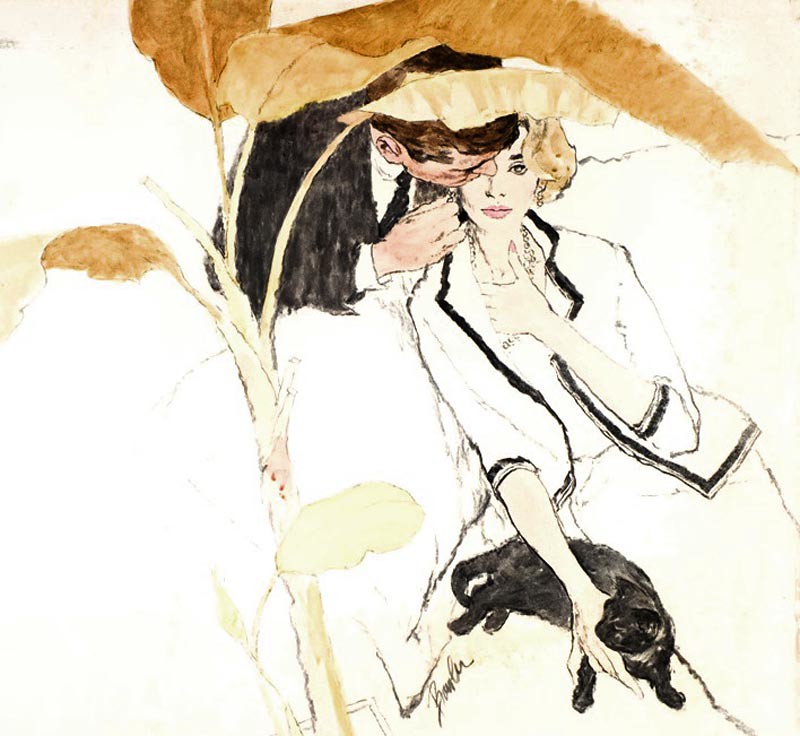
I did try a bit of everything at that time. I did a lot of just charcoal drawings with coloured ink washes and things like that, which were different, I guess, for me.

(Below, Joe Bowler illustration, year and publication unknown)
Bowler69

LP: The '60s were a difficult time for a lot of illustrators, but as the author of the American Artist article says, you're one of the handful who seems to have found a way to stay on top. Can you tell me a little about those times and how you managed to keep getting a steady stream of assignments?

JB: Well it was part of my philosophy of saying, "I'm going to do something that they'll always want." Whatever I was doing or thinking, it was working for me.

Joe Bowler

Continued tomorrow

* To see recent works by the artist, visit Joe Bowler's website

* Thanks to Isabel for allowing me to use a scan from her Joe Bowler set on Flickr in today's post. Thanks also to oldcarguy41 for allowing me to use a Bowler illustration from his Flickr image archives.

Thursday, July 15, 2010

A Gift from the Trap of Solid Gold

Last March I received a note from Steve Scott. It began, "I write a blog on author John D MacDonald, a guy who wrote hundreds of short stories for magazines of the forties and fifties, and I own a pile of old magazines containing his work."

Utz62

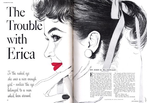
"Mostly I simply use scans of old covers -- ones I own or ones I found on the web -- but I occasionally do the inside magazine artwork if I can. I have to confess that I already nicked a couple of your scans for my blog: Thornton Utz's "Hangover" and Arpie Ermoyan's "The Trouble with Erica."

Utz65

Steve continued, "I'd be happy to send you copies of anything I scan for use on your blog, assuming I don't already see it in your collection." And not long thereafter, Steve sent some really terrific images by one of my favourite mid-century illustrators, Thornton Utz. Its those images which decorate today's post.

Utz66

Steve explained, "I started wondering how I learned [about] the friendship between Utz and MacDonald. A little digging and I uncovered the April 1957 issue of Cosmopolitan. It's their Florida issue and it contains the attached photo of Utz, MacDonald and yet another artist neighbor, Al Buell."

Utz63

"This issue features a MacDonald work illustrated by Buell..."

Buell01

"... plus another Utz work illustrating a story by Thornton Delehanty."

Utz67
Steve concludes, "I'm sure to come across more illustrations by this great artist and I'll be sure to forward them on to you when I do."

Utz64

Many thanks, Steve! Besides seeing once again what a versatile illustrator Utz was, its interesting to discover that he, Al Buell and John D. MacDonald were close friends and neighbours.

* Steve's blog is called The Trap of Solid Gold, named after a John D. MacDonald short story. Be sure to drop by there and check it out!

* My Thornton Utz Flickr set.

Tuesday, October 23, 2007

Arpie Ermoyan: A known unknown

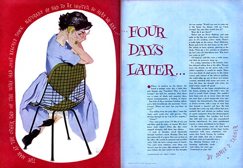
If you recall when Anita Virgil wrote about her late husband, Andy Virgil, you might remember she mentioned several other artists who worked at the same New York art studio, Rahl Studios. One of those artists was Arpie Ermoyan, the wife of Souren Ermoyan, who was at that time art directing Good Housekeeping magazine.


So Arpie Ermoyan became known to us... but aside from this one example of her work from the July 1954 issue of Collier's magazine, her work remained unknown.

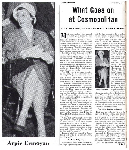
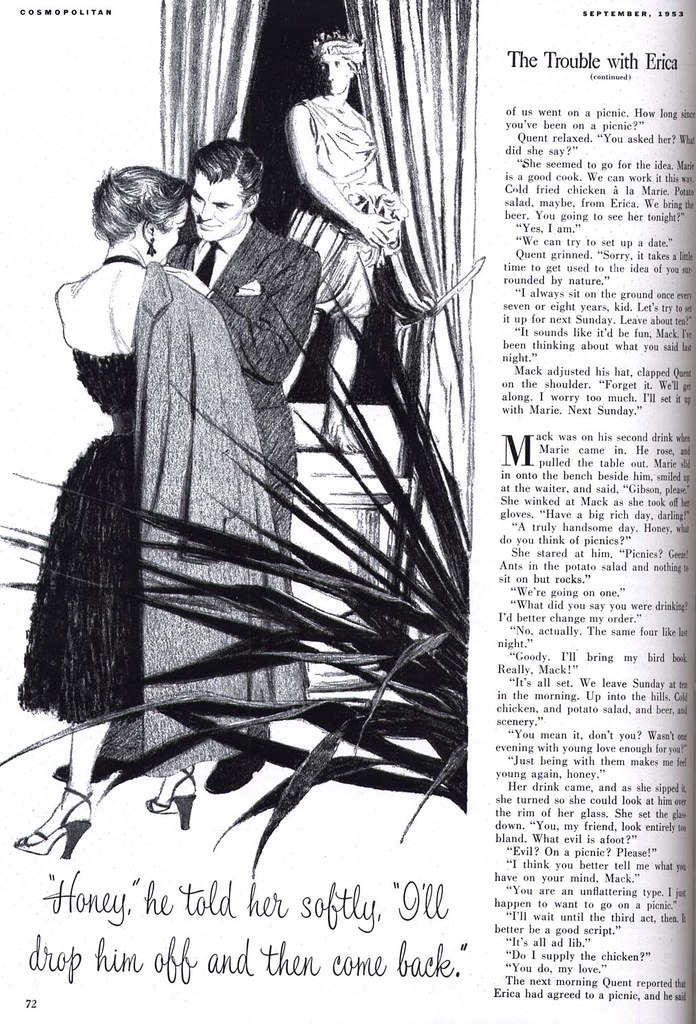
Well today I'm pleased to be able to show you not only a few more examples of Arpie Ermoyan's appealing artwork, but a picture of the stylish young artist herself. Thanks to this short article in the September '53 issue of Cosmopolitan magazine we now also know that the Ermoyans were part of that same Westport, Connecticut community of high profile illustrators that included Al Parker and Austin Briggs.


The article mentions that she also modelled for some of those same artists. That's not surprising, considering what an attractive lady Arpie Ermoyan was. Over the course of the past few years, who knows how often we may have looked at some lovely lady in a painting by one of the Westport artists... and not realized we were actually looking at Arpie Ermoyan?


The article suggests that this assignment from Cosmo was a sort of "debut" for Ermoyan . She had apparently been studying illustration for the previous five years. If that's the case, then she arrived on the scene fully formed. Her work on this assignment is top notch. So why is there so little of it to be found in the various mainstream magazines of the mid-1950's?


That, for now, remains unknown.

* If you'd like to read the article on Arpie Ermoyan without straining your eyes - or just want to admire her illustrations at full size - you'll find all of today's scans in my Arpie Ermoyan Flickr set.

Wednesday, January 31, 2007

Andy Virgil - Part 3: Studios

What was some of the preparation Andy entered the illustration world with?

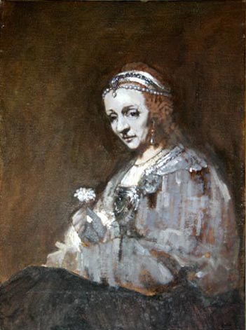
In those days when he was copying Rembrandts at the Met, he went about it as closely as he could to approximate the techniques of the 16th and 17th centuries. Following an incredible little book, rich with The Secret of the Old Masters by Albert Abendschein (D. Appleton and Company, © 1916 ), he ground his own paints with mortar and pestle, added the various mediums, gessoed his work surfaces, then built up such paintings by layering one tint placed over another: he under-painted in dark tones as did Rembrandt, then picked up these portraits with grays and whites,


and lastly laid on his layers of colors. Then glazed, varnished. I still have this book with Andy’s annotations regarding the painting of flesh tones. And that glass pestle.

Now he had to begin work in his chosen field and he had to produce a portfolio. Though I did not know him back then, I do recall him mentioning Fredman-Chaite, so I am guessing that was one studio he approached when seeking a job as an apprentice. I do not know what he showed them in order to display his own talent and dedication to art. Or if he only told him of his art education.

What he landed was a job at Cooper Studios some time in 1951 as an apprentice for their fabulous group which included stars like Joe de Mers, Jon Whitcomb, Joe Bowler. Andy cleaned their palettes, their brushes, acted as all apprentices in art studios: they were errand boys, cutting mats, probably delivering jobs, a veritable "gofer." But he was observing everything about this commercial art business. Apparently he especially befriended Joe de Mers whose work he admired. And de Mers kindly took Andy under his wing and loaned him his own photos with which to create his samples. Again, we have the pattern of Andy’s life: working late into the nights alone at his art. He did this at Cooper.

Also while he was there, and I am guessing it was only about a year or so before he built up his own portfolio, it seems there was a young woman who worked there, too. She appeared and disappeared from time to time. (I never got the impression from Andy that she was one of the artists. When he spoke to me of her, his recollection was of her casually washing the eternal coffee cups that everyone used.)

It turned out that this woman had tuberculosis, about which not enough was understood . Certainly, not by the general public. Suffice it to say, in those days, prior to 1952 , there was no real cure for it. It was called "arrested," at best, when in pulmonary tb the scar tissue built up over the diseased area[s] in the affected lung, and the fever abated, as did the cough, and the night-sweats. So she worked some of the time -- until she fell ill again. Then, a while later, she would return to work.

At that time, Andy was ready to strike out on his own. And we return to that rainy "Autumn in New York" afternoon in 1952 when he walked into Rahl Studios for the first time. And was promptly taken on as a member of that ‘stable’ of artists.

There were about 16 – 20 people there. I am not sure of the exact number. Several of the artists worked in the NYC studio which was made up of a series of partitioned cubbyholes for the artists. I think it was on the 14th floor of the French Building.


(Later, they moved nearby to 45 West 45th Street to a larger spread.) Those artists who utilized ‘in house’ space worked off a 60/40 percent commission. Those who worked from home gleaned a larger cut at 70/30 percent. There were several artists who commuted from such places as Norwalk and Westport, Connecticut and a couple came from Pennsylvania to New York City when their jobs were ready to be delivered by the sales staff. Rahl had a brother-in-law, Leo Vallen, as one of his salesmen; there was Norm Heffron, Roland Galen, (the latter two dealt more with out-of-town clients) Phil Rahl, of course (when he was in town from his Black Angus farm in Washingtonville, New York) and his extremely competent studio manager, Willard Seymour.

There were about three apprentices, one of whom -- George Walowen -- ultimately moved up to do artwork and/or sales (I’m not certain if it was both or just the one ) and there was Vinny Dwyer, I recall . Also with artistic talent. They delivered the art, cut the mats, prepared the samples from tear sheets which the sales staff would take around to the agencies and magazines. And in slow times between jobs, an artist would work up fresh samples for the salesmen to use to drum up business. There was the Costume Researcher (in later years they were dubbed Fashion Coordinators), myself who booked the models, obtained whatever any of the artists needed for their jobs, props from skis to peignoirs, period costumes, photos rented from Bettman-Archives or from the N.Y. Public Library. Sometimes it ranged from Victorian love seats to Eames chairs, and frequently clothes for the models who rarely had what we needed. One quickly learned to have a back-up outfit even when models said they had what we asked for. You could not waste time on a shoot if the clothes they brought were no good. You had to proceed, full tilt, regardless. Likely the clock was ticking on another model hired on that same job. Or another photo session was scheduled immediately after. Often clothes were purchased by me ahead of time just for the shoot and then returned to the department stores ASAP so the artists didn’t have to incur more expenses than they already had.

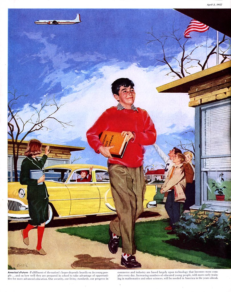
At this point it is interesting to note that all expenses for models (and prop rentals on a job) came out of the illustrators’ commissions. At the same time, the practice for New York photographers was to bill the clients for all this! I was incensed to learn of this inequity, and the artists often complained mightily about how unfair it was. But they did nothing about fighting it. Because of these costs, whenever possible, artists would use their own possessions for props, or take photos within their homes and use family or friends to pose for them. Much that appeared in Andy’s work came from our home. Including our felines and our Irish setter who was in this Dobbs hat ad,


our antiques and my clothes and my homemade curtains. And from 1963 on, our daughter ! Many times over. (Her rates were reasonable.)


In my ‘spare’ time I maintained a "scrap" file on every imaginable subject clipped from magazines. The scrap served the artists and was often incorporated into their illustrations via the "Lucy" (or camera lucida, that mainstay of the commercial artist) when they had to place photos of their posed models on shipboard or in a country setting, in a ballroom,


or in a factory or a kitchen, bedroom , etc. Last, but key as all were for the functioning of Rahl Studios, was a secretary /receptionist/ bookkeeper.

Some of the artists and/or those who were added on in the years I was there included Fred Siebel, Dorothy Monet, Oskar Barshak, Robert Patterson, Leo "Dink" Siegel, Phil Dormont, Ben Prins, Boomy Valentine, Al Muenchen, Raphael Cavalier, Herb Saslow, Roy Cragnolin, and later Fred Otnes and Arpi Ermoyan were added. There was a single photographer, Jerry Kornblau. (He, much later, opened his own antique shop in the city catering to such as Andy Warhol.)

It seemed to me as an outsider that, generally speaking, these people each had their own illustration niche and hence were not in close competition with one another. Once in a while, though, if an artist was chosen by a client but was too booked up with other work, a salesman might in those early years offer as a substitute someone like Dorothy to fill in for Andy. Or Siebel who originated "Mr. Clean" right there at Rahl in the ’50s , or possibly Muenchen could fill in for Dink Siegel’s semi-cartoon animated figures. That sort of thing. I don’t recall this happening often though. Muenchen, an incredible talent whom Andy liked a great deal, was the car man. In a pinch, if Muench was unavailable, Roy Cragnolin might fill in for him. Another artist Andy particularly enjoyed was Fred Siebel, a brilliant, complex and multifaceted individual. Dink Siegel was loved by all – especially by all the models! If they were lost sight of between posing for a job and coming out to the front desk to get paid, one only need go back to Dink’s cubicle and there they would be. Dink was a genuinely sweet laid-back fellow – and a chick magnet. Our in-house balding but crew-cut bachelor, a Gary Cooper type, with a slender hooked nose. And he was also one of Andy’s poker buddies. Dorothy Monet was a rare charmer with friends in theater and movies like Shelley Winters, Robbie and John Garfield, the Lee Strassburgs whose daughter Susan visited the studio one day for she was interested in commercial art, Clifford Odets, Artie Shaw. Dorothy was a beauty of many talents. Decades later, I was stunned to see that it was she who wrote the tv script for a fine production on the artist Mary Cassatt for PBS.

Tomorrow: Name Droppings


Anita Virgil is an internationally anthologized haiku poet. She lives in Forest, Virginia.

Entire contents of these posts on Andy Virgil (both text and pictures) © 2007 Anita Virgil. Nothing may be reproduced without permission of the author.

* A selection of Andy Virgil's original art is available from Graphic Collectibles.

Monday, January 29, 2007

Andy Virgil - Part 1: Autumn in New York

When Anita Dorne first laid eyes on a young man who came looking for a rep at Phil Rahl Studios, she had no idea that she was looking at love. The talented, determined young man before her was Andy Virgil, and this is his story.


"I still remember him that rainy autumn day in New York City," she writes today, "looking like a skinny drowned rat with a black portfolio almost as heavy as he was."

Anita continues:

The year was 1952 and, though I was the Costume Researcher at Rahl Studios, I was manning the lunchtime reception desk when Andy walked in.


I was 21 at the time, a graduate with honors from New York's High School of Music & Art, and recipient of a scholarship to The Art Students’ League. I had already worked right out of high school as an assistant to the Art Director of Town & Country Magazine. That was Souren Ermoyan, but in a couple of months, he left to become Art Director for Good Housekeeping Magazine. His assistant, Tony Mazzola, took over. (Tony later became Editor of T&C and then moved on to become Editor of Harper’s Bazaar for decades.) So it was that the two of us became the Art Department. I worked alone with Tony the rest of my time there before taking the job later on at Rahl Studios, New York's second largest art studio. Cooper Studios being top dog.

This soft-spoken shy individual gave me his name, Andy Calafatello, and said he had an appointment and I announced him by phone to Rahl. Patiently, he sat and waited opposite me on the couch at 551 Fifth Avenue (which was the Fred French Building, memorable for its huge and ornate double brass doors).

The door to Rahl’s office was shut. All was quiet. And when it finally opened, a burly attractive dark-haired man with a crew cut and the Madison Avenue Brooks Brothers attire, came out and ushered Andy and his huge wet portfolio into his office. A little later, Rahl’s right-hand man, Willard Seymour, joined them.

A long time ensued behind the closed door. The life of the studio picked up as the illustrators trickled back in from lunch. When the young man emerged from the meeting with Phil Rahl and Willard Seymour, he was a member of that studio. It was at that time they suggested he use his middle name, Virgil, as his professional name.

Once he had settled into a cubicle at Rahl, Andy kept pretty much to himself, working always with the same intensity, listening to his music, mostly classical, and staying on late at night in the often cold empty studio. He was pretty solitary -- except for me. Early on, we became good friends. I’d bring my lunch back to his cubicle and we’d talk about everything and listen to music together. He adored Mendelssohn’s "Violin Concerto in E Minor" and played it over and over. Its quietest moments will always remind me of him -- those first opening notes and the incredible plaintive phrases within it later. How they presaged our life together!

Later, since I was taking night classes in Fine Art at New York University, and since he nearly always stayed working late into the night, he would ask me to join him for dinner. Big mistake! I accepted -- and was often late for class since we so enjoyed each other’s company and forgot the time.


I recall breathlessly rushing into the city night to catch the Fifth Avenue bus with Andy waving goodbye as I climbed up the bus steps.

It wasn’t love at first sight on my part: I was already "a goner" and obliviously dumped my sad tale of woe on Andy who patiently listened and listened. But his feelings for me were different.


And he kept them to himself. Except maybe for those large soft sad eyes I caught often looking at me, a bit too long. Or for an occasional single rose he would leave on my desk . . . .

At one point, he wanted me to help him decorate his apartment when he obtained one. I think it was just a ploy to engage me more in his life, but that never happened and events by the new year took a dreadful turn. He had invited me to go to Carnegie Hall to a Brahms concert.


It was a cold January day. When I met him, he was in an elegant thin grey Chesterfield coat and I remember fussing at him for not being dressed warmly enough. Especially as he had a cold. Somehow, during that concert -- maybe it was the music -- he took my little dry hand with his beautiful soft long fingers, and I realized I might be beginning to fall in love with this sensitive, genteel man! Luckily, he was too polite and respectful of my ‘distraction’ with someone else, and I had only just begun to realize how I felt, so nothing transpired between us.

It was not long after, when I’d not seen him at the studio for a while, that another meeting behind closed doors in the office of Phil Rahl occurred with Andy and Willard. When they came out, there was a grimness on their faces. Andy had developed tuberculosis! He would promptly be hospitalized.

Tomorrow: The Dreamer

Anita Virgil is an internationally anthologized haiku poet. She lives in Forest, Virginia.

Entire contents of these posts on Andy Virgil (both text and pictures) © 2007 Anita Virgil. Nothing may be reproduced without permission of the author.

* A selection of Andy Virgil's original art is available from Graphic Collectibles.