Tuesday, September 15, 2009

William A. Smith: Condensed in '62

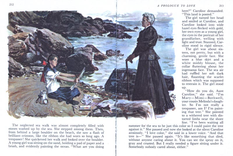
On a previous occasion when we were looking at some Sickles art from Reader's Digest Condensed Books, I received a note from Ferol Smith, the wife of the late William A. Smith. Ferol wrote, "One of these days I'm going to find other Reader's Digest Condensed Books illustrators; W.A.S. natch!! It was a great medium for some fine work by these artists."


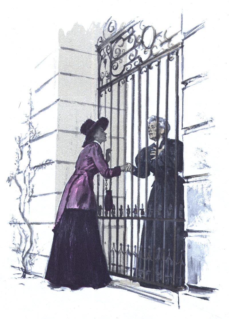
So I was especially pleased when I stumbled across this particular volume... because W.A.S. did a remarkable twelve paintings for one of the stories therein.


I sent a note last night asking the members of the Smith family if they had any recollections of this job... for instance, how much time would the artists have had to paint all these gorgeous illustrations?
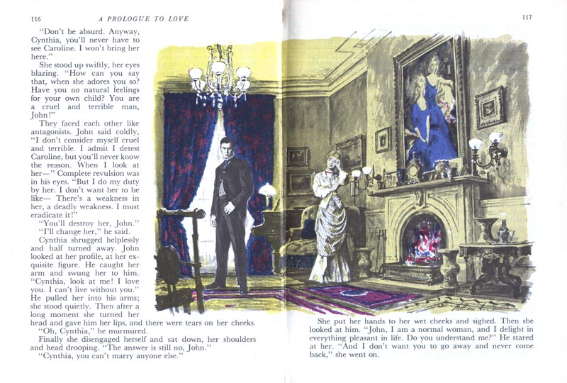

Eldest daughter, Kim, replied that she recalled her dad having about a month to complete the assignment - wow! - that's a lot of work to get done in just one month!
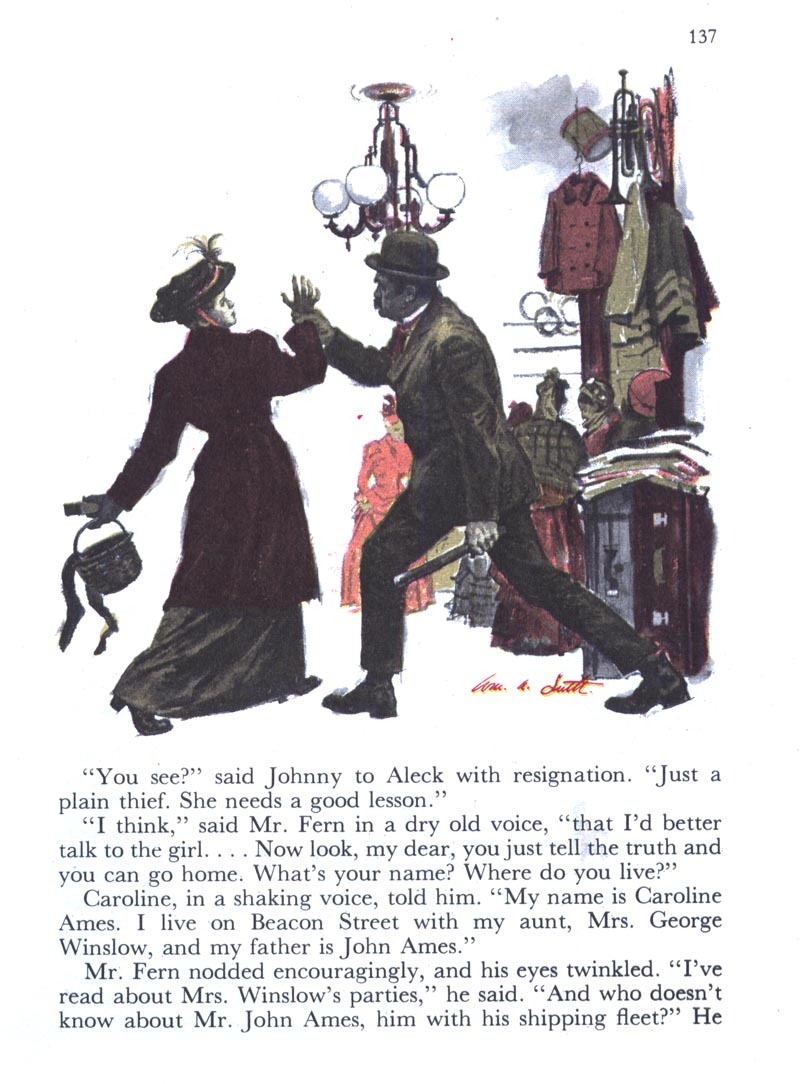

Especially when you consider the technical details and period costume Smith had to research and then render accurately.


Kim remembers her mom posing for the scene two above ( page 137 ) and adds, "I think it was also Dad in that painting."

* Addendum: A late note from Ferol Smith: "I'm 91,95,96, and 99. The tough looking old lady was a neighbor of ours and of the most kindly nature. She enjoyed a job with the local vet and worked with children during summer camp. Not so tough!"

As for the piece below, Kim Smith writes, "It was [Kim's older brother] Rick and me."


She adds, "Rick looks exactly like himself, though I look a little more like Alice in that painting."
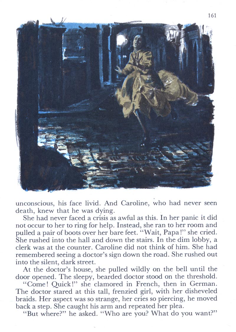

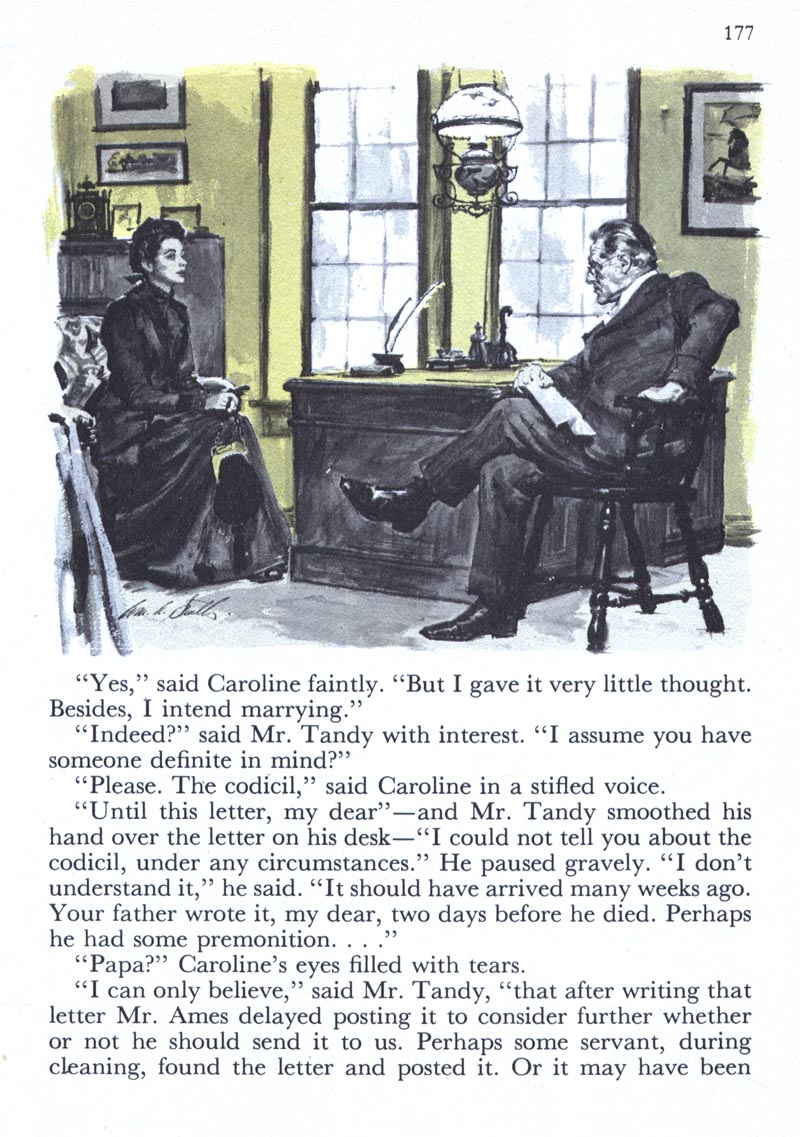
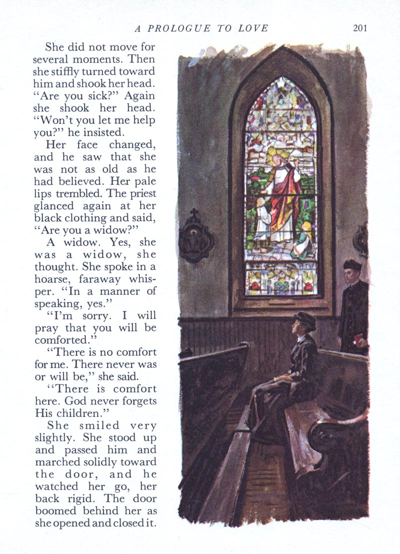
To be honest, the poor paper quality and small reproduction size can't possibly do justice to William A. Smith's paintings. They look this good in spite of the RDCB's shortcomings.


When I look at these I am reminded of the first time I laid eyes on a W.A.S. illustration -- and mistook it for Robert Fawcett's work.

And that in turn always makes me think of a great anecdote Charlie Allen recounted of the time he had dinner with Robert Fawcett and Haines Hall, who was Fawcett's brother in law and a partner in the SF art studio at which young Charlie Allen was working.

During a lull in the conversation at the table, Charlie, still very much a junior illustrator - and somewhat in awe of being in the presence of 'the illustrator's illustrator' nervously asked Fawcett if he knew the painter William A. Smith...

Charlie writes, "[Fawcett] did a double take, turned to Haines, and gesturing to me, said, 'who's this?' I think his actual words were 'who the hell is this?' Haines explained (I was the favored new kid on the block)."

Charlie continues, "RF reluctantly turned and said, 'yes, Bill is a good friend....and he's a fine painter'. He did not say 'illustrator'. That was the only conversation from him for the evening, with me at least. At the time I naturally was in awe of RF, but was also an admirer of Wm. A. Smith."

And we are in awe of Charlie Allen, who once again demonstrates the extent of his skills with another broad range of samples from his many years of service as a West Coast advertising artist. Go to Charlie Allen's Blog and check 'em out!

* My William A. Smith Flickr set.

* This post has been simultaneously published on The Art of William A. Smith blog.

Monday, September 14, 2009

Noel Sickles: Condensed in '62

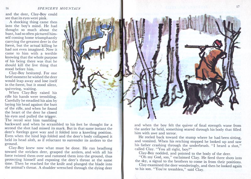
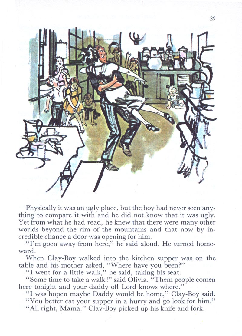
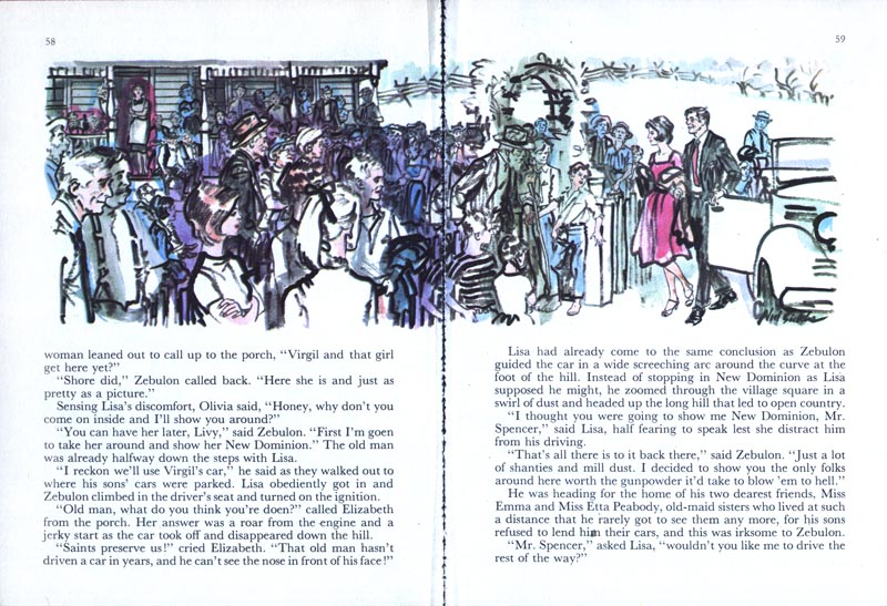
Recently I found another volume of Readers Digest Condensed Books, this one from 1962, at a local thrift shop. One thin quarter (25 cents) is all it cost me for this astounding book, packed from front to back with eye-popping artwork by some of the greatest illustrators of the 20th century.

Last week someone commented that he thought Noel Sickles was influenced (at least for a while) by Francis Marshall's technique in how he executed his illustrations for RDCB. If so, this group of illustrations might be the proof. The timing seems right, at least according to what we've seen so far of both Marshall's and Sickles' work for RDCB. Notice how many of these pieces look as though Sickles sketched them (maybe directly in black marker?) on location.


If you're a long-time reader of this blog you may remember seeing smaller versions of these pieces in my Noel Sickles Flickr set a couple of years ago. This one below I have always found particularly remarkable for its powerful, experimental graphic quality. Is this Sickles attempting to remain relevant in a time when illustration was being replaced by photography in most print media?


In regard to the waning of illustration during the early 60's, it must have been a relief for many of these artists that at least there was Reader's Digest to fall back on. The company seems to have relentlessly commissioned illustrations by the truck-load.


One thing I think you're going to find very interesting this week is how one single volume of RDCB contained such a wide variety of art styles. The casual observer might paint the illustration styles of the mid-20th century with the the broad brush of "the retro look". Nothing could be further from the truth, as we'll see.


Tomorrow: Something completely different!

* My Noel Sickles Flickr set.

Friday, September 11, 2009

Francis Marshall's Valentine

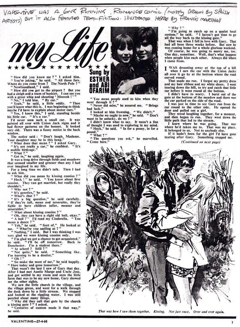
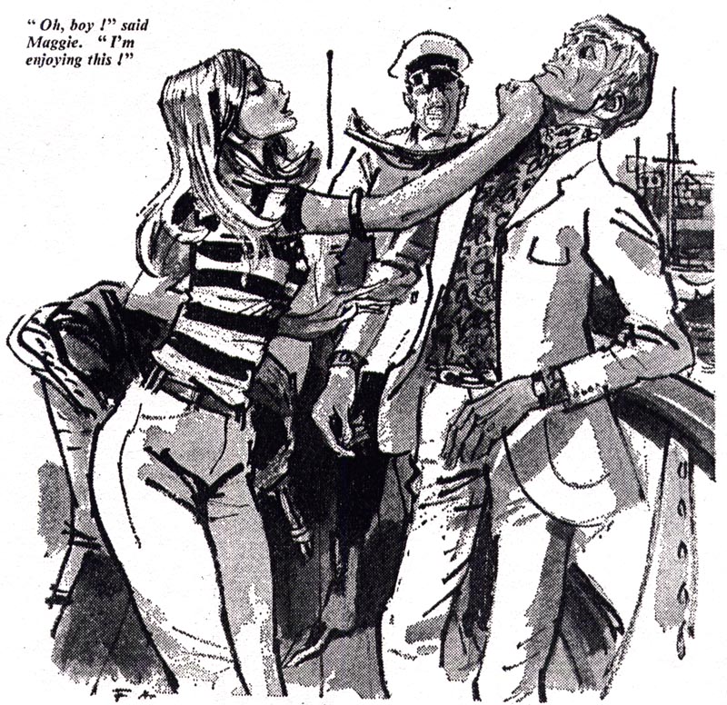
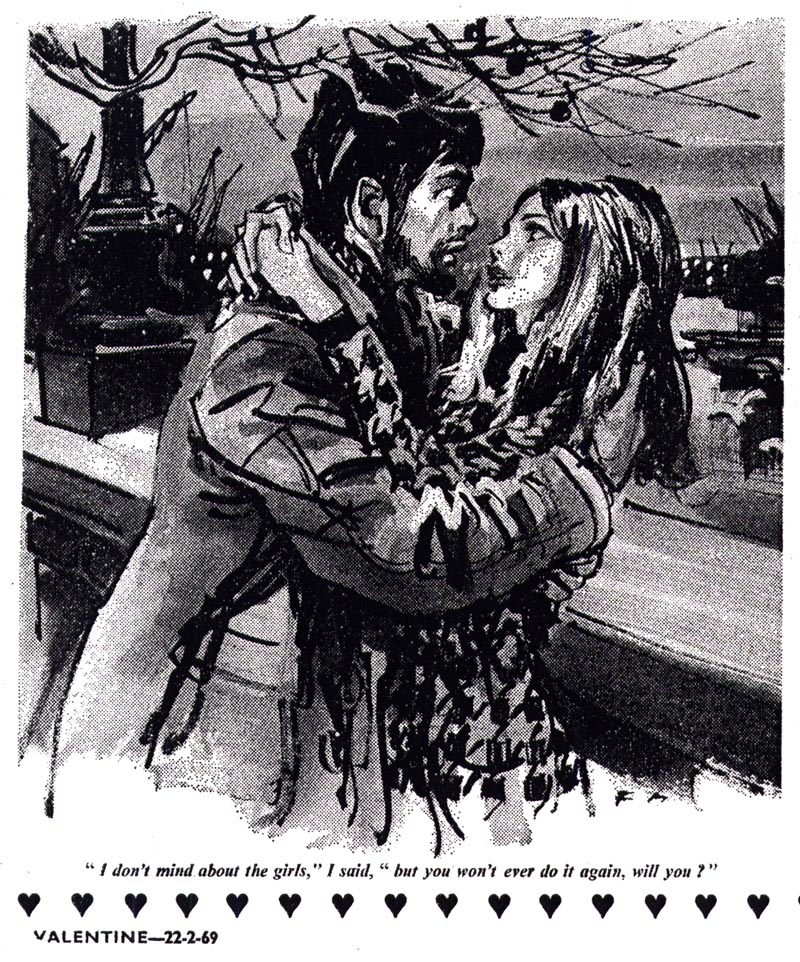
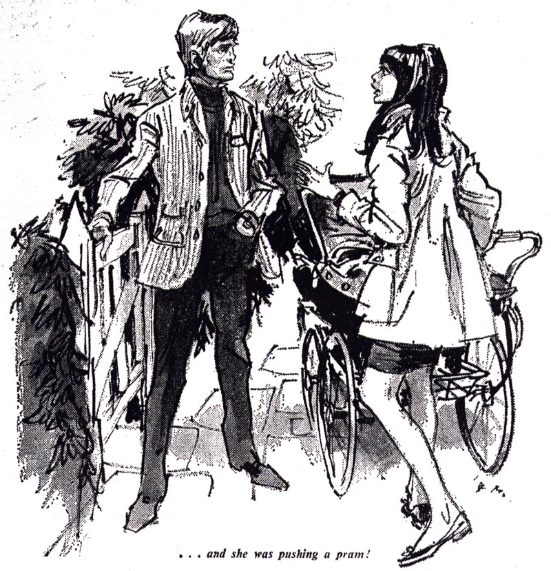
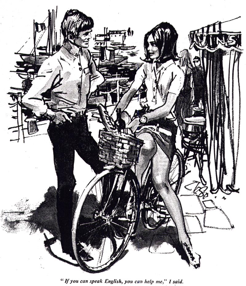
For our last day on Francis Marshall, we turn to British comics artist, author and comics historian, David Roach. David kindly sent me photocopies from some late-1960's issues of a British romance comic called "Valentine". As you can see from David's note below, Francis Marshall provided illustrations for the short text stories that were typically sandwiched between the comics sections of each issue.


David writes, "Marshall never actually drew strips , but Fleetway at that time certainly did have some use for straight illustrators."


" Not only did lots of their comics have fiction , as you can see here in Valentine, but they often carried illustrated features or painted covers."


David continues, "Marshall painted quite a few covers for the upmarket girls weekly "Princess" in 66-67 so he certainly had an impact."


Knowing how comics were typically looked down upon by the general public in North America at the time, I asked David if drawing for these British publications would have been 'a step down' for an illustrator of Marshall's stature. After all, this was an artist who had illustrated for Vogue, Reader's Digest, and countless other prestigious clients, as well as being the author/artist of a half dozen books including one on magazine illustration.


David replied, "If anything I'd say comics were probably held in even lower esteem here than in America but it might just have been that he needed something to tide him over between jobs. In Britain up until the late 70's most artists worked through agents such as Rogers, Temple, Kearley, Associated Artists, Artists Partners etc. so if the agent had a relationship with Fleetway/IPC they could just as easily obtain work for their clients from a glossy woman's magazine or a comic. Clearly the comic payed less but then maybe Marshall wouldn't need to put as much effort into this stuff."


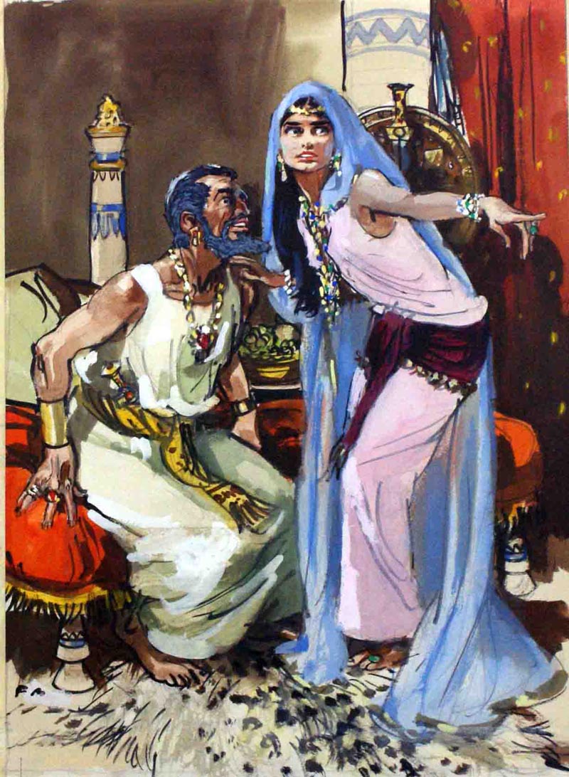
Finally (and again, thanks to David) we have a few examples, scanned from the original art, of Marshall's fully painted work done during the latter part of his career.


About these pieces, David writes, "I spent much of yesterday up in London sorting through vast piles of art up at the Book Palace and dug out these Francis Marshall originals. One is from "Bible Stories" circa 1962, [below] the others are unknown - but rather wonderful."


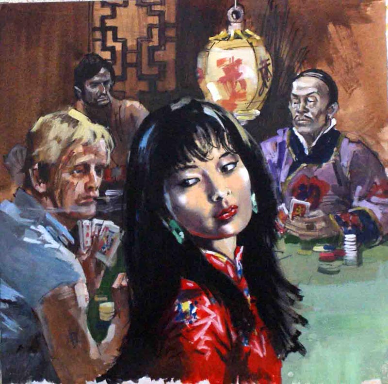
This last piece is the latest example we have of Francis Marshall's work. Done in 1975, just five years before Marshall's death, it was for a "romantic thriller" paperback cover. Thanks to Geoff at The Book Palace for sharing these scans with us via David. And thanks to David Roach for providing today's art and information.


Incidentally, Geoff has this piece and several other Francis Marshall originals available for sale (including a great shark attack illustration that's quite unlike anything we've seen by the artist this week). For those interested in seeing these pieces, click here.

* My Francis Marshall Flickr set.

Thursday, September 10, 2009

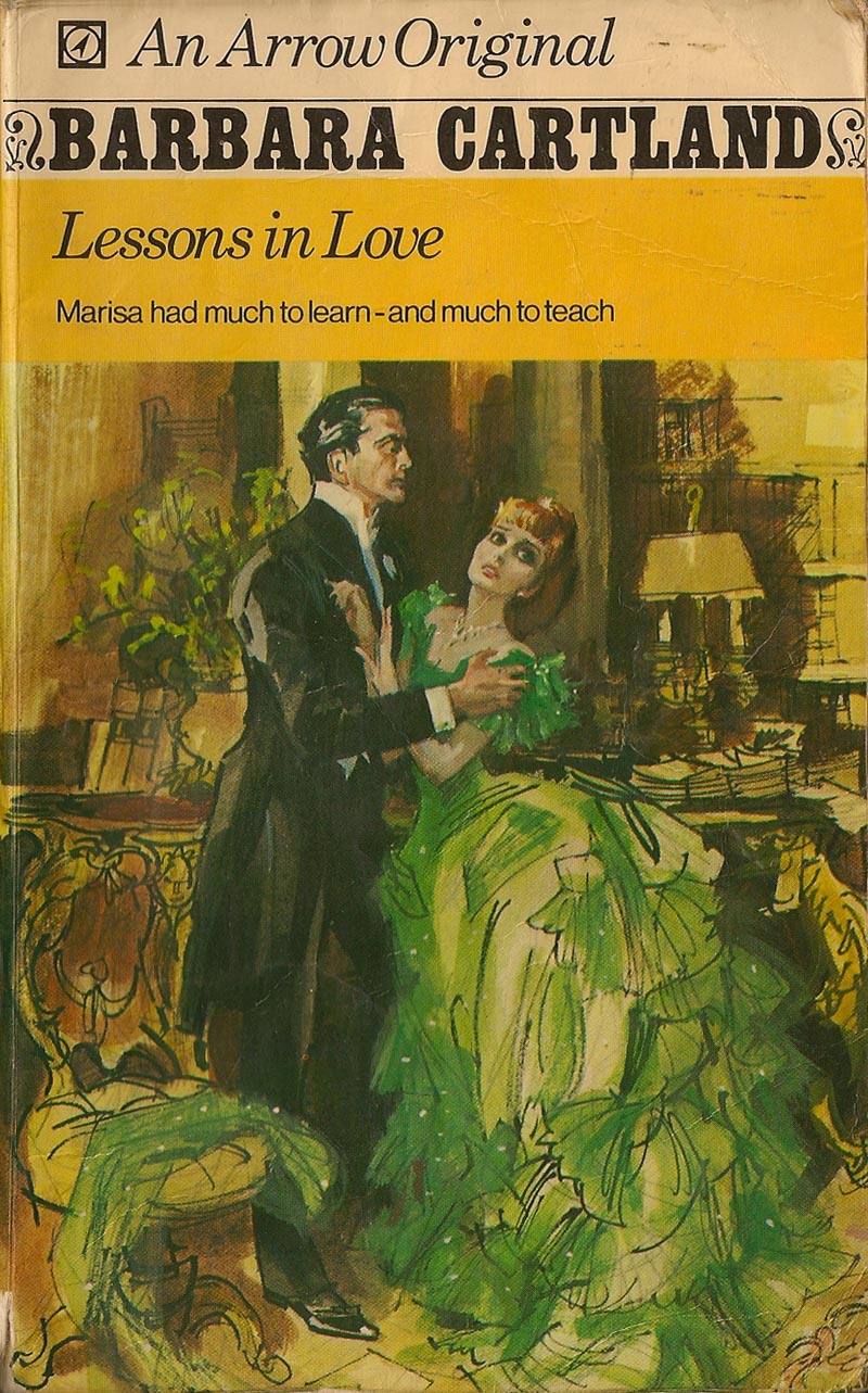
Francis Marshall: Lessons in Love

Until last spring I had never heard of Francis Marshall. Then one day this note arrived:

Hello

I love your blog, it really is a source of daily inspiration. My kind of work isn´t particulary retro, but there is so much to learn from those amazing illustrators of the fifties that I end up incorporating a lot from what you post.

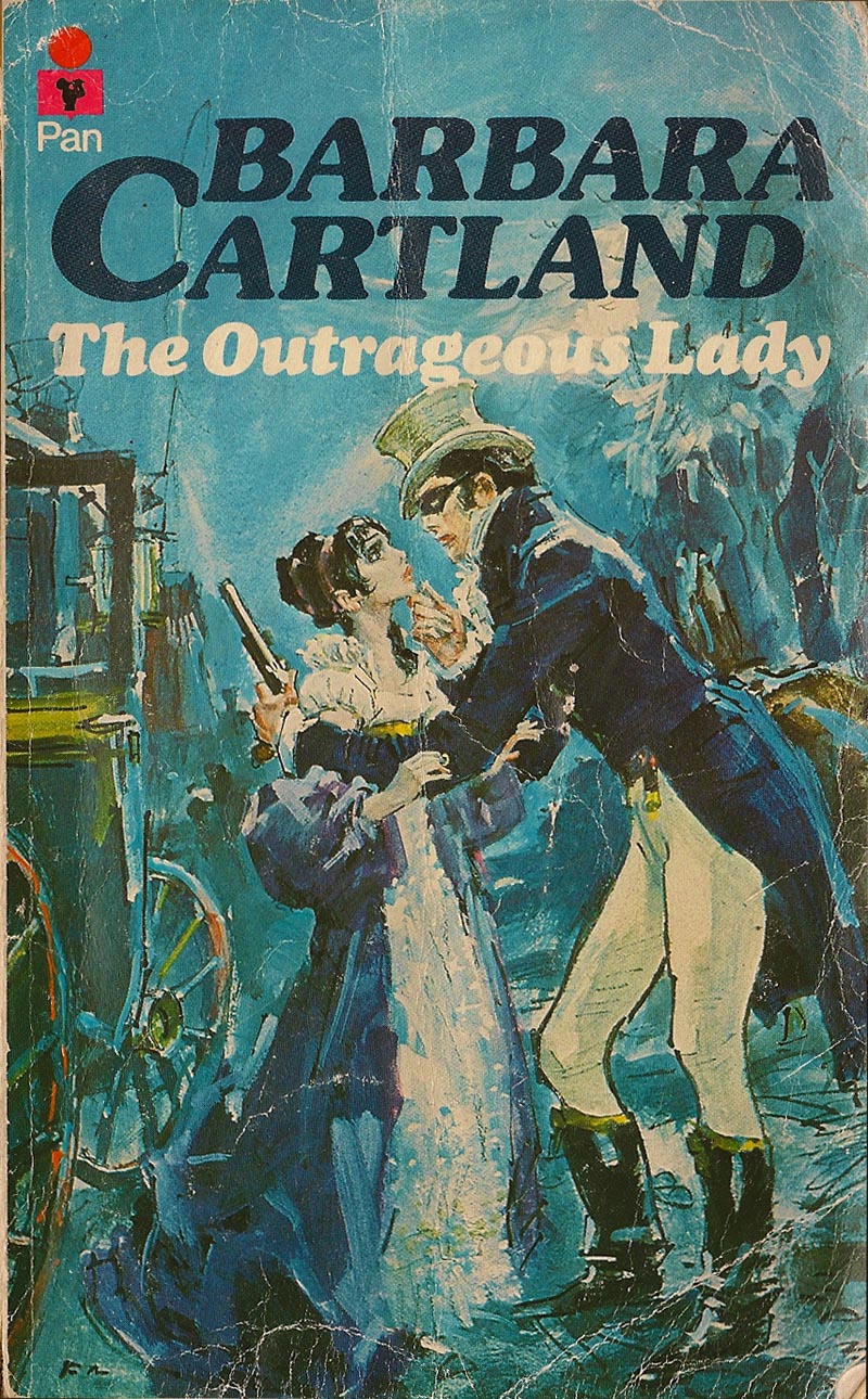
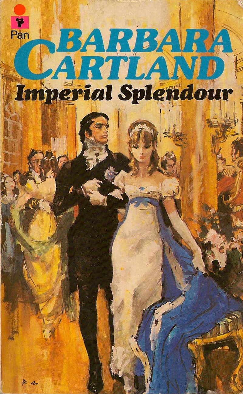
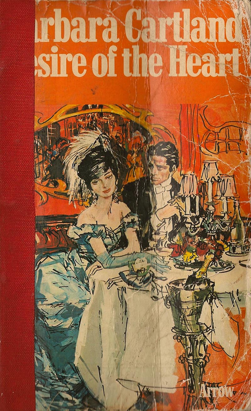
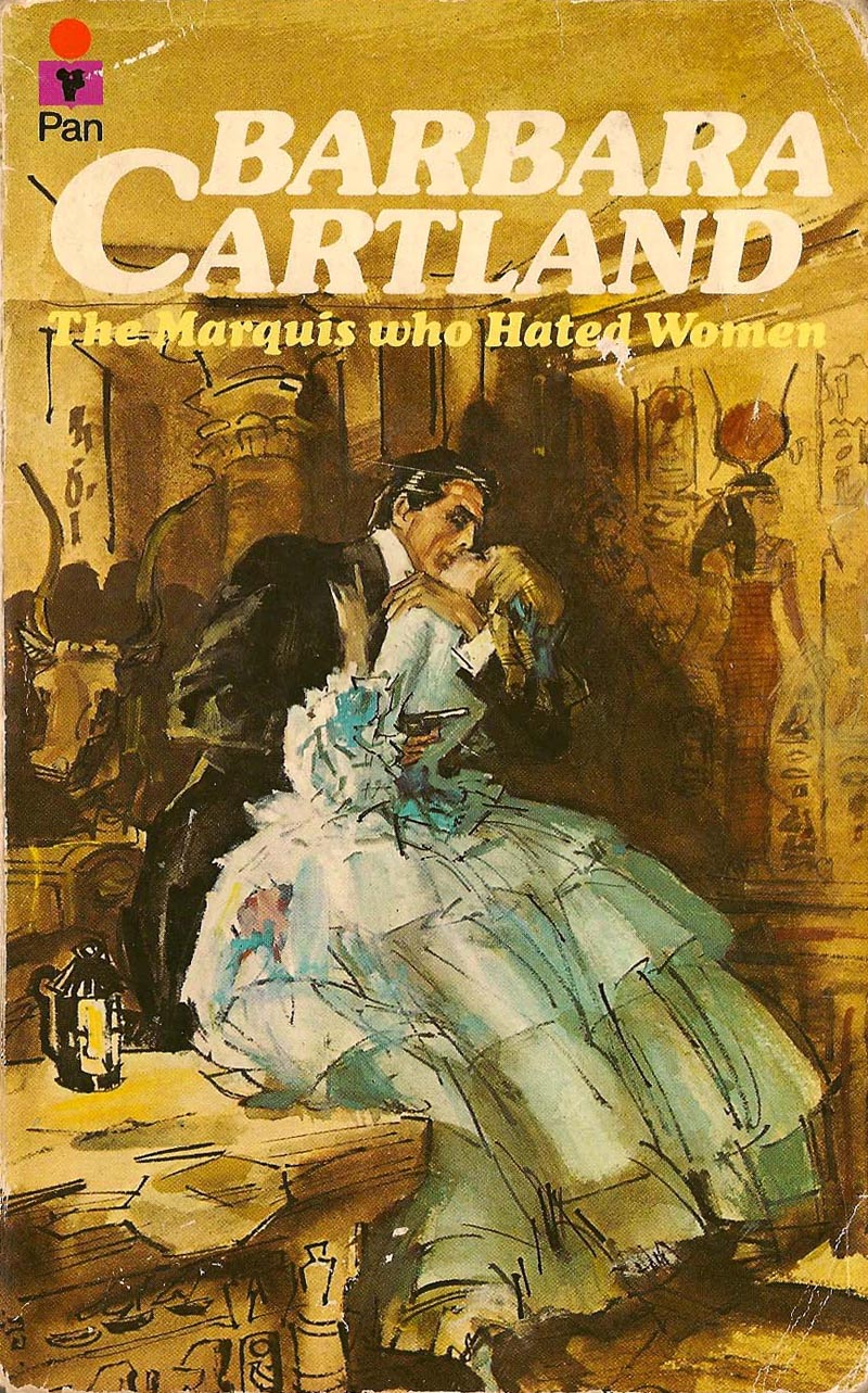
I´ve been looking for information on a British illustrator called Francis Marshall. He did fashion stuff, and covers for Barbara Cartland romance novels. I can´t find much, and was wondering if maybe you have some magic wellspring of information, or a know where originals of his work can be found?

Thanks so much

Ximena Maier


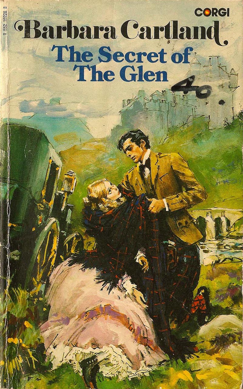
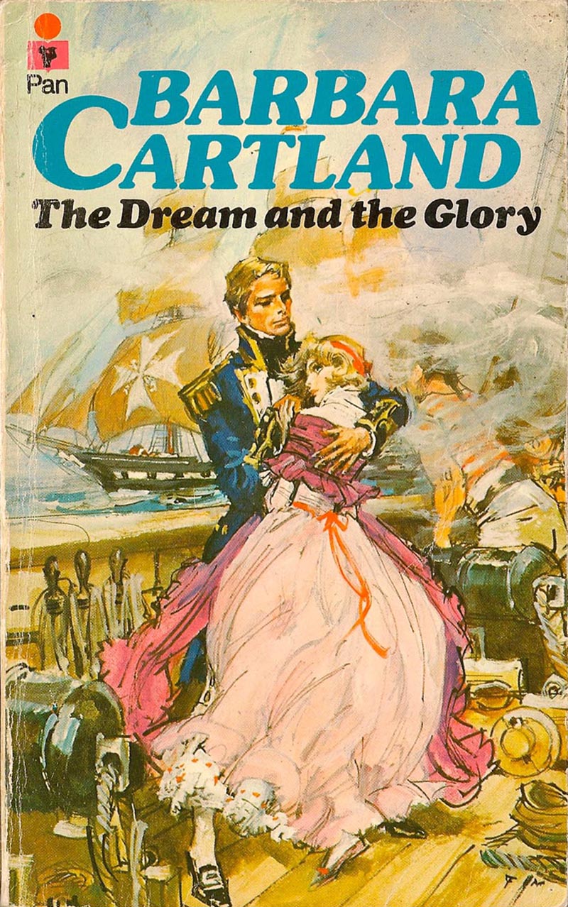
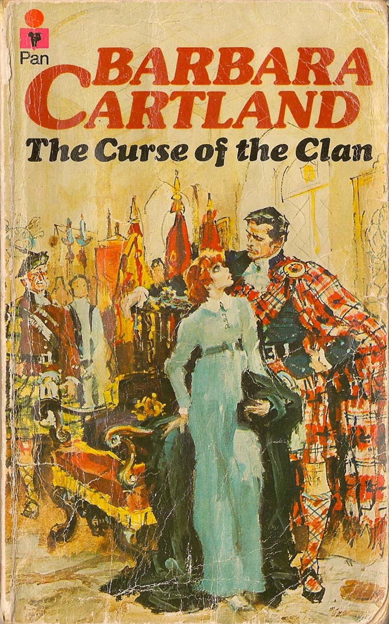
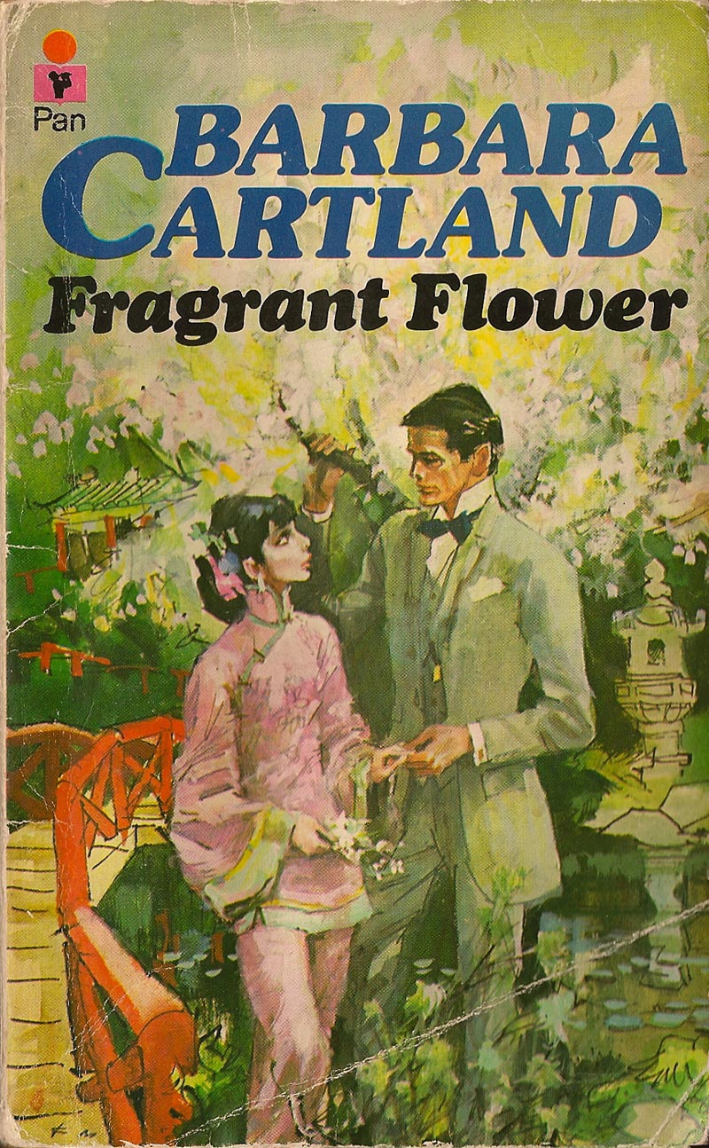
Ximena and I began corresponding and she generously agreed to send me some scans of Francis Marshall's cover illustrations from the many Barbara Cartland romance novels she had.


"My mother has several hundred Barbara Cartland novels," wrote Ximena, "which she read as a teen, and my sister and I have read them enthusiastically too. They´re so simple that you can read them even if you don´t speak much English, so they were a perfect learning tool, and a lot of fun. I still read one every now and then, if I have the flu."


"Of all the ones we have, the best are the ones with covers by Francis Marshall," she continued. "After him, the standards slips, and they´re totally unreadable. Or else I´m influenced by the cover art, which is really good, head and shoulders above the usual Mills&Boon type stuff."


Ximena is right - Marshall's covers really are good. And so stylistically atypical of romance cover art its almost a wonder that he received the assignment to do them in the first place.


Some are fairly painterly and 'illustrative'...


But many others begin to verge on cartoony (and I don't mean that as a slight - I think these are some of my favourites).


Occasionally one or two even remind me a little of Jack Davis' work - when Davis was doing his more realistic looking stuff. There's that same sense of rapidly drawn sketchiness; an infectious, energetic, first draft gestural quality that absolutely breathes with life!


Ximena seems to agree with me. She writes, "His fashion stuff in the forties and fifties seems to be pretty much like most others in the premier league . But these romance covers are very different from the usual."


"For one thing, all the girls have 'manga eyes', which is a signature mark of Barbara Cartland heroines, and makes them more unreal. For another, they´re all period costumes, and his background in fashion really shines through here. He is brilliant with the clothes, I find."


She continues, "I particulary love how loose they are. That green skirt in Lessons in Love, or the bridge in Fragrant Flower, they seem to have been done in seconds. Much more alive than the typical historical romance cover."


Earlier this week we learned from commentor Chad Sterling that Barbara Cartland refused to return any of the original paintings to Francis Marshall, instead framing them and hanging them on the walls of her mansion, which left Marshall feeling quite bitter. Ximena provides an eye witness confirmation of that sorry situation: "I once had tea with Barbara Cartland (possible title for an autobiography) and she had a whole wall with originals. They were a bit bigger than an A4, and so cool, all together like that, it made me really jealous."

As Tom Watson pointed out in a follow-up comment, the practice of keeping illustrators' originals under the assumption that the physical art was part of the purchase price of the reproduction rights was all too common for many decades - and rarely challenged by artists who feared rocking the boat and risking the loss of future assignments. From personal experience, (having had the experience many times in the early years of my career of not getting my original art back) I learned to always clarify the purchase terms of an assignment in writing up front.

* Many thanks to Ximena Maier for introducing me to the fantastic art of Francis Marshall - and for sharing her scans and stories with us!

* For anyone interested in seeing many more of Francis Marshall's romance cover illustrations, be sure to visit Rhonda Whiting's blog, Barbara Cartland Books and Cover Art

* My Francis Marshall Flickr set.

Wednesday, September 09, 2009

Francis Marshall: Condensed

Thanks to TI list member Harold Henriksen, who sent all of the scans we are seeing here today.


While details of Francis Marshall's career don't seem to be readily available, we can guess that the 1950's were a busy, productive time for him.


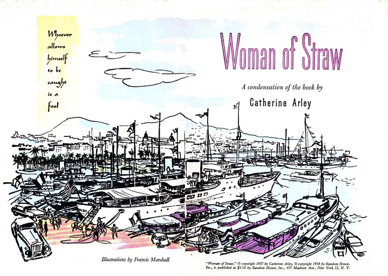
In addition to whatever work he was finding in England, he had been discovered by the editors of Reader's Digest Condensed Books.


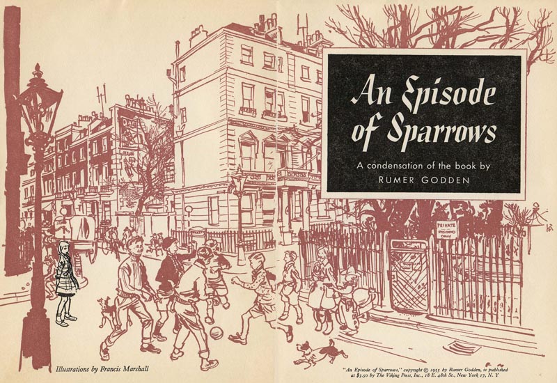
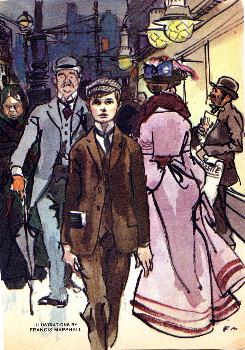
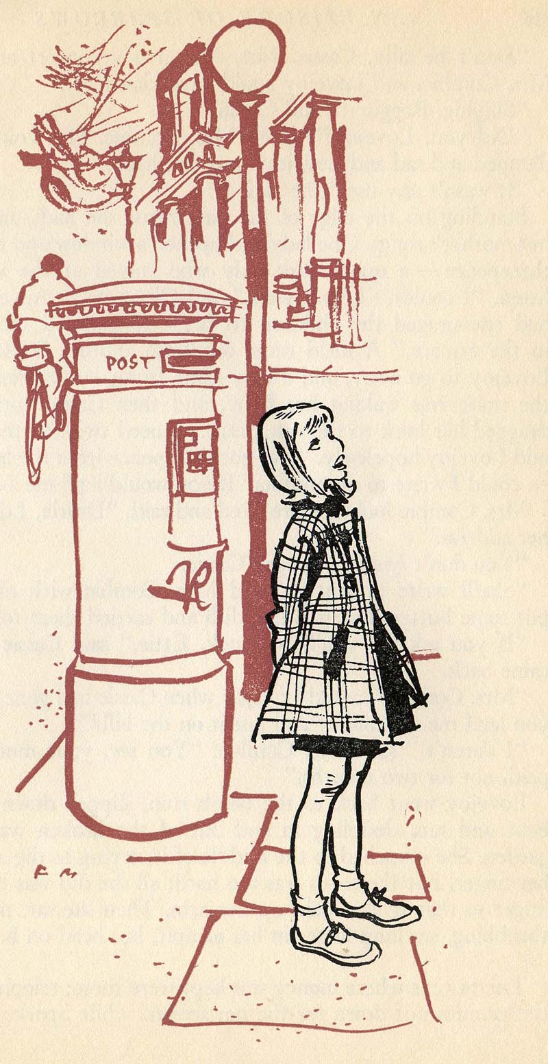
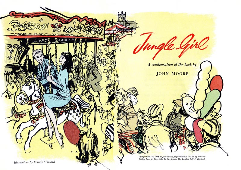
All of these illustrations date from 1955 to 1958...


then, in 1959, Marshall's book "Magazine Illustration" was published, which suggests that the artist was enjoying a busy career doing, well, magazine illustration.


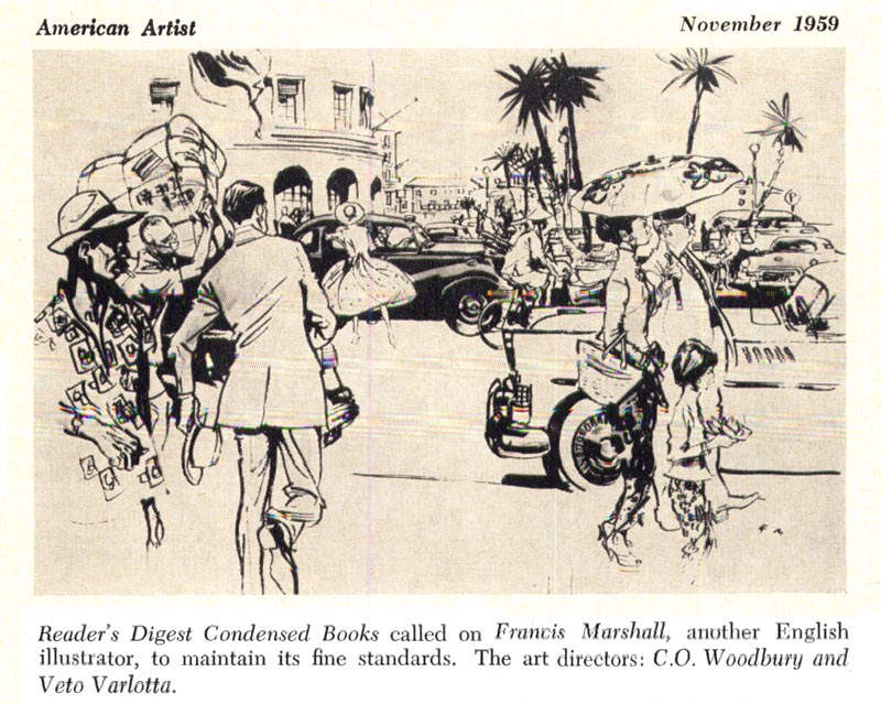
Also in '59, Marshall's RDCB work was included in the first annual show (and book) of the Society of Illustrators, as noted in this November 1959 article from American Artist magazine.


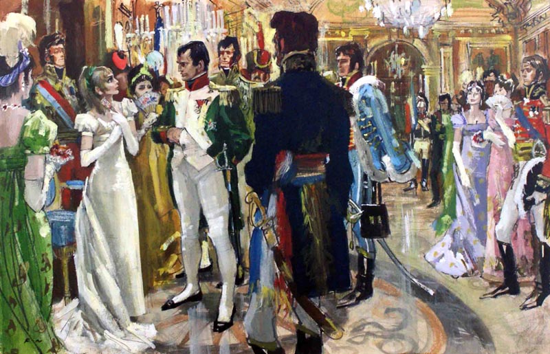
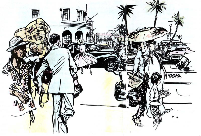
We've already determined that Marshall preferred to sketch 'from life', and some of his large scenes like the one below might have been done on location...


... but I think its unlikely that, in some of the complex story specific scenes (like the one below), he posed everyone and asked them to hold still while he executed his drawing. Did Marshall rely on photo reference, drawings culled from his many sketchbooks, or did he create these figures 'out of his head' for these scenes?


Here's another interesting example: The background scene in the pub very likely was done on location. It looks like Marshall probably inserted the story's main characters (at lower right) to an existing drawing from his sketchbooks.
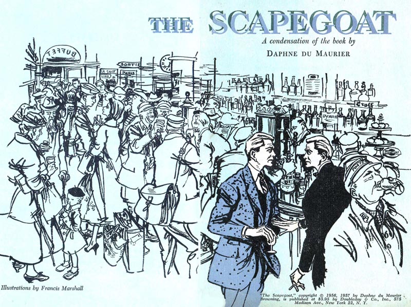

Once again, thanks to Harold Henriksen for sharing all these terrific Francis Marshall illustrations with us!


* My Francis Marshall Flickr set.