My wife got me the 1970 and '71 NYAD Annuals for Christmas and that lead me to ask Murray Tinkelman to clarify a few things about trends in illustration and graphic design at the time. Earlier this week Murray explained how Pushpin Studios influenced the industry during that period. Then we discussed how Herb Lubalin and other designers put greater emphasis on typography as a key component of the early '70s design aesthetic. Today we discuss the emergence of a "new reality" in illustration in the same time period... ~ Leif Peng
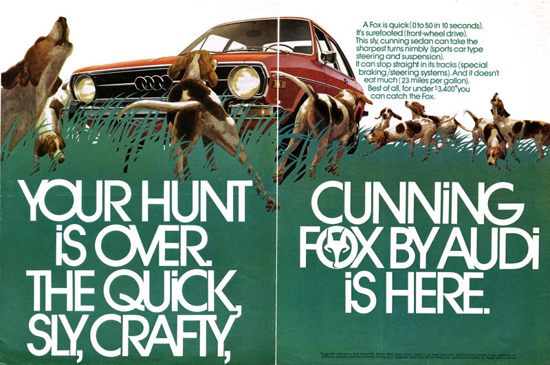
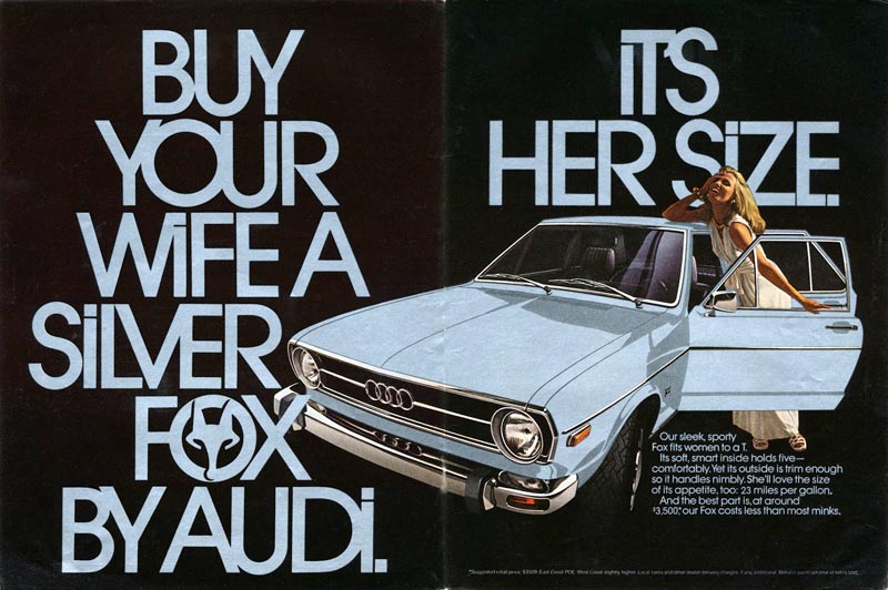
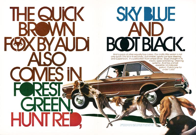
LP: This series of ads I posted in yesterday's part of the discussion, the ads for the Audi Fox, those were done by two artists named Don Wheland and Jerry Cosgrove. These ads were art directed by a guy named Helmut Krone... have you ever heard of him?
MT: Yes I have. As a matter of fact my high school illustration teacher was a dear friend of Helmut Krone (Murray chuckles) and in 1951, when I graduated high school, my teacher told me to look him up, show him my portfolio. Here I am, like, a seventeen-year-old kid (he chuckles again) making an appointment with Helmut Krone. He was a huge figure in art direction.
LP: Well, when I look at that series of ads - of course, they're all absolutely brilliantly designed - I see a couple of interesting things that really epitomize (for me anyway) the look of the '70s: one, that really prominent use of typography...
MT: Right...
LP: ... the other is that very realistic art treatment.
 LP: This morning I sent you an email with a bunch of images attached by different illustrators from the early '70s.
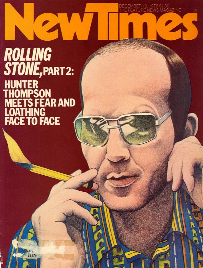
(Below, Bill Nelson, 1976)
LP: This morning I sent you an email with a bunch of images attached by different illustrators from the early '70s.
(Below, Bill Nelson, 1976)
 (Below, Jerome Podwil, 1973)
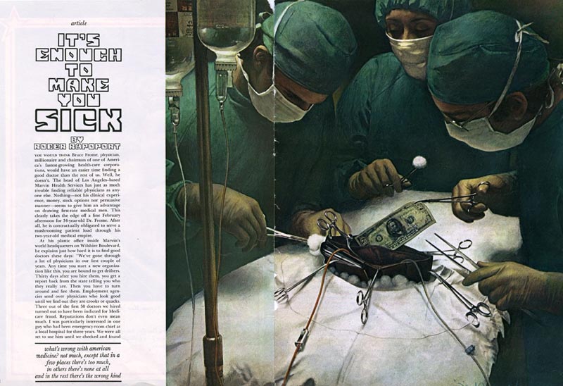 (Below, Alex Gnidziejko, 1974)
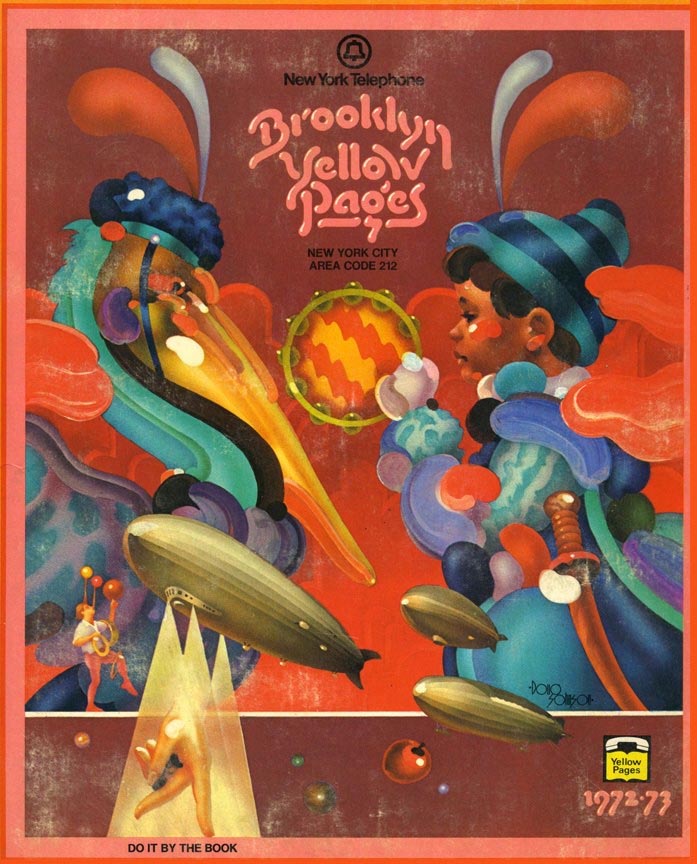
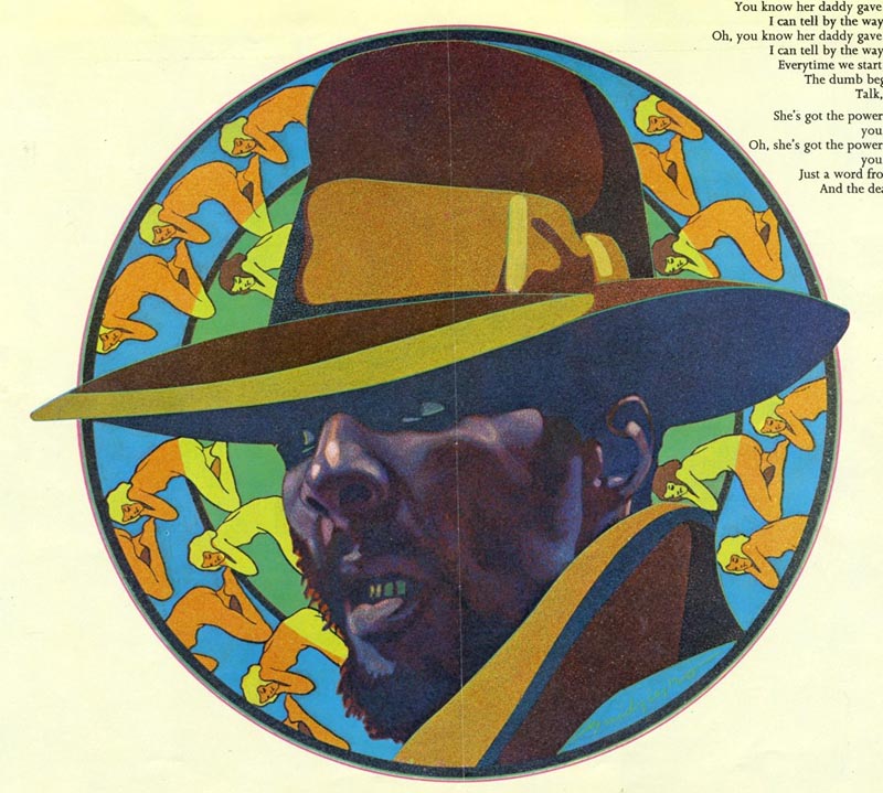 (Below, Doug Johnson, 1972)
 (Below, Roy Carruthers, 1972)
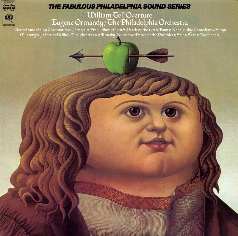 LP: There seems to have emerged at that time, a return to realism, but it isn't the kind of painterly realism that illustrators used in the '50s, or the kind of high-energy, 'action-y' realism you saw illustrators using in the '60s, with textured gessoed board and streaky acrylic washes. This is a realism that seems very... precise... very controlled.
MT: I'm looking at the list again... Jerome Podwil, Roy Carruthers, Doug Johnson, Bill Nelson - really talented people you've got here on the list. It
IS the '70s and I could easily use these examples and construct a lecture about illustration in the '70s. But the thing is, this could be likened to the story of the blind men and the elephant - you know that story?
LP: Yeah, absolutely.
MT: You can find what you want to find or you can hone in on a characteristic and it might take on more significance --
(Below, Roy Carruthers, 1974)
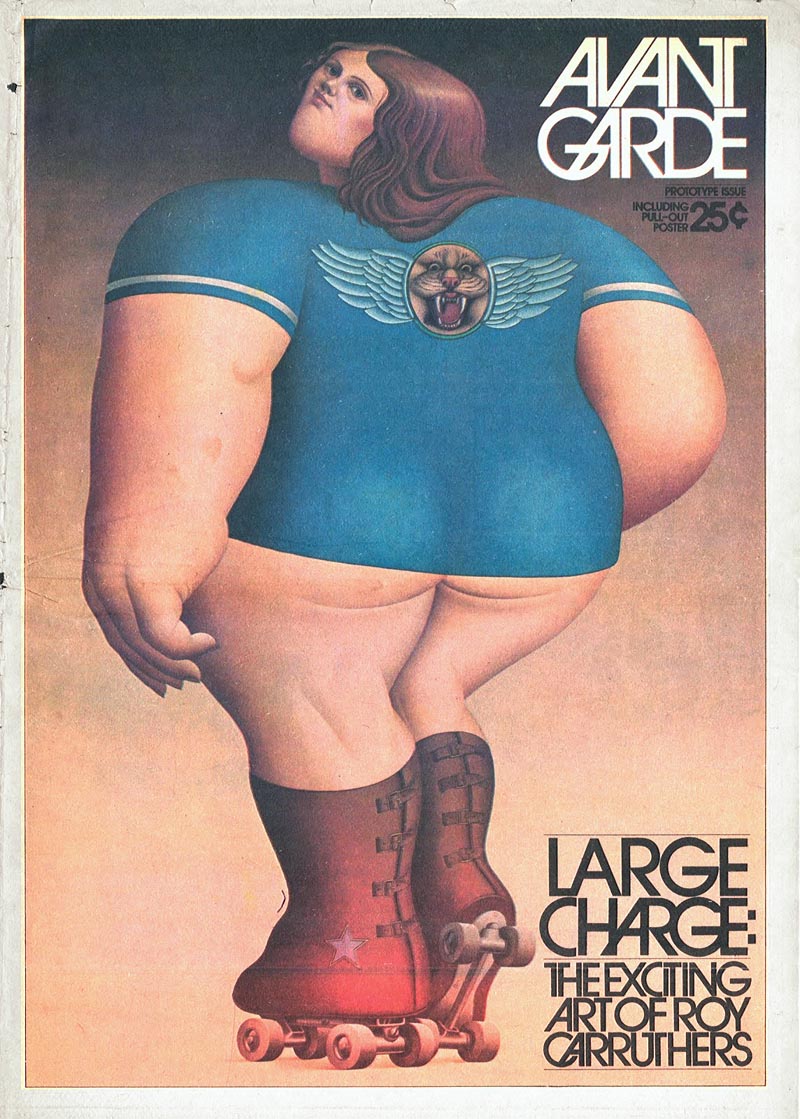 LP: Yeah, I do get what you're saying. This niche we're discussing isn't all-encompassing of the '70s; it's just one aspect of what was happening.
MT: Right. To me the '70s has a look that was actually three different looks: precision was certainly one of them, but you also had the rediscovery of the airbrush and that whole west coast movement by people like Charles White III and some other really brilliant airbrush people.
(Below, Charles White III, 1972)
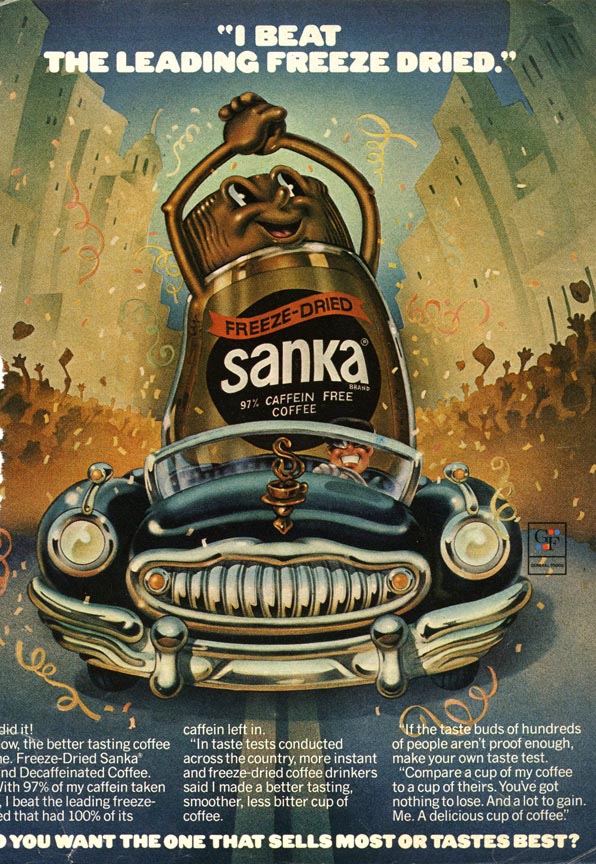
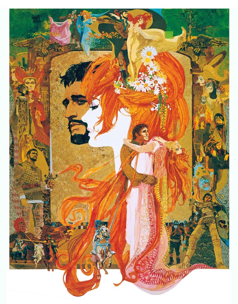
MT: And then another really very strong style of that time was the montage, which was initially most prominently used in things like movie posters where they'd give you the whole movie in one picture. And there was a very strong convention about how to do montages.
(Below, Bob Peak, Camelot movie poster art, 1967)
MT: The other look of the '70s was a kind of rediscovery of surrealism.
(Below, Robert Giusti, 1972)
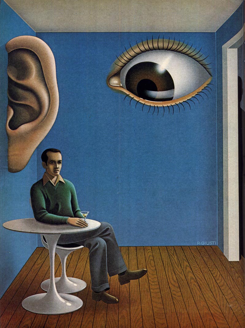
MT: So you had people like Bob Giusti, Roy Carruthers, Gil Stone and many other really good artists doing their version of 'neo-surrealism'.
(Below, Gil Stone, 1973)
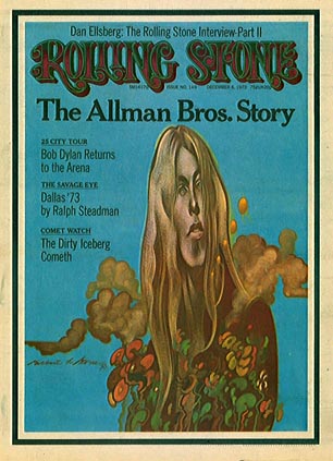
MT: Incidentally, Gil Stone was a friend of mine and I always said he was the result of a shotgun marriage between Magritte and Giacometti. (We chuckle)
(Below, Gil Stone, year and publication unknown)
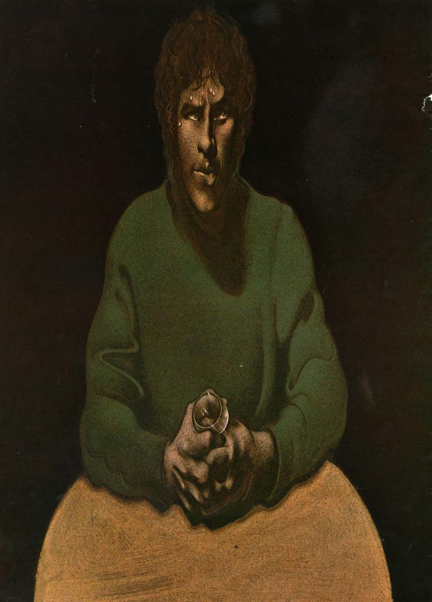
MT: Gil got a scholarship out of art school and went to Florence. And I think - and this is just my opinion - but, his elongated style? I think that came from his trip to Florence where he was working with the Mannerists, who elongated everything. When you see a slide of a Mannerist painting next to a Gil Stone, you see that relationship so strongly.
 (Above and below, Gil Stone, year and publication unknown)
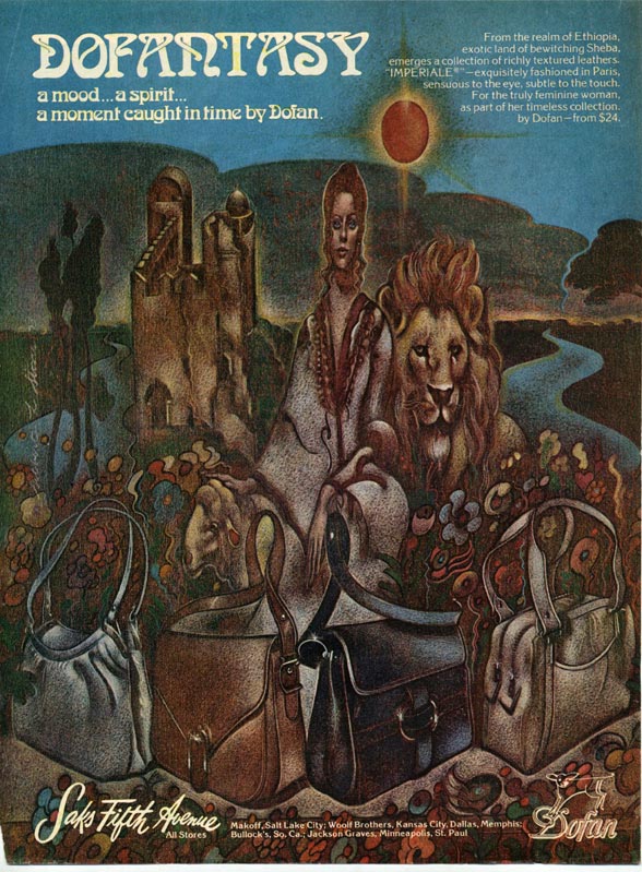
MT: So anyway, those three 'looks' really equal the '70s, for my money. And then there's another sort of ironic twist: Mark English, Bob Peak - they were not really as prominent as they'd been the previous decade, but they were working that montage routine very, very well.
(Below, Mark English, Redbook magazine, November 1972)
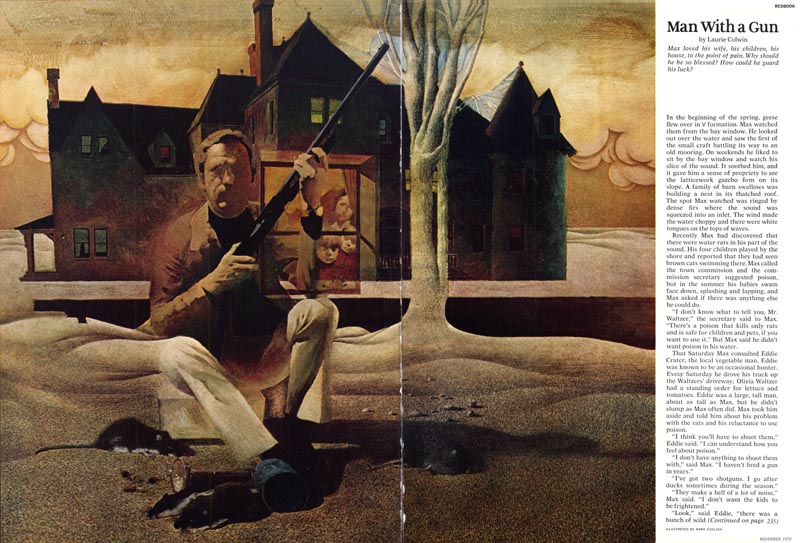
MT: Nobody ever did montage better than Mark English. I think he was the best montage person, ever.
(Below, Mark English, year unknown)
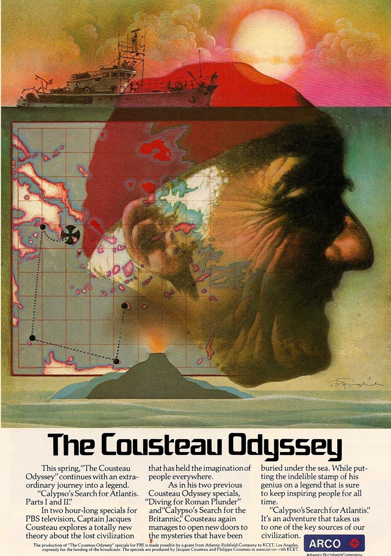
MT: Did I just muddy the waters there?
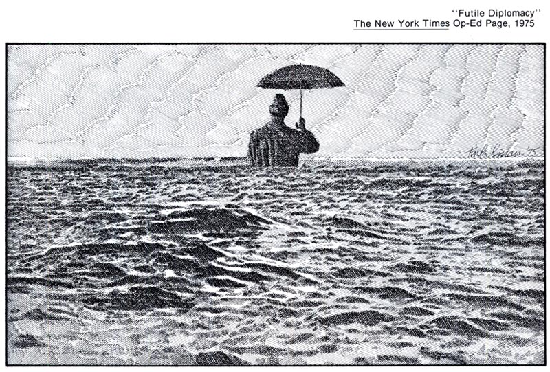
LP: No, not at all. In fact, I think you've helped clarify a few things for me and that's why I appreciate getting your thoughts on this. Because the thing is, despite the fact that your work is linear and more typically black and white, I connect you to this 1970s look as well; this idea of precision and realism (or surrealism to a certain degree). You know, I was looking through your book again this morning, and looking at the kind of pieces you were doing for the New York Times Op-Ed section.
(Below, Murray Tinkelman, NY Times Op-Ed page, 1972)
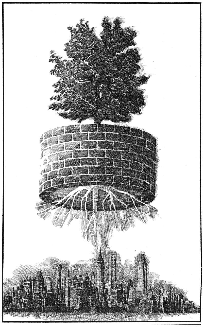 LP: You made a transition from your 1960s John Alcorn-influenced style, which was a cartoonier style, to a more realistic look at that same early '70s time period that I see in all these pieces, whether they're done in airbrush, or paint brush. The thing that is entirely absent in all of this work is the looseness, the sort of wild abandon, the splashing of paint that happened a decade or so earlier as a result of, I don't know - the influence of Abstract Expressionism, maybe? So my question, I guess, is what compelled all of you guys to undertake this return to realism, to a very precise sort of realism, in the early 1970s?
MT: That is a great question and I'm not sure my answer is going to fit neatly into it. When I started with the decorative style it started with Lorraine Fox and then moved up through the Pushpin people - and I loved it and I still do - but my change to the more realistic was not an aesthetic choice. It was a subject matter choice. There came a point, I guess it was around 1970, when I became less interested in technique, in style and in art, if you will, and I became much more interested in subject matter.
(Below, Murray Tinkelman, from 'Alistare Owl' by Herbert A Kenny, 1972)
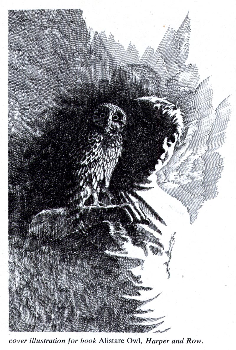
MT: I was, like everybody else, very enthusiastic about materials:
"Let's paint it with chicken fat on waxed paper and bake it in the oven." (laughter) But very quickly, around 1970, I became less interested in
how I did it and much more interested in
what I did. So current news topics... the op-ed pieces... I just felt, personally - and it was very personal - that it was more appropriate to draw these visuals in a more realistic way.
(Below, Murray Tinkelman, NY Times Op-Ed page, 1974)
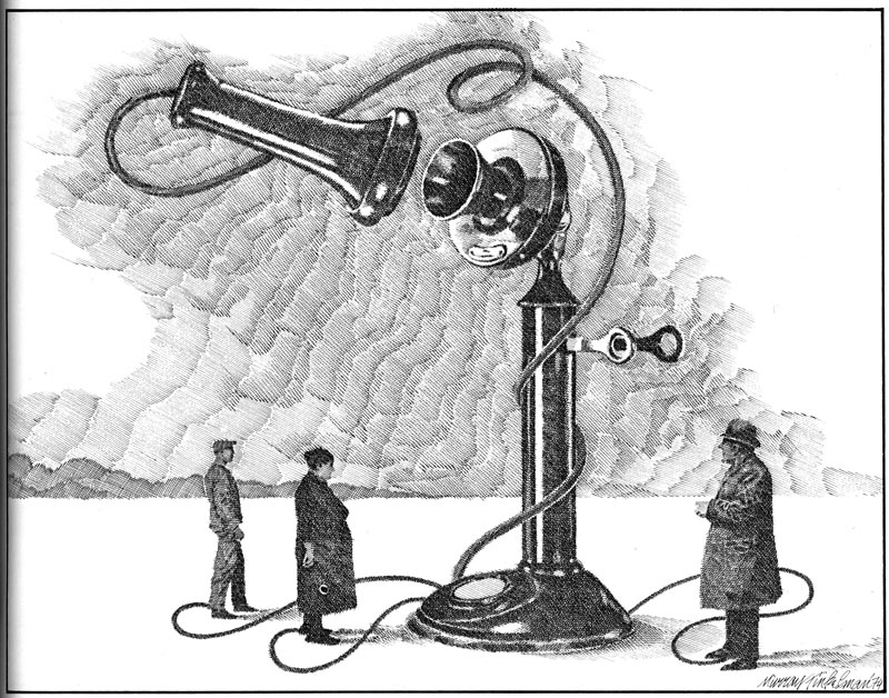
MT: So the pen-and-ink crosshatch became a good vocabulary to describe the subject that I was dealing with. If we're talking about world hunger, for instance, the style of Lorraine Fox or John Alcorn really doesn't make much sense, does it?
LP: No it doesn't.
 LP: So tell me if I'm completely off base about this; if the '60s saw the emergence of this wide variety of decorative stylized work that didn't really even reference the realism of the '50s, do you think that the '70s saw the beginning of an emphasis on 'concept'?
MT: Oh yes.
LP: Ok. Because I'm looking at all these illustrations for magazine covers and articles on a variety of social and political issues...
(Below, Roy Carruthers, early 1970s)
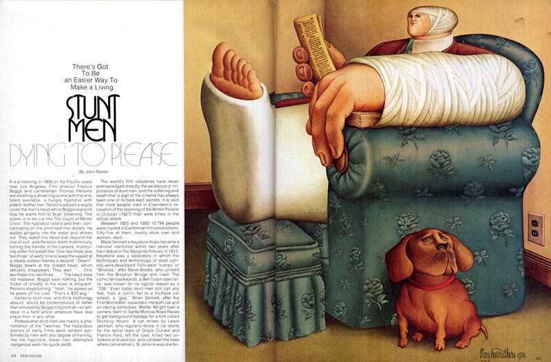 ... and I'm seeing a variety of techniques, all of which reference a kind of realism or surrealism...
(Below, Jerome Podwil, 1973)
... and I'm seeing a variety of techniques, all of which reference a kind of realism or surrealism...
(Below, Jerome Podwil, 1973)
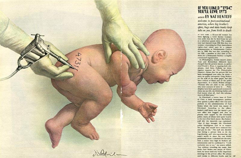 ... but what I'm really looking at, what I'm really seeing now that you've pointed it out, is concept. Conceptual illustration.
(Below, Alex Gnidziejko, year unknown)
... but what I'm really looking at, what I'm really seeing now that you've pointed it out, is concept. Conceptual illustration.
(Below, Alex Gnidziejko, year unknown)
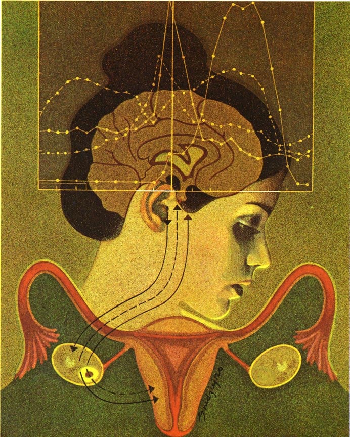
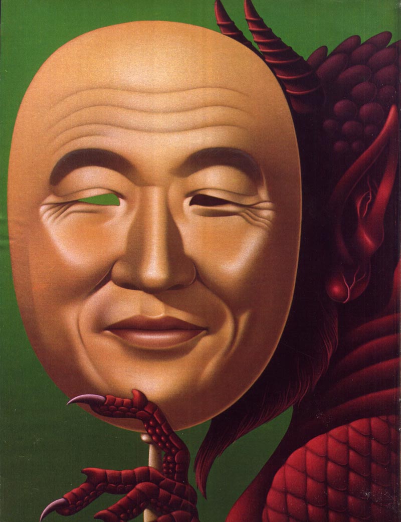
MT: Yes. the term 'conceptual illustration' has always amused me in a way. Because 'conceptual art' in the gallery world was completely different than what art directors would call conceptual illustration. In the gallery world, conceptual art would be covering a gallery floor with two inches of dirt. And that was the show. And what the illustration word considered conceptual art was
"How many ways can we rip off a Magritte." (Leif laughs) And you can quote me on that because, really, that's it.
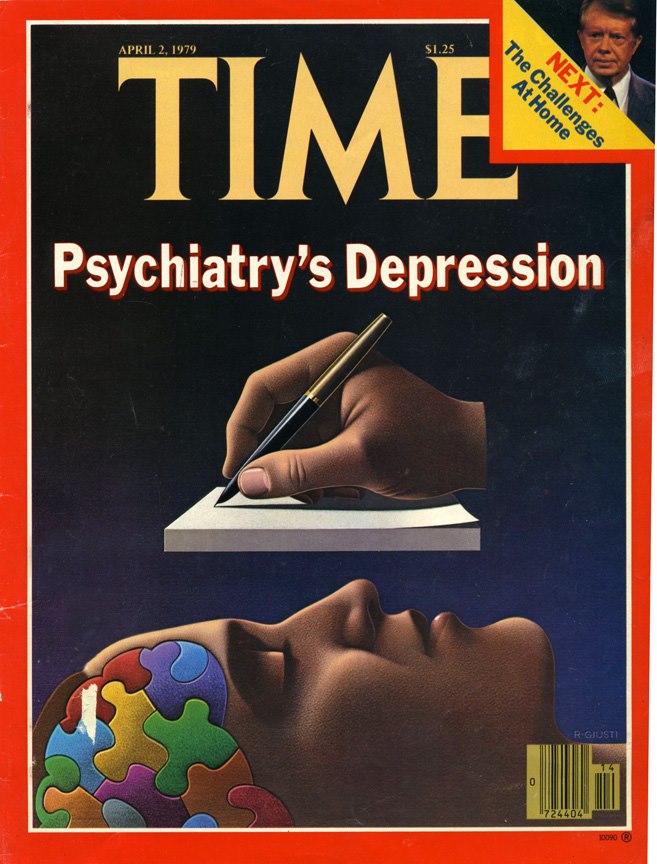
(Below, Robert Giusti, early 1970s)
 LP: Well, sure, I mean look at the example I sent you by Robert Giusti; the Time magazine cover... in a different time and place, no one would doubt that Magritte might have done that piece.
MT: Exactly. And by the way, Bob Giusti is a very nice person and very accessible. I just had him as a guest speaker for
my Hartford group last summer. Really a dear, sweet guy - if you ever want to speak to him...
LP: Sure! I'll tuck that away until you prod me a little more about it.
MT: (chuckles) Ok.
LP: Now, with the decline in illustration for advertising purposes, it seems to me that what emerged in it's place is a lot more of an emphasis on using illustration for these op-ed and socio-political issues. Is that something you would agree with?
MT: Yes. Sure.
LP: Ok. So do you think that's why we see so much of this kind of work being done at the time by a whole variety of artists? Was that basically where you guys could get the work, because I presume there just wasn't nearly as much work available in advertising.
MT: That's true. And the advertising was being done by illustrators that came from more traditional roots. Somebody like Bob Peak evolved through the style, the look, the approach of traditional illustration. For example; Austin Briggs. You don't have to stretch that far to go from Austin Briggs to Bob Peak, or Austin Briggs to Bernie Fuchs. Bernie's breakthroughs were in technique, in style, in quality... but not in any kind of conceptual way.
(Below, Bernie Fuchs advertising art, 1982)
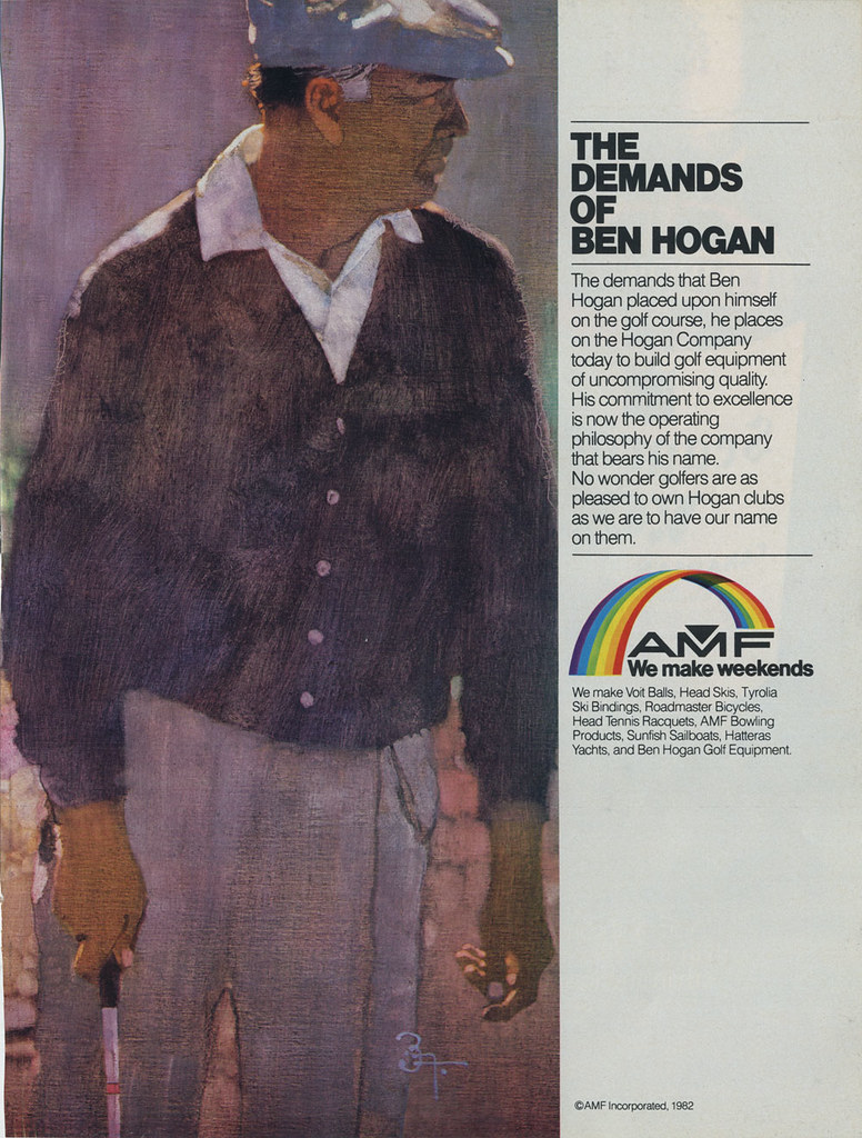 LP: Right. So then returning to the group of illustrators we've been discussing, you see the sort of common theme I'm talking about? I again, I feel you need to be included in that.
MT: Yeah, I think I fit there.

*
Murray Tinkelman has won Gold Medals from The Society of Illustrators, The New York Art Directors Club and The Society of Publication Designers. He has over 200 Awards of Merit from The Society of Illustrators. Murray is the director of Hartford Art School’s limited-residency Master of Fine Arts in Illustration program.
* Many thanks to
Tony Gleeson for providing the scans of the Audi Fox ad series and many other scans in today's post, and to
Matt Dicke for the use of his Bernie Fuchs scan.