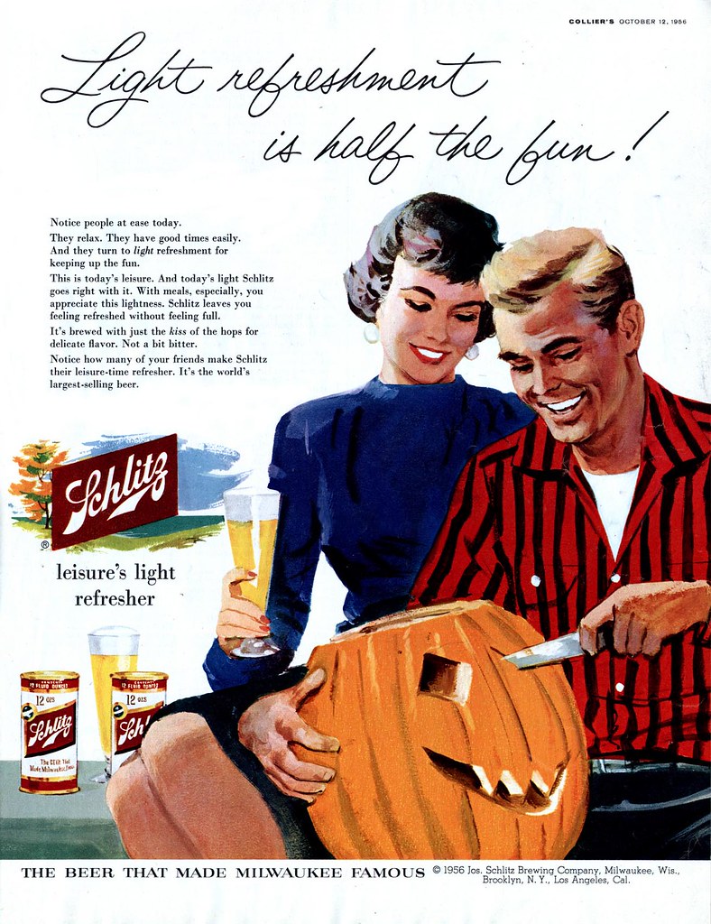
 Tom Hall was one the first artists I took notice of when I became interested in 50's illustration - but I was always frustrated that I couldn't find any information on him. Though he was no Robert Fawcett or Austin Briggs, Hall typifies for me the journeyman illustrator who produces reliable, solid commercial art. I've always had a lot of respect for this kind of worthy craftsman, and have always been a little miffed that artists like Hall have gone unrecognized.
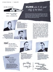
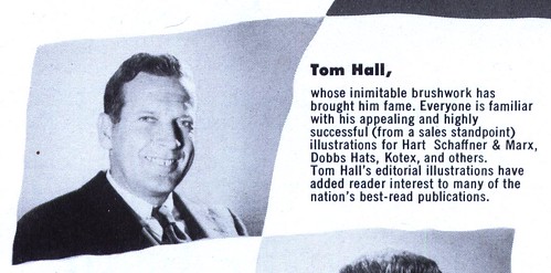
 Then this ad for Kling Studios of Chicago in a 1952 issue of Art Director and Studio News provided at least a piece of the puzzle.

So now we know what Tom Hall looked like, that he was a Chicago illustrator at the massive Kling Studios, and though I was well aware of his advertising work (plenty of which you can find in my Tom Hall Flickr set) its news to me that he did editorial illustration because I've never come across even a single piece.
I wish the folks at Kling had included a little more biographical info in their write-up on Hall, but for now, that information remains a mystery.
Glamor & beer---gotta be the last time they put THAT forth. Visited his Flickr set. Wish folks still dressed half as well now as they did then tho'....
ReplyDeleteThanks for posting these Leif!
Zach
Thanks for your comment, Zach! Yes, I also sometimes imagine what it must have been like to show up each morning at my drawing board or easel in a crisp shirt and a tie. Those were the days! ;-)
ReplyDeleteHi Leif,
ReplyDeleteYou are so correct; Ya' gotta' have respect for, as you say, the "journeyman" illustrator. Nothing wrong with being a reliable, successful artist.
I would still like to be that!
hi leif!
ReplyDeletedo you know if this is the same tom hall that illustrated these four covers for some judge dee stories?
http://i49.photobucket.com/albums/f266/jayenticollins/deecovers1_316.jpg
http://i49.photobucket.com/albums/f266/jayenticollins/deecovers2_181.jpg
i've always wanted to find more of his work. i hope it's the same artist!
thanks!
jayenti
Eric; so would I! ;-)
ReplyDeleteJayenti;
Those are some lovely illustrations - quite different from the work of this Tom Hall from the 50's, but who knows, it could be the same guy as a more mature, accomplished artist at a later date...
Tomorrow I will confuse the issue further by showing you a couple of other pieces by another Tom Hall (or maybe the same Tom Hall)! ;-)
The style reminds me a lot of the Jane and Peter reading books we started off with when we were very young... don't know if you're familiar with that? :-)
ReplyDeleteI googled them and I see what you mean, pickleshane - its that very standard sort of generic illustration look, isn't it? That's exactly what I'm talking about: not terribly spectacular, but nice solid, well done commercial art that's worth recognizing for the quality of the craftsmanship.
ReplyDeleteThanks for commenting! :-)
Exactly! :-) You put it into words a lot better than I could ever hope to :-)
ReplyDeleteI work for Hart Schaffner & Marx in Chicago. Tom Hall's original artwork is framed around the office. I wish the company could do a collection of his prints because I think the style and humor of his illustrations are really appealing. Thanks for taking note of his talent!
ReplyDeleteWow! how lucky you are to get to see Tom Hall's originals every day at work, anonymous! If I ever get to Chicago I'm going to drop in for a look! Thanks for commenting :-)
ReplyDelete