
No one describes this approach to composition better than does my friend Armando Mendez on his excellent website, The Rules of Attraction: Whitcomb's illustrations most often involved "zooming in on people--mainly pretty young city girls for large format magazines aimed at a feminine audience --and everything else in the picture became design not narrative elements." As well, Whitcomb's models were "transformed by idealization formulas Whitcomb and [Al]Parker, with others like Haddon Sundblom, made standard throughout the industry."
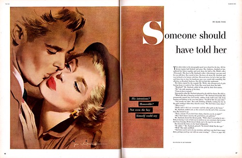 Whitcomb found this formula so successful, he used it not only in story assignments, but in countless ads...
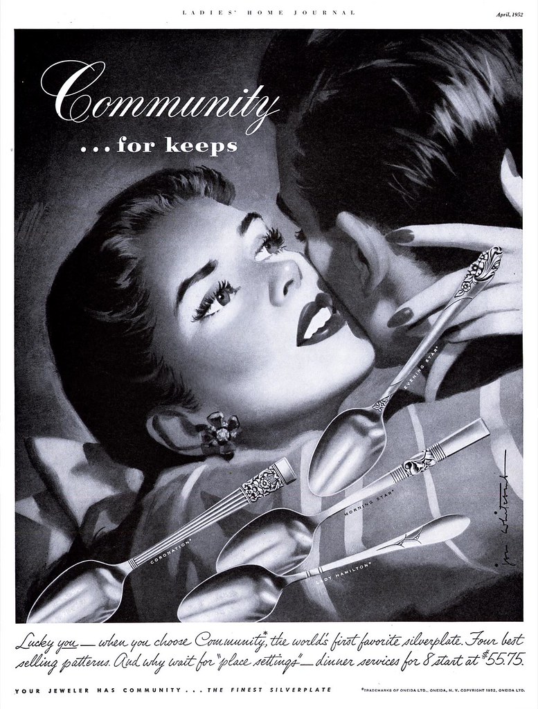 They are so common in women's magazines from the 40's and 50's that I stopped marking them for later scanning.
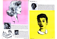
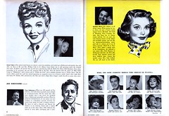 Whitcomb was enjoying not only unprecedented exposure for his work but as a public figure as well. His celebrity status is apparent in this October '53 issue of Cosmopolitan magazine, which gave him six pages to discuss his choice of models - all actors or performers from television, Broadway or Hollywood. Its interesting to see how Whitcomb applied his formula for idealization when the model's photo is set next to his drawing. And notice also that once again, its all about the head-shot.
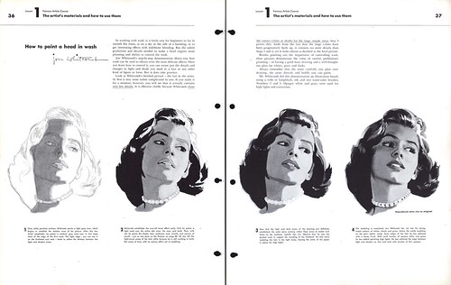
 Returning to the crowd scene at the beginning of this post; remember the Famous Artists School lesson from last week on designing a crowd scene as described by Albert Dorne? Jon Whitcomb was also one of the twelve founding faculty members at the school. Which lesson in the FAS binder does Whitcomb teach? "How to Paint a Head in Wash". Of course.
You'll find all of today's images at full size in my Jon Whitcomb Flickr set.
I am really enjoying your thoughtful commentary on Whitcomb, Leif. I never thought about the connection between Dorne and Whitcomb, but it makes perfect sense and sheds some interesting light on the transition of the times.
ReplyDeletePersonally, I don't care much for Whitcomb's work. There were others, such as Al Parker, who suffered through the "big head" phase of American illustration with far more artistic integrity. (For another fascinating perspective on how the illustration style of the day was affected by the culture following World War II, read Al Parker's superb essay on "The Decade: 1940-1950" in Walt Reed's The Illustrator In America.)
Anyway, I had to laugh at your discovery of a "crowd scene" from Whitcomb. For him, a crowd scene means big heads in the foreground and smaller heads in the background-- all surrounded by night shadows which eliminate the challenging problems of perspective, foreshortening, interaction of figures, etc. Compare this "crowd scene" with the complex architecture of the crowd scene from Dorne that you posted last week, and you can see that we were well on our way to the dumbing down of America.
Thanks for your comment, David - I will be sure to read Parker's essay!
ReplyDeleteI know exactly what you mean about Whitcomb and the dumbing down of America, or more specifically, the dumbing down of illustration. Its the point Noel Sickles and Gil Kane made in that Comic's Journal interview, using Whitcomb as the marker of the demise of "good" illustration.
That's why I'm so amused by the Cosmo article where Whitcomb describes the qualities of his various movie star models - by that time, he had evolved his idealization formula to the point where, really, no model was necessary.