 ...or in goofy costumes...
 ...or nearly nothing at all,
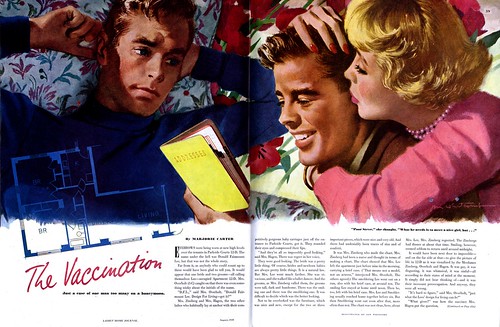
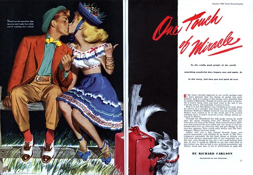
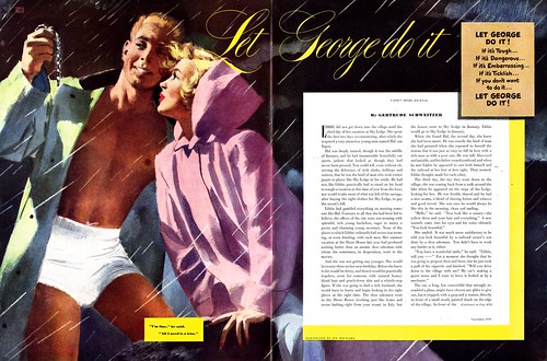
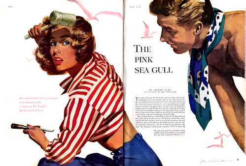
 Jon Whitcomb seems to have applied the same formula for idealization to his boys as he did to his girls; they are all homogeneously cute.
 Consider this "Jon Whitcomb's Page" from the February '53 issue of Cosmopolitan: its kind of amusing that Whitcomb went to the trouble of hiring all these different models to pose for him. When you look at a finished work, could you tell which guy was which, really?
 Of course guys only served in a supporting role to the real focal point of any Whitcomb piece (the girl) but its worth making note of because, as the most visible women's magazine illustrator of the time, Whitcomb was a powerfully influential force on a generation of female magazine readers. His interpretation of the ideal male lover was almost certainly co-opted by thousands (millions?) of young girls and women across America.
Or maybe its entirely coincidental that the generation of American females that grew up in the 40's and 50's started buying their daughters millions of Barbie and Ken dolls in the 60's.
Finally, here's one really unusual piece: one of the latest I've ever come across by Whitcomb, its from 1960. Its unusual for many reasons, not the least of which is the detailed environment - something Whitcomb rarely got involved with. As well, it seems to be painted on canvas with oils or acrylic; again, not typical for Whitcomb. The people are shown in full figure, very unusual for the king of the "big head" school of story illustration. But the most unusual thing about this piece is the uncanny resemblance the man bears to Jon Whitcomb himself. I think the artist painted a self-portrait here!
 For a 54 year old man, he looks surprisingly...cute.
All of today's scans can be seen at full size in my Jon Whitcomb Flickr set.
Great post, today, Leif!
ReplyDeleteThe "Playboy/Plumber" piece is definitely on canvas, and you're right about the composition. It looks very much more like something McGinnis would compose for the magazine illos he did, with the full figures and detailed background. I think by around 1960 there was a definite move from "big heads" to "scenic" illustration.
As with most artist of that period, I always wonder what happens when their spotlight fades. Are they already at the age of retirement, or are they forced to find other, more "stable" work in an ever changing market.
ReplyDeleteThe fear is always been out of work. But being out of work and out of "style" is a whole other matter.
=s=
Thanks for the great Jon Whitcomb posts. Will you be doing one on another "big head" artist, Coby Whitmore?
ReplyDeleteSpeaking of "big head" art, how popular was that term? I had the chance to help interview Alex Toth before he died and I mentioned "big head" art and he had no idea what I was talking about ( that is, he knew the art, but never before heard it referred to as "big head" art )
Thanks for your great comments guys!~
ReplyDeleteJoe; I'm not sure what the move was around 1960, except away from illustration in general. I don't have many 60's magazines but they consistently have only atiny fraction of illustration - maybe 3-10 pieces throughout, including ads - compared to 50's mags. Its sad really...
Shane; With the rise of paperbacks, many magazine illustrators made a pretty smooth transition out of magazines. Others went west to enjoy a semi-retirement painting cowboys for the "fine art" market. If Whitcomb didn't blow the money he made in the 50's he could easily have retired comfortably on that, plus, remember he was a principal in the Famous Artists School. I've read that group of 12 all enjoyed tremendous wealth from the success of the school.
Benton; I think that term is bandied about more among today's students of the history of the period than by those who experienced it first-hand. They were also known as "clinch" artists. ;-)
What an amazing thing that you got to meet and interview Alex Toth!