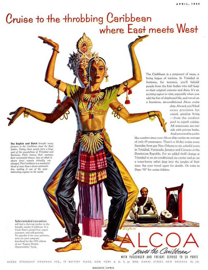
The desire by art directors of the 50's to find interesting and appealing twists on the realism demanded by clients was likely one reason James R. Bingham had so many ad accounts. Bingham's style of realism was not the photographic realism of a Douglass Crockwell or an Earl Mayan. Nor was it the romantic, idealized realism perfected by some of the Cooper artists. Bingham's realism had a sort of super-constructed, designed-to-perfection orderliness. It was "realism plus"!
Whether dealing with the natural or the man-made world, Bingham put his distinct style on every element in the artwork world his people inhabited.
This distinction makes even an unsigned Bingham, like the one below, instantly recognizable.

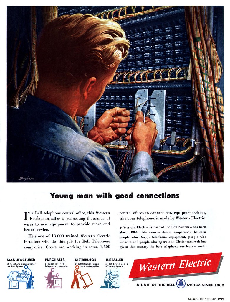
Looking back to the mid-forties (below), when Bingham was painting with a greater degree of naturalism, it only takes a squint of the eye to see his style of a decade later beginning to emerge.
These images have been added to my James R. Bingham Flickr set.
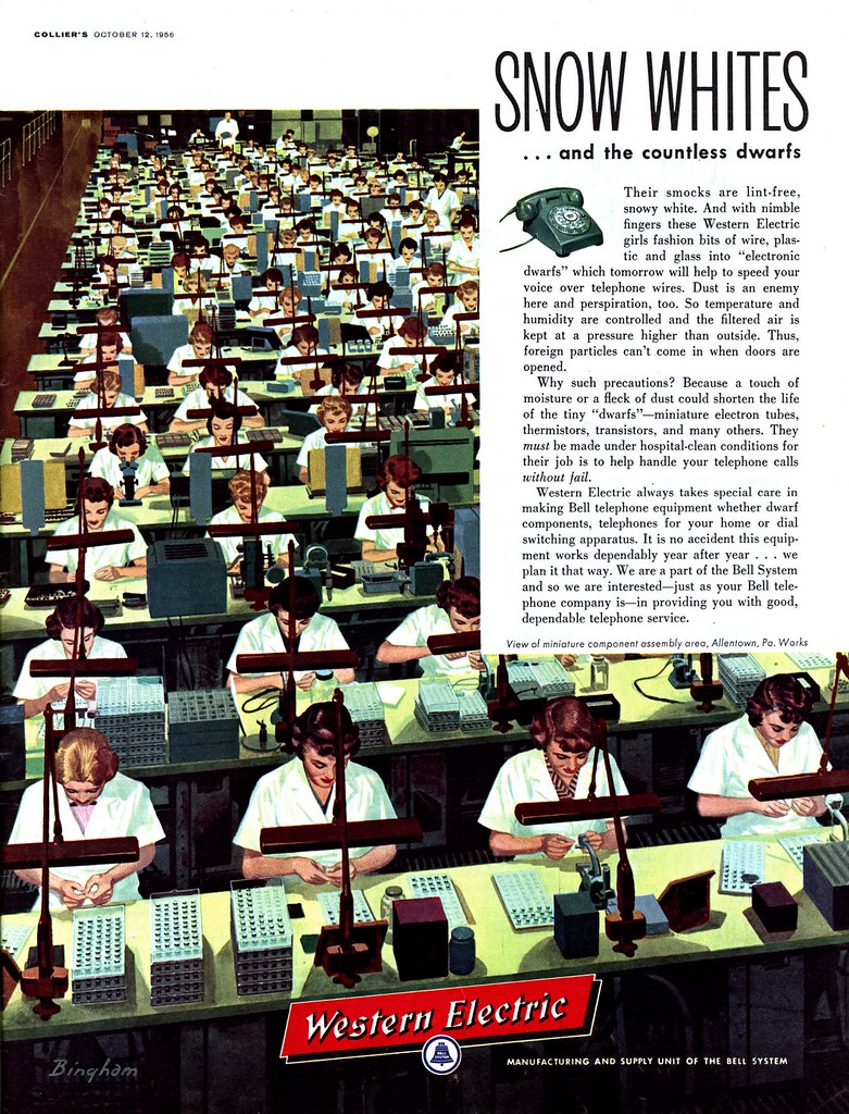
Neil; I know, those Western Electric ads are mind-boggling, aren't they? I imagine Bingham painting all those wires and circuit doohickies in that electrical panel, or all those operator ladies, thinking to himself, "only twenty to go, only nineteen to go, only eighteen to go... god, if this job didn't pay so well...!"
ReplyDeleteOn those spots from the other day: agreed :-) We'll look at some nice related material tomorrow!