These stories were usually serialized over several issues and began with a nice big double page spread to help draw the viewer in. But subsequent chapters were allotted far less visual real estate.

This doesn't appear to have daunted the artist...
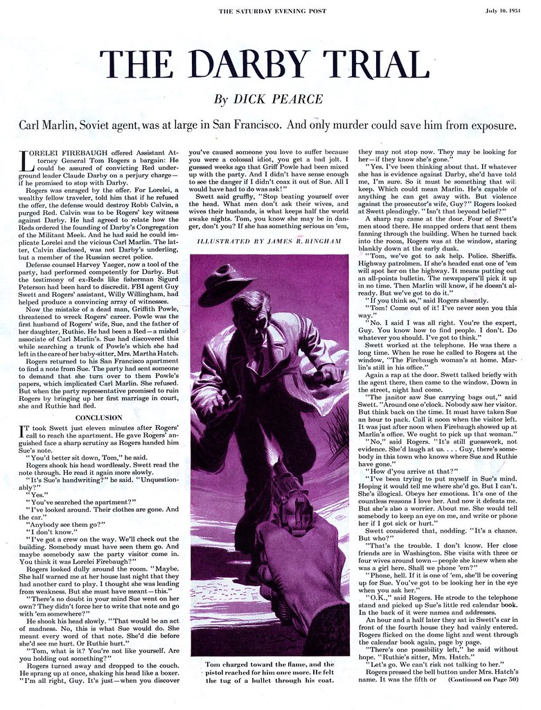
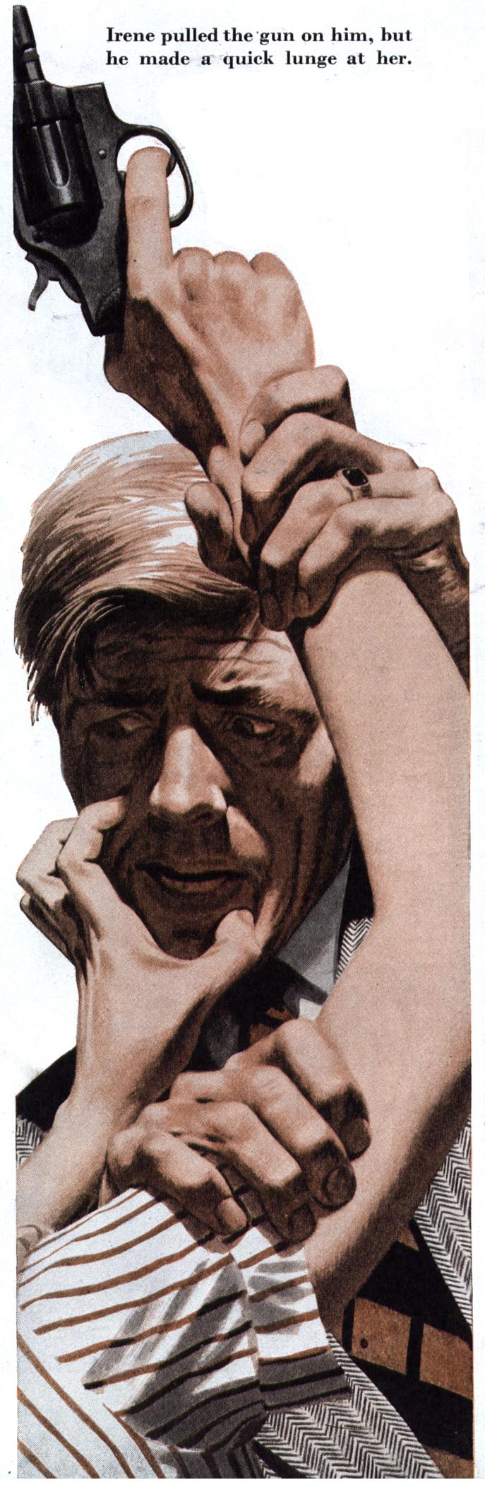
...some of his most powerful compositions are only one column wide and half-a-page high.
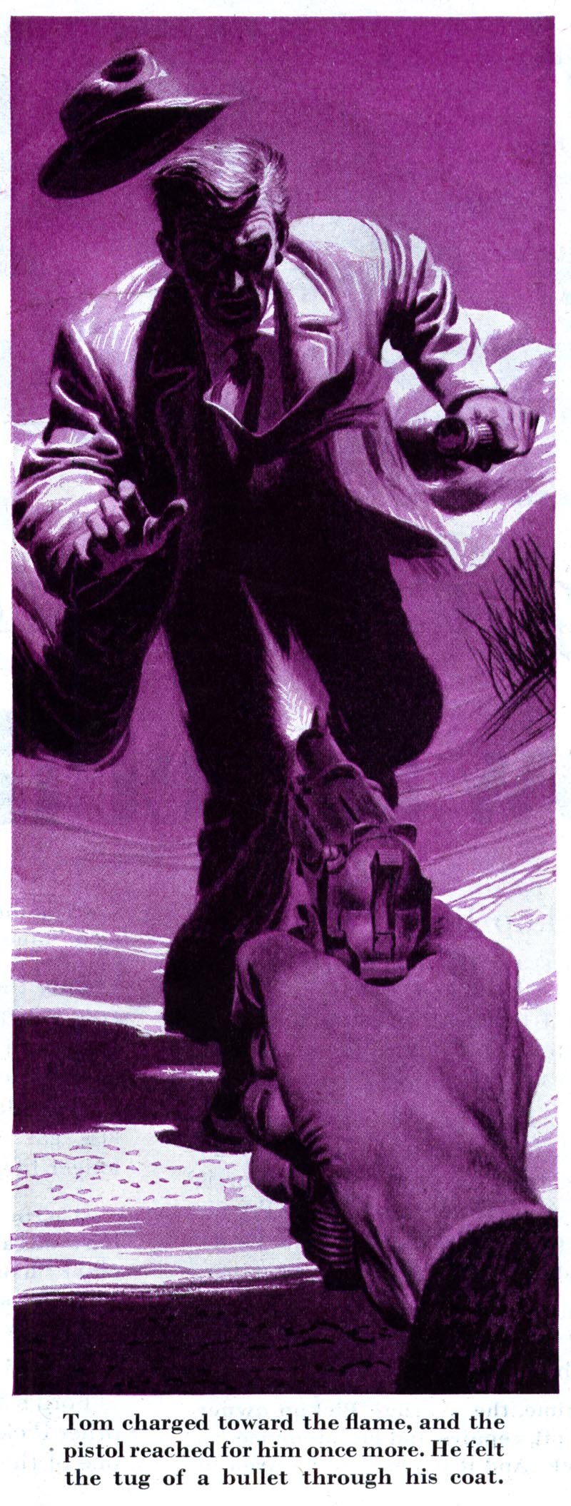
He also seems to have luxuriated in a limited colour palette. Black & white plus one colour is a hallmark of Bingham's crime art. It suits his noir-ish approach perfectly.
I love Bingham's stark silhouettes and striking compositions in these long, slender illustrations. They are as worthy of praise and study as his full page pieces.
These images have been added to my James R. Bingham Flickr set.
The detective/noir illustrations are great. I teach detective ficiton quite often, and I've been thinking about including a look at magazine illustration, as well as book jacket covers in the course.
ReplyDeleteDo you have access to some giant archive of Saturday Evening Posts? I've been remembering some of the striking Post illustrations I saw as a kid via my grandparent's Post subscription.
In particular, I remember the page and half illustration for some short story about ghosts...the premise was that a teenage couple dare each other into sneaking into an abandoned ballroom where legend tells of two lovers killing themselves on the dance floor, leaving a bloody X...
That's pretty cool, prof estevez - and yes, I have a large collection of Saturday Evening posts and many other magazines bought from thrift shops, second-hand book stores and of course, ebay.
ReplyDeleteThe illustration you describe sounds like this one by Robert Jones - a fantastic, versatile illustrator.
Hope you enjoy seeing it again! ;-)
I love the last illustration in your post. Such a striking composition, and beautifully executed. You make me want to start prowling the thrift stores to find my own copies.
ReplyDeleteOMG!!!! That's it!!!
ReplyDeleteThank you so much! I've thought about that image for years!
Prof E; I'm so glad I could help. :-)
ReplyDeleteColin; I encourage you to do so - then scan those puppies and get that imagery back in circulation. Its a tragedy that so many great artists are slipping into obscurity.
* be sure to always give credit to the artists and publishers! :-)
Neil; my gosh - you're right! You could really clobber somebody good with that giant champagne bottle!
ReplyDeleteOn Bingham - agreed - I think of Bingham as a designer as much as an illustrator. His shapes and compositions are all about construction, if you know what I mean, whereas some illustrators use a more "organic" approach.
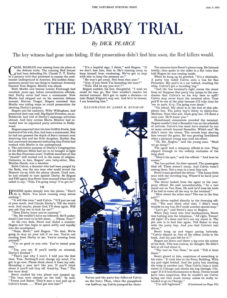
Bingahm is first rate, Leif, and I am really enjoying this series. That image of the man jumping to the dock is one I have admired for a while, but I never knew who did it. I put it on my blog some time ago as the work of a great unsung artist. Now that you have educated me,I will need to go back and correct it!
ReplyDeleteLike Professor Estevez, I have long been haunted by memories of illustrations I saw when I was young. Since you are performing this wonderful finder service, I have a list of about 25 images to describe to you.
That sounds like a fun assignment, David. I look forward to that list!
ReplyDelete