Celebrating illustration, design, cartoon and comic art of the mid-20th century.
Wednesday, February 28, 2007
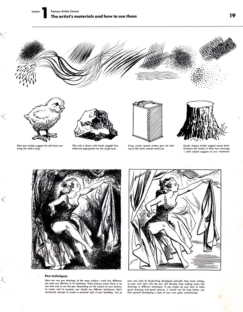
The FAS: Teaching the Art of the Inked Line
In the 'Commercial Art and Illustration' volume of the Famous Artists School binders, the art of the inked line is one of the very first lessons. Who could teach this lesson any better?
After all, the 12 founding members of the FAS were among the most skilled, successful and popular illustrators of the 20th century. You could do a lot worse than to be the beneficiary of their collective knowledge!
Some people scoff at the Famous Artists Course because the images are dated and because the course was offered by correspondence -- as if it were just a money-making scam. But for the sincere and ambitious student of illustration you could not ask for better instruction.
As a kid I learned a ton about drawing with pencil, pen, brush and ink from a book called How To Draw Comics the Marvel Way.
Now I realise that the lessons in that book were virtually lifted from the Famous Artists Course and simplified for a younger audience. I wonder how many other illustrators of more recent generations have studied from the teachings of Albert Dorne, Robert Fawcett, Austin Briggs, et al and, like me, didn't even know it?
Green kid or seasoned vet, we could all benefit from reviewing what the Famous Artists taught countless thousands all those years ago.
Take a look at these lessons at full size in my FAS Flickr set.
Tuesday, February 27, 2007
The Art of the Inked Line: Frank Lacano
Beautiful, inspiring drawings are all around us, often escaping notice because we don't take the time to really look.
I discovered these wonderful ink line drawings by Frank Lacano in a bunch of science booklets for sale at a local thrift store. I paid 25 cents a piece for the booklets - but the work by Lacano is invaluable. They reveal so much about good design, composition and technique... and Lacano teaches as much by what he chose to leave out as by what he chose to put into each illustration.
Because these booklets are from 1971, I might be pushing the parameters of the vintage era Today's Inspiration covers (afterall, I was a kid in 1971 and I'm hardly vintage... am I? Oh no...)
But Lacano had long been a master of the ink line drawing-with-spot-colour style of illustration by the time he did these pieces. He had done similar work two and three decades earlier for the likes of Reader's Digest and Coronet magazine.
I have a special fondness for this type of work... its an approach to illustration that was popular with pulp and digest magazines in the 40's and 50's -- publications that used poorer printing methods and cheaper paper. Its a shame that its not used more today because, as you can see here, the effect can be quite striking. In many ways, more striking than full colour.
Lacano makes it look easy -- but the artist must decide which elements will be line and which will be shape - and how the combination will most effectively create an entire picture that not only defines its elements but also creates the illusion of mood and lighting - and without the benefit of local colour. Its a fun challenge, but anyone who's tried it will tell you how difficult it is to do really successfully.
As though that weren't enough, Lacano embues his inking style with an exciting character and energy - well worth examining at closer range. Why not do so... take a look at the largest size versions of these images in my Frank Lacano Flickr set.
Monday, February 26, 2007
The Art of the Inked Line: DMS
Just because a drawing is small and the subject matter seems inconsequential doesn't mean it isn't praise-worthy.
And just because the artist who drew the picture isn't one of the recognized masters of the period doesn't mean we should not celebrate his talents.
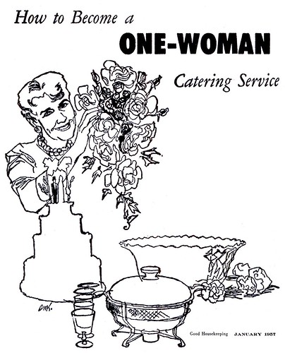
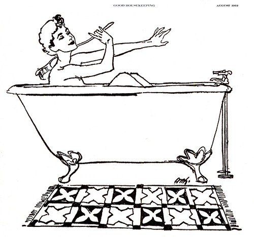
Around the mid-1950's, Good Housekeeping began an insert feature on coarse paper called "The Better Way - A monthly service portfolio designed to keep readers informed on numerous matters factual and fascinating." Art Director Gene Davis commissioned about a dozen small spot illustrations each month for this section.
The artists who worked on 'The Better Way' never received a credit line... and since the illustrations were reproduced at a very small size, many seem to have opted for signing with initials instead of a full signature (which likely would have become obscured).
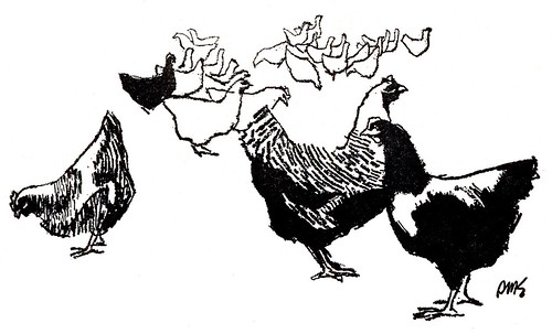
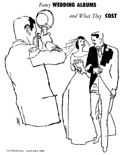
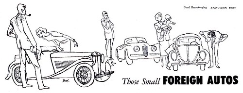
One of the steadiest contributors to this section was an illustrator who signed his work with the initials 'DMS'. This artist was, in my opinion, doing some really lovely work. His contour-line ink drawings showed an economy and sensitivity that made for some excellent visuals. If we "read between the lines" of DMS' illustrations, we can see he was a very skilled professional.
And here's a really odd coincidence: around that same time, another illustrator, David Stone Martin, was powerfully influencing the way line art was being done. Up until that point most line art styles had a clean, realistic, very commercial look to them. David Stone Martin (already reknowned for the many record jackets he had illustrated for top jazz artists) was now doing high profile magazine illustrations in his trademark scraggily line style. Now that style was being imitated and modified by many other illustrators. You can see David Stone Martin's ( or DSM's) influence on DMS' work!
Of course you can see that DMS was less stylized (there is an underlying structure of 'realism' to most of his work) but its that looser, organic quality that the actual line displays - the character of the line - that makes the work so appealing and elevates it above the merely utilitarian.
This week, let's take a look at the art of the inked line - in all its glorious variations!
*To truly appreciate the quality of DMS' work, I urge you to go to my new DMS Flickr set and view each image at its largest size.
Friday, February 23, 2007
A Sleeping Giant Awakes
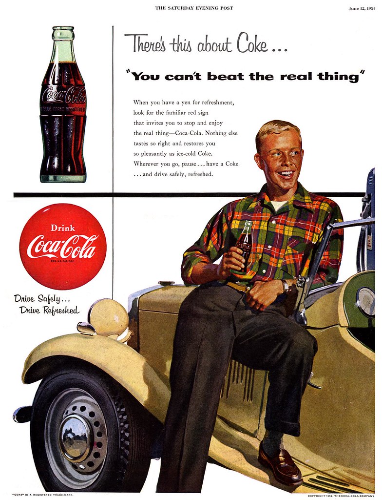
I'd love to have been a fly on the wall in 1956 when Coca-Cola's ad agency convinced the soft drink giant to undertake a radical departure from its long-running wholesome, all-American small town approach.
While Pepsi stayed the course with its Sociables series of ads, Coke, which was running photographic ads that year, suddenly commissioned a dozen illustrations by a relative newcomer, Jack Potter, whose style could certainly be described as 'avante garde' for the time. Not only did Coke leap into the abyss - but they chose to run these ads on the high profile and expensive back covers of major magazines like Life, Look and The Saturday Evening Post.
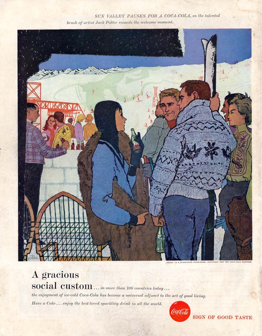
Imagine what this commission must have meant for the 30-year old Potter! Though he had relatively little published work at that point, he was about to be the visual representative for a major national ad campaign lasting an entire year and occupying some of the most prestigious media real estate in the country. I have to wonder what other, better established illustrators of the day must have thought of this...
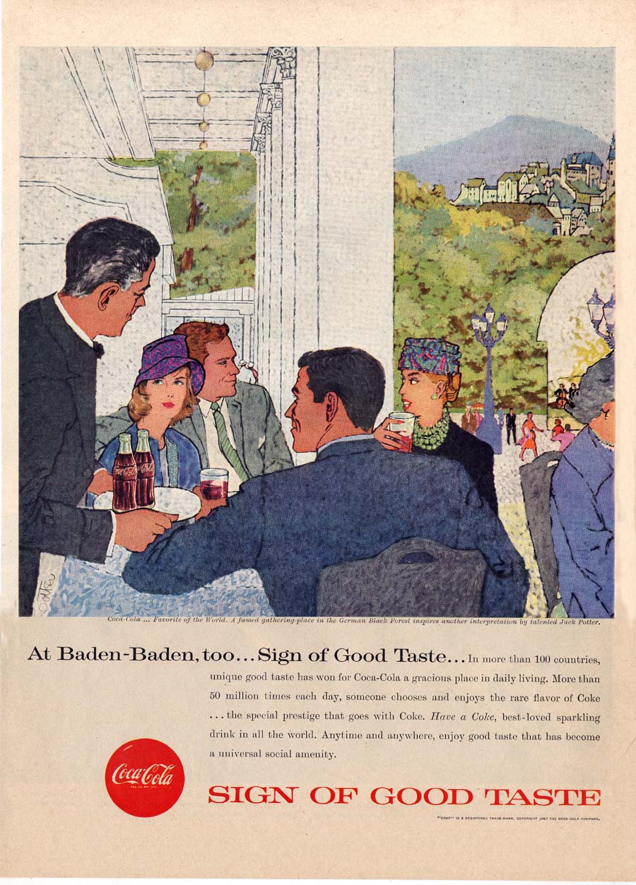
And perhaps more importantly, what did Pepsi think of Coke's full-bore assault on the brand's carefully nurtured marketing strategy? Was Coke's year-long experiment the catalyst that pushed Pepsi into 'modernizing' its visual presentation?
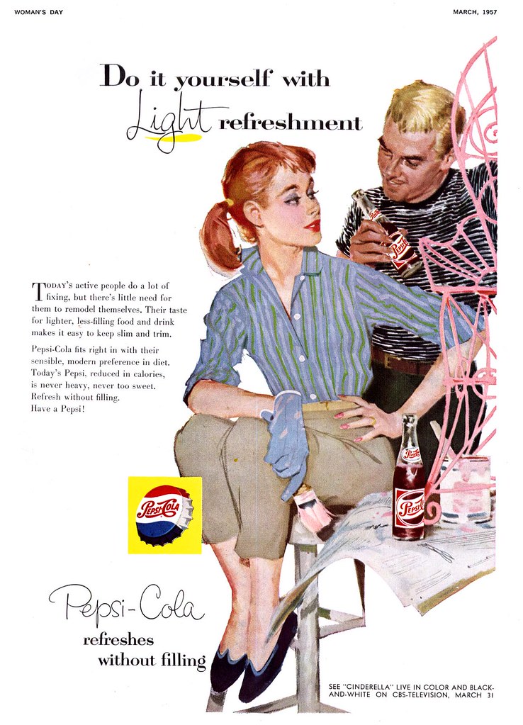
If yesterday's examples from 1959 represent a stylistic shift in approach then this series of ads (below), which Pepsi also ran during that year, suggest that the company was indeed casting about for a new identity. The style and design (if not the subject matter) are really quite a dramatic departure from what had been a solid, steady and long-running brand identity.
Illustrated by Roy Besser, this series strike me as having been designed to appeal to the same demographic that was seeking out the just-that-year released Barbie doll.
Why did Pepsi run these ads in mainstream magazines like The Saturday Evening Post? They feel like they'd have been more appropriate for the readership of Seventeen magazine...
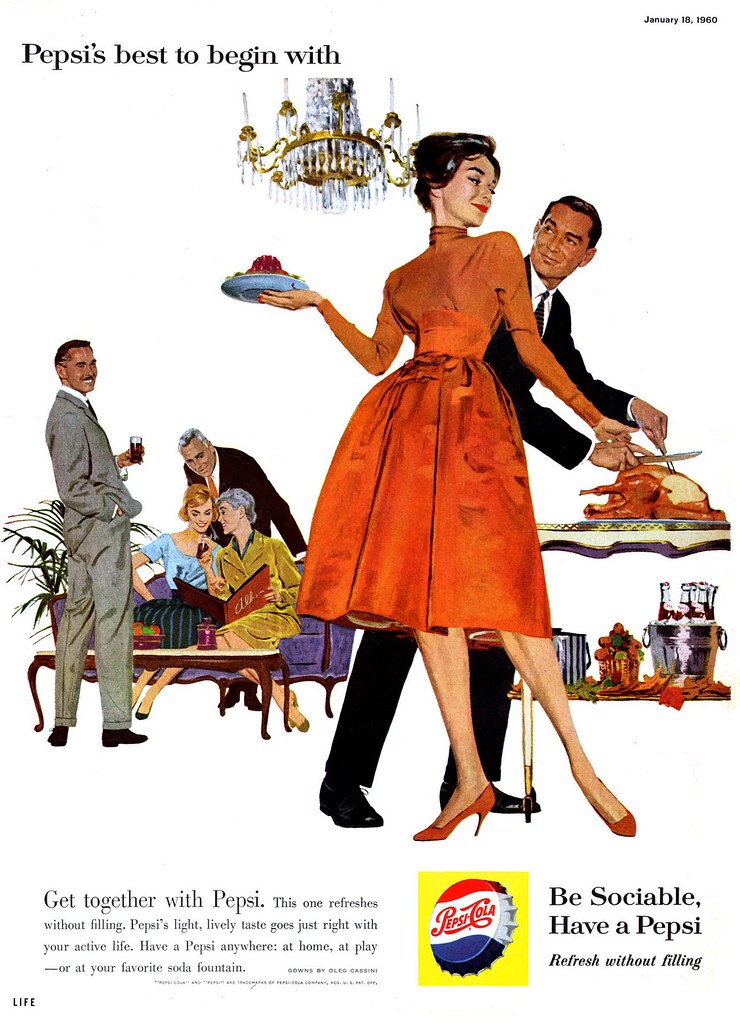
In 1960, Pepsi returned to the tried and true look that had been its hallmark throughout the 50's. The Sociables were dating again!
Yes, they were socializing with others -- but clearly they had eyes only for each other. The focus was on the couple while everyone else remained in the middle distance.
In an odd bit of brand continuity, each ad seems to have required the illustrator to include a powerful red motif as an element of clothing on the beautiful woman which, in my opinion, would have had the viewer subconciously thinking about drinking... a Coke!
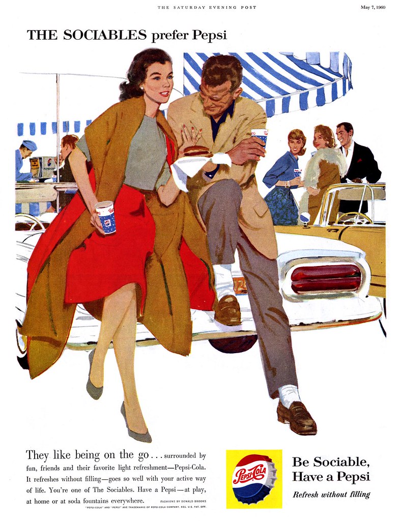
Whatever the case, the point becomes moot after 1960. Like so many other advertisers, both Pepsi and Coke shifted their focus to photography. With the exception of Haddon Sundblom's Coca-Cola Santa Claus, relatively little illustration was used by either company from then on. The Sociables quietly faded away.
All of today's images have been added to my Beverages Flickr set.
Thursday, February 22, 2007
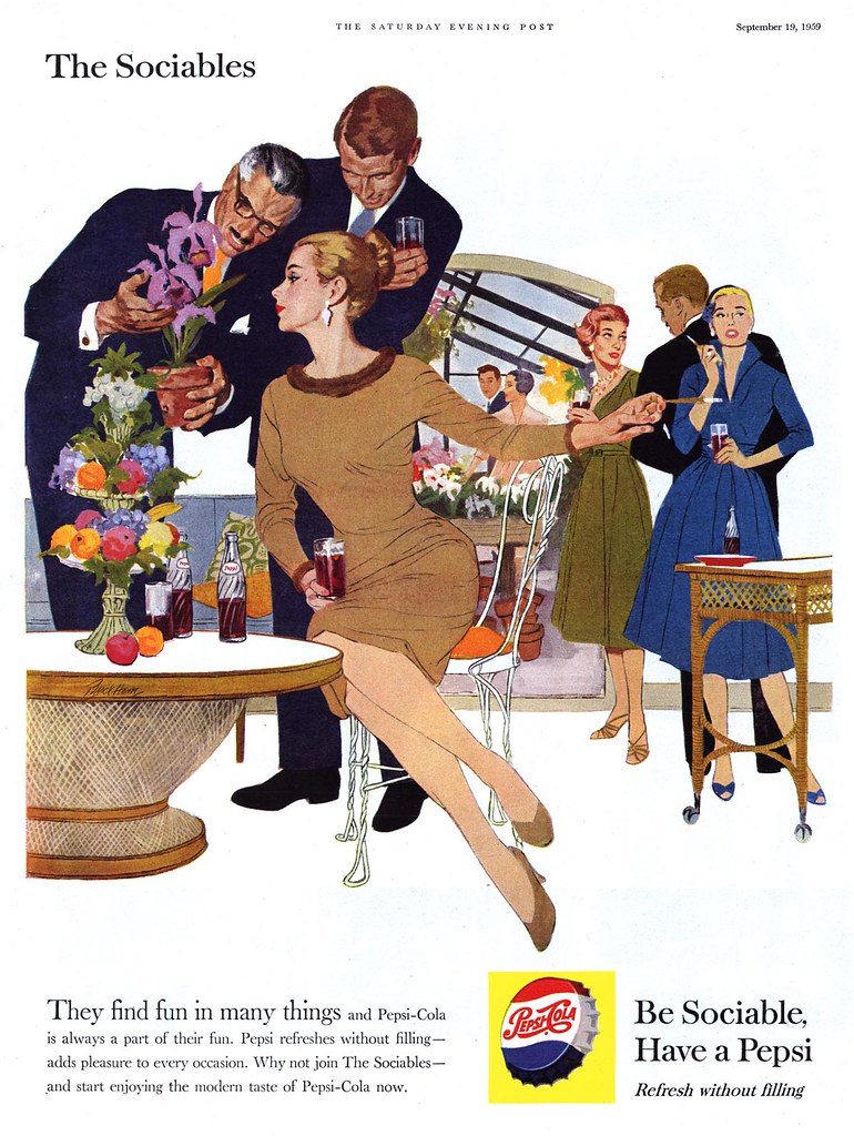
The Sociables Settle Down
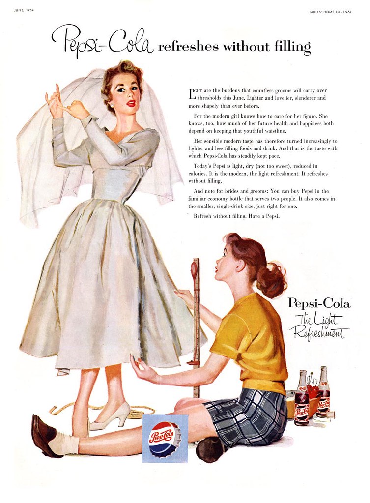
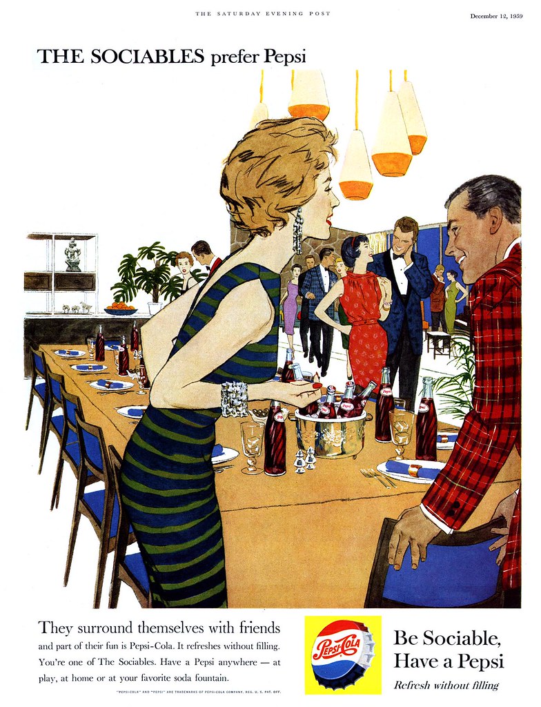
In 1959 something changed for The Sociables. They'd spent most of the decade dining and dancing and painting the town red, white and Pepsi blue. We'd attended their weddings and now we were watching as they settled down into married life.
The ladies gave up their careers as models and jet-setting stewardesses and the gentlemen moved into corner offices at America's law firms, ad agencies and manufacturing industries. Everybody traded in their downtown loft apartments for sprawling ranch style homes in the suburbs.
Instead of late nights at chichi resaurants and jazz clubs, The Sociables started spending lazy, sunny afternoons by the pool with friends, throwing dinner parties and looking at each other's vacation slides.
This transition from singles to couples was marked by some interesting adjustments in presentation: settings became more fully realized, striking room and furniture details reinforced The Sociables style and affluence. Men began to play a more significant role - even older men were consciously included (though, notably, not older women).
Most intriguing for us though (as students of the art form) was the move to a semi-linear illustration style that makes me think a little of comic book art. With some elements fully painted and others treated flat and graphically, Pepsi managed to revitalize The Sociables in a most compelling visual manner unlike anything else being done in magazine advertising at the time. The piece below, signed by Lynn Buckham, tells us that the Cooper Studio was still involved with the account - though I have my doubts that Buckham did all four of these ads.
Its a shame Pepsi abandoned this new style the following year. Tomorrow, a look at the decline and fall of The Sociables.
All of these images have been added to my Pepsi Flickr set.
Wednesday, February 21, 2007
"Wholesome" ...or "Delicious"?
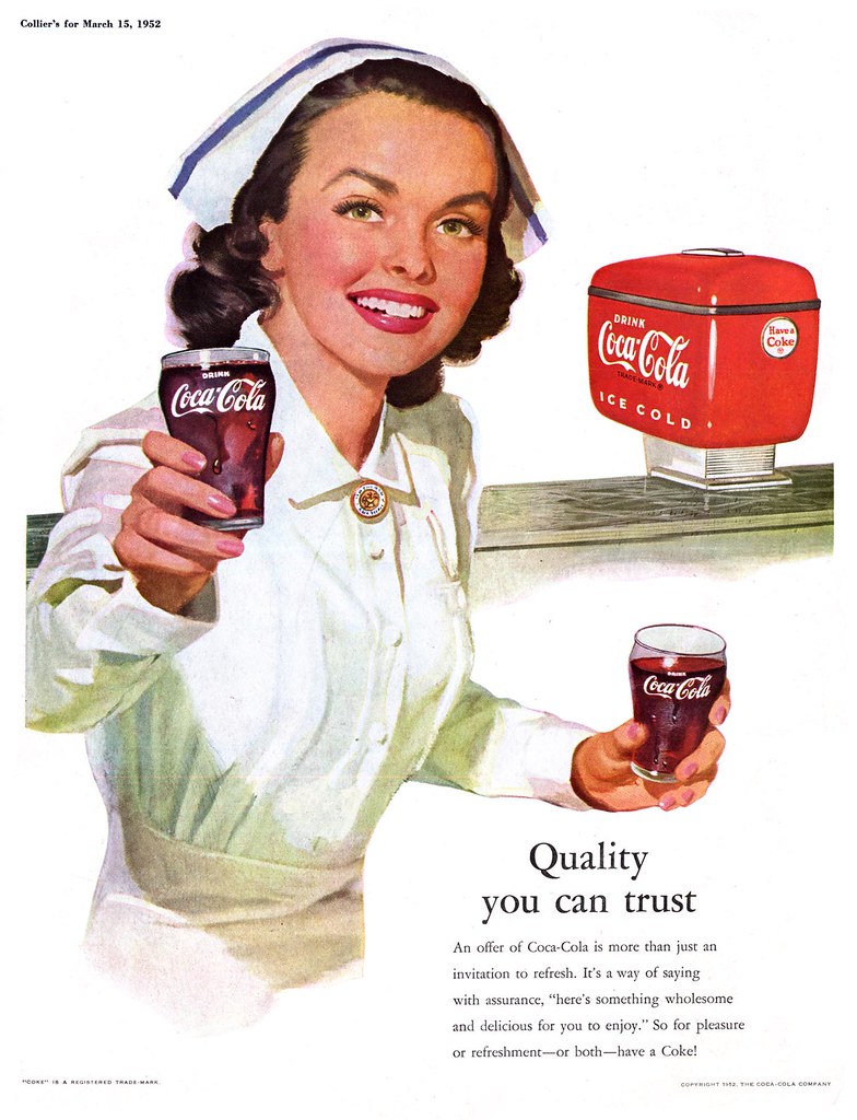
What kind of girl do you prefer: 'wholesome'... or 'delicious'? For the better part of the decade, Coke chose to focus on the wholesome, small town, all-American girl-next-door image.
Coke must be good for you, right? Look, even nurses are serving it!
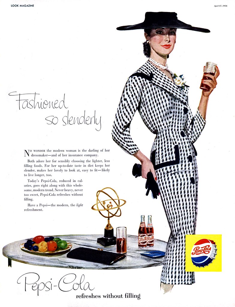
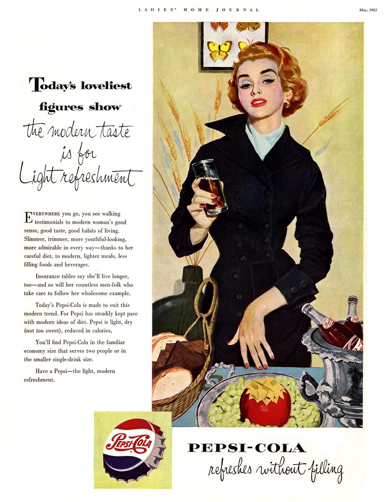
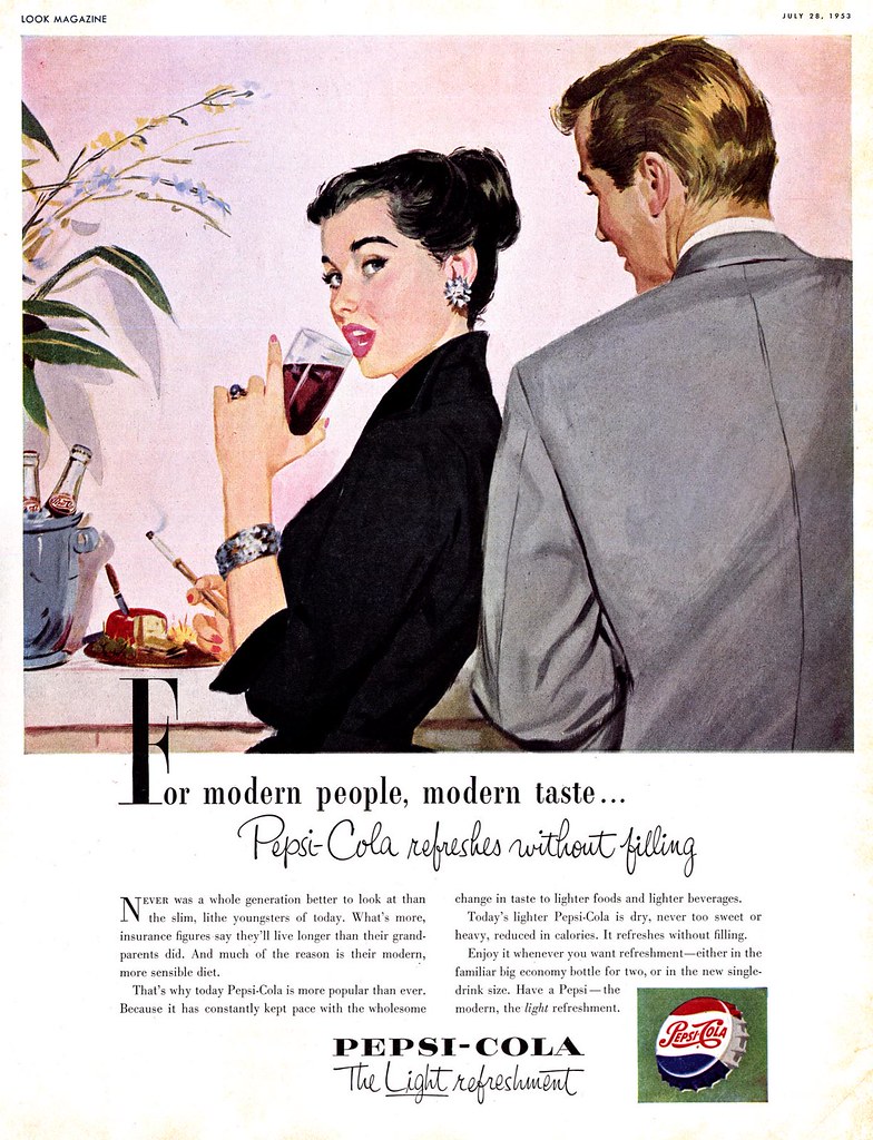
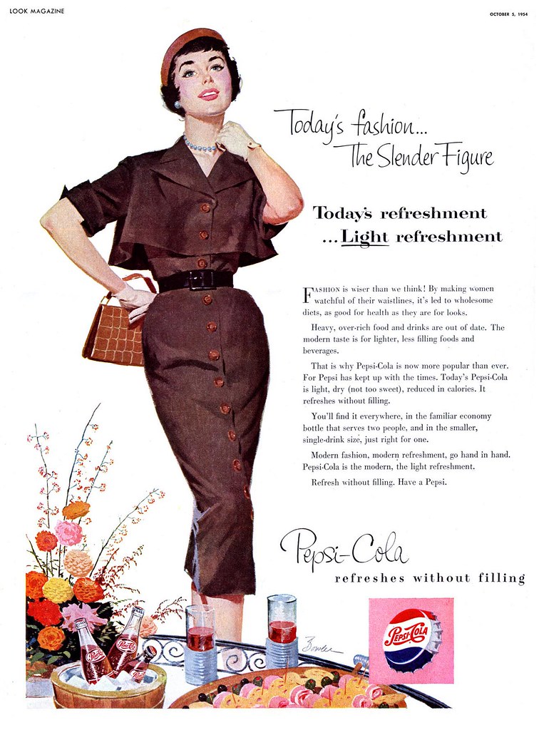
But ladies, "calorie-reduced" Pepsi was part of your healthy, modern lifestyle too -- so you'd look smashingly slim in the latest fashions as much as so you'd get a better rate on your life insurance!
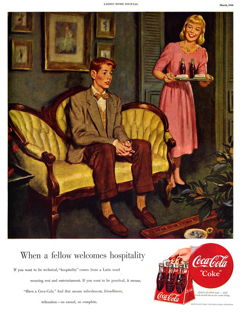
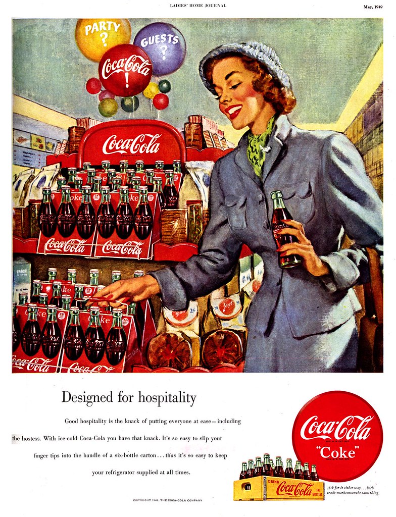
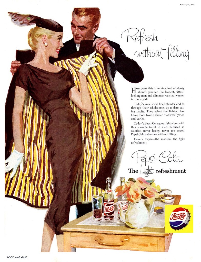
The difference between the Coke Girl and the Pepsi Girl wasn't just about style...
It was about attitude.
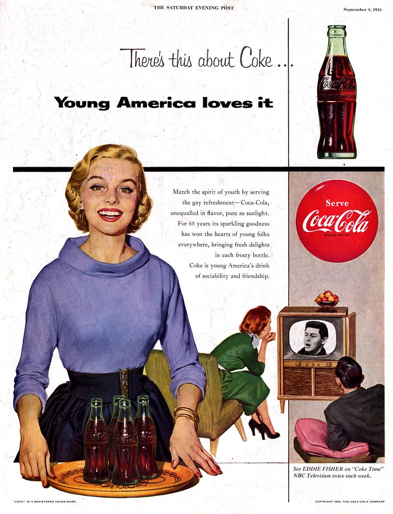
While the small town Coke Girl was entertaining an awkward suitor in her parent's livingroom...
...or picking up a 6-pack at the local grocery store...
... the carefree, stylish Pepsi Girl was heading out for a romantic night on the town.
As for ads featuring guys, well, I don't think Pepsi even ran any ads featuring just guys. While both brands seem to have felt that women were their target market, Coke at least made an effort to engage the other half of the population.
For the Pepsi Girl, men were no more than a prop... a fashion accessory. After all, the modern woman, "the darling of her dress-maker", had "countless men-folk" to pick and choose from.
All of today's images have been added to my Beverages Flickr set.
Tuesday, February 20, 2007
First Comes Love, Then Comes Marriage
Actually, I suppose you could say, "First comes lust..." Did you check out the expression on the girl's face in the ad above? That ain't the look of love, baby!
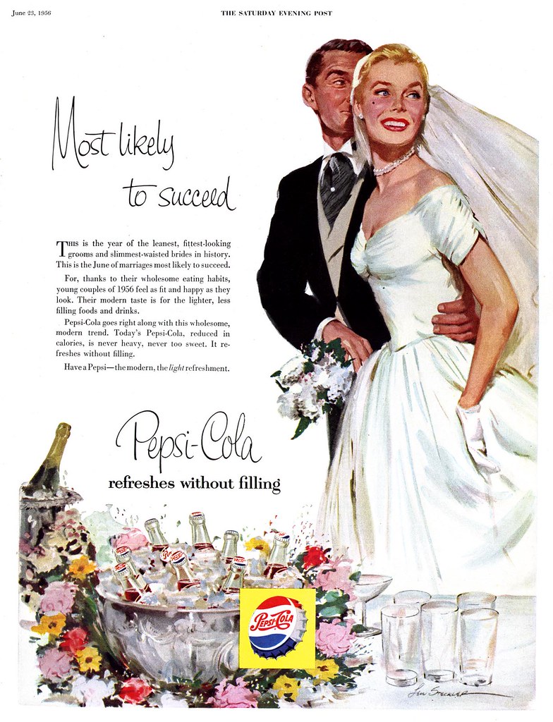
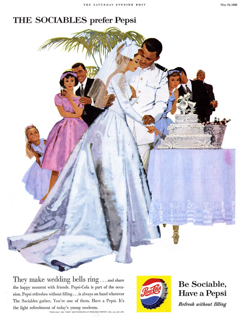
Nonetheless, it quickly becomes clear who Pepsi was specifically targeting with its long-running "Sociables" series: women. Earlier in the 50's the series focused on gorgeous young couples caught at that moment the spark of romance is ignited. All emphasis was on the woman... the man was clearly subordinate in purpose, often not appearing at all.
Nothing confirms Pepsi's strategy so much as its return, time and again, to the theme of weddings.
Don't get me wrong, ladies, many of us guys are only too happy to be married to the love of our lives -- but when it comes to advertising themes we're more likely to identify with Pall Mall's marlin fishing ads or Schlitz's barbeque visuals!
So where was Coke while Pepsi was defining the lifestyle of a generation?
We'll find out tomorrow.
All of these images have been added to my Pepsi Flickr set.
Monday, February 19, 2007
The 1950's Pepsi Generation
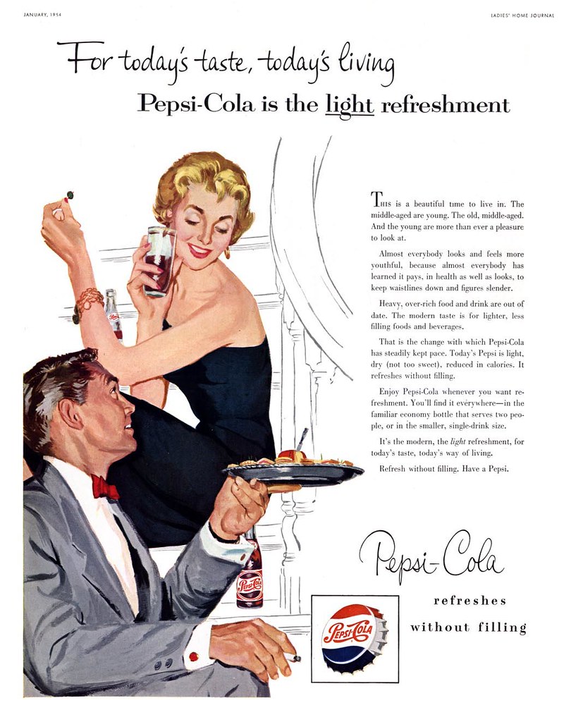
Did any other ad campaign of the 1950's even approach the style, consistencey and duration of Pepsi's "Sociables" series? No. This astounding program of magazine ads lasted an entire decade and utilized the talents of some of the top artists in the field. Much credit to both Pepsi and their ad agency for sticking to their guns, sometimes tweaking the details, but never waivering from the underlying concept: that Pepsi was for young, sophisticated, successful, urban Americans; that Pepsi was about the 'new' lifestyle - sharing good times, finding romance -not in small town America, but in hip New York apartments and restaurants or trendy Hollywood homes.
Pepsi understood what the 50's generation aspired to and made sure to position themselves as the cola brand of choice. So prolific was their output of images, it sometimes seems like they commissioned a new illustration every month for the entire decade!
This week, let's take a look at a bunch of those ads... this week, let's "Meet the Sociables".
These images and a whole bunch more can be found at full size in my Pepsi Flickr set.
Friday, February 16, 2007
Fritz Willis (1907-1979)
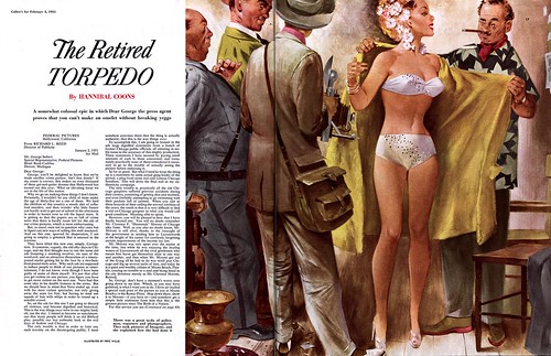
These are the only two pieces by Fritz Willis I've come across in my collection of Collier's magazines... but I wouldn't mind finding more! Without really knowing anything about the artist I was pleased to discover he's well represented on the Internet. For those who want to learn a little about Willis, this bio at The Pin-Up Files is fairly comprehensive. What isn't mentioned there but which I find very interesting is this tidbit I found in Walt Reed's Illustrator in America: as a neophyte commercial artist, Willis worked in Hollywood with Joe De Mers - often on the same drawings - at Warner Bros. Studios. The two men continued to partner on pin-up assignments for Esquire magazine before going their separate ways.
Actually, if you can tear your eyes away from his lovely ladies for a moment, its worth noting how much personality Willis invests in his male characters. I'm reminded a little of some of Albert Dorne's work when I look at Willis' slightly cartoony approach to the men in this second piece. And the two bathing beauties are hardly wooden-faced mannequins. Willis was clearly skilled at projecting attitude with body language and subtlety of expression.
These images can be seen at full size in my new Fritz Willis Flickr set.
Thursday, February 15, 2007
Bathing Beauty... or Somebodies' Mom?
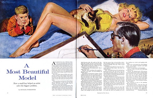
There are always a few people who actually read the opening to these stories and then ask, "but what happens next?" I have to admit that this one time, because the story was about an illustrator, I too wondered what happened next. So, a brief synopsis:
Six year old Tim (whose dad is away at a sanatorium because he has TB) and his mom, a writer of detective novels (and a real looker to boot), live downstairs from Mr. Burford, a commercial artist. Burford is having an ulcer because he can't seem to draw glamorous, seductive legs on the spokesmodel in the illustration he must complete post haste for his client, ad man George Dockwra. At stake for Burford is a fee of $500. Dockwra is flipping out because, not only is his illustrator unable to draw glamorous, seductive legs, but he is about to lose his biggest account for lack of a brilliant ad concept. Tim dreams of owning a paint set like his hero, Burford, but lacks the one dollar it costs. Meanwhile, old Miss Mary, another resident of this renovated manor house, has lost her favourite heart-shaped charm in the snow outside.
Through a series of coincidences worthy of Charles Dickens, the author delivers good fortune to all: Tim finds and returns Miss Mary's charm, his mom gets good news that his dad is recovered and returning home (which puts her in the mood to pose her glamorous, seductive legs for illustrator Burford), ad man Dockwra saves the account with an idea gleaned from an offhand remark Tim made at their earlier chance meeting in Burford's studio - and thanks Tim by purchasing (on a hunch) the one dollar paint set for him.
Everyone lives happily ever after. But I am left wondering just one thing:
This story is from 1959... since we learned recently that McCall's was paying over a thousand dollars for a story illustration in 1959, how is it that Dockwra was going to pay Burford only 500 bucks for an illustration that would be used in a national advertising campaign?
This image and another can be seen at full size in my new Pete Stevens Flickr set.
Subscribe to:
Posts (Atom)