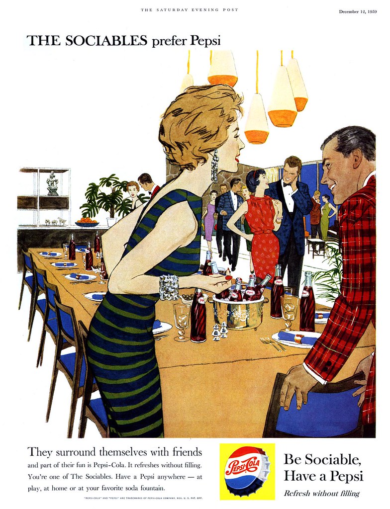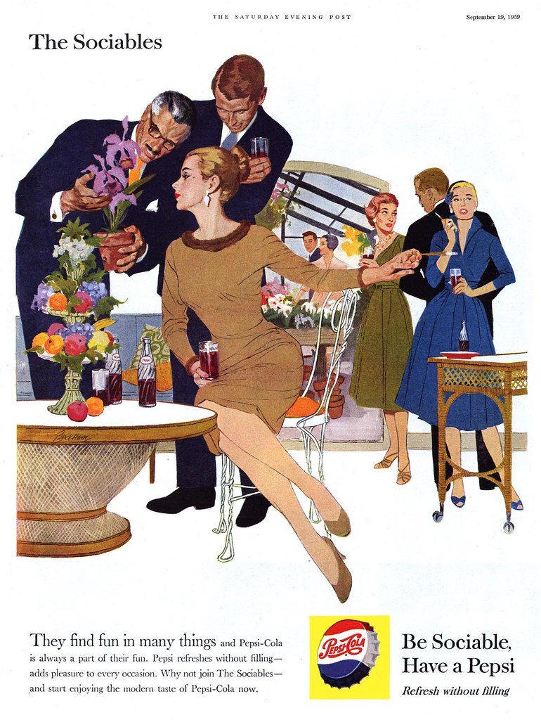
The ladies gave up their careers as models and jet-setting stewardesses and the gentlemen moved into corner offices at America's law firms, ad agencies and manufacturing industries. Everybody traded in their downtown loft apartments for sprawling ranch style homes in the suburbs.
Instead of late nights at chichi resaurants and jazz clubs, The Sociables started spending lazy, sunny afternoons by the pool with friends, throwing dinner parties and looking at each other's vacation slides.

This transition from singles to couples was marked by some interesting adjustments in presentation: settings became more fully realized, striking room and furniture details reinforced The Sociables style and affluence. Men began to play a more significant role - even older men were consciously included (though, notably, not older women).

Most intriguing for us though (as students of the art form) was the move to a semi-linear illustration style that makes me think a little of comic book art. With some elements fully painted and others treated flat and graphically, Pepsi managed to revitalize The Sociables in a most compelling visual manner unlike anything else being done in magazine advertising at the time. The piece below, signed by Lynn Buckham, tells us that the Cooper Studio was still involved with the account - though I have my doubts that Buckham did all four of these ads.

Its a shame Pepsi abandoned this new style the following year. Tomorrow, a look at the decline and fall of The Sociables.
All of these images have been added to my Pepsi Flickr set.
Thank you for this set!
ReplyDeleteI really like this particular style. Some areas of color are almost flat, with no modeling, but it doesn't clash with the more detailed areas.
And the composition and eye flow in images 2 and 4 are well worth studying.
You're very welcome, Kathryn - I'm glad you're enjoying these images. :-)
ReplyDeleteVery nice sset Leif! Thanks!
ReplyDeleteLief - this is great stuff. I dont' know if you teach a course but this defines a lot of things at the time - art, advertising and society. Again, great stuff.
ReplyDeleteThanks, René!
ReplyDeletepilot schmitt; I'm no teacher - just an avid student - but I'm very glad to know that, as I learn, others like yourself are enjoying the process of discovery along with me - thank you! :-)
Hi I am doing a blog on the 60's and would like to borrow a picture with ofcourse a link back to your article.
ReplyDeleteMy word! where did you gt s these amazing magazine ads?
My blog is RetroKimmer.blogspot.com
Mainly I am interested in what the women are wearing and their clothes.
Please let me know. The picture I want to use is the formal one with the mink stole. Lovely work!
Sure kim maki, you can find all of these images and more in my Pepsi set on Flickr (just follow the link at the end of the post) - thanks for asking :-)
ReplyDeleteI collected all of these ads from old 1950's magazines I acquired, mostly on ebay but also from used book shops.
Slam dunk Pepsi! I love these.
ReplyDeleteThis is not about images, but sound. Does anyone know who the "Kay" was who sang the Pepsi jingle on the radio in 1960? Some think it was Kay Starr, but her voice sounds too high to me. PepsiKay.mp3
ReplyDeleteYou can reply to: