From what I can tell, The American Magazine was probably Utz's steadiest client during the late 40's and early 50's. His work appears once and sometimes twice in almost every issue I've seen.

This tells me the editors clearly liked using Utz for story assignments. I would guess that a client hires and rehires a particular artist because they have come to count on a certain predictable style and technique they feel will be appropriate to the assignment. But Utz seems to have enjoyed surpising his clients by trying many different media and rendering styles. I would guess that they gave him so much work because they trusted him and enjoyed the diversity he delivered.

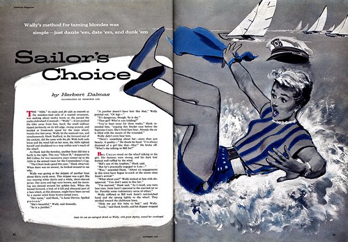
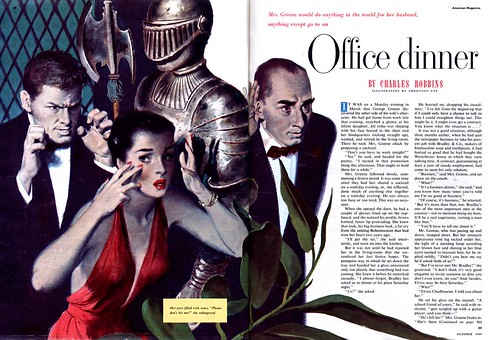
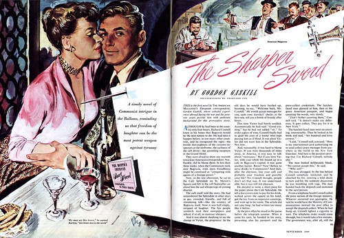
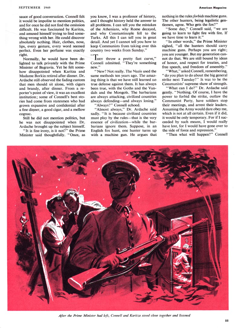
Granted, Utz stayed well within the parameters of the popular "realistic" look of the day, but while his painting technique on yesterday's piece reminded me a little of Ben Stahl, the illustration above has a hint of Tom Lovell while the ones below, done for the same September 1949 issue of American, look like they could have been the work of Perry Peterson. The first piece at the top of today's post, which I especially love, is something else altogether. Utz seems to have painted vigorously and directly onto a box board sort of surface, giving the piece a very graphic freshness that works well with the subject matter. For the second of today's examples, his much tighter, moody technique compliments the melodrama of the stage set-like scene being played out.


But even the broad range of approaches you see here doesn't fully reflect the variety of Utz's styles. Tomorrow we'll look at another side of the versatile Thornton Utz.
For now, take a look at these images at full size in my Thornton Utz Flickr set so you can better enjoy Utz's energetic and diverse artwork.
Hi Neil; Thanks for your comment! I'm working on that right now. Hopefully by the end of the week we'll know quite a bit more about Utz beyond what's available in his "Illustrator in America" listing.
ReplyDeleteI love an illustration that demands your attention. One that forces you to understand the story the art is trying to convey. Utz seems to be good at that. Reminds me of those old 1950s sci-fi/horror movie posters where the main image would be this grand masterful painting but somewhere at the bottom or on the side is a cool little pen & ink line drawing of one or two other action scenes. I'm assuming (hoping) one day we'll start seeing those in your "Today's Inspirations". :)
ReplyDeleteThanks much for finding all this gold, Leif.
My pleasure, Les - and thanks to you for your comment! :-)
ReplyDelete