Last week I enjoyed a long lunch with Will, my younger son, Simon and good buddy, René Milot at a restaurant in Toronto near Will's home. After lunch we returned to Will's place for a quiet conversation in which Will generously explained the details of how he worked on commercial assignments in the 50's and 60's. "This is pretty early on," Will remarked when I showed him the photocopies I had brought with me, "Later on I didn't bother with all this. I'd just rough it out directly on the board or canvas and send that over to the client for approval."
Still, this earlier system Will employed represents a valuable lesson in how to properly develop a piece of finished art. And for me at least, even the roughest sketch provides an inspiring example of how a talented hand creates a strong, energetic and sound composition - something we should all thoughtfully strive for in our own efforts.
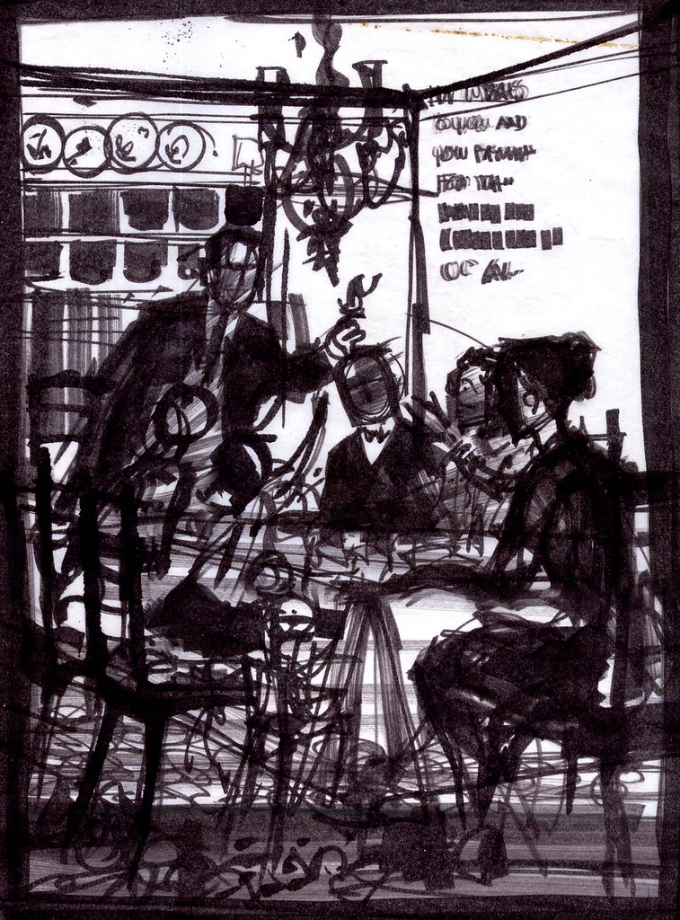
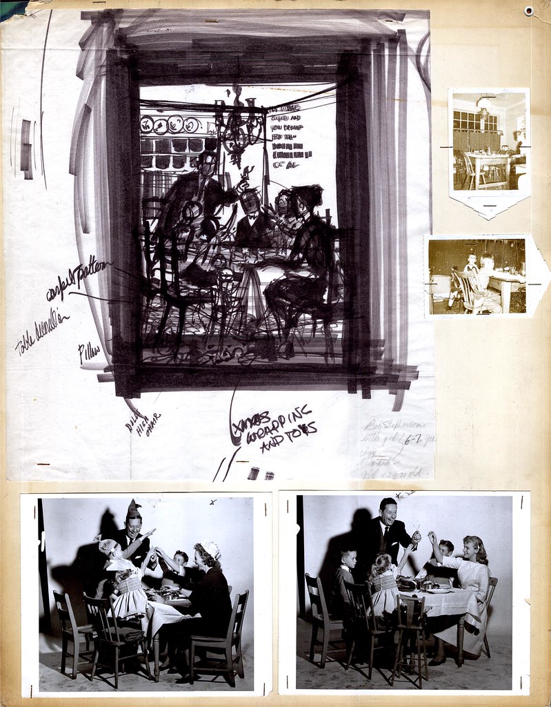
During the late 50's/ early 60's Will did quite a few full page newpaper ads for the major department store chain here in Canada, the Hudson's Bay Company. These ads typically centred around holiday themes - and in this case, it would appear from the notes dashed in on this rough that the theme was "Christmas".
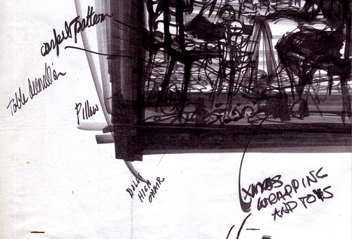
Will says that, although these assignments came to him via The Bay's ad agency, he usually was given the freedom to come up with his own idea for the scenario. "Some people call them thumbnails," says Will, "but I never did thumbnails. I'd think about it for quite a while, doing thumbnails in my head, then, when I finally did do a rough sketch, it looked pretty much the way I wanted it to. Hopefully!"
I asked him if this first rough was done in magic marker but he insisted, "No. Pastel. Magic markers came later - and I hated them." Will told me that he liked the subtlety of pastels. Markers, he says, were too confining. "Once you put a line down, you were stuck with it. I had to use them for a time when they loaned me out to a studio in Detroit. But other than that one time, I never used them."
* In spite of Will's insistence, I still think this particular rough is done in magic marker, perhaps at a later date is preperation for his lecture demonstration.
Once Will was satisfied with the general idea he had sketched out, he then went about preparing to shoot models , props and scenery. "That's Bud Feheley's wife as the mother," Will said, pointing at the lady in the photo.
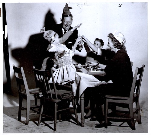
Feheley was the "F" in TDF, the art services studio were Will was employed as top man in the illustration department at the time. "I asked for her for the mother. She had the perfect look. The others are all hired models... no, wait -- that's Kerry, my youngest daughter! I had forgotten about that ... we shot this scene in my home at the time, in Scarborough."
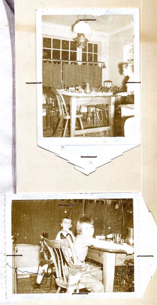
Will says that he would describe the scenario to his models and then have them act it out. He'd then moved around taking shots - sometimes capturing happy accidents that would find their way into the final illustration. "Usually I'd shoot a couple of rolls and end up with one or two good shots - the rest I'd throw out."

For example, the variation above with a teenage daughter instead of the mother that did not make it into the final cut.
You can examine these images more closely in my Will Davies Flickr set.
Wow.
ReplyDeleteSeeing this process and hearing his thoughts on it....So helpful AND inspiring to a relative young guy in the business.
Thanks Leif and Will.
More!, More!
paul
Just marvelous....I continue to be amazed at the wealth of fascinating information and images here.
ReplyDeleteThis was especially interesting to me: not just the step-by-step walk through of the process, but a look back at a process that some would say has been technologically eclipsed (I wouldn't say that, of course!). I love the idea of bulding up the illustration from posed photographs, etc. And I love the sketched over photo!
It has to be marker, though. You'd have to have a pretty tough pastel to hold that sharo an edge
Sorry...hit publish before I re-read.
ReplyDeleteI meant:
I love the final sketch FROM the photos and a pastel would have to be very hard to hold that SHARP an edge...
(coffee maker broke. domestic disaster this morning)
Thanks so much for your comments, guys! I know Will is always surprised to hear that people still care about his work - and I was a little unsure how this week's theme would go over - but I can tell from your remarks that I'm not alone in feeling this is interesting and important stuff for those who visit the blog. I really appreciate your feedback! :-)
ReplyDeleteAlthough I've know my grandfather my whole life, I never learned how he produced such amazing art. I have always been impressed, and now I understand a little more about my grandpa's art.
ReplyDeleteIs your grandfather will davies? I modelled for the harlequin romance covers for him for years. I loved working with him. Such a kind man. I had been looking for him a few years back to say hello. Is he still with us?
DeleteTo see a Will Davies illustration broken down step by step is a rare glimpse into a private and exclusive realm of a master illustrator. So much meticulous prep work affirms his mantric adage ... reference, reference, reference. And here we see why he swore by that. This example is one of hundreds of his, and exemplifies why he was the go-to illustrator for decades.
ReplyDeleteThe 2 little girls in the sepia polaroids are my younger sisters, Kerry and Jenny. Our youngest sister, Lesley was probably 4 at this time, and brother Joe wasn't even a twinkle yet. Dad often used us to pose, and we all have fond memories of our visits to his studio on the corner of Avenue Rd. and Yorkville, smelling the pipe tobacco smoke and casein as we climbed rickety old steps. For me, this was truly heaven, for I had no doubt that one day I wanted to do this also.
There is just so much to say about this unpretentious artist who generously shared insights. It was incessant hard work, and he made it look so easy. He was so demanding of himself, and was always astonished by praise and admiration. Will Davies is truly a gentleman.
Thank you for doing this Leif. It's a suberb site.
Pam Davies
I remember the studio well. He was the kindest man I knew. I have a few romance covers in a suitcase downstairs with the rest of my modelling pictures from a 35 year career. We worked together many times while he took the pics with his camera and then drew from the black and white pictures. What an incredibly talented man
DeleteOh, man, Leif -- very sorry in not commenting on this sooner. This is a brilliant post! Marvelous is right, Professor Estevez -- to see how Will Davies went about in piecing together and constructing this piece of work is simply wonderful.
ReplyDeleteThanks so much for posting this, Leif. And especially this amazing blog. Love it.
Thanks Ward! L :-)
ReplyDeleteThis was a real blast from the past for me. My father, Peter Cook, also worked for TDF as an artist, and admired Will Davies' work very much.
ReplyDeleteMy dad has been gone for several years now, and with sadness I read last week of Bud Feheley's death.
Thanks for the glimpse back in time