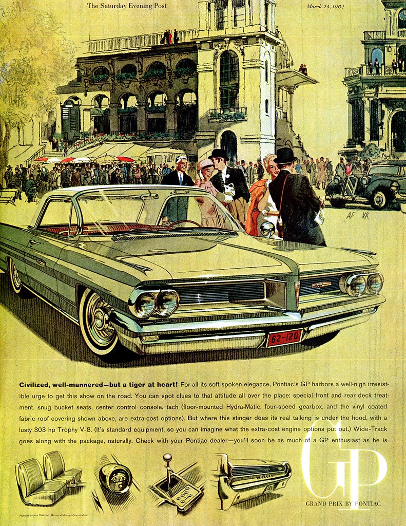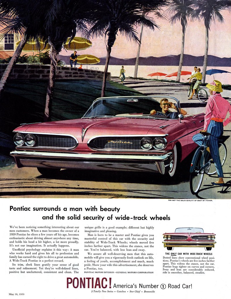
From around 1959 until 1971, these two gentlemen defined the look of Detroit with a seemingly endless and effortless series of automotive collaborations. Happily, Art Fitzpatrick is still with us and has a website so I won't go into greater detail about these two artists here. Instead, here's an interesting bit of trivia about how the "super stretched" look of the period was achieved.

My friend Will Davies, who did his share of auto ad illustration, both in Toronto and in Detroit, explained the process to me a few years ago. A studio photographer would shoot the car from a variety of angles according to the approved ad layout. This was most often done indoors, with no attempt made to stage the surrounding people and environment that would eventually be seen in the final illustration. The best photo from the shoot would then be sliced into pieces and glued down on a board with all the pieces moved outward from the centre point, but still aligned "correctly" with each other, suggesting a much longer and wider car than what actually existed in the real world.

Now the technical expertise of the automotive illustrator was called on to "fill in the gaps" - stretching grills, door panels, etc. across the white spaces in the photo arrangement. This new drawing was used as the basis for the eventual finished art, with the second artist in the duo providing the surrounding figures and environment.

You can see all of today's images at full size in my AF/VK Flickr set.
Leif, once again a great presentation...I told you I used to work at Clive Pecocks
ReplyDeleteStudios with Wes Chapman, its Randy here, I hate to tell you this but there was another room off Fred Forsythe's photo studio....and it was literally jammed with hundreds of these car ads, all on Bristol board and pieced together somestimes, car and BG just as you say!
This style was over when I was there...why didn't I just grab a few....once again ...opportunity missed!
Randy