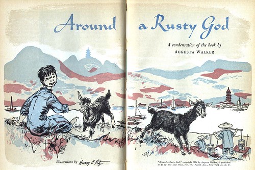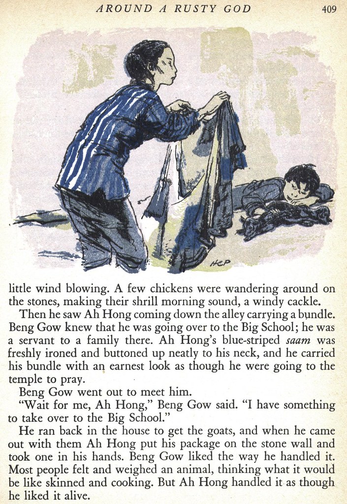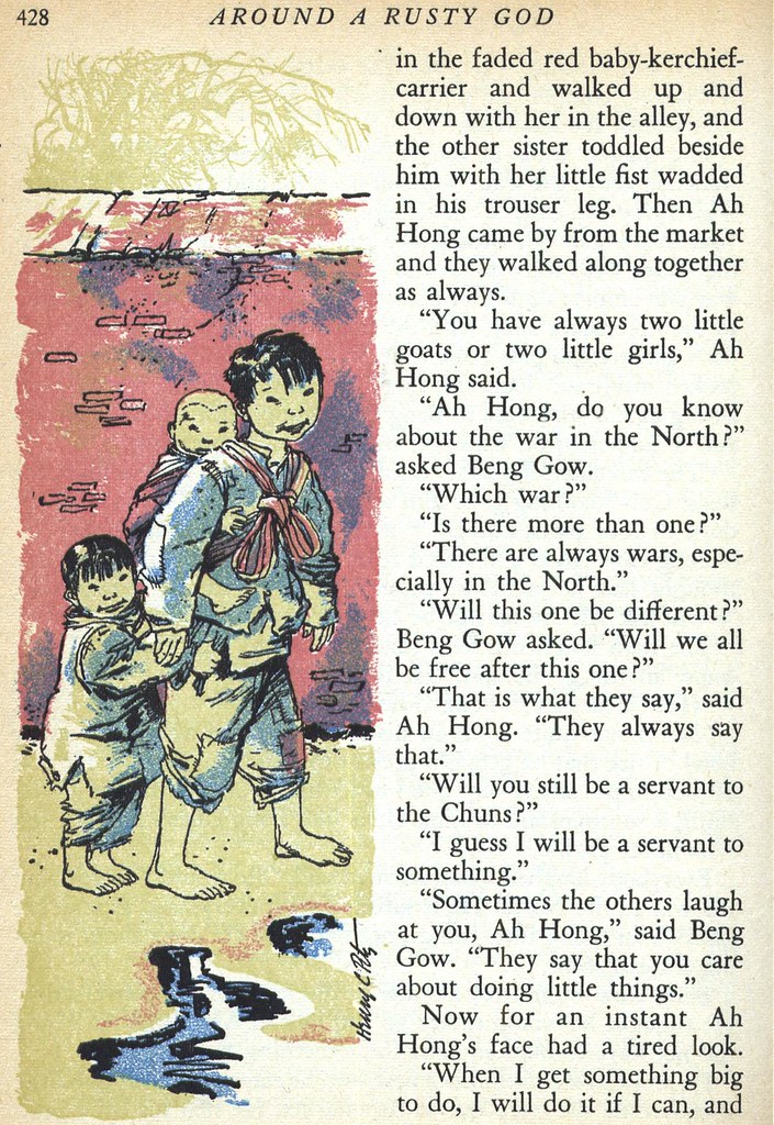
I first encountered Pitz's work some years back while reading Jules Verne's 20,000 Leagues Under the Sea to my young sons at bedtime. The artwork by Pitz in that book seemed exactly right for a story set in those earlier times. Pitz's style has a distinctly un-modern quality to it that reminds me a little of the era of steel engravings and Gibson Girls.

Of all the artists in this Autumn '54 edition of Reader's Digest Condensed Books, Pitz seems to have managed to use his limited colour palette with the greatest subtlety. I had to skip bleaching out the yellow of the cheap paper so as not to lose the quality of the colours.

In his book, The Illustrator in America, Walt Reed writes, "Although Pitz experimented with, and worked in, almost every medium, he had a special affinity for line drawing and book illustration."

"He illustrated more than 160 books, as well as for a whole range of magazines."

Pitz's sensitive ink line is best viewed large so take a moment to look at the full size versions of these illustrations in my Henry C. Pitz Flickr set.
My first introduction to Pitz was also through 20,000 Leagues Under the Sea courtesy of my Elementary School Library in 3rd Grade. I read it once but checked it out many times just to look at the illos and copy them!
ReplyDelete