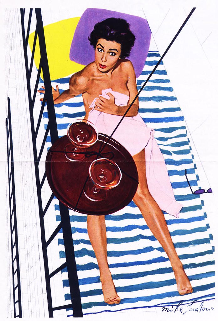
The 1954 piece below is the earliest example I've found of Mike Ludlow's work. Though it already incorporates some aspects of the New School style (no background, minimal environmental props, parts of the figure blending with the background) it is still too tightly and traditionally rendered to qualify as the genuine product. When we look at the bulk of Ludlow's later work, its clear that he is near the beginning of his career with this piece.
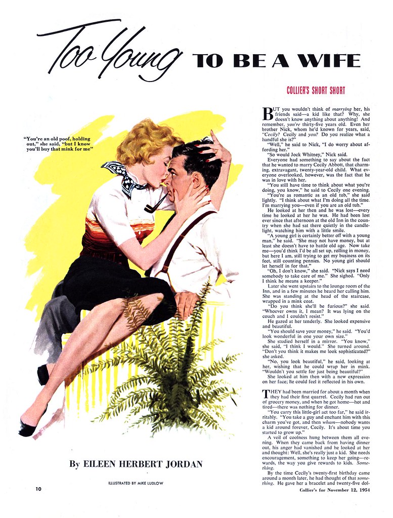
Exactly one year later, Ludlow is beginning to loosen up. The piece below, though still looking like the work of an artist searching for solutions, is showing a lot of promise.
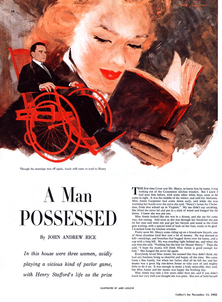
What's perhaps most startling about Mike Ludlow is the giant leap forward that the artist took after 1955. In 1957 Ludlow was chosen to illustrate the Esquire pin-up calendar. His painting style had evolved so much in just two years, its as though a different artist was at the board. From the tentavive experimentation of the piece above has sprung a confident, accomplished New School style that absolutely wowed me the first time I saw it - and still does today. In the context of pin-up art, its a unique approach that must have looked thoroughly modern at the time compared to the typical Old School style of Gil Elvgren et al and suggests that Esquire was looking to position itself as a hip, modern publication.
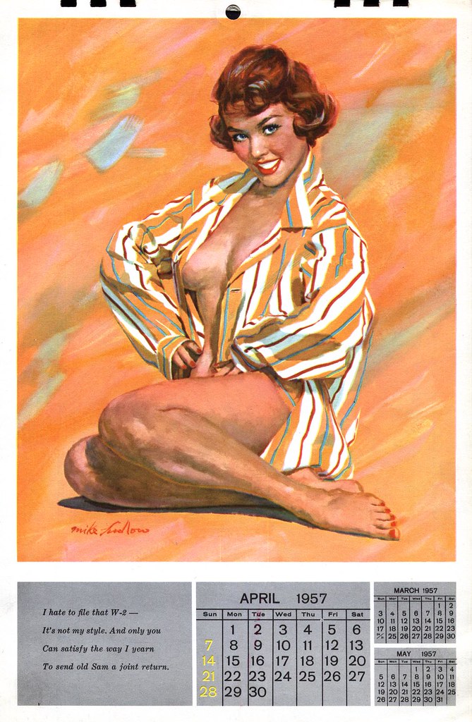
That Esquire switched to photography for its pin-up calendars after Ludlow's gorgeous 1957 effort doesn't reflect poorly on the artist - it simply confirms which way the wind was blowing in all print publication at the time.
Ludlow, meanwhile, had found entré into the the rarified atmosphere of The Saturday Evening Post, where he now regularly received editorial assignments and did high profile advertising art, like the example below.
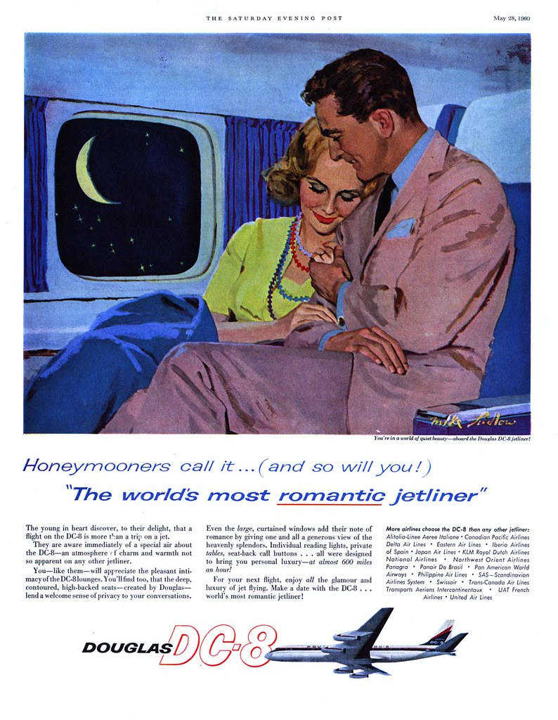
It was perhaps a little too late. After 1960, as with most other illustrators, Ludlow disappeared from the pages of America's magazines. I have, however, found his signature on several album covers like the one below from 1962, which still reflect his New School chops. There's very little biographical info on Ludlow out there. What became of him after the early 60's is a mystery.
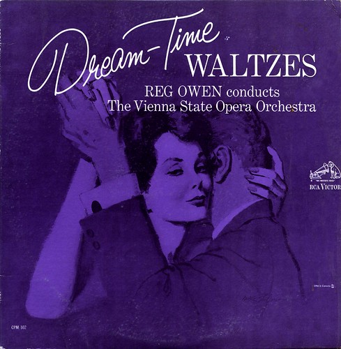
You can see several more of Mike Ludlow's Esquire pin-up paintings, as well a a variety of story illustrations, in my Mike Ludlow Flickr set.
Wow Leif.....six years....how times fly buddy
ReplyDeleteJeff
Leif, that famous image of the girl on the balcony was selected by Walt Reed for his very first edition of The Illustrator In America. I think Reed was as intrigued by the situation as every other male who wore out that page with their eyeballs over the years (including yours truly). I have to say, I think that balcony picture is both sexier and better painted than the more explicit pinup work you have included from Ludlow's later years.
ReplyDeleteThanks for that insight, David! Yes, I agree about the pin-up art vs. that first piece, which is my all-time favourite Ludlow. Still, the pin-ups are a treat when observed not for subject matter - but for technique, because Ludlow wonderful, energetic painting style and clothing drapery impart an exciting graphic quality.
ReplyDeleteI think he did quite a bit of work for Esquire around that time and I'm not sure if the pin-ups came before or after the girl on the balcony.
Perhaps one day we'll get to see even more of Ludlow's delicious work from the period and the situation will be clarified.
Reed placed the balcony scene in the January 1955 issue of Esquire, which would make it prior to the pinups. (It's amazing which details stick in the brain of a 12 year old boy.)
ReplyDeleteI don't suppose you would consider making an exception to your rule and telling the world what was happening in the story accompanying that illustration?
Haha - I wish I could, but that piece isn't from a magazine - its one of the original clipped pages from Bud Fente's morgue that my friend Dan Milligan and I inherited.
ReplyDeleteI must say, I'm curious to read that one, too!
Interesting that this was so early in Ludlow's career ( from what I've inferred by looking at whatever I could find ) but it sure demonstrates what a tremendous talent Ludlow was cultivating.
Thanks, David :-)
The following was emailed to me privately and is copied and pasted here with permission of Armando Mendez:
ReplyDeleteCraig Yoe's latest "Arf" magazine has a beautiful 1958 Mike Ludlow cover (girl with open blouse reading the funny papers). I find Ludlow part. interesting because if you compare his stuff with pin up photography of the era, it's the exact same type of posing/treatment the photographers were trying to use (and not Elvgren's "Oh, no" situations either) but far more sensual because of the texture and grit of the rendering and Ludlow's vivid color sense. Black and white glamour photography, mainly through the fantasized sensibility of Russ Meyers (who was just about to begin directing and producing his well known big bust exploitation films), was providing a new way to photograph women. But color photography was of the time was still very bland and artificial, washing out almost all modeling and depth on the girl in pin ups. Ludlow was 10 years ahead of what other men's magazines would achieve with photography.