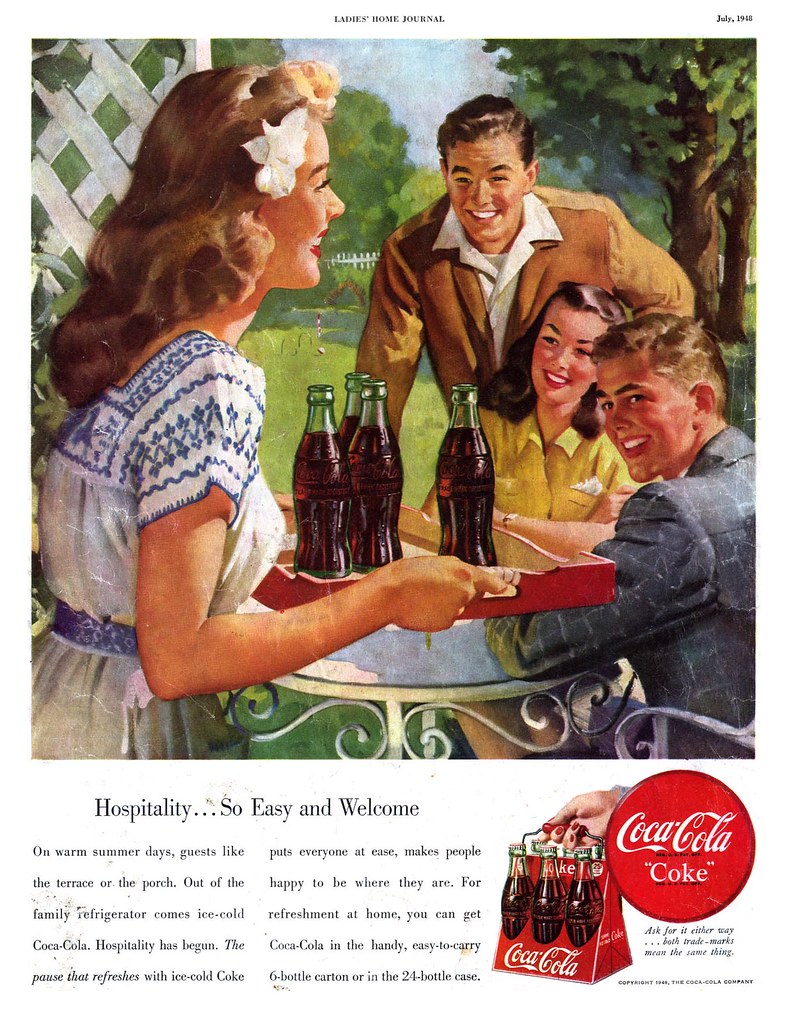
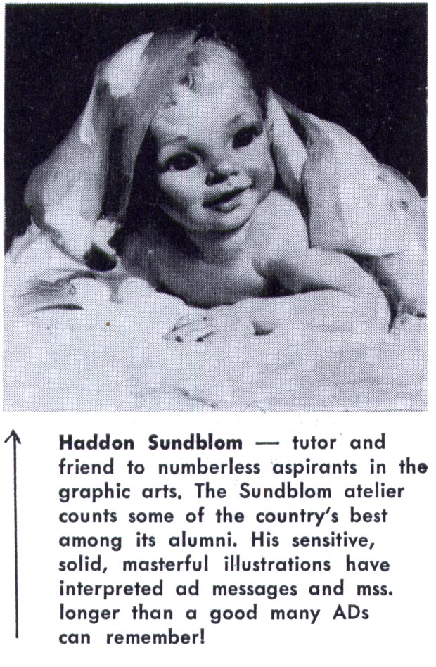
A friend emailed me the other day, saying he always thinks of what I call "the old school style" as "the Chicago style" - and that might be an appropriate term. Of the artists we looked at this week, Harry Anderson, Haddon Sundblom and Andrew Loomis all worked out of Chicago.
Even the Formfit ads from yesterday list Chicago as a primary address, adding to the plausibility that the art for those ads was done by Chicago-based illustrators. I mentioned the famous pinup artist, Gil Elvgren in the context of those ads and he too was a Chicago based artist (who had learned how to paint while apprenticing with Sundblom).
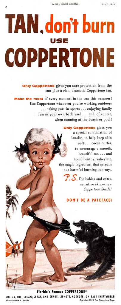
Add to that list Joyce Ballentine, who worked out of the Chicago art studio, Stevens Gross and of whom Frederick W. Bouton, VP of Creative Services, JWT, Chicago, writing in the November 1952 issue of Art Director and Studio News had this to say:

Ballentine famously created the "Coppertone Girl"...
But I would consider well known east coast artists like Walter Baumhofer...
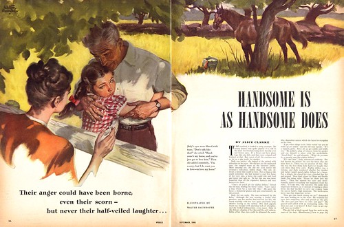
...and Tom Lovell (both of whom had roots in the pulps)...

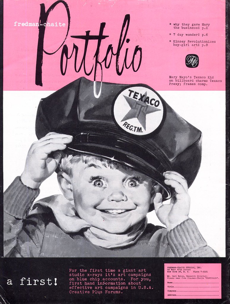
...and Fred/Chaite Studio's Mary Mayo to fall well within the broader range of the "old school" style. In fact, there were a great many artists enjoying tremendous success by painting in the style of the old school.
Haddon Sundblom claimed among his influences, John Singer Sargent, and Frederick Bouton described the look I'm trying to classify in his AD&SN article as "the solid chords of academic realism". For the sake of expediency, that description might be enough. Whatever the case, in spite of the long-enduring popularity and high profile of the old school, there was a change taking place as the 50's progressed.
Next week: The New School
Thanks, Leif, for these informative and entertaining posts. I found the comments about Joyce Ballentyne from the Art Director and Studio News are hard to take. As if only men could lay paint on the canvas. It reminds me of a funny critcism Reid Austin made to me about Sundblom (and keep in mind that Reid once hired him to paint a cover for Playboy). He said that Sundblom laid paint on so thick it looked like he cut it with mayonnaise.
ReplyDeleteI've seen a few original Sundblom's and your right, the paint is beautifully thick! Heck of a pain I'm sure with drying times.
ReplyDeleteTom Lovell like Harry Anderson are masters of light and color, hands down...heck I'd even throw in Sundblom as well. Rarely do I see such range in a lot of the illustrators of that period...or even now.
Sad to say they only published a book of Tom's Civil War/Native American works. I've got a few illos in my National Geographic Illustrated book that's just wonderful. Wished there were more to learn from.
=s=
Thanks for pointing that out, Jack - and its an attitude about which I have some posts in the works. Women illustrators deserve more credit than they have received. We'll try to reconcile that old fashioned attitude some time soon!
ReplyDeleteMay I add that Henry Vallely was also a member of "The Chicago School"?
ReplyDeleteYou may, DSK - with my thanks! :-)
ReplyDelete