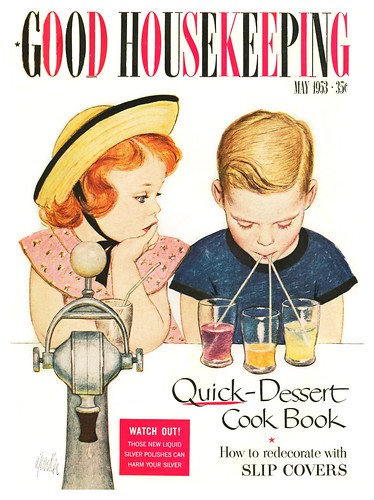
First, from Tom Johnson, a longtime fan and collector of Al Parker's work, comes this generous contribution of scans featuring cute kids as rendered by the man Cosmopolitan magazine described as "the illustrator of our times."

"I remember the Mother/Daughter covers from growing up in the 50's", writes Tom Johnson, "thanks to my Mom's subscription to LHJ. I bought a couple at a garage sale , probably 25 years ago and went about collecting them all (there are 36 LHJ M/D covers from 1939 through 1955) and 1 M/D cover he did for the Famous Artists magazine."

"When I got them all collected ( before Ebay) I went on to the AA ads and anything else I could find."

Next comes this interesting analysis from retired West Coast illustrator, Tom Watson:
Thought you might find the 2 attached illustration comparisons of identical subject matter, but handled in 2 distinctively different ways. One is Mary Horton's boy eating an apple in an apple tree house, which you posted a few days ago. The other is an almost identical situation of a boy in an apple tree house eating an apple and reading a book, by Paul Nonnast for a 1950 Prudential magazine ad.

Horton's illustration is more of a decorative stylized design statement for a 2 page spread with simplicity of detail. The emphasis is on the carefully designed silhouette of the apple tree, which is in full shadow contrasted with the sunlit house and yard below. Behind the the well designed shape of the tree is a contrasting pale blue sky and light yellow green yard, emphasizing the the overall tree shape. The boy is somewhat understated in importance, and the real focus seems to be on the overall energy and whimsical mood that is cleverly depicted. The charming touch of a squirrel on a limb and birds in flight, add to the cheerful mood.

Nonnast's illustration is soothing and quiet, and shows great clarity, strong academic drawing and a very skilled painterly quality overall. It is more defined with a three dimensional reality that was characteristic of the 40's and 50's style. The leaves show clarity yet depicted with looser brush strokes. There is a wonderful glow of both dappled and direct sun light throughout the scene. The boy is definitely the point of interest. Both paintings have red roofs on the house below, which is in keeping with the red/green complimentary color scheme of both paintings.
Different styles and personal points of view, depict very different moods. The point I would like to make is that selecting the right illustrator for the right job results in the the right message for the viewer. I admire both illustrations equally, because of their individual approach and excellent illustration qualities.
My thanks to both Tom Johnson and Tom Watson for their enthusiasm for mid-20th century illustration and generosity in sharing of their knowledge and scans with the readers of this blog.
All of today's images can be found in my Cute Kids Flickr set.
This kind of advertising it’s amazing and outstanding, I’m in the business but all things are digital (I mostly work with indesign and photoshop) but your blog it’s an amazing place ¡¡¡thumbs up!!! brother, keep the good work!
ReplyDeleteRegards from Chile, South America.
BTW I’m Andrew Loomis fan :)
Thankyou, Pablo - its a pleasure to meeet you and to hear that you're enjoying the blog!
ReplyDeleteAs you can see from today's post, its thanks to the readers and subscribers to the mailing list that I'm able to provide such a rich and varied amount of material for the benefit of everyone who loves classic illustration. :-)
great ads, greetings!!!
ReplyDeleteThanks ihatedesign - and thanks for featuring my blog and flickr archives on your blog! :-)
ReplyDeleteGreat illustrations and such illuminating commentary. It also seems that the treehouse represents different things in each illustration. In the first, it's a source of pride and maybe even power, in the second a place of escape and peaceful solitude. It would be great to find more of tree house illustrations for further comparison.
ReplyDeleteThat's a great idea, Jack - I'll keep an eye out for similar themes! :-)
ReplyDelete