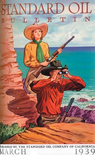
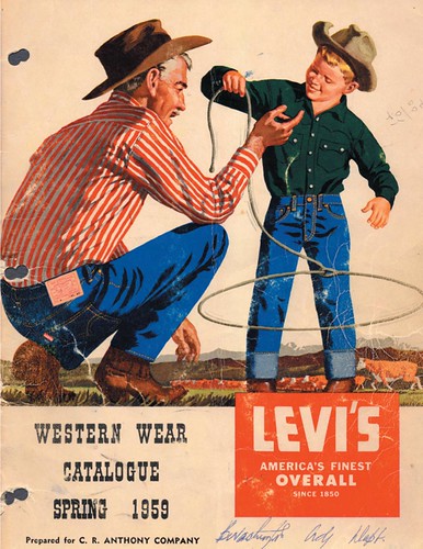
The studio's key artist at this time was W. Haines Hall, who had joined the firm in 1925 and continued to be active in the business through the 1960's.

Haines, along with fellow employee Alton Painter, was a founding member of the Thirteen watercolorists (founded by Maynard Dixon and Maurice Logan). He was also active in the Bohemian Club, producing posters and portraits for their various events.

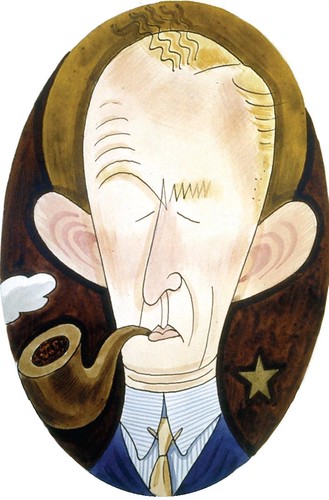
Seavey's cartoons of the P&S artists often portrayed Haines as the sage arbiter amidst the turmoil and pandemonium of a bustling art studio.

So, after Sullivan left the business in 1939 (or more accurately "the business left him", Hall was J.E.'s first choice to become his new partner.

This quite naturally led to a name change: Patterson & Sullivan became Patterson & Hall.

You can find the full length version of this article in Illustration magazine #19.
Man alive, the article on P&H was the coolest thing ever. I thought to myself this would have been the place for me, if I had only been born 30 years earlier.
ReplyDeleteThe variety of work and style choices the artists were able to handle definitely calls to my sensibilities.
I remember in art school they kept telling us to choose 'one style of illustration' as our own personal style. It was like saying from the buffet of life, you get to eat yams for your duration on earth.
So I gave up on becoming an illustrator and got into comics and storyboards.
Still miss doing finished art though. ;(
Nice stuff...glad this is expanded here Leif.
=s=
Shane; Hearing anecdotes from the glory days of the art studios is always fascinating... I've talked with many friends about how we would have loved to be a part of that scene.
ReplyDeleteBut I think you're probably mistaken about the idea that artists had the opportunity to experiment with a tremendous range of styles and subject matter. Rather the opposite: if you were a car guy, you got to do cars - somebody else did figures, someone else again did architecture and yet another artist did nothing but food.
I think we freelancers today enjoy more diversity of style and subject matter than a lot of in-house illustrators did back in the day.
Anyone out there care to confirm or deny my suspicions...?
I'm really enjoying this week's series, Leif, just as I enjoyed the article in Illustration Magazine. Thanks for your role in preserving this information.
ReplyDeleteThanks, David! :-)
ReplyDeleteEvery time when I read your interesting blog, Leif, it’s like a time travel brother, you keep the old masters illustrators alive for the new generations :)
ReplyDeleteToday I’ve been watching some Norman Rockwell “Saturday evening post” pics and other stuff, and I thank god to know that kind of art; N.Rockwell, A. Loomis and Burne Hogarth were instructed by George Brigdman.. amazing!
Regards Leif
Hey, thanks so much, Pablo - I'm very happy to hear you're enjoying the blog so much. Be sure to check out my friend, David Apatoff's amazing blog, Illustration Art, by clicking on his name just above.
ReplyDeleteDavid has just written a couple of fantastic posts on James Montgomery Flagg that I know you will get a kick out of :-)
I don't have anything too insightful to add, but I'll just say I'm really liking these Standard Oil posters. Great article as well.
ReplyDelete