 But artists - especially commercial artists - have just as often gathered in groups to share studio space, enjoy the social interaction of the busy workplace, and attract more clients by offering a larger variety of graphic arts services that only an expansive studio can provide. Just last week I made reference to a Chicago powerhouse called Kling Studios and we've looked at length at the reknowned New York studio owned by Charles E. Cooper... but what about the West Coast?
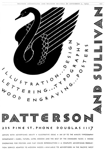
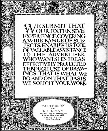
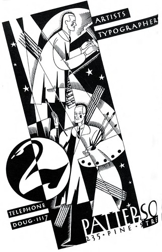
 TI list member Bruce Hettema is the owner of P&H Creative Group and the author of an article in the current issue of Illustration magazine on the history of his Petaluma, California art studio, which began life in the 1920's in San Francisco as Patterson & Sullivan. Bruce, with the blessing of Illustration magazine editor, Dan Zimmer, has graciously offered to give us an abridged look at the contents of his article this week. My thanks to both gentlemen for sharing this fascinating story, which begins below:
 J.E. Patterson came from a big agency background where, as an art director/layout man, you were expected to design the ad, then pass it off to a "finish man" to do the final art - even if he wasn't the best suited artist for the job.
The philosophy at Patterson & Sullivan's new studio was to assemble a capable team of talented artists versed in a wide range of styles. They felt that if they could have the best artists available, they could deliver a better product than the ad agency could produce with its own in-house talent.
The 1920's were halcyon years in California. San Francisco was becoming the West Coast's hub of advertising, and the agency quickly proved to be successful beyond the young artists' dreams. Advertising agencies quickly discovered the benefits of hiring P&S, and soon P&S was attracting high-profile clients such as Southern Pacific Railroad, Dole, Del Monte Corporation, Stanford University, Standard Oil, Matson Lines, and Dollar Steamship Lines.
Tomorrow: A look at the art and artists of Patterson & Sullivan.
You can find the full length version of this article in Illustration magazine #19.
Interesting history once again, I work in an art/advertising company here in Chile, so this week I will look Leif’s blog with my eyes wide open :)
ReplyDeleteRegards
your “spanglish” friend
Pablo
Thanks, Pablo - your comments are always welcome -- and I'm curious to know if you find a similar situation at your agency in Chilé today: do the art directors employ in house artists, even if they are perhaps not quite right for the look they'd like to see? Or do they call upon outside art studios?
ReplyDeleteFrom my own experiences in the Toronto market, I did a fair amount of fisnished art that was not really in my style for art directors at the agency I worked at.
If they had carte blanche on the budget, they'd get the perfect illustrator, of course...
Leif:
ReplyDeleteMy art director works in the office besides me, so when I start a design he looks from the start to finish the job, btw we most work in Corporative design.
In the office here works: photographers, web designers, magazines designers (my partner and me), journalists, sometimes I pick up some freelance works but only in my free time.
Are you gonna go for Stanford? Check this info https://essaydragon.com/blog/stanford-essay then.
ReplyDelete