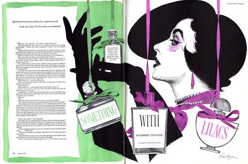
He turned in this eye-catching experiment in high contrast illustrative design which is so forward thinking, one could almost imagine Patrick Nagel creating it in the 1980's - at the same time it evokes the era of the Gibson Girl.

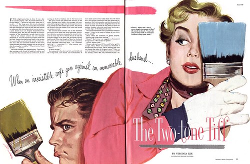
D'Andrea remained true to the principles of the New School of illustration: focus on the head and hands, eliminate background environment, use only props relevant to the story, large areas of flat colour that emphasize strong design.
Below is another great example of those principles as rendered by D'Andrea - but this time in his more typical painting technique. It was his WHC contribution from two months earlier. Throughout this run of issues I have, spanning 1948 to 1952, Bernard D'Andrea regularly contributed story illustrations to the magazine. The piece above is the only one I've seen where he attempted this graphic, high contrast approach. In fact, I don't think I've seen another D'Andrea in that style in any 1950's publications.

You may think I'm making too big a deal out of something trivial - but in the context of the times and within the narrow confines of the women's magazine story illustration niche that top piece is genuinely radical!
What inspired Bernard D'Andrea's foray into graphic experimentation? I welcome your thoughts on the matter.
These images can be found at full size in my Bernard D'Andrea Flickr set.
This comment has been removed by a blog administrator.
ReplyDeleteI think he was trying to start a new style of illustration to refresh the magazines a new wave or something like that.
ReplyDeleteRegards
This is a great site! Illustration art rocks!
ReplyDeleteSpeaking of Patrick Nagel's work, please come visit a new forum set up by some of his fans:
http://patricknagel.lefora.com/forum/