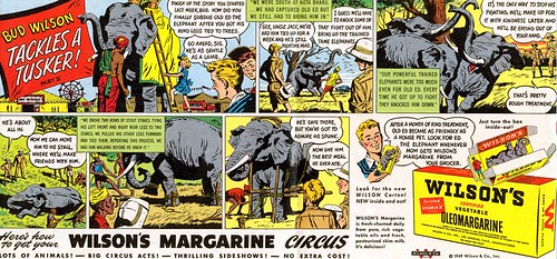
"Here are some samples by Charlie Allen who worked at P&H from 1950 through the 80's and even into recent years on a freelance basis. Charlie could do it all. Cars, beautiful women, rugged men, kids, animals , products - in full color and B/W."
"I think he's one of those unsung greats of illustration, and would make a great future blog subject."
I asked Tom Watson (whose eloquent comments and analysis on a variety of topics have greatly enhanced this blog in recent months) about Charlie Allen... and his enthusiastic reply will serve as a far better introduction to this week's topic than anything I could have hoped to write:
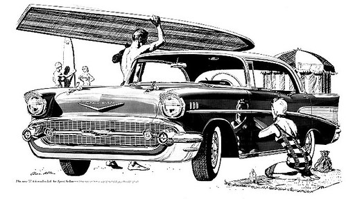
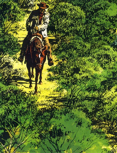
Charlie Allen was one of the top illustrators in S.F., when I started my career in '63. His reputation was huge for his incredible craftsmanship and draftsmanship. His pen and ink drawings were unsurpassed by anyone in the business.
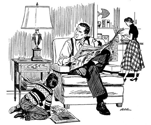
For newspaper reproduction, pen and ink drawings were crisper and had more punch than a halftone reproduction from photography. This was due to the low quality paper stock, cheap plates and mass production printing methods for newspaper's very high volume. Charlie mastered a pen and ink technique with maximum skill and great impact. Using just a series of lines, he could visually create a full range of tones... giving dimension, sculptural volume and a wide variety of lighting effects. Leif, his great command of pen and ink might be an area you can focus on.
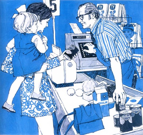
He could illustrate something as uninteresting and dry as a hand holding a bottle of whiskey, and it would be a thing of beauty. His people were very real and very carefully and accurately drawn, and when his full color illustrations were very clean. He was the consummate professional advertising illustrator. When Charlie Allen was assigned a job, there would be no doubt, what so ever, that the job would be perfect in every way.
In those early years of my career, I would see Charlie Allen illustrations, (usually in b/w pen & ink or 2 colors) in S.F. published magazines or S.F. newspapers. His incredible skills were so superior to other illustrators, that I could recognize his work, even if they were not signed. In those days they would sometimes delete the illustrator's signature on advertising illustrations, for whatever reason... very annoying to us illustrators, since it was one of our best methods of advertising ourselves. Every time I saw a Charlie Allen illustration, it was a reminder that I had to work harder than ever as an illustrator to continue improving... a real inspiration. For me, he was a beacon of quality in a very competitive small San Francisco market.
Some illustrators, who were into experimental approaches or a more decorative style of illustration, may not have held Charlie Allen in such high esteem as I, but I never personally heard a single criticism of Charlie's work. It seems to me that it's pretty hard to criticize something that has so much going for it... and just because it was not on the cutting edge of illustration in the 60's, didn't seem to matter much. He seemed to always be in demand.
Excellent quality speaks for itself, and Charlie Allen's work was a loud voice in advertising illustration.
My thanks to Tom Watson for his thoughts on Mr. Allen's work -- and to Bruce Hettema for facilitating this week's topic. As you can imagine from reading Tom's words, you have barely begun to see what Charlie Allen has accomplished over the course of his career.
Tomorrow: a look at Charlie Allen's classic 50's painting style.
* Today's images can be viewed at a larger size in my Charlie Allen Flickr set.
Do not know how to rid of the annoying calls? Here is https://topspyingapps.com/best-call-blocker-app/ a free solution.
ReplyDelete