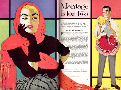
Also, this great anecdote from Ken Krull, who was a salesman at the Chicago art studio, Stephens, Biondi, DiCicco, when Lucia worked there during the 50's:
Bringing up Lucia's name reminded me of our first job to together. I had just started in sales at SBD in the late 50's. An art director from FCB wanted to use Lucia on an ad featuring two women's heads. His budget was $200 (this was the 50's). I approached Lucia with the layout. Her question was "What will this bill for?" [When I told her the budget] she said, "That's really not very good - plus I'm very busy." Her way of turning down work.
Disappointed, I left, forgetting to take the layout. Next morning when I arrived the finished art of the heads was on my desk with a note... "Ken; Don't tell anyone what these billed for." "L"
We went on to do much work together...She was the Queen.
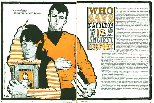
Ten years later, half a decade after Lucia had moved to SBD's L.A. office, she did the piece below for Petersen Publishing's Teen magazine.

Long-time TI list member, Armando Mendez, who was kind enough to send me the scan, added this bit of chronology to the Lucia story:
The month before [March 1965] had another very stylish Lucia DPS illustration with a dark-haired girl (who could be based on the same model) reading through old magazines but without the heavy containment line and flat blacks of this month; a very open, sketchy, continous line Briggs/Fawcett (lithographic crayon) type drawing. I don't have a complete run but I can tell you a year later and what little story illustration remains would be 180 degees different in approach.
Around that same time, writes Armando, "The large department stores ran incredible full page fashion drawings in the two main [L.A.] newspapers (even as a young boy, the drawings amazed me) but weren't signed. I certainly think Lucia had the chops for these."
That jibes well with something Will Nelson, another artist at SBD Chicago wrote to me about Lucia: "As I recall, Lucia was immediately in demand in the high end fashion market... I.Magnin, Bullocks, etc."
Perhaps someone out there will have saved some of those 1960's newspaper fashion ads and will read this post. With a little luck, we may yet get to see Lucia Lerner's work from that later part of her career.
* Today's images have been added to my Lucia Flickr set and the previous posts on Lucia Lerner can be quickly accessed from the drop down menu in the blog's side bar.
It’s very nice keep learning about Lucia, and her beautiful drawings :)
ReplyDeleteRegards
Thanks, Pablo. I'm very glad to hear that! :-)
ReplyDeleteLucia never ceases to amaze me. The 'Who Says Napoleon is Ancient History" illustration at first glance, appears to be just another well done guy girl situation. But notice, the guy behind the girl is a subtle duplication of the portrait of Napoleon, on the cover of the book she holds.... same hair shape, the stern expression and the typical arm and hand position identified with Napoleon. The little bow at the edge of the girls hair, helps convey a wholesome demure appearance, which contrasts the guy's appearance. It's these clever little touches that separate illustrators like Lucia, Al Parker and a few others from the mainstream, in my opinion.
ReplyDeleteTom Watson
Wow! Will you look at that... I hadn't noticed - thanks for pointing that out, Tom. :-)
ReplyDeleteI enjoy your blog very much. Your comments about newspaper fashion illustration have reminded me of my empty search on the web for such work. While attending the Cooper School of Art in Cleveland in the late 70's the newspapers were full of beautiful figure illustrations showing off the clothing for sale. Hardlines were rendered quite capably as well. Here's hoping someone has saved those and it will start appearing on the internet someday.
ReplyDeleteJeff Suntala
Jeff;
ReplyDeleteI'm with you on that. Just found a couple of old newpaper ads from the 60's for dept. stores here in Canada. The fashion drawings are absolutely gorgeous, not to mention the type elements and general design of the page.
I am setting all this aside for a week on fashion illustration... hopefully to include some of the work mentioned re: Lucia for I. Magnin, Bullocks, etc. - if someone can locate any for us.
Armando mendez sent this follow-up note which describes the challenge quite well:
"Bringing up Lucia makes me want to go and check out the period newspapers at the downtown public library.
But it's my least favorite thing to do--mircofilm readers, loading reels, focusing wheels and changing lenses--the scanning of the pages actually makes me motion sick--with each reel only covering a little less than two weeks and back up to the counter to request more. Then if I find something worthwhile, I get frustrated trying to get at readable photocopy without image destroying steaks and dropouts. Gosh how I hate it!
It doesn't have to be that hard. At Art Center College for Design in Pasadena I'm positive that the library once had a Los Angeles Art Directors Club Annual, much like the NYC series. It had the best illustration and photography done here each year, not only artist named but studio, client, and medium, sometimes with headshot photos of the prizewinners. (I don't remember the time span but it certainly covered the 50s and 60s.) But when I noticed it existed, I wasn't researching local artists so I didn't examine it too closely. Later, I thought.
Now when I go to inquire about it the librarians there treat me like I'm talking in Farsi. Maybe I dreamed it. . . ."
great really beauty, this women have a different style and with unique touch, you can recognize the true talent when you see something like this.
ReplyDelete