"Even though Whitcomb 'knocked out' the figures in his column compared with those his story illustrations, they show the same glamour and much of the same flair. I think that he was incapable of drawing a less than beautiful girl or handsome man. Even his Arthur Godfrey looks close to handsome."
To which I must add, its the fact that the art in Whitcomb's columns are 'knocked out' that gets my juices flowing! As accomplished as Whitcomb's story illustrations are, I've always found them to be a little ... overwrought. A bit too perfect -- and subsequently, a little static.
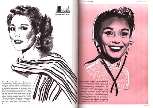
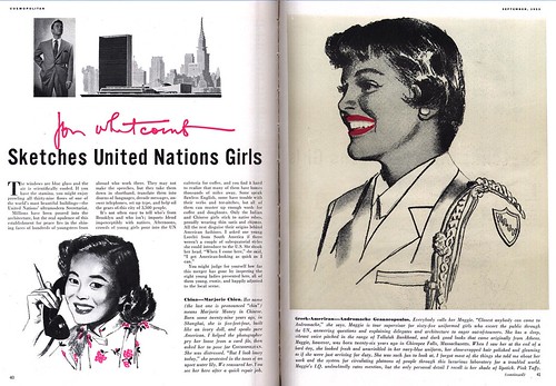
The work Whitcomb produced for these Cosmo articles shows a keen sense of simplicity and their stripped down appearance lends them a wonderful vitality!

They contain the energy of a first stage rough - an energy many of us who work in illustration feel is lost by the time we get to the finished product.
Jon Whitcomb Flickr set
I agree with your assessment 100%, Leif. It may be true that Whitcomb was incapable of drawing a woman that wasn't pretty, and it may also be true that his glossy, sugar coated style was wildly popular with magazine readers, but in my view he could not hold a candle artistically to peers such as Joe de Mers, Coby Whitmore or Joe Bowler.
ReplyDeleteAs popular and as wealthy as Whitcomb became, I don't think his art got much respect from the acomplished illustrators of his day. Every once in a while I see a very good, serious piece of illustration from Whitcomb, so we know he was capable of it. Apparently, he got motivated in response to taunts from Robert Fawcett and others.
Although I revere Robert Fawcett's talent, I have heard he was a bit of a prickly personality. I wonder how he 'taunted' Whitcomb. I do think these sketches, while not particulaly remarkable, are fresher than a lot of Whitcomb's stuff. What a slick customer he was -- his writing has the same gloss that his illustrations do.
ReplyDeleteTransferring the energy from a rough to the finished product-- yes, this can be an issue. It is something that my students often find difficult to deal with. It's sort of a balancing act, walking on the razor's edge if you will. Likely this is what art directors mean when they say that they want an illustration to be "loose but tight"!
ReplyDeleteThanks so much for posting all this, it's excellent and priceless!
ReplyDelete