What readers were beginning to see more and more, when illustration was being used, was Decorative art. Chief among the rising stars of this relatively new form of illustration, was John Alcorn (below).
If this fairly early example of the emerging decorative style movement doesn't grab you in a big way, consider that in a few short years it would lead to work like this, and you'll better appreciate how the Decorative style was leading the charge in the shifting taste of popular culture of the time and providing a distict illustrative alternative to photography.
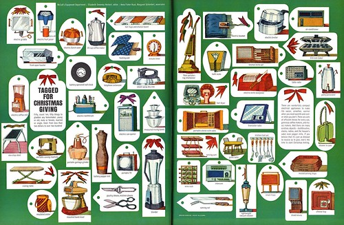
Even more dramatic than AD Otto Storch's inclusion of John Alcorn's work in this issue is the piece below, by one of the greatest decorative artists of the day: Walter Einsel.
"But," you say, "this isn't an illustration... what kinda stunt are you pulling here, Leif?!"
In fact, this piece by Einsel is a revelation - and should be given thoughtful consideration by those of us competing in the shifting sands of today's commercial art market. Walter Einsel accomplished an amazing thing with his design of this "Christmas cake house": he managed to use commonly available store-bought materials to creat a three-dimensional sculpture that accurately reflects his illustration style!
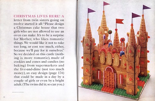
Consider this: if you've read the explanation on the spread's left-hand page, you'll understand the challenge McCall's editors faced in providing a solution to the two girls' request. And in doing so, did they come up with that solution themselves? Did they go to the no doubt very able chefs and consultants in their cooking department? Did they call upon a photographer to provide a solution?
No. The asked an artist.
Great series on the period of transition in the late-50s. I need to sit down and read every post on this blog, because they are always rewarding.
ReplyDeleteI don't know if New Yorker-style gag cartoonists are a particular interest of yours, but today I found some illustrations from a book called "Operation Elvis" by Eldon Dedini. They all feature Elvis Presley and illustrate a slim volume that describes his induction into the Army. I posted them on flickr just now:
http://www.flickr.com/photos/12533190@N00/
Cheers,
Neil H.
Changes in illustration, as Lief aptly pointed out, did reflect the changing times. It was the beginning of the social revolution in America, that took root in San Francisco and Berkley, CA in the 60's, and effected illustration, design, fashion, and many other aspects of the visual arts. John Alcorn's illustrations, and other decorative illustrator's creations of the 70's, were a spin off of the "psychedelic" posters look that became popular in the mid 60's and 70's... wild electrically charged color combinations, with swirling organic designs reflecting visual and psychological illusions, experienced from taking LSD... a potent and popular drug at the time. To be clear, I am not implying that John Alcorn ever took LSD.
ReplyDeleteThe "psychedelic" look became one alternative to the 50's look, and gradually evolved into a more decorative trend to illustration in general. In spite of the changes, traditional realistic illustration did not disappear altogether... depending on the character of the project. It was a time of adaptation for many illustrators, including myself.
Tom Watson
Neil; thanks for your comment - and for the link. While New Yorker-style gag cartoonists are not central to what I choose to explore here on this blog, I certainly have an appreciation for that sort of work. I appreciate you sharing your scans by Dedini with us!
ReplyDeleteTom, your first-hand experience and eloquent writing style always provide the sort of depth and clarity I wish I could put on the page myself - truly appreciate your input - thanks!
One aspect of what you wrote I want to challenge this time, though:
Artists like Alcorn and Einsel, and a handful of others, began making their mark in the the major mags in the late 50's, well before the Berkley, LSD, and the psychedelic posters of the 60's.
I think of this group as truly being on the vanguard of the next wave in commercial art. Perhaps it was they who influenced the psychedelic poster artists... and not the other way around.
Consider that those artist were children flipping through their parents' magazines ( and of course their own textbooks, childrens books and kid-targeted magazines like "Jack&Jill", "Humpty Dumpty", "Golden Magazine" and for the teen set, "Seventeen" and "Boys' Life" )in the late 50's and early 60's.
They would have seen more and more art of the sort Alcorn and Einsel were doing and almost none by people like Bowler, Terpining etc.
Even more so when you consider that modern decorative styles were being adopted by young artists (like the young Robert Crumb, for instance) working at places like American Greeting Cards, Hallmark, Carleton - and that sort of art on birthday cards, valentines and so on - along with other kid's pop culture: bubble gum cards, comic books, toy packaging - might have been even more influential on the next wave of youngsters than magazine illustration.
I'm only guessing... but that's my theory, for what its worth. ;-)
Say... you ought to post the plans for the Christmas cake. I'd love to see how it was constructed...
ReplyDeleteAgain, you make a convincing point Leif, and you may be right. It's sort of a, "what came first, the chicken or the egg" scenario. I did a little research, and the consensus I found is that psychedelic poster art started in the 60's, and influenced the psychedelic movement into advertising illustration, in the late 60's and 70's. Whether those original psychedelic poster artists (Rick Griffin, Victor Moscoso, Stanley Mouse, Alton Kelley and Wes Wilson) were in any way influenced by the 50's decorative illustrators, was not documented or addressed in my research. There is a considerable difference however, between the decorative line and flat color of John Alcorn and Walter Einsel's 50's illustrations, and the original psychedelic look. According to my findings, the psychedelic poster art and counter culture movement directly influenced decorative advertising illustration and design, and even underground comix. If anyone is interested in more
ReplyDeletein-depth information, go to the following URL:
http://en.wikipedia.org/wiki/Psychedelic_art#Psychedelic_Art_in_Corporate_Advertising
As much as I would like to think some of the 50's designers and illustrators had much influence on the original psychedelic poster artists, it appears to me that it was the other way around.
Tom Watson
Tom;
ReplyDeleteI suspect we are both on the right track... as children, no doubt some of the psychedelic rock poster artists saw the work of the early decorative artists - then they in turn probably influenced those same artists during the next decade.
Interestingly, I found that scenario repeating itself from personal experience (from speaking with younger illustrators in my local market). They have told me that they used to see my work in the Source books, picked up on aspects of what I was doing... now, when I see their more contemporary variations, I try to adapt some of their freshness ( and a bit of that now-pervasive 'Manga' characteristic ) into some of my own current work.