Friday, November 30, 2007

Merry Christmas, Jon Whitcomb!

Try to imagine this scenario happening today: a national magazine, with a circulation in the millions, asks 5 top illustrators to draw a Christmas greeting to one of their fellow artists so the magazine can publish the drawings (and a short comment from each artist) for all the world to see.

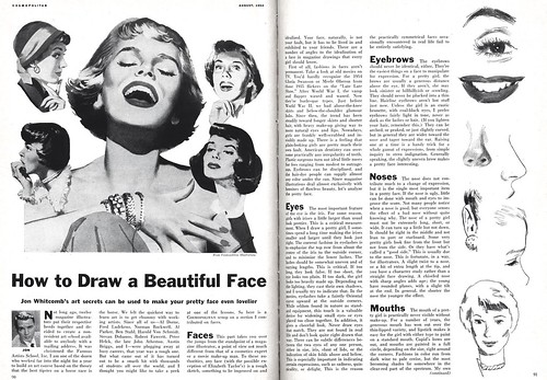
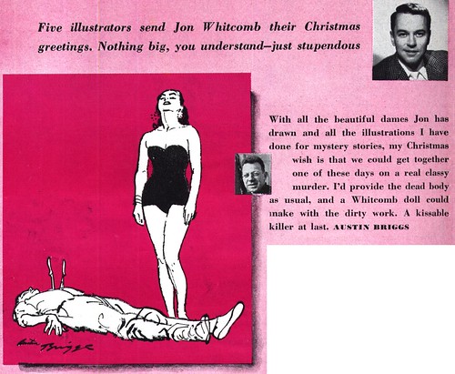
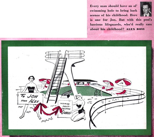
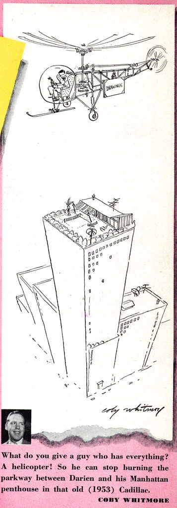
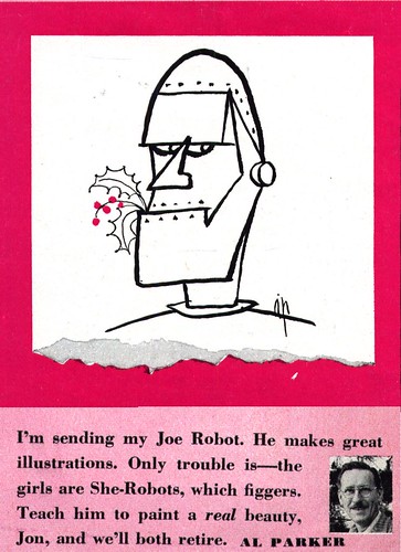
Of course it would never happen.

But in what is surely one of the most concrete examples I could give you of the kind of prominence enjoyed by illustrators in the first half of the 20th century, that's exactly what Cosmopolitan magazine did.


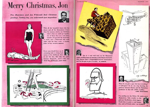
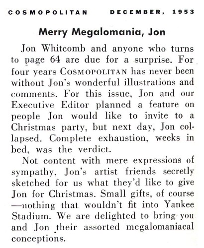
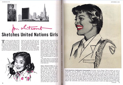
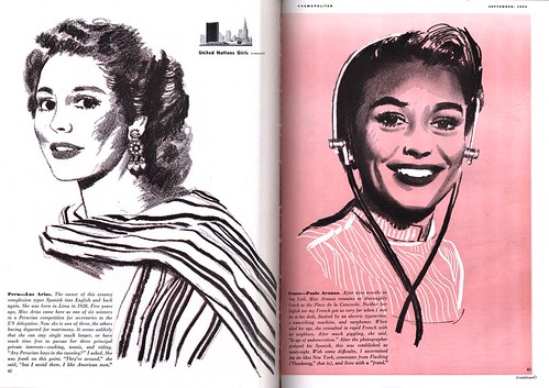
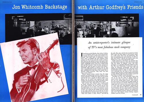
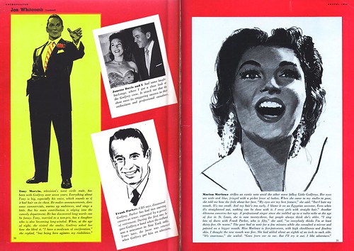
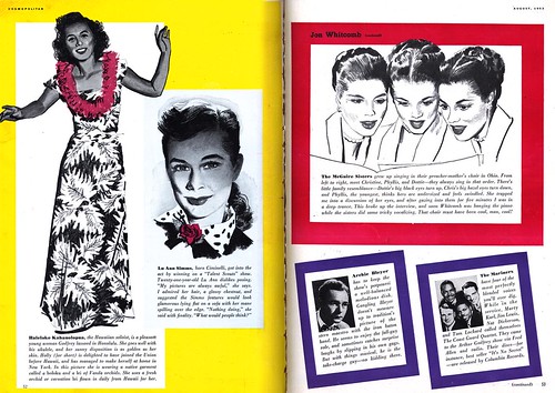
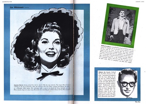
I'd mentioned a while back, when I first did a week of posts on Jon Whitcomb, that I felt he became the heir to Albert Dorne's throne as the most successful and popular illustrator in America. Perhaps you'll agree that this article goes a long way in supporting my proposal. Honestly, I've never seen anything like it!


Barbara Bradley sent a wonderful note to me last night that I think makes a fitting commentary to accompany this post. She agreed to allow me to share it with you:


"Almost every semester I plan a day in which to show students and discuss the work of the great 50’s illustrators of women: Whitmore, Whitcomb, De Mers, Bowler. (Parker’s so great he gets a day of his own) Each has his own wonderful strengths and characteristics. So, I’ve especially enjoyed reading comments about Whitcomb’s work. I believe his abilities and skills are underappreciated today. He could draw! He made people look the way he wanted them to. He designed their gorgeous clothes. No one, even if they wanted to, could make eyes sparkle, lips as moist, and hair shine quite as much as did Whitcomb. His technique in watercolor and his brushwork were amazing: fluid, controlled, and varied. His portrayal of women date more than those of many other illustrators, probably because of their almost exaggerated glamour. When he painted a housewife, she wore stiletto heels, her apron ties were starched, and the flowers in her hair were fresh. But, how he could paint!"


"Whitcomb was the first magazine illustrator I really noticed. He was actually number one in my Hit Parade in my early high school years. Then I discovered Parker and that was that!"

"I remember with thankfulness a special thing that Whitcomb did for Parker once. About twenty five years ago, in preparation for the Academy of Art awarding Al Parker an honorary degree, I asked several of Al’s contemporaries to record comments to be aired during the presentation. Whitcomb’s was outstanding. He went to great effort, recording a long, beautifully written, gracious, and eloquent appreciation of Parker, one that he later used as an article in the society of Illustrators Bulletin. I also remember the graciousness of Joe Bowler who helped the ailing Coby Whitmore do his tribute in the form of a lengthy question/answer interview."


"For lack of time, we had to edit many comments, I still recall Coby opening with ”I just loved Al”.


"There were others, including Bernie Fuchs and David Stone Martin. (How I wish I knew now where these tapes were hiding out.) This did begin as an appreciation of Whitcomb. Let it end so. He was a masterful illustrator!"

My thanks to Barbara for her wonderfully insightful appraisal.

Jon Whitcomb Flickr set

Thursday, November 29, 2007

Jon Whitcomb: Famous Artist

Some thought-provoking comments yesterday from David Apatoff and Neil Shapiro about the relationship between Jon Whitcomb and Robert Fawcett lead me to choose the images below from the August 1954 issue of Cosmopolitan for today's post.


Above is one of four illustrations Robert Fawcett did for a story in that August '54 issue. Its epitomizes the kind of masterful care and attention to detail that was typical of Fawcett's work. No doubt Robert C. Atherton, the art director at Cosmopolitan, was incredibly pleased with this and Fawcett's other three pieces. I'll bet every illustrator, art student and just about anyone else with an appreciation for good illustration marvelled at the skill with which Fawcett executed this piece.

In spite of all that, I doubt Cosmo's mostly female readership gave it much more than a glance.

By contrast is Jon Whitcomb's contribution to that same issue of Cosmopolitan: a four page excerpt from the Famous Artists School course that was one of the lessons Whitcomb provided to the course; "How to Draw a Beautiful Face".


How concisely these two articles describe the work of these two artists!

Compared to Fawcett's moody, elborately detailed and structurally complex story illustration, Whitcomb's article on "how to draw a pretty girl's nose" seems incredibly shallow and facile.

Here's the thing: I'll bet it absolutely captivated it's audience - and probably sold more than few memberships to the Famous Artists Course.


To better facilitate that eventuality, this ad appeared in the same issue as the article.


Both Robert Fawcett and Jon Whitcomb were among the founding faculty of the Famous artists School. Whitcomb was one of the four public faces of the course, along with Norman Rockwell, Albert Dorne, and Al Parker - all of whom appeared in FAS ads regularly placed in most national publications back in the 50's.

I have never come across a single FAS ad featuring Robert Fawcett.

Whitcomb's celebrity extended beyond just his FAS ads. Besides his column in Cosmo, he appeared in several national ad campaigns.


I wonder how frustrating this situation might have been for both artists... Fawcett, with all the respect and admiration of his peers, but lacking the public popularity to attract the kind of wealth and fame that seems to have come so easily to Whitcomb -- and Whitcomb with all the financial success, status and public adoration... but considered a formulaic hack by "the illustrator's illustrator" (whose opinion no doubt carried a lot of weight among the best and most highly placed in the industry).


You know, I can't help but think that in another time and place, say, during the time of Praxiteles, Whitcomb's approach of using a formula for idealised realism, developed over years of study, practice and refinement would have been more than accepted - it would have been celebrated and emulated by every other artist.

Its an interesting example the complexity of the questions: "what is art?", "what is quality?" - and "what is quality art?"

Jon Whitcomb Flickr set

Wednesday, November 28, 2007

Jon Whitcomb: at the U.N.

A note arrived yesterday from Barbara Bradley, who worked at the Charles E. Cooper studio with Jon Whitcomb in the early 50's:

"Even though Whitcomb 'knocked out' the figures in his column compared with those his story illustrations, they show the same glamour and much of the same flair. I think that he was incapable of drawing a less than beautiful girl or handsome man. Even his Arthur Godfrey looks close to handsome."


To which I must add, its the fact that the art in Whitcomb's columns are 'knocked out' that gets my juices flowing! As accomplished as Whitcomb's story illustrations are, I've always found them to be a little ... overwrought. A bit too perfect -- and subsequently, a little static.


The work Whitcomb produced for these Cosmo articles shows a keen sense of simplicity and their stripped down appearance lends them a wonderful vitality!


They contain the energy of a first stage rough - an energy many of us who work in illustration feel is lost by the time we get to the finished product.

Jon Whitcomb Flickr set

Monday, November 26, 2007

Jon Whitcomb: Cosmopolitan

Al Parker might have been a favourite of Cosmopolitan's editors for story illustrations... but Jon Whitcomb was the magazine's true 'cosmopolitan'.


For several years during the 1950's, Whitcomb had such a consistent presence in Cosmo, his work appeared in virtually every issue. First he regularly contributed Jon Whitcomb's Page in the early 50's, then he began doing these expanded, fully illustrated articles on (it would seem) whatever struck his fancy.


This week, while I put the finishing touches on a top secret Today's Inspiration project (which I'll announce next week), I'm going to let Jon Whitcomb do the talking. No doubt his fashion tips and 'man-about-town' advice will make us all feel a little more cosmopolitan!

These images at full size: my Jon Whitcomb Flickr set.

Friday, November 23, 2007

A Few More by Rehberger

A note from Gustav Rehberger's wife, Pamela Demme, about the recent week when we looked at her late husband's work and career gives me an excuse to show you a few more pieces by the artist.


Pam writes, "I’m back in my office and just saw all the work you put up for Gustav. Leif, I’m floored. It’s a gorgeous display of his art. You did a wonderful job. I can only guess at the amount of work you put into it. Your comments after each illustration were perfect. He did worry more about “conveying mood and emotion… than getting the right kind of button on a shirt.”


"It’s ironic," Pam continues, "during the 80’s, he was told by some galleries to play down the fact that he was a former illustrator….or he’d be pegged as a “mere illustrator.” And now, the attention he’s getting on “Today’s Inspiration” is because he was an illustrator. At that time the art world looked down its nose at illustrators. The stigma hurt Gustav. He deleted “illustrator” from his bio for many years.


Pam also clarified something I had misread from my source material: in my first post I mentioned that "During the Depression he was turned down for two college scholarships."


In fact, Rehberger turned down the two scholarships in order to support his parents, brother and sister. "He was the only one working at the time," explains Pam.


Pam also answers a question from David Apatoff - who asked if Gustav Rehberger's personality was as fiery and volcanic as much of his work.


"Gustav was the complete opposite of his art," writes Pam. "All that volcanic fury was channeled into his art."


Later in his career, Rehberger would give live drawing performances accompanied by classical music. Pam still has many of those perfomances on video tape and says, "I was looking through my list of videos of Gustav's lectures and music and art performances. [Looking at those tapes] you can see how totally unpretentious Gustav was."


All of today's images have been added to my Gustav Rehberger Flickr set.

Thursday, November 22, 2007

Happy Turkey Day, America!

We celebrated Thanksgiving a month ago here in Canada. But for our friends and relatives to the south in the U.S. of A. today is a day for giving thanks. Thanks for freedom. Thanks for turkey. And thanks for beer!


Because "in this friendly, freedom-loving land of ours - Beer belongs... enjoy it!"

And in case you needed any clarification, the good folks at Schlitz offered this additional hint: when wishing on a wishbone, wish for a Schlitz.


Yes, Thanksgiving... its a wonderful day. Unless you're a turkey. Then... not so much.


Want a closer look? The top two images have been added to my Beverage Ads Flickr set. The last one is in my Eddie Chan Flickr set.

Wednesday, November 21, 2007

What's Joe Bowler Been Up To?

During the second half of the 1950's, Joe Bowler was one of the best and most popular illustrators at the Charles E. Cooper Studio. Bowler did work for all the major magazines - and was especially well liked by the art directors of the women's mags for his beautiful paintings of romantic couples.


Here are three pieces by Bowler in chronological order, from 1957, 1960 and 1965. Bowler was still making regular appearances in magazines like Good Housekeeping well into the 60's... long after other Cooper artists like Jon Whitcomb and Coby Whitmore had disappeared from those pages.


So what's this tremendously accomplished artist been up to lately? A note arrived in my Joe Bowler Flickr set last week with some exciting news:

"You may be interested to know that Joe Bowler will be having a show celebrating 60 years of professionalism at The Red Piano Art Gallery www.redpianoartgallery.com, Hilton Head Island, South Carolina, USA, during December 2007. On display and for sale will be illustrations, his paintings of children, families, friends and pets, his classic nude figure paintings and portraits."


The note adds that you can preview the images that will be in the show at Joe Bowler's website. Well what are you waiting for? Go take a look!

Tuesday, November 20, 2007

A Last Look at Frank Soltesz?

I sure hope not. If you've been following this blog for a while you'll already know that Frank Soltesz' work was incredibly well received by those who visited here back in March. In case you missed them, I've added all those previous posts to the drop down menu in the sidebar.


Recently I've heard from three of Frank Soltesz' grandchildren. One of them, Andy, writes about a truly unfortunate situation:

"My mother (Frank's daughter) had a tremendous collection of his work. Unfortunately, in the recent San Diego wildfires, all of this work has been lost. Since we were family, we did not purchase any of this work. We are looking for anyone who may have information regarding purchase price of his work, when the work was purchased, and a description of the work. Obviously, this is for insurance purposes. Do you have or know anyone who has this type of information?"


I wrote back to Andy suggesting that he contact The Illustration House and Graphic Collectibles, two of the biggest and most knowledgable dealers in original illustration art. If you have any other suggestions for the Soltesz family, I'm sure they would appreciate hearing from you. You can contact me via my email address in the profile section of this blog or leave a comment at the end of this post.

Soltesz' grandaughter, Tammy, left this comment:

"Some of my favorite work that he has done (in addition to his cutaways) is his series of Esso map covers and his Christmas card artwork. It is neat to know that his work is still appreciated and odd to think that people regard him as a man of mystery."


And another grandson, Scott, wrote:

"We still have several of his pieces though, and my sister and I are embarking on a project to digitally photograph what we have and catalog them for all to enjoy. He was unique in his style, and loved by many."

Today's pieces have been added to my Frank Soltesz Flickr set.

Monday, November 19, 2007

A Last Look at Tire Ads

We ran out of days last week before I could show this terrific Armstrong Tire ad, contributed by Pau Medrano, the graphic designer from Barcelona who requested last week's look at 40's and 50's tire ads. The artwork isn't by Keith Ward, who usually did the Armstrong cartoon rhino ads. This one's by Frederick Siebel, another great illustrator who I'll be spending a week on at some time in the future.


For comparison's sake, I had another Armstrong Tire ad by Keith Ward tucked away. Thought I'd share it with you before we move on...


And out of the blue, TI list member Bruce Hettema sent along this wonderful Atlas Tire ad drawn by Charlie Allen, who's work we looked at just a few weeks ago. I sent the image to Charlie and he replied with this amusing anecdote:


"The example Bruce sent was a series... portraying a fictitious family. The dad, our lettering guy and all around 'everyman' model. Used him many times. The boy was a kid in our neighborhood who mowed lawns for 50 cents. His five dollar model fees totally spoiled him...and the neighborhood economy! The Atlas billboards were typical schmaltz, smiling Chevron guys holding or looking through a tire. I sent a gag comp over to BBD&O of one of them looking through a toilet seat....a few yuks!"

* You can see the full size versions of these images in my Auto Ads Flickr set.

Friday, November 16, 2007

Atlas: "More than Just Tires"

Throughout the 50's, Atlas Tires used a variety of multi-panel layouts for all its ads, whether they were for tires, batteries, anti-freeze or whatever other accessories the customer might need. Thanks to that design consistency, I'd say the company maintained a highly recognizable identity. Very laudable from a branding point of view.


Unfortunately, the format of many tiny panels (even with variations) tended to be a little dull.


A lot of well known illustrators worked on the Atlas account, including Stan Ekman...


Robert Moore (probably more than any other artist)...


Melbourne Brindle...


And even James Williamson, who's less realistic style and large image page design actually makes for the most interesting visual -- while still maintaining the overall Atlas brand look.


By 1960, the Atlas brand seems to have become associated with Esso in some manner. And the look of the 1950's Atlas ads is gone.

What's kind of interesting (and a little weird) about this later period Atlas ad is that the art was done by Ed Valigursky - who's career more often had him visualizing the fantastical future, not the ordinary everyday.


And speaking of Ed Valigursky, TI list member Ken Steacy has an Ed Valigursky book in the works. Drop by his site to sneak a peek and you'll see what I mean about Valigursky's more typical work.

* All of today's images have been added to my Auto Ads Flickr set. You'll want to look at the largest size versions to get a better view of the many tiny panels shown here.

Thursday, November 15, 2007

The General Tire - "Goes A Long Way to Make Friends"

Probably the oddest tire ads came from the General Tire Company. But also some of the nicest.


Naturally, General Tire's wartime ads had a patriotic focus... but what's so odd about them is not only the gently humorous style of the art (so singularly unique among the more typically aggressive, "masculine" artwork employed by the other companies) but how little emphasis General Tires put on tires.


One of my Flickr friends, Paula Wirth, graciously allowed me to borrow a couple of her own General Tire scans to emphasize the point.


Taken as a whole, I'd say that General Tires planned early on to appeal to the real decision maker of the house, "she who holds the purse strings"... the little lady.


In fact as late as 1948, when this ad below appeared (finally showing a tire on a car) the emphasis is still more on flowers than on automobiles.

And notice that its a woman at the car door, while the old gent tends to the tulips.


In 1955 General actually produces an ad with a car-centric theme. Also, after ten years of a consistent "big single image" page layout, the ad sports a slight design variation as well, with the addition of the four vignettes along the bottom.

But take a closer look at the people in the image and a subtle message begins to appear...

The hubbies are all, "Gee honey, ain't it neat? Can we get one, pleeeeeze?"

But the wives (who carry the chequebook) are stand-offish. Their body language, arms crossed across the chest, hands in that contemplative, "Hhmmm, I don't know..." position give away that the General Tire strategy hasn't changed one bit.


In the end of course they will acquiesce. After all, these cars sport General Tires. And General Tire "Goes A Long Way to Make Friends."

* My thanks to Paula Wirth for sharing her scans with us. Be sure to visit Paula's new blog A Damn Fine Product for tons of art and articles about "the ephemera of the past".