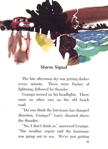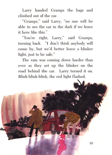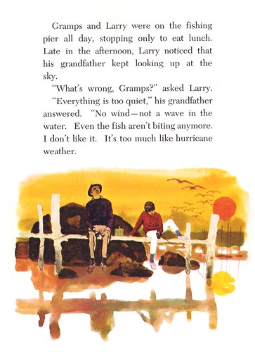
But I was used to the artist's 1950's style, as seen above. I was quite surprised when I discovered the illustrations below that Brackett did in 1970 for the Harcourt Brace textbook, "Widening Circles".

Of course, every artist grows and experiments over time... and the style Ward Brackett employed for this series sort of reflects a mood that really does feel "1970's" doesn't it?

I'm very curious about what medium the artist used for these pieces. Is it simply wet on wet watercolour? Or did he use some sort of resist technique? Some areas almost look like the result we used to get with fingerpaints on that highly coated paper the teacher gave us in grade school.

Another possibility is magic markers, believe it or not. The early magic markers, popular as artists' material around the time these illustrations were done, came in little glass bottles with screw-off tops. I've heard that it was common at the time to open them up, take out the benzine-soaked felt pad and sweep it around on your bond paper or illustration board surface. You could also buy refill cannisters of marker colour and just pour that lovely, flammable, cancer-causing stuff right down on your work. The good ol' days!

Whatever the case, Brackett achieved a pleasing effect in this series. They have a wonderful dream-like quality, hazy yet vivid, like the memory of a young boy's childhood adventure with his grampa.
My Ward Brackett Flickr set.
Ward Brackett's loose, spontaneous, designee illustrations are a good example where the illustrator trumps the photographer. These illustrations convey mood, animation and a personal statement that is very effective in communicating the essence of the story... and in my opinion, much more imaginative and effective than a photograph.
ReplyDeleteAs Leif suggested, Brackett's technique could very well be as simple as wet into wet watercolors on a smooth absorbent surface paper, such as a hot press watercolor paper. It also could have been Dr. Martin's dyes (a very concentrated potent and permanent water based dye that comes in brilliant colors) on a smooth coating of Elmer's white paste on illustration board, which gives a stained glass effect, and can be worked wet into wet.
Regardless, it is defiantly characteristic of the late 60's and 70's, when photography was not only a serious challenge to the realistic illustrator, it was eclipsing most illustration.
Tom Watson
I agree with Tom. This definately trumps photography.
ReplyDeleteMy guess would be some sort of wet-n-wet technique. I wouldn't be surprised if it was Dr. Martins. They are quick and vibrant, and when used on smooth board they could produce such an effect.
I really like the last example. I thought of Doc Martin's dyes too but wonder. Those dyes were so strong they just seemed to oversaturate everything you used them on, and Brackett's work retains a real sense of subtley.
ReplyDeleteHave u try the online bookstore
ReplyDeletewww.Cocomartini.com
I get all my textbooks for this semester from this bookstore. All are brand new textbooks and half price discount textbooks and cheap textbooks.
Good luck and wish some help.
hehe ^_^