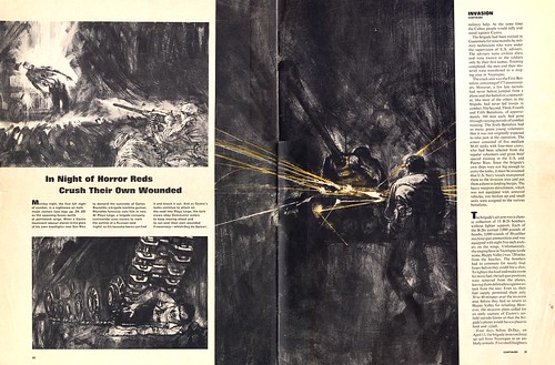
The low eye level looking into the agonizing face of a wounded soldier, and looking up at the massive steel tread of a Russian-made tank, puts us in the middle of the action... almost as though we could be next!!

On the page to the right, a soldier uses tracers to mark the outline of a Russian tank, so his bazooka teams can find it and knock it out. Once again Kossin dashes in a dark abstract tone leaving only a suggestion of the soldier and the tank, with the emphasis on the orange tracers. About 75% of this illustration is is dark abstract background and foreground... drawing the eye to the heart of the action. Notice the forceful tense gesture of the soldier. All of Kossins figures have great intensity and animation. Through keen observation, expert decision making and well honed skills, Kossin has visually and dramatically brought the "Bay of Pigs" Invasion to the general public. Truly this series is a compelling example of the right illustrator for the right assignment with compelling results.

I have seen stories illustrated in a somewhat loose manner, and when they show individual closeup illustrations of the leading characters, they tighten up their rendering technique. Kossin consistently uses the simple loose brushy technique that he used on all the previous illustrations. He avoids most of the modeling of the features, and stays with the essence of the head. Simple textural gray tones dashed in a few key locations of the face, is all that is needed to keep it unified with the rest of the previous illustrations.
My thanks to Tom Watson, who clipped the these pages for his files back when this issue of Life magazine first came out, in May of 1963. This week Tom provides his insightful analysis as well as all the scans, giving me a nice break!
My Sandy Kossin Flickr set.
No comments:
Post a Comment