Whether your a fan of traditional Jewish songs or your tastes run more to thrash metal (or maybe both?) there's no denying that the cover of this recent find would be much beloved of any mid-20th century illustration fan. I'm almost 97.5% sure that Mike Ludlow painted the album art - and probably in the late 50's.
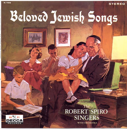
If you take a look at some of the examples in my Mike Ludlow Flickr set I think you'll agree that this looks very similar to the work Ludlow was doing for The Saturday Evening Post and Esquire around 1957 to '61.
But since there is no signature visible we'll have to put a question mark behind the credits on this first one.
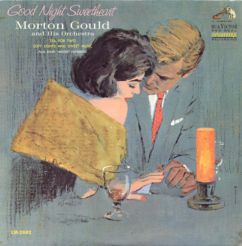
No doubt about the next record jacket, though - its signed in Ludlow's earlier signature style and is a great example of the classic 50's romance "big head" style the illustrators of the Cooper Studio perfected. I'm willing to bet Ludlow painted this piece around 1960.
And finally, a later period Ludlow album cover. Its got the popular mid-60's 'streaky line' style that many illustrators were adopting at that time... and the less legible signature that we were finally able to determine is Mike Ludlow's, thanks to reader Harold Henriksen, who helped identify it in this recent post.

You'll find plenty of other illustrated album covers -where else? -in my Illustrated Album Covers Flickr set.
Leif, I have to say, that's about the most Christian/Catholic-looking Jewish family I've ever seen! Oi!!
ReplyDeleteGreat album cover art but Ludlow probably did use the same models for those Jewish folks songs as he did for the Christian folks songs album. I love the painting style.
ReplyDeleteI really see a strong Coby Whitmore influence in the "Good Night Sweetheart" album cover. Whitmore used that blue color scheme frequently, but his style towards the late 50's and early 60's, became looser and more impressionistic than Ludlow's more academic resolved renderings. The paint streaks in the background of the "Glenn Miller" album cover, became more prominent, especially in Fuch's early Sports Illustrated illustrations... rendered in acrylics. Acrylics were brand new at that time. That effect was referred to as the "rain storm look". It is achieved by using a lot of medium in the paint, which makes it slick like painting on glass... very hard to control at first, but the happy accidents were could be exciting. Take a look at yesterday's Bob Peak illustration of a boy sitting against totally abstract background, and you will see how far that method was taken. At the time, it conveyed looseness, spontaneity and bold dramatic energy, replacing the smoother blended backgrounds of the early to mid 50's. It was a pretty daring and exciting new look for illustration. Ludlow is using a more subtle version of that look.
ReplyDeleteTom Watson
This comment has been removed by the author.
ReplyDeleteIn reference to Ava's comment. It reminded me of when my wife, a gentile, worked for a large insurance company in Los Angeles in 1961. She met a Jewish girl at work and they became close friends. One day my wife wore a cross necklace to work, and her friend was floored. She assumed my wife was Jewish, because of her appearance and personality. ( Actually my wife is English and Irish heritage.) Her friend was 20 years old, grew up in a Jewish neighborhood, and had never had a gentile friend in her life. They had a good laugh over it and remained close friends.
ReplyDeleteTom Watson