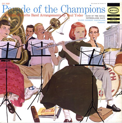
Of course finding the work of yet another talented unknown is just a reminder that there were so many accomplished illustrators working in the field back then - and only a tiny portion of them ever made it to "name status".
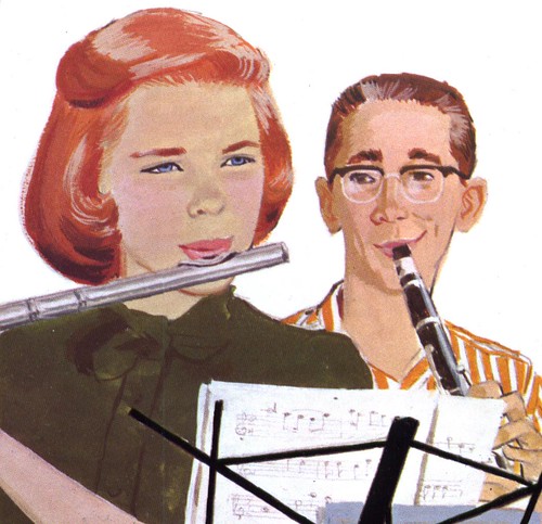
This album cover might seem a little dull at first glance (I blame the muted colour scheme for that), but Watkins created a great composition filled with interesting character types - and an amusing scenario that isn't immediately obvious.

In fact I didn't even realize that everyone was waiting for the pretty flutist's reaction to the joker on the trombone's fake mouse until I got the record home!

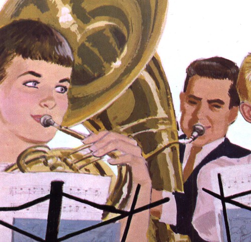
What puzzles me most about Watkins' illustration is why, after doing such a fabulous job of creating very distinctive and individual characters with subtle and nuanced expressions, did he dash off a generic face on the tuba player. Did he feel that character wasn't worth the extra effort? Was he rushing to finish... or did he just not care for tuba players?

We'll probably never know - just as we'll probably never see any more work by Robert Watkins. My internet search didn't turn up any leads. Whoever he was, this album cover is all he left for us to ponder.
My Robert Watkins Flickr set.
Looks to me like the tuba player might be an older person, maybe the teacher? He may have wanted to focus on the children, or he may just have wanted to have this guy blend into the background? A mystery indeed, but a lovely illustration.
ReplyDeleteLeif,
ReplyDeleteI'm pretty sure that the tuba player is less distinct for a couple of reasons: 1) he's the furthest back of the group, and loosening the detail helps to recede the space (as Stephen says), and 2) Watkins didn't want the tuba player's face to compete with the trombone player, and by extension, with the mouse sight gag.
At least, that's what I thought when I saw it. As you say, we'll probably never know...
This illustration has those same great qualities as a Barbara Bradley illustration... they look like real people and real natural body gestures. I like the simplicity of the all white background, which gives greater interest to all the different shapes in the composition. Watkins has turned an other wise mediocre illustration into an entertaining illustration.
ReplyDeleteTom Watson
What a sweet illustration! I love the eye expressions especially- they have an alertness to them that's really charming.
ReplyDelete