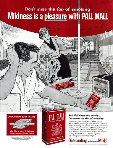
The bizarre contradiction to Peak's lack of presence during that period is that when you do find him, he is invariably illustrating for some of the most high profile of ad accounts, like this Pall Mall ad below.
In his article in Illustration magazine #6, Thomas Peak, the artist's son, writes about his father's frustration at not breaking into the top tier of the illustration business:
Dad wanted to ... produce more expressive work. He was often told, “There’s no market for your flamboyant work. You’re going to have to pull in your horns.”
To appreciate the obstacles Peak faced, take a look at the Mal Murley illustration below, far more typical of the popular illustration style of the time, and the style one finds on almost all Pall Mall ads from the mid-50's. The art director who hired Peak for that one ad above was going out on a limb.

Tom Peak writes, "Bob made an effort to conform to this standard, and was able to receive a few early assignments."
The Coke ad below might be an example of that effort. Again, its an astonishingly high profile client for a relatively unknown illustrator - one who didn't have the presence at the time of, say, Al Parker or Coby Whitmore, in America's major magazines. That Peak received such assignments at all is a little surprising and speaks to both his determination and the skill and connections of the Fredman-Chaite Studio salesmen.
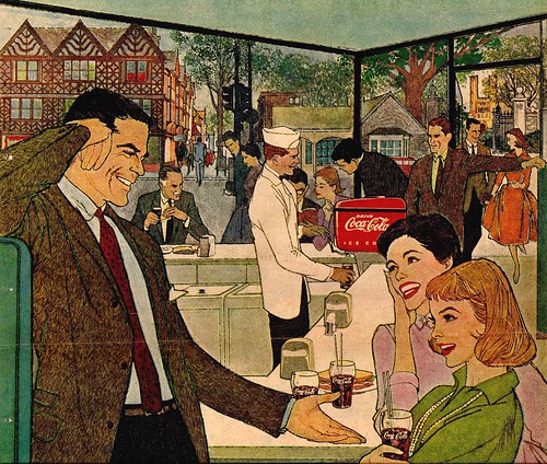
The same year (the same month, in fact, the same week) that Bob Peak's Pall Mall ad appeared in The Saturday Evening Post, Jack Potter, who was producing a series of ads for Coca Cola, had the piece below on the back cover of The Saturday Evening Post. It was 1957 and both young artists had made the journey from Art Center School in California to New York City, Potter arriving just a year or two ahead of Peak.
Dan Zalkus, a former student of Jack Potter's who later became his close friend wrote to me that, "Potter mentioned Bob Peak but only a few times. If memory serves they went to school together. Peak was very focused on being commercial and getting as much work as he could. If what I heard was correct Peak struggled at first and then came to NY to visit Potter in order to see what he was up too. After that Peak started getting more work."
And in his article, Tom Peak writes that during this same period Peak was "dissatisfied with his work, however, he made the decision that he would have to be true to himself, or he may as well give up and move back to California."
Was there something about that meeting with Jack Potter that fomented Peak's resolve to succeed, and on his own terms?

Whatever the case, it was during this period when "Bob proceeded to burn all of the illustrations he had made to that point, and vowed from that moment on to only do the kind of work that he wanted to do, spending the next six weeks perfecting his style."
"An art director and a salesman at [Fredman] Chaite Studios took notice of Bob’s paintings and appreciated what he was trying to do with his work. The salesman took a stack of Bob’s sketches over to Martin Stevens, a friend and art director at Old Hickory Bourbon."
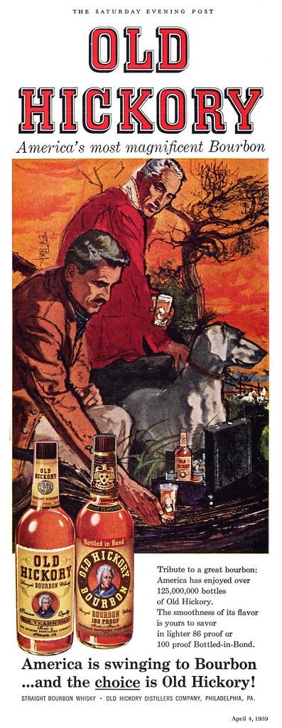
"At that time, the company was looking for an illustrator to create images for their new ad campaign. After that initial meeting, Bob received an assignment to create some concept drawings for Old Hickory."
The client was also considering the reknowned French artist René Bouché but "In approaching the assignment, Bob created an unusual picture depicting men with hook noses and big ears, holding their hands up in front of their faces. It was a departure from the images of beautiful people often seen in commercial illustration at that time. As it turned out, his unconventional style appealed to the people at Old Hickory, and he was chosen over Bouché for the final job."

"Using the bourbon campaign as a springboard, it was only a matter of months before Bob found his illustrations on the back covers of Look and Life magazines, and he went from making virtually nothing a week to making over $40,000 a year. In quick succession, Bob Peak had established himself as a name in the commercial art world."
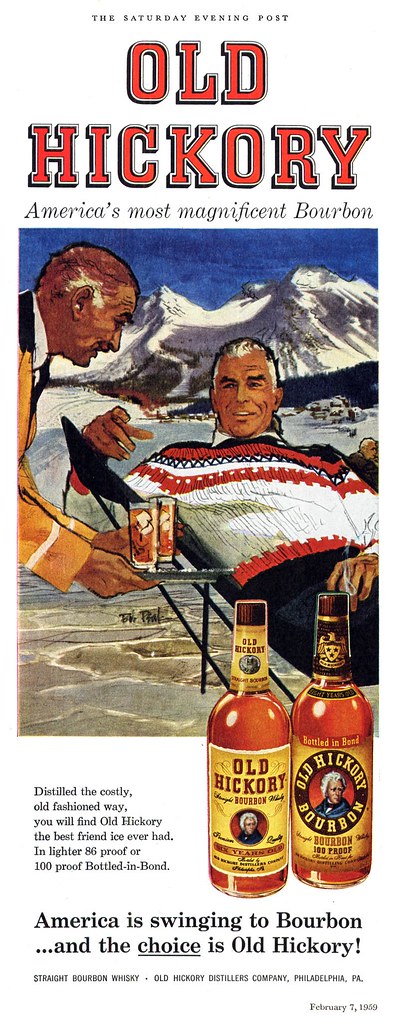
The Old Hickory campaign happened in 1958 and 1959. During the mid-50's Bob Peak had been ready to take on the world. Now, with a new decade fast approaching, it seemed the world was at last ready to take on Bob Peak.
* I have many people to thank for assisting me with this week's topic: Barbara Bradley, Charlie Allen, David Apatoff, Tom Watson for their advice, opinions, information and scans, and Dan Zimmer for allowing me to excerpt passages from Tom Peak's article in Illustration magazine, which are ©2003, 2008 by Tom Peak, Dan Zimmer and The Illustrated Press, Inc., and all artwork © The Estate of Robert Peak.
There is much, much more on the artist at Bob Peak.com
My Bob Peak Flickr set.
Leif-
ReplyDeleteI didn't see this post before I made my comment on your earlier Peak one.
What year is the Peak coke ad from? I'm curious because I know in 1957 Potter did a series of them.
Leif-
ReplyDeleteSorry about that. Didn't mean to make my post above anonymous. I hit the send button too soon.
Hi Dan;
ReplyDeleteI tried to locate some info about the Coke ad online. I was only able to find a reference to Bob Peak Coke ads at Plan 59 (see my sidebar for the link), showing two other examples of Peak Coke ads, both dated 1957.
I wonder if he did them right after Jack did.
ReplyDeleteMaybe Plan 59 can give you an exact date on the scans they have...
ReplyDeleteCharlie Allen contributed the piece I used, which he clipped back in the day for his own files - and of course he would not have been concerned with making sure a date was attached. Sorry I can't be of more help. L:-(
Thanks for this! And, thanks for not pulling in your horns. I know Peak was also the envy of young hands, too. Me.
ReplyDeleteI still have several of his print (TV Guide, Tme, McCall's) pieces in my morgue. His West Side Story, My Fair Lady and Camelot posters we're a kick in my conventional little head... wow, wow, wow.
Regarding the Coke series, Coca-Cola decided to switch artists mid-stream, canceling the balance of Peak's illustrations and turning the campaign over to a young artist in Detroit named Bernie Fuchs. That switch took place shortly before Fuchs moved to NY in 1959.
ReplyDeleteLooking at the rapid turnover in artists (from Potter to Peak to Fuchs in just a few years) you can really see Madison Avenue beginning to ramp up for the crazy '60s, flailing around for the very newest style. It seems like Madison Avenue hyperventilated throughout most of the '60s.
Peak was extremely upset about being displaced by Fuchs, and came roaring back a few years later with a series of fantastic, turbo-charged ads for 7up.
Thanks for filling in those blanks, David... I just saw some of those 7-Up ads for the first time since beginning the research for this week's series and 'turbo-charged' is an apt description!
ReplyDeleteThis comment has been removed by the author.
ReplyDeleteI don't recall the Coke ad by Peak, but when I was an illustration student, I specifically recall the Old Hickory ad depicting the guy with the red and white ski sweater. I loved the composition and confident drawing of the figures... and still do. It is my guess after looking in my clip files, that Jack Potter was the first to come up with those gorgeous color combinations that we see in that Coke ad by him... in fact all his Coke ads. After seeing Potter’s Coke ad series, I began noticing Peak using fuchsia, oranges and purples together, similar to Potter's color schemes. After 1960, Peak's talent exploded like a runaway locomotive heading downhill. He could make a simple situation dramatic, exciting and with the flair of a world renown rock star! He seemed to be determined to outdo himself on each new assignment, once he began his roll.
ReplyDeleteI was less enthusiastic about his later psychedelic period, and then his airbrush work... never the less, he had a very impressive career, and was a great inspiration to myself, and other illustrators.
Tom Watson