"Weaver let what he saw influence his design, whereas Peak, and Fuchs to some extent used photos of life to fit their designs. Weaver drew a lot of what he saw outside his studio, where Peak traced photos and jazzed them with an airbrush and pastels. Don't get me wrong, Peak was a great thinker... but for me, his work lacks any depth, exploration, or lasting feeling."

Really? Is that how we can sum up Peak's work? Just some jazzed up photo tracing, lacking any lasting depth or feeling?
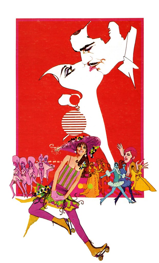
In the late 60's, Bob Peak began a new way of working. Where his early illustrations had a tremendous degree of texture and a sort of wildly gestural quality of movement, now Peak applied his always brilliant sense of design and colour and tempered them in a style that gave a nod to the 'psychedelic' counter culture pop art movement of the day.
During this period, Peak was producing exciting new work with tremendous confidence that propelled him to the front of the pack. He received a Gold Medal from the Society of Illustrators in 1967 for his movie poster art for the film Camelot (you can see that image on the front page of bobpeak.com)
In his article in Illustration magazine #6, Thomas Peak, the artist's son, writes:
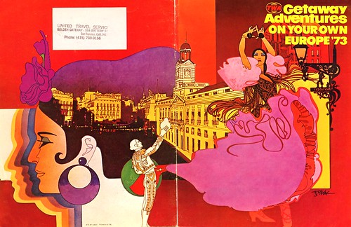
In 1973, Charles Butler Associates commissioned my father to do a series of murals for the backs of the TWA movie screens. The murals met with rave reviews from Charles Butler Associates and TWA, which led dad to do a series of menu covers for the airline. He continued to produce artwork for other TWA publications like the Getaway Adventures guides [below] with their wrap-around cover designs. This artwork was more sophisticated and subtle than the murals, but kept with the same basic design scheme and look that Bob had produced from the original four murals. Over a period of two years, dad illustrated 60 pieces for TWA. These works gave him a tremendous amount of exposure, and enabled him to receive broader media exposure through such publications as North Light magazine and Communication Arts.
The commercial artist faces many challenges in the effort to make a successful picture. A balance must be struck between the client's needs and the desire for artistic expression. To attract a broad audience, the image needs to acknowledge current tastes - and then, hopefully, push some boundaries... even if only a little. I have the greatest admiration for any artist who is able to combine all of those variables to produce truly remarkable work that appeals to a great many people. They lead the way for other artists by inspiring them to think differently about their own work. Bob Peak was one of those artists.
Charlie Allen, who provided many of this week's scans, summed it up nicely in a email he sent me last night:
"Peak was quite a talent. There are leaders and followers in every field of endeavor it seems."
* I have many people to thank for assisting me with this week's topic: Barbara Bradley, Charlie Allen, David Apatoff, Tom Watson for their advice, opinions, information and scans, and Dan Zimmer for allowing me to excerpt passages from Tom Peak's article in Illustration magazine, which are ©2003, 2008 by Tom Peak, Dan Zimmer and The Illustrated Press, Inc., and all artwork © The Estate of Robert Peak.
* NOTE: Because of the tremendous volume of material that was provided to me in preparation for this week's topic, I'll continue to post over the weekend.
There is much, much more on the artist at Bob Peak.com
My Bob Peak Flickr set.
"Peak traced photos and jazzed them with an airbrush and pastels. Don't get me wrong, Peak was a great thinker... but for me, his work lacks any depth, exploration, or lasting feeling."
ReplyDeleteQuite possibly one of the most uninformed opinions I've ever read. Sad part is that he's probably teaching somewhere.
Leif, if you think it's fair play, maybe you could name the blog .. it sounds like a thoughtful and instructive site. I'm especially interested in the history of photography in the hands of artists armed with traditional skills, and the contributor you cite -- though my reaction to Peak is just the opposite -- appears to have an ample understanding of technique as well as an intriguing critical approach to illustration.
ReplyDeleteUsing models, or drawing and painting from life, as opposed to drawing and painting from photography, has been discussed, debated and argued since the camera was invented. Norman Rockwell was very reluctant and felt guilty he started using photography in the late 1930's, since he always painted from a live model before. But, using models was often restrictive in changing perspective, and many other creative approaches that the use of the camera could achieve. Rockwell was even shunned and openly criticized by some of the die hard classical, traditional, academic illustrators of the day.
ReplyDeleteSince then, it has been a common belief that to use a photo creatively, the illustrator must first learn to draw and paint from the model first, and then use the photo... but only as a guide for general proportions and gesture. It is important when using a photos, to edit it by emphasizing, exaggerating and most importantly leave out or subdue what is not necessary to the overall effect you are looking for. The gesture of the figure should have top priority, when drawing from either the model or a photo.
With that said, Peak certainly past the test on using photos to create his illustrations, in my opinion. His figures were never just photo realism or even photo-like. I think Peak was one of the top illustrators that took the use of photos to another level.
He always added HIS personality and flair to his illustrations.
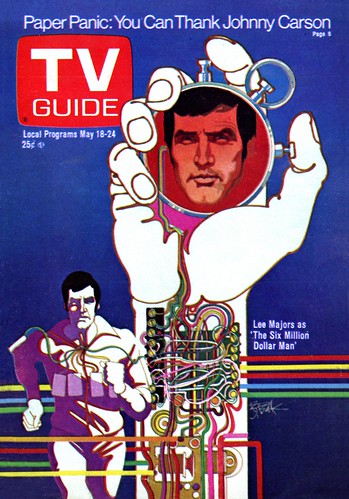
Take a look at the TV Guide cover of the Bionic Man, where he mixed academic accuracy with great flair in his use of color, and the stylization of a decorative graphic designer. I believe that is what set Peak apart.
As for Weaver, he seemed to be more influenced by the fine art approach to illustration, but why would that give his illustrations 'more depth, exploration or lasting feeling,' than Peak's illustrations? I don't think it does.
At that level, it becomes a matter of personal taste... not who's better.
Tom Watson
Peak did a watercolor portrait of Egon Schiele that has all the depth & quality I would want in a painting.
ReplyDeleteAnother round of excellent posts this week, Leif!
ReplyDeletePeak remains one of my favorite illustrators - if not my absolute favorite. That TV Guide illo was new to me, and it reminds me how much, as a child, I adored his rainbow-hued images from the late 70s, in particular his movie posters (Superman, Star Trek, etc.)
Glad to hear you'll be posting more images throughout the weekend.
This has been an excellent, informative week, Leif. I have really enjoyed it. Thanks for all your hard work.
ReplyDeleteDavid
My name is Mike Santore. I'm a graphic designer, illustrator, fine artist. I studied with Bob Peak, for a brief stint,during evening classes at the Art Students League. I say for a brief stint.....he was so busy that he seldom showed. He had a friend of his Bob Hermann, a fashion illustrator, fill in for him. Hermann was a nice guy and a competent artist.....but NO PEAK.
ReplyDeleteOut of a class of perhaps 35, there were 6 professionals. We used to have to gang up on Peak, as soon as he walked in, and hammer him with questions....just picking his brain. He was an awesome talent, and a damn nice guy. One last note. One evening he came up behind me, while we were drawing from the model, and he says, "Santore, you scare me, because you know where everything goes.I want you to stumble for it, stumble for the lines." I really didn't know what he meant, at the time. However, I know now. Thanks for letting me rant.
I don't agree with the comment by Mr. Jusko. Bob Peak was a trailblazer and one of the greatest illustrators of all time. The work he created was unique and compelling and gets even better with time. The sign of a true master. Peak is often copied to this day by others and what's even more remarkable was his diversity over the years. There is lasting feelings to his work which is is obvious to any artist anywhere.
ReplyDeleteStephen; Thanks for your comment, however, I think you misunderstood Joe's comment; he was indicating that he disagreed that Peak was merely a photo tracer and essentially shares your point of view.
ReplyDeleteHi Leif,
ReplyDeleteOh my gosh you are right! I did not see what Jusko was referring to. I just read that top portion of his comment and got crazy. There are Peak bashers out there that are actually teaching and I agree with Joe because I have experienced it. I know Joe's work too and he's very good. I got to spend a few hours with Peak in the 1980's and he selected my art for the cover of American Artist magazine.
He was a good man and really liked the fact that I was interested in illustration and graphic design. The meeting I had with Bob Peak has remained a highlight in my illustration career.
Peak defined a whole style of art. I just bought some Peak works at heritage and for a few grand they are a steal. Compare his talents to the rip off morons who are being shown by Sothebys or Christies contemporary sales.
ReplyDelete