After all, could the mid-50's Bob Peak have sold a client on the idea of a green man drawn in a distorted style as the best way to advertise their product? I don't think so.
But at last times had changed, and all of a sudden Peak's signature - and signature style - seemed to be everywhere.
In his article in Illustration magazine #6, Thomas Peak, the artist's son, writes:
"Using the [Old Hickory] bourbon campaign as a springboard, it was only a matter of months before Bob found his illustrations on the back covers of Look and Life magazines, and he went from making virtually nothing a week to making over $40,000 a year. In quick succession, Bob Peak had established himself as a name in the commercial art world.
The impact of his work with the Old Hickory campaign led him to other assignments from Pepsi-Cola, Chrysler, and Dobbs Hats."

Bob Peak was named "Artist of the Year" by the Artists Guild of New York in 1961. At last, he had arrived.
That same year, Peak began what would be a long, successful association with the film industry. Tom Peak writes, "David Chassman, an executive at the United Artists film studio, hired Bob to create a new look for a feature film version of the hit Broadway musical West Side Story [below]. Up until this time, the major studios such as Universal, Allied Artists, and MGM had used illustrators such as Reynold Brown, Ken Sawyer, and Joe Smith to create the “key art” during the ’50s and ’60s for westerns, romances, and monster movies. The art created for this film was a radical departure from the established styles of these other artists."

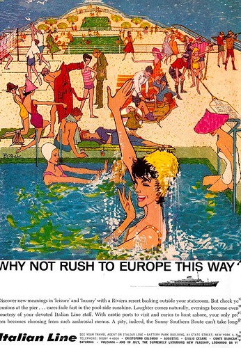
As Bob Peak's popularity spread far outside the New York market, even art directors in far-flung regions, typically working with smaller budgets, were making exceptions if it meant they might get Bob Peak in on an assignment.

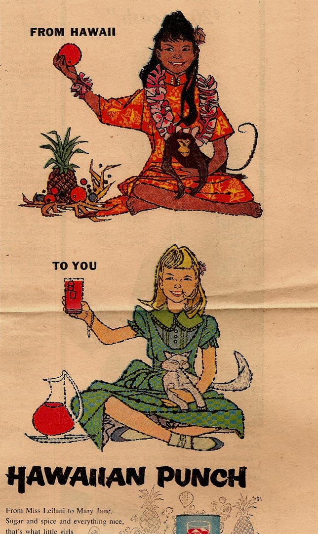
Charlie Allen, who worked in the San Fransisco area, sent the pieces above and below and writes, "Saw the two Hawaiin Punch originals at McCann-Erikson and was a bit miffed. I'm positive they paid Peak more than we local yocals... they were tight spenders locally!"
While many other formerly successful illustrators saw their own careers sinking beneath a tide of change that was sweeping through the print industry in the early 60's, it was 'full steam ahead' for Peak.
His tremendous popularity didn't neccessarily convince all of his peers of the merit of his work, however.
David Apatoff relates this anecdote:
"In 1964, the Famous Artists School wanted to put out a new edition of their materials, and wanted to bring in the younger crop of fashionable illustrators so that the FAS would appeal to the next generation. So all of the old greats-- Dorne, Ludekens, Rockwell, Briggs, etc., -- had to pass judgment on who was good enough to join "the club." Most of the choices were obvious, but there was a real split of opinion over Peak. Some of the old guys (led by Briggs) thought that Peak was flashy, but just not good enough, and strongly opposed extending him an invitation. Ultimately, they chose to invite him."
Because inevitably, there was no denying that the 'Golden Age' of 1950's illustration was over - and it was time to adapt or die. As Charlie Allen puts it, "To be honest I wasn't a big fan of Bob Peak's work until he began the amazing Hollywood movie posters. Wow! Wasn't a big fan of Potter or Hays, but I did use techniques, more underpainting, textures, etc. they pioneered."
* I have many people to thank for assisting me with this week's topic: Barbara Bradley, Charlie Allen, David Apatoff, Tom Watson - and today, Larry Roibal as well - for their advice, opinions, information and scans, and Dan Zimmer for allowing me to excerpt passages from Tom Peak's article in Illustration magazine, which are ©2003, 2008 by Tom Peak, Dan Zimmer and The Illustrated Press, Inc., and all artwork © The Estate of Robert Peak.
There is much, much more on the artist at Bob Peak.com
My Bob Peak Flickr set.
Wow, these are great.
ReplyDeleteA bunch of friends and I flew out from Seattle to NYC for the Bob Peak show at the Society of Illustrators back in 2005. It was excellent...really covered his career. It's just that when you see all these other works you realize it barely scratched the surface.
=s=
In the 60's, Peak seemed to be leading the charge into the new look of illustration. I often wondered whom was looking at whom for inspiration, influence and new ideas. Could it be that Peak looked back to the impressionists, or maybe the expressionists, or was he checking out the abstract movement that became popular in the 50's?
ReplyDeleteAs an illustration student in the late 50's and early 60's, we were encouraged to look to the past for inspiration, influence and new ideas, but keep an eye on the present trends.
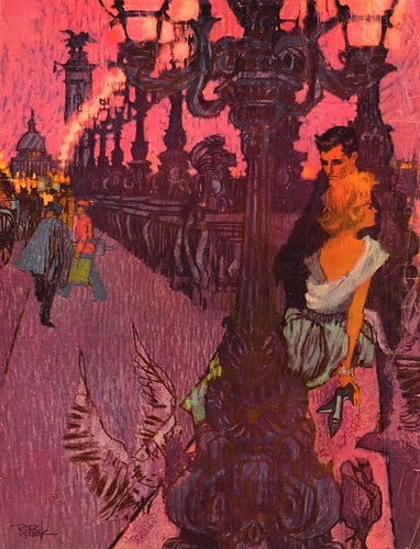
Peak's color schemes were revolutionary in the 60's, and they took my breath away, every time I ran across one of his illustrations in a magazine. He could make the entire picture radiate and glow like a stain glass window with the sun shining through it.
What excitement and drama Bob Peak gave to his work... therefore, it was ideal for the movie industry posters.
He was no doubt, the right illustrator at the right time.
Tom Watson
I visit this site almost daily and really should have said this sooner, thanks for putting up this blog.
ReplyDeleteTim Langenderfer
Dayton Ohio (home of Coby Whitmore)
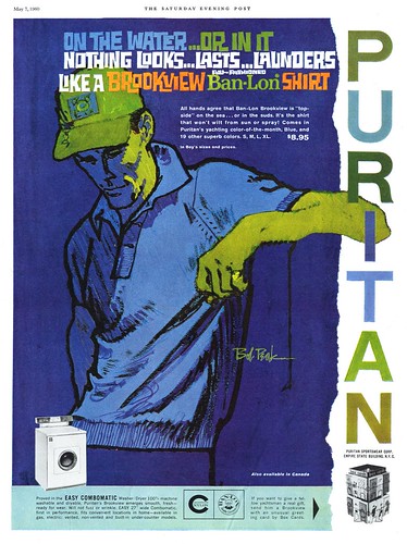
I always thought that Peak borrowed heavily from Egon Schiele; that sensitive, highly stylized outline that became his trademark in cigarette and Puritan ads. As for his colors, I don't think there was any precedent for that, if only because no one had invented those fluorescent, irridescent, DayGlow colors before.
ReplyDeleteI agree with David, that Peak's colors were not special Florescent or DayGlow paint. I believe his combination of excellent taste in color schemes, and his willingness to use intense bright color combinations, instead of neutralizing or muting his pallet to represent a more literal color scheme.
ReplyDeleteTake another look at Jack Potter's Coke ad in yesterday's post, and you will see a similar decorative use of color, which Peak began using on a regular basis in the 60's. It is my conclusion that Potter came up with those colors first, and Peak may have been influenced by the possibilities... and he took them to another level in his illustrations. However, that is only a somewhat calculated guess.
Tom Watson
Thank you for posting this.
ReplyDeleteHe was one of my favorites.
Thank you all for your comments - and to Tim and Santiago - I appreciate you letting me know that you enjoy my posts! :-)
ReplyDeleteI had the pleasure of growing up in Greenwich, CT while Bob and his family lived there. His sone became a friend of mine and my family. I had always known that Bob was an artist but as a boy with sports cars on my mind...I most loved his lovely ferraris and lamborghinis. It was not until later in my life that I learned what a prolific artis Bob Peak was.
ReplyDeleteLast night I attended the Bob Peak exhibition in LA County and I must say that the art gave me chills. It spoke to me in a unique way. I felt connected to his work and actually got chills from time to time. Overhearing the comments from others at the opening...I realized I was not alone in feeling the impact.
A tremendous event in tribute to a tremendous artist.
Charcoal Winter Sale
ReplyDeleteI don’t usually read blog posts, but I’d like to think this write-up really forced me to try and do it! Your writing style took me by surprise. Thanks, good post, really nice.