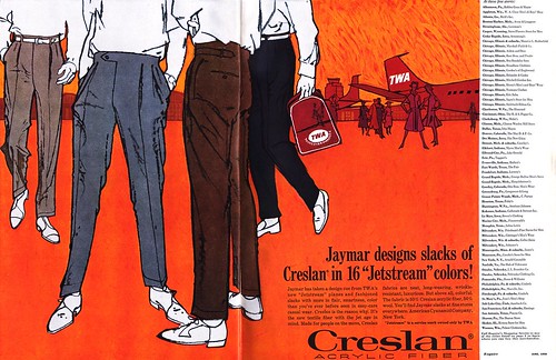
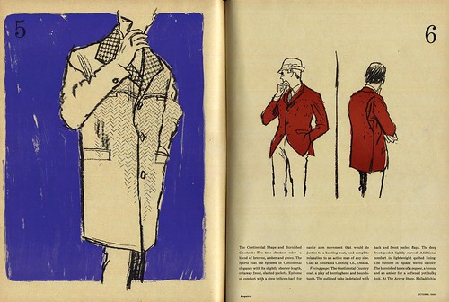
For example: the Dobbs hat ad below from Esquire magazine, signed 'Bob Peak', follows the unsigned Creslan ad from the previous spread.

Also by Peak? Or merely 'Peak-ish'?
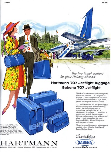
I often come across these unsigned examples that make me wonder just that... and even when they are signed, like the Hartmann luggage ad below, its undeniable that the artist intended to give his illustration a Peak-ish flare.
Before Bob Peak, you simply don't find this sort of style anywhere.
More than anything else, this influence on the look of early 60's illustration might be the greatest indication of Bob Peak's success.
In his issue-long article on Bernie Fuchs in Illustration #15, David Apatoff recounts how Advertising Age magazine at one point began running a series of ads by Fuchs imitators ... a game to see who could spot the copies, because they had become so prolific in the business.
Consider today's post your opportunity to participate in a similar game.
* I have many people to thank for assisting me with this week's topic: Barbara Bradley, Charlie Allen, David Apatoff, Tom Watson for their advice, opinions, information and scans, and Dan Zimmer for allowing me to excerpt passages from Tom Peak's article in Illustration magazine, which are ©2003, 2008 by Tom Peak, Dan Zimmer and The Illustrated Press, Inc., and all artwork © The Estate of Robert Peak.
There is much, much more on the artist at Bob Peak.com
My Bob Peak Flickr set.
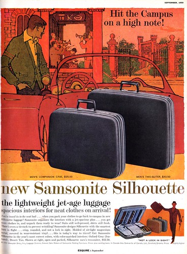
I believe the Samsonite ad was illustrated by Peak.
ReplyDeleteIt seemed to me that when Peak was at his peak in recognition and production output, clients wanted to have his signature on those illustrations. After all, they were probably paying top dollar to get him to illustrate their product. I can't imagine a big brand name client or their ad agency choosing a top of the line illustrator to illustrate their product, and then allow his signature to be excluded somehow... however, there were always exceptions to the rule.
ReplyDeleteIt was my experience in the 60’s, that art directors were hoping to discover the next hot illustration style, before everyone jumped on the band wagon. I tried to look Peak-ish, with a few samples of Peak imitations in my portfolio, at that time. The general reaction was, that the Peak look was being done a lot, so they wanted to see something new and different". Good advice for any young illustrator.
Tom Watson
Tom, here's one of those "exceptions" to your general rule about an ad agency excluding the signature of a top illustrator: when Bernie Fuchs became popular, the agency asked him to sign his latest painting. But when they saw it, they ordered him to remove his signature because it looked like a swear word.
ReplyDeleteLeif, I was ten years old when Peak was at the top of his game in the 60s, and I remember going through the exercise that you describe in this post: "is this really by Peak, or by an imitator?" My father sat down with me and went through my pile of clippings and we talked about what made each picture good or bad (as opposed to cosmetically similar). He showed me that if I looked for quality, rather than a specific bright color or a particular style of line, I could usually distinguish an original talent from his many imitators. He said the underlying quality, rather than the superficial appearance, should be my polar star. And where the test failed, and a "non-Peak" crept into my collection it was a "no lose" proposition because at least I had a quality picture.
Tom; regarding good advice for young illustrators: its shocking how often tthe opposite is given. David has a reference to the encouragement of imitation in his Fuchs article, where he says, "Veteran illustrator Daniel Pelavin complained that art students were all training to mimic Bernie" ... and I've read similar situations yeard later in, I think, CA, where an article quoted several illustration students talking about how their teachers encouraged them to imitate Brad Holland or Gary Kelly or Guy Bilout until they had established themselves and could start developing their own styles.
ReplyDeleteI'm not saying its right - I'm just saying that its the nature of the business.
David;
I don't know where to begin... you were collecting Peak clippings at age 10?!
Incredible. Your dad certainly gave you excellent advice... sooo which of today's scans are by Peak?
;-)
i'm diggin the peak posts!
ReplyDeletei'm surprised you have not gone over the influence that peak has given commercial illustration and the art of the graphic novel. one his his protege's bill sienkiewitz held down the peak legacy in the GN field.
electra assassin being my FAVE!
thnx ...-d!
Thanks for your comment, Deryke :-)
ReplyDeleteI tend to stay away from modern illustrators and comic artists since the focus of this blog is pretty specifically 40's, 50's and 60's illustration.
Also, this isn't intended to be a thorough overview of Peak's career ... just a capsule look at the first part.
But hey, you told 'em, so... there you go!
Leif, you would have done the same thing. I had been saving comic strips because I liked the pictures of people punching each other. Then I saw the Peak ads for Puritan, with people with blue skin on bright purple backgrounds, and they knocked my socks off. I said, "whoa... maybe I should start saving these too!" And so began my long slide...
ReplyDeleteDavid, I recall reading about Fuch's signature problem, in your article for Illustration Magazine. During the 70's, one of my clients would not accept anything that had the colors purple, pink, peach or lavender, because he thought it was too feminine. It was an industrial account and he thought blues were more appropriate, period. Sounds like a similar mentality, that was concerned with Fuch's signature.
ReplyDeleteLeif, I was lucky I guess, because all my teachers encouraged us to be inspired by new and exciting illustration styles, but they always warned us not to directly copy or imitate a certain style. I knew better, but I thought I could get some assignments by jumping on Peak's band wagon. David's father was very intuitive... the quality or lack of it will come through and separate the second rate imitators from the star performer... most of the time. It was all a learning experience for me, that was part of the maturing process.
Tom Watson
actually it was: "Give a student the ability to imitate Bernie Fuchs and you've given him a good shot at the CA Illustration Annual for 1974, give him skills to negotiate, promote and run a business, and he may actually be able to make a living."
ReplyDelete