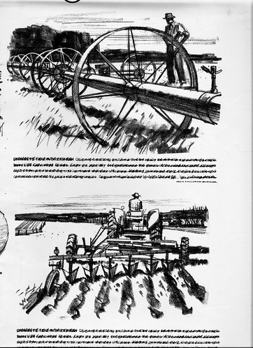
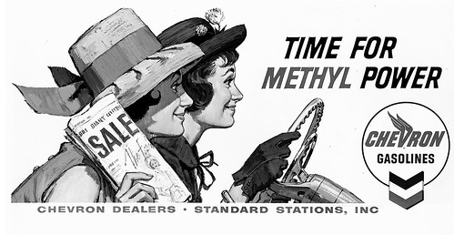
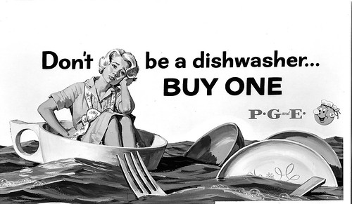
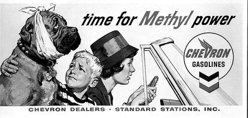
"Glad to help....but haven't a clue whether any of this is available these days. Something similar should be. Tools....plain old wooden pen holder. Pen points: 'Hunt' number 303 and Globe (little nib, like a bank pen)....Windsor Newton numbers 2 and 4 sable brushes....Higgins India ink, or equivalent..."

"...and, (this is no longer made, in fact) Whatman hot press, or surface No. 1, illustration board. Mother is....no....necessity is the mother of invention....and something could be conjured up these days to work, I'm sure!"
All that sounded great -- but I had a feeling the illustrators out there would want even more detail. So I pressed Charlie to elaborate - and, gentleman that he is, he accommodated me:
"WOW....A complete art lesson! OK.....one steel spot per day, at least. 3 to 4 days to complete the four illustrations. Thumbnails for a beginning, then a charcoal pencil comp for BBD&O..."

"... then part Lucy and part drawing on the finished board. As with cars, certain parts can be 'Lucied', (faces for example) and the rest interpreted, or drawn. Then the ink rendering..."

"...and the reason I loved Whatman Board was that it could be erased. I had an electric eraser....and used it a lot! Some illustrations resembled a 'battlefield'! Hope this helps....but, as I learned early on, you learn by doing. And every illustrator I knew had HIS way of getting the job done!
But Charlie wasn't finished sharing his wisdom just yet. So here's some more from the master of black and white:
"Now...take cover....art lesson coming! On every color illustration since the dawn of man, the illustrator has to juggle four main elements (like a four ball juggler)....drawing, composition or design, values, and color."

"Color is the least important....the other three equally important. Best example of this was Robert Fawcett. His color was of least importance....on the other three he excelled. On B&W line art, the elements are drawing, composition, values (if halftone screen is added) and texture. Texture is the added challenge....and a lot of artists never 'got it'. "

"Have no idea why I started all this...except to say a good color illustration should photograph well in B&W halftone....and I think these 24 sheet posters do."

Whew! Many thanks to Charlie Allen for sharing such a wealth of art and information with us this week! I know I'm not alone in saying how much we learned from - and enjoyed - his invaluable contributions.
My Charlie Allen Flickr set.
Oh yeah...this was a great week. I love line art. Good tip on the power of values in illustration too.
ReplyDeleteThanks for sharing Charlie!
=s=
Thank you for this weeks entries. Charlie Allen's pen work is amazing. Clean and not "overdrawn".
ReplyDeleteNow to show my own ignorance, what does "lucy" mean?
Hi Dave,
ReplyDeleteA lucy is a projector (lucidograph) where you could take a photograph, or a sketch and project it on to your illustration board. We used these at art school. They were long, horizontal contraptions and had a track where you would pin up your photo. Then you could move the track back and forth to enlarge, or reduce.
And no, using a Lucy isn't cheating as some folks think, it's just a tool;-)
P.S. While I was typing this response to Dave, Bruce beat me to the punch. This will be more than you ever wanted to know about a "Lucy"... ha!
ReplyDeleteIt's a nickname for an overhead opaque projector. Most illustrators back then used them for speed... getting visual information down quickly, by tacking a photo or image to a vertical board, then switch on a spot light, and the image would project through a lens onto a horizontal table top to draw from. A black cloth encircled the whole machine, to keep unwanted light out. The image could be enlarged, reduced and focused... we could even distort the image somewhat.
"Time was money", so anything that could save time was fare game. The key however, was that an illustrator had to understand those essentials of picture making that Charlie Allen pointed out. He knew how to use a "Lucy" as a TOOL, and not a CRUTCH, and that's part of why his illustrations never looked artificial.
Tom Watson
Bruce and Tom,
ReplyDeleteThanks for responding. This blog is a great resource.
Thanks, Charlie. Your comment on Fawcett is exactly why I study his work. I remember reading an interview with Bob Peak, mentions that he needed to re-draw, not scale, so his work wouldn't lose that spontaneous feel.
ReplyDeleteJust googled "pen+nibs+Hunt" and got 21,000 hits. Charlie's pen points are still available in cyberspace.
Never used Whatman, but double-weight cold-press Crescent. At the end, all I could get was Letraset board. (The single weight wouldn't let you re-work the surface. Whatman was clearly superior, so I think it was an economics decision.)
BTW, "projector+Lucigraph" got exactly 6 pages, and no leads. Y'all who used the horizontal model had it easy-- we had the vertical model with hand pulleys in front, standing, staring into those 4 monster bulbs until we saw blue spots.
The female artists at the studio thought the guys were being cute "naming" the machines, so they named the Velox camera; in additon to "Lucy" there was "Aggie" (Agfa). LOL
Re: ",not scale," in previous post.
ReplyDeleteI was hasty. I meant Peak disliked mere tracing and re-drew fresh when he used a Lucy.
I found at least two different models of opaque projectors--new ones, at that--in a Currie's art shop in Toronto, Ontario, this last January, so they're still around and still being manufactured.
ReplyDeleteHi Leif, It was a great week, I always enjoy seeing Charlie's work, I saw a lot of it when I worked at Campbell-Ewald. The tools he used are the same ones that I used for all of my ink line work. Whatman board was an excellent surface to ink on and the electric eraser was indispensable. Most of the illustrators I worked with back in Detroit used a Besseler projector instead of the Lucy.
ReplyDeleteThe Mothers of Invention
ReplyDeleteThanks Leif & Charlie for this exhaustive thread.
Very interesting to see the progress of those thumbnails up to the ink rendering. As if looking through a camera and then focussing: From a somewhat blurred picture to a real sharp one. Oh! Still love to look at that tractor, the furrows and all...
Charlie`s art lesson was a highlight for me, in all it's irony: First I took cover, as recommended, but then the chance.
He even is his own art critic! Why does he say those grey values are badly managed on that Del Monte ad?
Mmmmh, if I were an art teacher, I´d present that question to the students; just wondering how many of them might understand...
Also liked Tom's comparison of the tool and the crutch, which just hits the nail on the head.
Thanks once more, Charlie!
Thank you to Charlie, and to the others who have commented here. What a great week!
ReplyDeleteGreat detail to the process. The board does make a big difference if you are doing a lot of erasing because with some boards, if you rub off the top layer as you erase, any further ink application will soak in and bleed. Never heard of Whitman/Whatman brand.
ReplyDeleteDid Charlie mention his habit of working from a drawing board arranged to let him work while he was in bed? Chris Kenyon and Jim Sanford used to marvel at Charlie's work and told me stories, perhaps apocryphal, but most entertaining about that secret element in his style! His inking abilities are second to none, and set a style that was considered the Northern California look, if my memory of Jim Sanford's comments is clear. Chris and Jim would both make good subjects for investigation. chuck
ReplyDeleteI worked as a 'medical illustrator 81e30' at the Medical Field Service School, Brook Army Medical Center in San Antonio in 1969-70 (draftee, obviously!) and our Training Aids section had a real treasure trove of what are now antique art devices -- paid for by taxpayer largess. Hell, there was a war, albeit a very unpopular one, on! I was offered Specialist 6 (E6) to re-up.
ReplyDeleteWe had a big black Lucie that I would LOVE to have right now, but it was a rear-projection version. These comments seem to mention only overhead types.
We considered it a major expedient; we were expected to produce a lot, probably some not so good, to be too useful to send to 'Nam -- we supposed. Being artistic was just circumstantial -- most of the good 'art jobs' were done by contracted civilians. Lots of picking up cigarette butts, too.
I have an Edmunds Scientific 'how to' booklet on how to make drawing devices which spells it "luciograph" and shows it as only a rear projector. Advantage: the artist's body parts don't get in the way, and it reproduces without reversing the image. I was about to make one, but if I could buy a used on it would be great! Tho I got an MA in art/education, I ended up happily teaching Kindergarten (lotsa good creative art!) and nearing retirement, want to try some illustrating again.
PS: my magnum opus for the Medical Corps was a leathercraft manual for rehabilitation therapy, plus a bunch of motivational slides with Yellow Submarine/Peter Max type comix!!
"Right way, wrong way & Army way!"
Wick Humble