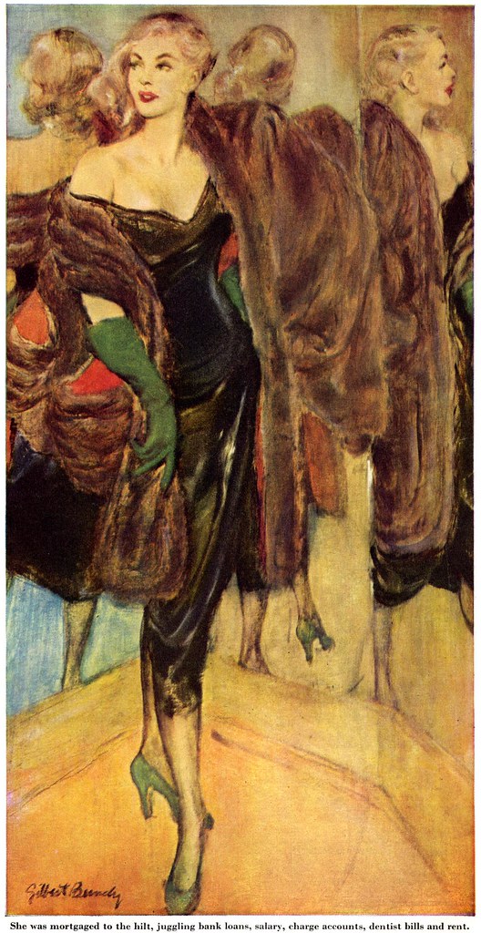
Bundy actually borrowed a huge antique mahogany 'three-way looking glass' from a friend, damaged it while hauling it up two flights of stairs, then was unable to achieve the effect he wanted by using it.

"I finally posed my model backwards or sideways in three different poses, one for each panel of the mirror, and worked direct," Bundy told the author, "Then I combined the three to get the triple-reflection effect."
Because a mirror reverses the image, Bundy had to reverse each version of the girl... then discoverd at the last minute that the legs in one panel were in the wrong position. These are the sort of error details Post readers loved to write in about - and that Post editors took very seriously. In spite of the error looking the way Bundy had wanted it to, "with next to no time left, Bundy frantically got his painted lady to put her best leg forward and the illustration was saved."

Painted ladies and best legs were a common theme in Bundy's career.
"Until the New Look made a well-turned ankle a thing of the moment instead of the past, the hallmark of a Gilbert Bundy illustration was a shapley pair of legs at full length. They were always beauts, and no foolin' about them."

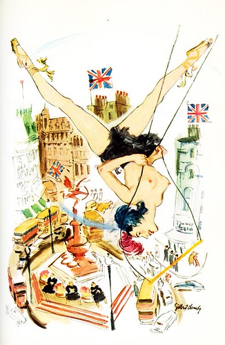
Just the other day, Kent Steine sent the pin-up above and writes, "This is from the Ted Saucier (cocktail mixing ) book, "Bottoms Up". The cover has the Dorn piece reprinted in numerous thumbnail sized repeats. The Bundy is contained within."
"As you well know illustrators were considered celebrities in the old days, and among many other things, often had cocktails named after them in places like the Stork Club, 21, The Iron Gate, and the Cafe DeArtiste (Cornwell and Mr. Reilly lived above, in the Hotel De Artiste)."
"Bundy's 'Piccadilly Circus', was a concoction of: jigger of dry gin, 1/3 French vermouth, dash of absinthe, dash of grenadine, ice. . . shake well, strain into a cocktail glass."
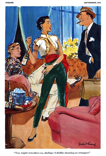
Speaking of girls, booze and social clubs, one last point of note is Gilbert Bundy's long association with Esquire magazine, for which Bundy began producing cartoons in the early 1930's. In The Illustrator in America, author Walt Reed credits Bundy's "deftly drawn, risqué humor" as being integral to the early success of that magazine.

As luck would have it, my pal Mike Lynch posted some scans just this week from the Esquire 25th Anniversary Cartoon Album, including one by Gilbert Bundy.
My Gilbert Bundy Flickr set.
Esquire Magazine was considered pretty daring for kids. During the 50's when I was a teenager, I would occasionally find the somewhat taboo Esquire Magazine in our house, buried at the bottom of a stack of monthly magazines, as many parents back then considered it an adult magazine, and not to be displayed for kids to eyeball. That was all we needed to sneak a peek at those very provocative illos., like Gil Bundy's. Checking out the latest issue, was a real adrenalin rush for a 50's kid. Who needed drugs??... looking back on it, Bundy and other sexy women illustrators, were unknowingly doing a public service.
ReplyDeleteTom Watson
He he he, good comment, Tom!
ReplyDeleteThe 50's were quite adventurous times for teenagers, "sneaking peeks"...
What's that Union Jack flag on top of "Bottoms Up" here?
Does he want to convey something?
I just love the way he painted the fur of that mirrored lady.
Nice illustrations!
ReplyDeleteThis comment has been removed by the author.
ReplyDeletehistory of Illus. class never got to mr.bundy . thanks for turning me on to this guy!
ReplyDeletegr8 post!
Thanks for your comments, everyone - glad you enjoyed our week on Bundy - and I'm pleased to hear I've introduced you to this wonderful artist, deryke!
ReplyDeleteIt seems to me that the mirror was the least of Bundy's problems on that oil painting. He was brilliant with watercolor, but his oil painting left something to be desired. (Maybe he sprained his wrist lugging that big mirror up the stairs?)
ReplyDeleteToday I was in the library, browsing the bargain book section, when one book in particular caught my eye - an old encyclopedia of cocktails, illustrated with vintage pin-ups. Of course, I'm talking about "Bottoms Up". At only ten cents, it's by far the greatest score I've gotten in a while! A real treasure.
ReplyDeleteAnyway, I quickly flipped through the book on my way out of the library, and instantly recognized Bundy's Piccadilly Circus illustration, from seeing it on this blog. It was very cool to click back here, and learn a tidbit or two about the book I've just bought.
...and this is as good a time as any to come out of lurking and say how much I enjoy your writings here. Thanks so much for keeping this blog up! I love it!
I've been a huge fan of Gilbert Bundy for years -- he makes it look so easy, and his use of color is always spot on (and better than Hurst's). Thanks!
ReplyDelete