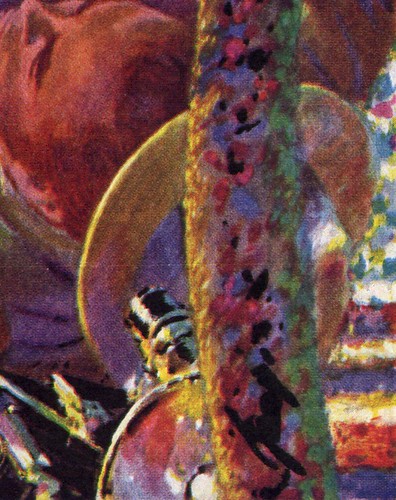
Where others might have seen a tree trunk as a strip of brown bark, Georgi saw an opportunity to sprinkle down a swath of candy-coloured paint daubs.
No grey tones for Georgi -- he filled shadows with deep purples to counterbalance the rich yellows of his sunlit spaces.
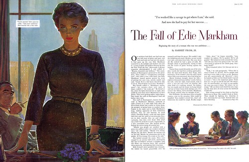
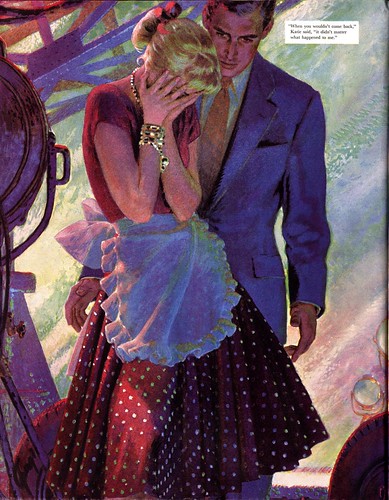
Like Seurat, Edwin Georgi shunned the easy solution of using literal colour, preferring the challenge of conducting an orchestra of coloured points to play a symphony of dazzling luminosity.
That lack of literal color gives Georgi's illustrations a magical quality.
Sometimes their intensity is almost too much to bear.
Georgi, perhaps more than any other illustrator, was capable of creating such ferocity of colour that the art fairly glows white-hot.

But when he wanted to, Georgi could tame that fire. More startling than his riotous colour schemes are those that radiate a quiet intensity.
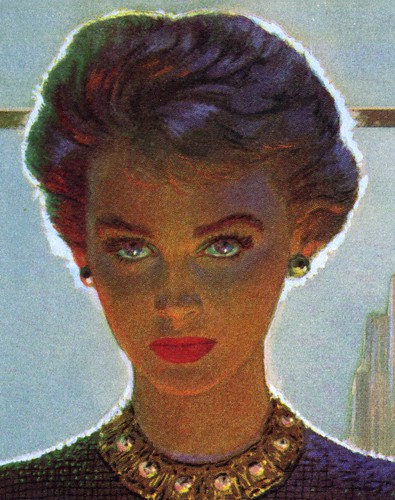
Georgi's masterful command of colour allowed him to temper his work to the mood of any particular assignment.
I found this wonderful quote attributed to the artist Paul Klee that I think Edwin Georgi would easily have related to:

"Color possesses me. I don’t have to pursue it. It will possess me always, I know it. That is the meaning of this happy hour: Color and I are one."
Edwin Georgi, the man who loved colour, died in 1964.
My Edwin Georgi Flickr set.
Georgi was an artist I liked a lot. His work transformed at some point in the 50's and his use of color was like no one else's.
ReplyDeleteEdwin Georgi's color, as Leif suggests, is based on the principals of the impressionists. Gorgi explored combinations of warm vs. cool, using the theory of adjacent colors on the color wheel: (blue & orange, or yellow & purple, or red & green) for the bases of a color scheme. Then he created variations within the scheme... such as adding separate daubs of green, and turquoise, and purple to blue. And adding daubs of yellow, and pink, and red to orange... causing a much richer glowing interpretation of the more muted literal color we gernerally see in nature .
ReplyDeleteGeorgi's spin on this theory, was to apply it to very literal renderings. During the 1920's, similar impressionistic use of color was applied to more loose painterly techniques, that were more characteristic of Monet's landscapes and Degas' later pastel ballet dancers.
Georgi's illustrations appear to be a revival of the theory of impressionism, without the calculated mechanical appearance that Seurat gave to his paintings. Ironically, at about the same time, interest in French Impressionism was being revived throughout the country.
Tom Watson
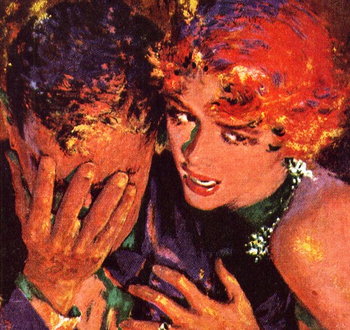
The example you give us here, the lady portrayed in opposite light conditions, I find it stunning.
ReplyDeleteMust be very difficult to render this subdued glow of colors and skin tones and getting it right.
Another things the impressionists practised (it think it has been discovered before by Delacroix and the like) is that shadows are neither black or grey, but themselves have colours. That gave them this brightness which often lacks in photogaphy. If you look at some photographed twilight landscapes, for instance, you will find the shadows way too black.
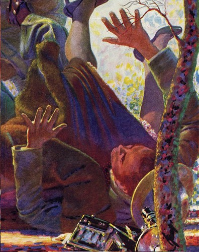
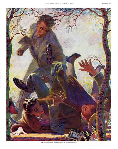
Amazing! Simply amazing. Leif, I love how you dissected that first piece in chunks, as it had me guessing who was tumbling over and why. With each new section expanded (of course to point out your colour
ReplyDeletetheme) you also gave proof, in the final entire reveal that Georgi was no slouch in composition either.
Bravo.
My mother, now age 87, posed for Edwin Georgi back in the day. If he was illustrating three different women, one a redhead, another a brunette and the third a blonde... my mother was the face of all three! He also made her instantly Asian! Fabulous color, fabulous illustrations and fabulous memories! We have a handwritten note to her and a nice collection...
ReplyDeleteMy career included Creative Directorships at both Macy's NY and Neiman Marcus. As a child, I noticed and remembered 3 illustrators: Norman Rockwell for humor, Meg Neil at Neiman's for pure genius for simplicity of fashion line and Georgi for color that influenced everything else including my wardrobe. I used to pore over his work absorbing the amazing glow and intensity nothing else I ever saw had. I wish I could have met him!
ReplyDelete