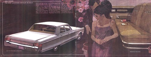
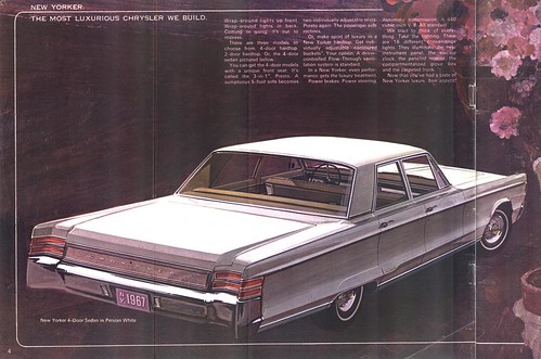
"When I first noticed Heindel’s illustrations, it was sometime in the 60’s. A car brochure that was illustrated in a style that looked to me like a cross between Bernie Fuchs and Mark English, caught my attention... but there was no signature or credit given to the illustrator, which was not unusual. I recall one illustration was a montage of an attractive fashionable women sitting on one side of the page, and a new car, super imposed into the main portion of the page, combing two different perspectives. It looked to me like it was done in acrylics, with well defined transparent paint strokes. At that time Fuchs and English had been experimenting with acrylics... with what we termed as the “rain storm look”. It caught on quickly and illustrations using variations of acrylic washes were prevalent in editorial, advertising, brochures, posters and book illustrations, all through the 60’s."

"This technique however, was new and unique for car brochures at that time. Virtually all car brochures were featuring tight renderings or photographs of engines and glamourous depiction of cars and backgrounds, also using illustration or photography. Occasionally the backgrounds were loose and even abstract, but I don’t think it was standard procedure."

"Who was this mystery illustrator I discovered, that was not only illustrating the cars and figures, but the interior scenes and the engine as well? All were illustrated in the painterly acrylic style that was replacing the traditionally resolved renderings done mostly with traditional opaque gouache. It was the era of “keep it loose and spontaneous, simplify and minimize detail”... and let the paint strokes show."

"Sometime later, I noticed a story illustration in one of the women’s magazines that resembled those car brochure illustrations I had seen. I was pretty sure it was the same illustrator, and I finally had a name to go with it: Robert Heindel... mystery solved. The story illustration depicted a guy standing casually at a bar with a drink in his hand, wearing a suite. It seemed like most of the men in those illustrations back then, looked like Ivy League Harvard graduate business men. Heindel’s men were no exception. The composition was a strong horizontal and vertical combination, that depicted an upside down L shaped bar and two figures. The main figure was a vignette from the waste down, creating a balance to the opposite bar top... headline and copy were positioned in the open or negative space in the center. The composition was bold and daring, and caught the readers attention. It seemed that breaking away from traditional rendering and composition was mandatory in the 60’s, which meant new and innovative compositions were the order of the day for many magazines . Bob Heindel seemed to fit into the 60’s look quite easily and kept up with Avant-garde appeal that was constantly in flux."

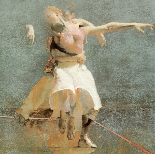
"As Fuchs, English, Peak and others continued to develop new and different techniques, I noticed Heindel’s illustrations were steadily improving, and becoming more personal. By the 70’s they were no longer similar to a 60’s Fuchs or English illustration. They definitely were taking on a life of their own. The paint application was no longer the transparent brushstrokes of acrylics, but he began mixing his media and working on canvas or colored paper surfaces of various textures, using subtle accents of pure reds, oranges and an intense electric blue. The figures became more silhouetted with less definition and detail, but with careful subtle drawing. His color treatment and application of paint and pastels became more “fine art” oriented, more expressionistic and less commercial looking."

"My impression was that he was pushing the envelope, not in a radical extreme way, but in a sensitive intellectual way. The real Bob Heindel had emerged out of the 60’s and he was finding his own direction from within. He began creating illustrations and fine art paintings depicting the performing arts of dance and music. These paintings in my opinion, conveyed the true core of Heindel’s talent."

"I believe that the illustration field for Bob Heindel, was a stepping stones to his success as a fine artist. Illustration provided the discipline and catalyst for his gallery paintings, later in his life. Like so many of the mid 20th Century illustrators, Bob Heindel had two related, but different careers... and he was quite successful at both."
My thanks to Tom Watson for sharing his thoughts on Robert Heindel with us, to Harold Henriksen for providing the Heindel scans - and to Harry Borgman, who provided the Heindel 'Dancer' image above.
My Robert Heindel Flickr set.
I think Tom is absolutely right, Heindel had the talent and foresight to escape from a dying market for illustration in women's magazines by carving out a "fine art" career for himself. His pictures of ballet dancers are (in my opinion) his very best work, and they allowed him to travel and lead the life he wanted.
ReplyDeleteFuchs and English also escaped into the world of fine arts. In fact, this month Fuchs is having his 50 year retrospective at the Telluride gallery and a bunch of his work is on their web site (worth visiting). English was never in the same category as Fuchs, but he too broke away and did well in the "fine art" market.
There were a lot of solid illustrators from that era who were not nimble enough to escape, but Heindel, Fuchs and English were able to stand astride the two markets and prosper in both.
The amazing similar thing with many of the great illustrators that you bring up is that they all were in a class by themselves and nobody since has been able to visually create work like theirs. They also are and were very nice people. We live in a "Me" world today of instant gratification and these guys did not play to that thinking. It's like Sinatra and James Taylor to music, the reluctant superstars. They simply love art and did their thing. It's a matter of greatness and we all should be grateful to these trailblazers. Bob Heindel was truly special and inspired countless other artists. We are so fortunate in this country to have seen generations of greatness.
ReplyDeleteI remember seeing his work for the first time in an advertising brochure for Chrysler, in the late sixties. I was by then, familiar with the work of B. Fuchs and I remember taking a second look, I was intrigued, it was different, more designed I thought. I loved the contrast of transparency &
ReplyDeleteopaqueness. I recall his early ballet pictures & feeling that he was on his way to achieve a major milestone in his career. He will be missed!