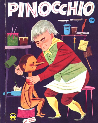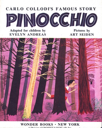
Seiden, who illustrated many children's books during his career, produced the art for Wonder Books' edition of Pinocchio in 1954...

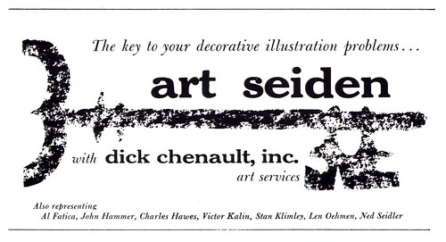
But Seiden was far more than just a storybook illustrator. He did this piece for American magazine in 1951, he had worked for a variety of advertising and editorial clients, including Phillip Morris, Hoffmann-LaRoche, General Motors and Hearst Publications... and his talents were being advertised to a broad base of commercial clients by his rep, Dick Chenault Art Services, in at least one 1953 issue of Art Director & Studio News.

This small space ad doesn't seem to say much at first glance, but actually it provides some interesting clues to Seiden's career and to the illustration business of the time in general:
For instance, in the ad Chenault also lists the other artists he represents. They include Charles Hawes, Victor Kalin and Stan Klimley - all successful illustrators with 'realistic' styles. In fact Klimley had been associated with the powerhouse Charles E. Cooper studio just a few years earlier.

Chenault's decision to highlight Art Seiden among his stable of illustrators suggests that, while the realistic illustration styles still dominated the commercial art field at the time, storybook styles were garnering consideration among ad clients as a forward-thinking alternative.

Note also that the ad describes Seiden as a 'decorative' illustrator...

'Decorative' was a broadly used term for a range of styles that didn't fit the general category of realism. Even cartoonist Roy Doty, in his listing in the 1947 Art Director's Annual describes his work as "humorous decorative illustration".
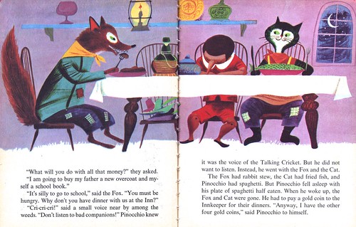
Certainly Seiden is one of the artists who set the tone for what would become the 'look' of decorative illustration later in the 50's and into the 60's (one need only look at the many props in this batch of illustrations to see the template a generation of decorative artists used in their own work -- a template still being used by a generation of illustrators today).

But Art Seiden's deceptively simple-looking style is actually far more than merely 'decorative'. It may well have been the perfect variation of the popular approach used by many realistic artists during the 50's: that flat, graphic gouache technique incorporating bold, symplified, colourful shapes and patterning.
When the camera began replacing that 'big head', Cooper studio type of realistic illustration, the style Seiden (and others) had fostered provided a stepping stone - a transition point - for the next phase in illustration.
My Art Seiden Flickr set.
How wonderful! I work in the art department of a storybook theme park that was originally built in the 1950's, so I'm finding your "Storybook style" posts very inspirational and informative. I look forward to finding out more about this time period, style, and the artists that helped to define it.
ReplyDeleteInteresting subject. How this style evolved. "What had the greatest appeal to children?" Was it realism or a departure from it? Or a mixture between the two?
ReplyDeleteMade me remember some childhood experiences with illustrated child books. Some were enthralling, captivating with sheer magic, some were less. What made the difference I couldn't define, there was no intellect then - just outlines and color.
I absolutely love Seiden's work. Beautiful. Just picked up a couple more of his old books this weekend!
ReplyDeleteGreat post!
Whoa! A blast from the past! I had that book as a kid and read it a million times...I must have because I vividly remember those illustrations! Great to hear a bit of the story behind them.
ReplyDeleteI'm sure it was books like this one, and Treasure Island (NC Weyth)etc. that inspired me to want to produce art. Thanks for posting this!
I love Art Seiden's stuff.
ReplyDelete"Never Pat A Bear: A Book About Signs," a Little Golden Book, was one of my absolute favorites growing up. Not only is it incredibly thrilling pictorially, but it gave me an appreciation of fonts and signage that has stuck with me to this day. The book has stuck with me as well...it's right here next to me. 39 cents!
i agree mr. seiden was definitely a visionary of "storybook" style and was a man ahead of his time, as they say. most of all, i know i really like looking at it :)
ReplyDelete