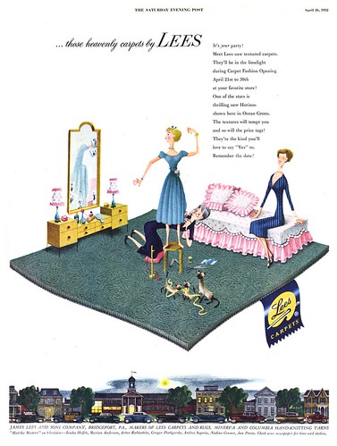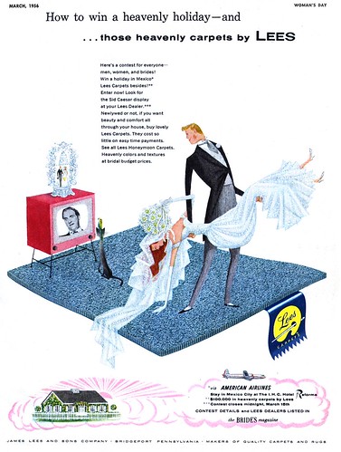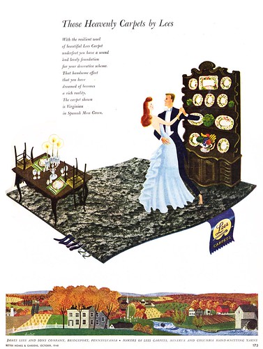
Smith said that his aim was, "to get as far as possible from the well-worn formula for carpet advertising: a wide-angle shot showing a lonesome woman in evening gown, viewing about three acres of carpet with a mixture of pride, aristocratic reserve and genteel melancholy, who is probably wondering why her husband hasn't come home yet, to take her out to a nice comfortable saloon with sawdust on the floor."

Part of Smith's solution was to find an illustrator who could bring to the ads, "a high-style humorous touch that could imply fashion leadership in the manner of the leading department stores and other top-flight retail outlets."
To accomplish this task Smith chose Jan Balet. When the ads first appeared in 1948, they won an Award for Distinctive Merit from the Art Directors Club of New York.

For the next decade Jan Balet produced a steady stream of Lees Carpet ads, always executed on the same design template Smith had originated, suggesting that the client must have enjoyed great success with their distinctive approach.

Their high profile and consistent year after year appearance must have meant that not only were the Lees Carpet ads a lucrative account for Balet -- but as a bonus, they would have been an excellent promotional vehicle, no doubt attracting many new clients.

As for art directors, 60 years later, the message is still clear: want your concept to stand out from the crowd? Use illustration!
* These delightful ads need to be seen at full size to be really appreciated. To best view them go to my Jan Balet Flickr set
These are outstanding ads!
ReplyDeleteThey're putting a Picasso on the wall over the fireside on the first picture, contrasting with the rather old fashioned, baroque surroundings.
What's below all those carpets is also captivating, the "ambiance" those ambient buildings and all the underscored depictions.
The art of it, I find, is the appeal at once for the superficial look at it, as well as for the scrutinizing onlooker.
Right you are, Rich - its "the gift that keeps on giving" ;-)
ReplyDeleteBalet's charming illustrations coupled with Smith's strong page design operate on both levels, as you point out: the details, like the ever present cats and dogs, and the landscape/ cityscape scenes along the base of each ad compel the viewer to linger ... exactly what the client would hope for.
As a child, I absolutely loved those Lee Carpet ads. There was something utterly magical about a whole household soaring over the landscape on a magic flying carpet. Thanks!
ReplyDelete