This is not the Bernard D'Andrea of even a year or two earlier. This is exciting stuff!

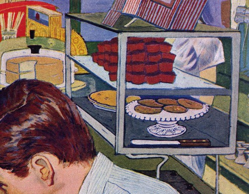
I believe this piece and the one that followed it (below) represent a turning point in Bernard D'Andrea's style. You can see he is still sticking to the kind of literal representation he was comfortable rendering for the main figures in the picture...
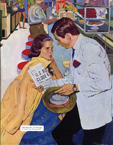
... but just as we sometimes get the real story when we read between the lines, we get the real picture...
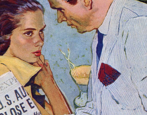
... when we look between the figures.
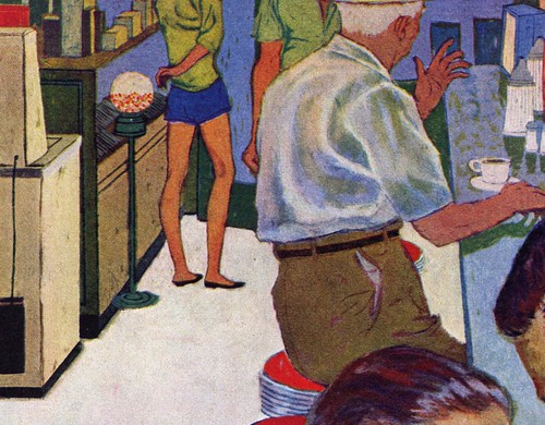
D'Andrea painted a green ground and then covered it with opaque paints, leaving areas between his brushstrokes exposed to create a sort of random patterning (as well as a green outline around objects). This might seem inconsequential, until you consider that this was a new technique a young maverick named Jack Potter was introducing to the market as a signature element of his own style.
Potter was doing a series of Coca-Cola ads that same year, and their prominent placement on the back covers of the Post might have inspired D'Andrea to experiment with a similar technique. Looking closer at the figures and props in the background of D'Andrea's illustration, we see how he set aside his usually accurate draghtsmanship in favour of a sort of decorative stylization that again reminds one of Potter, Phil Hays... or even a bit like early Bob Peak.
While the advertising industry (and the Post's art editor) might not have been ready to accept the styles of those young mavericks, D'Andrea's work must have been within their comfort zone... and at the same time, he would have enjoyed the opportunity to stretch a little - with even more exciting experiments to follow shortly thereafter!
Some time soon I hope to devote a week to the work of Bernard D'Andrea, but for those who missed it the first time, take a look in my Bernard D'Andrea Flickr set to see what I mean about just how far the artist pushed the envelope.
Wow!
ReplyDeleteIsn't it an art by itself, being able to get
..."the real story by reading between the lines, getting the real picture"...
as you point out to us,
Leif?
Excellent evaluation Leif, as usual you are right on target. Impressionism and Post Impressionism techniques were emerging in experimental magazine illustrations in the late 50's. I think that had an influence on letting color outline and bits of background color show through.
ReplyDeleteWhile an illustration student in 58 and 59, I clearly remember Bernard D'Andrea's name and some of his illos, but Jack Potter, Bob Peak, Phil Hayes and a few others who were exploding on to the scene, seemed to eclipse other very good, but more conservative illustrators such as D'Andrea. At least that's how we perceived it in our early years as students.
In retrospect, D'Andrea's illos certainly stood up to the others in the magazines. And, today I am even more impressed with his.
Tom Watson
Potter was influenced by Vuillard and I think he got that technique from him.
ReplyDeleteSuperb work - and great analysis of it !
ReplyDelete