Seeing this piece for the first time certainly made me stop and say "Wow!"

But I wonder how fun it was for Baker when only months later another artist swiped his 'lady in red' for the movie poster below? Not only is the body position and outfit virtually identical, but even the lighting and shadows that define the form of the bikini-clad babe have been copied.
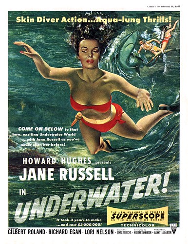
American Art Archives attributes a similar poster for the same film to Ren Wicks. I can't say for sure if Wicks did this version as well, but it serves as a reminder to us all that our swipes can come back to haunt us... even half a century later!
My Bill Baker Flickr set
My Scuba Diving Flickr set
It seems unusual to have the main figure in a Collier's cover appear in a movie ad 6 months later in Collier's. The bkg. figures & the background look good. The swimmer in the ad looks more highly finished. Usually a swiped figure is less finished & not quite as good.
ReplyDeleteIn the case of a swipe used to portray a major film star for the movie poster, I suppose they would spend an inordinate amount of time doing a tight rendering, harald.
ReplyDeleteBut beyond that, the swiping is terribly obvious, isn't it?
It is obvious and strange that it would happen in a movie ad with a film star. The body is copied.
ReplyDeleteI just wondered why?
I would guess that the movie poster was painted by Howard Hughes' pre-pubescent, half-blind nephew. That's the only way I can see how a big budget ($3 million!) movie would use a picture with such an amateurish background (those white motion lines and bubbles are too childish to be believed, especially when the artist had the Colliers original right in front of him to steal from. And that awkward shark fight is a clumsy distraction in exactly the wrong place).
ReplyDeleteWhy do I specify pre-pubescent? Because no artist past the age of puberty would paint a picture of Jane Russell's cleavage by substituting the body of a generic female skin diver lifted from a family magazine. That kind of defeats the whole point.
Growing up in the 50s and 60s, the one comic artist who always mesmerized me was Russ Heath. Heath did a little remembered DC title called THE SEA DEVILS about a group of aqualung adventurers and his skill and drawing underwater sequences (never an easy job) was
ReplyDeletemind-boggling. The Collier original here totally reminded me of Heath's
work.
That was not the only swipe. A few years later it would surface (submerge?) again as the cover image for ERRIE #22. Only this time the artist, Vic Prezio, didn't trace the image. But the details are all there.
ReplyDeleteThe movie poster looks so awkward! The arms are the wrong length for the rest of the body and Jane Russell's face looks just sort of plopped on the body. I can't believe this was actually printed as a poster!
ReplyDelete