Happily, the conflict was resolved when Peters agreed to change Mitch's arrangement. He would now be paid by the job instead of the hour, and use T.J. Peters' studio as a base of operations while continuing to do jobs for Al Chaite.
When Mitch returned to New York after the war, his space at Peters and the old arrangement was waiting for him. But Al Chaite, a sort of 'journeyman studio manager' had found a new partner in one Harry Fredman, and their new studio, Fredman~Chaite would soon lure Mitch away.
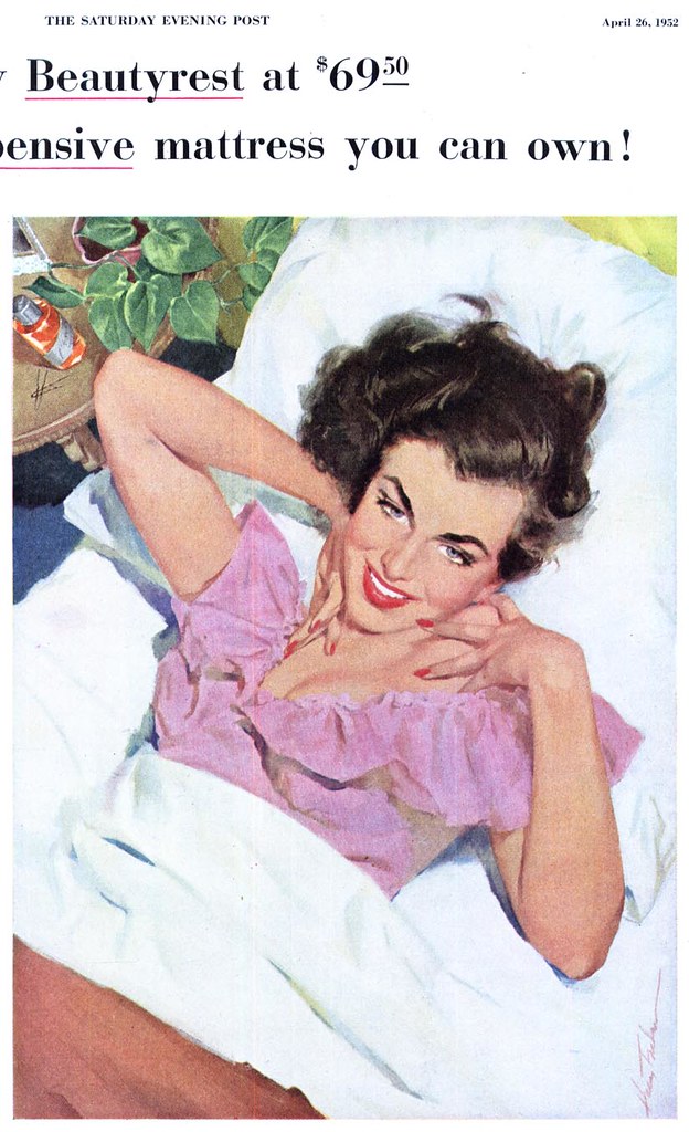
Harry Fredman, recalls Mitch, was "a tremendously talented (and wildly successful) illustrator who had the uncommon touch of imitating the style of the time." Confirming Mitch's assessment is the example by Fredman, above. This 1952 ad piece could easily pass for the work of Joe de Mers or Coby Whitmore, two of the hottest commodities of the day at rival Charles E. Cooper's studio.
Fredman Chaite, though not as lavish or expansive as Cooper according to Mitch's description, was nonetheless a huge player in the commercial art business of 1950's New York City. It occupied a six-story townhouse at 62 West 47th Street, and was "a great big bustling building full of illustrators, most sharing offices in groups of two or three."
"There were always more arriving during the day," says Mitch, "and the place was open until 10 or 11 o'clock, so you'd see all sorts of freelancers there all the time working late into the night."
This is where Mitch refined his abilities to illustrate in the popular literal style of the day. "I was inspired by Al Parker, Austin Briggs and all the others. We all were," says Mitch, who shared his space at F~C with two other artists, Joe Little and Darrel Greene.
"But these were work friends," says Mitch. "I didn't really socialize much with the people at Fredman~Chaite. And there were other floors I never visited, so I don't really know who was working on those other floors."
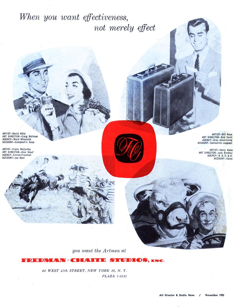
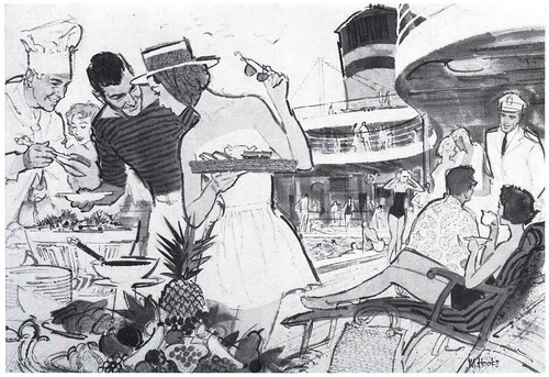
The ad below gives a pretty good idea of some who might have, though, to name a few: Harry Kane (who did the 'Back To School' illustration we looked at last week) David Attie, Mary Mayo, Frank McCarthy and most famously perhaps, Bob Peak. "A few people had their own offices, and Bob Peak was definitely one of them," says Mitch. "Right from the start he was a hot commodity... everyone understood that. But in general, it was a socially egalitarian place. There was no distinction of anyone being 'better' than anyone else. I used to play cards with Al Chaite and some of the other guys."
But Fredman-Chaite wasn't landing Mitch the big advertising assignments he had been working towards, and the nature of the artwork in demand wasn't really satisfying his need for personal growth as an artist.
In a 1960 article in American Artist magazine, Mitch told interviewer Jules Perel, "I decided to take what for me was a large gamble. I quit all the commercial work I had been doing to concentrate soley on the paperback field. I wanted to experiment and develop a personal viewpoint."
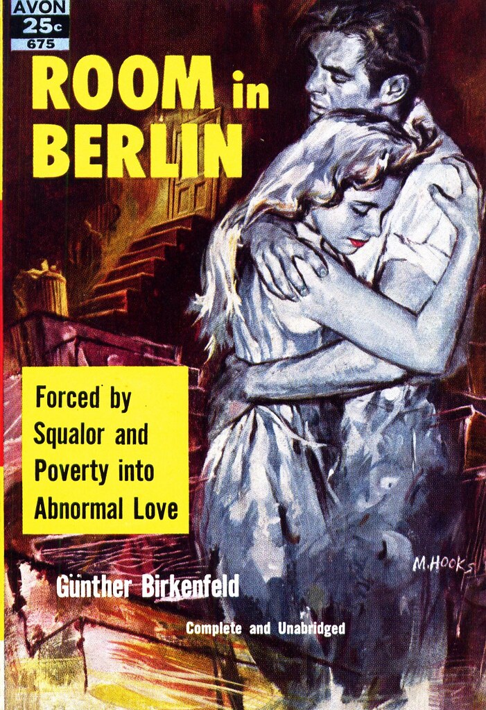
Mitch talks about how at that time paperback covers had a sort of lurid, "come-on" quality to them. This early piece below perhaps reflects some of that older-style approach...
But sales were slipping and the publishers had decided to undertake a drastic change: they now would insist on an honest interpretation of the content of the book, good art and design, and happily for Mitch, they gave the artist all the freedom he wanted.
"For the next couple of years," says Mitch in the AA article, "I did almost nothing but book covers, and my gamble began to pay off."
Mitch describes how he would approach a typical book cover assignment:
"The... problem, aside from the constant aim of trying to make a good picture, is to find an original picture device that is inspiraed by the subject. This could be an unusual bit of action taken from the story, unrealistic use of color to emphasize a mood, or interesting props or background used as a strong part of the design."
These examples from the mid-50's certainly demonstrate how effective Mitch's strategy was, and represent a period of important growth for the artist. Its no wonder that he became one of the most sought-after illustrators in the paperback market. Mitch discovered that while he had never intended to settle down as a book cover artist, he was able to make a living at it, and he "found book work generally exciting and a lot of fun."
All the while though, he had another, greater goal in mind, and the artwork he was creating for book covers was part of his larger plan. "I wanted to do story illustrations for the women's magazines. I had always aspired to doing major magazine illustration."
You can see the accomplishment of that aspiration in, for example, this 1958 piece below for Redbook magazine. In the space of a few years, Mitch had found his own distinct and exciting 'look'. His work would begin appearing with increasing frequency in such high-profile publications as The Saturday Evening Post, McCall's and Cosmopolitan.
And more, he would be recognized for his distinction and creativity: The Society of Illustrators included his piece 'The Snatch', a Dell book cover, in their annual, Illustrators '59. It was only the first of 24 notations in eleven SoI annuals.
Tomorrow: Cosmopolitan and The Post
* My Mitchell Hooks Flickr set.
* Many thanks to 5m@5hYdez for allowing me to blog several of the scans in her excellent Mitchell Hooks Cover set.
Man alive...where was this installment when I needed it most? :)
ReplyDeleteWow...now I'm hungry to try and tackle this look again.
Thanks for this week, it's been excellent so far.
=s=
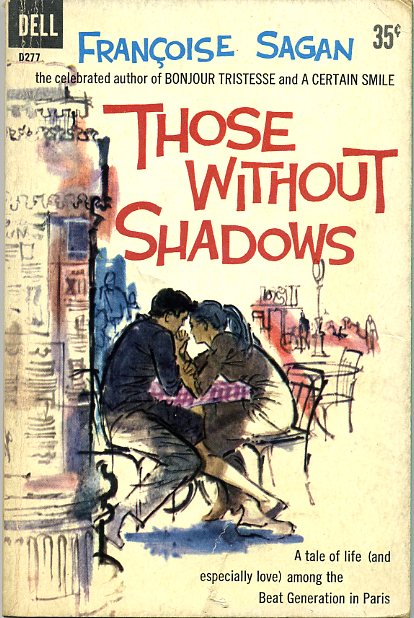
The Francoise Sagan cover: How skilfully he applied the blue-white-red of the French flag!
ReplyDeleteRemembering the times of those paperbacks. While reading, from time to time I would turn back the leaves to gaze at the cover again. Especially if it was done in such an exquisite manner. Magic!
yes, reading books with beautiful cover illustrations were the reason i signed up for "commercial art" in the late '60's. found you via a link on my son's illustration/comics blog.
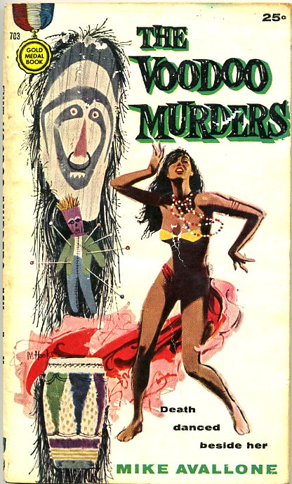
ReplyDeleteWow! "Voodoo Murders" is amazing! Thanks for sharing Leif!
ReplyDeleteThank you all for your comments --
ReplyDeleteShane; I hope you do... your interest in Mitch Hooks is part of the reason I elected to have him as my topic this week.
Rich; your comment stirred memories of my own early days reading Conan paperbacks with those incredible Frank Frazetta covers - and flipping back now and again to enjoy how vividly Frazetta had captured REH's imaginary world.
Virginia; glad you found us - whatever became of your commercial art education? Did you enter the business afterwards?
Bobby; agreed - be sure to check out the rest of Mitch's amazing artwork at the link I included in the post - with thanks again to 5m@5hYdez for her awesome Flickr set!