From the introduction to the Parker step-by-step article in the Winter 1958 issue of FAM:

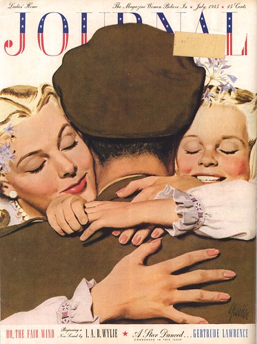
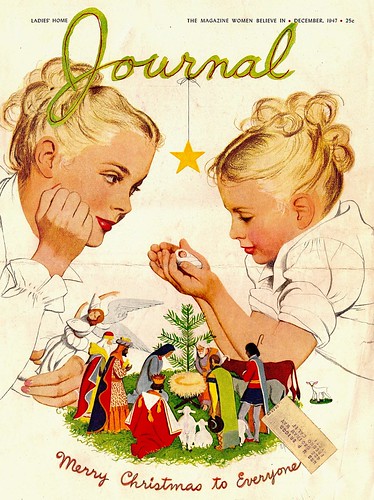
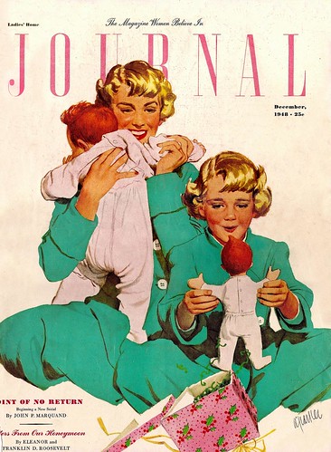
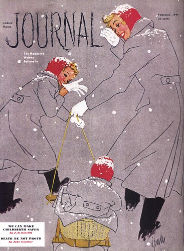
Just twenty years ago, Al Parker painted two cover girls that really started something. They appeared on his first "Mother and Daughter" cover for the Ladies Home Journal in 1938. American women immediately made them part of the family, copied their clothes and their hairdos, flooded Al Parker and the Journal with fan letters. "Mother and Daughter" fashions became a national rage - and the greatest of all cover series began, by popular demand. With apologies to the Journal, we can't help adding, "Never underestimate the power of an artist!"

A noted art director once said that Al Parker's "ever-increasing interest in illustration that involves creative thinking and planning is inspirational. The search for something that will give his drawing 'the Parker touch' goes on endlessly."
These talents went into his Mother and daughter covers. And they were an expression of his philosophy of what the cover of a magazine should be.

"I believe the cover of a magazine should be simple in design, especially if it is to be displayed at newsstands," says Al Parker. "Too many shapes or colors tend to clutter it and cause it to disappear in the maze of covers on display. The pretty girl has been featured on covers for years-but I feel she should be more than just a pretty girl. A pretty clotheshorse or, more often, a pretty hathorse is not enough. But if the artist paints a truly beautiful girl, honestly characterized, he will have no difficulty selling his painting to a magazine."

His Mother and Daughter paintings fill another Parker cover requirement: they are cover designs, not editorial illustrations. Why? Because they are complete in themselves. Nothing is left unsaid. In a story illustration, you don't tell all, but leave the reader guessing the outcome -- intriguing him into reading the story.

The success of the Mother and Daughter covers is also the result of knowing and working for a definite audience. "Some magazines cater to a sports audience; others have a strictly human interest or chic fashion approach," explains Al Parker. "But the various approaches can be incorporated to a lesser degree in a women's magazine cover: the pretty girl can be wearing fashionable clothes, the mother and daughter can enter into sports. The human interest these two characters exude is obvious."
*My Al Parker Flickr set.
* Some of today's images come from Charlie Allen, who has his own excellent blog - many thanks, Charlie! Others are courtesy of The Norman Rockwell Museum, from Ephemeral Beauty, the exhibition book the NRM released in conjunction with their Al Parker show last year. The book is still available from the Museum's website. The book is a steal at just &7.95, packed with beautiful and rare artwork, interesting essays and biographical information. I highly recommend it to anyone with an interest in Al Parker or mid-century illustration.
Now the legal:
Ladies Home Journal covers by Al Parker from the Al Parker Collection, Department of Special Collections, Washington University Libraries ©1945 and 1949 by the Meredith Corporation. All Rights Reserved. Used with permission of Ladies' Home Journal and the Norman Rockwell Museum
They look very fertile, all those covers!
ReplyDeleteCompliments to Al Parker!