Nino Caroseli
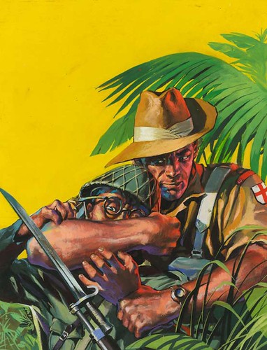
Like his fellow Italians Caroseli moved on from movie posters to war comic covers commissioned through the Milan based D’Ami studio . His earliest British work was for the detective series Sexton Blake but he soon moved over to the war titles and ended up painting almost 200 of them . His painting style was polished and slick like DeGaspari but perhaps without the same sense of the dramatic . On occasions though he could come up with a real classic, like the example here . He would appear to have drifted away from comics in the mid 60’s and I believe he moved over to fine art .
Graham Coton
Not all the cover artist were Spanish and the most prolific of all was a Brit – Graham Coton . Coton started out as a comic book artist in the early 50’s and developed an incredibly detailed pen and ink style . Machines and vehicles were his speciality and he drew numerous strips featuring racing cars or aeroplanes . In the early 60’s his covers began appearing on Air Ace though at this stage he was using thin watercolour washes , By the end of the decade he had changed over completely to thickly troweled on oils , painted on enormous sheets of masonite , board or wood. His later covers – of which there must be well over 1000 are typified by grizzled , dirt encrusted soldiers and vast monolithic war machines, gesturally painted in a style that always reminds me of the great John Berkey. Coton was there until the end in 1984 and continued to turn out vast numbers of pictures for Look And Learn magazine and the fine art market .
Jordi Longaron

Best known in the states as the artist of the Friday Foster newspaper strip Jordi Longaron was a much more versatile artist than most people are aware . From the late 50’s to the late 60’s he was absolutely the top Romance artist in Britain providing countless strips the S.I agency to titles such as Valentine and Marilyn . In fact he so dominated the genre that his sleek , pared down style and knack for drawing pretty girls set the style of the genre for over two decades . In between the romance strips he squeezed in over 30 war covers in an ultra – dynamic , gritty style more reminiscent of Jordi Penalva than his own comic work . After Friday Foster was cancelled in the mid 70’s he turned primarily to western paperback covers which combine elements of his war covers with the realism of a Robert McGinnis . I’ve long believed that Longaron ius one of the giants of illustration but sadly his work is almost totally forgotten these days – it’s high time for a revival !
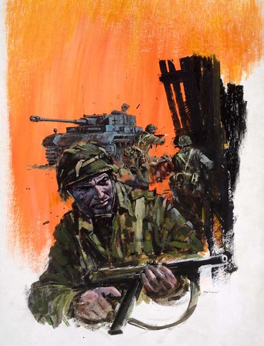
Ian Kennedy
A legend in British comics, the Scottish artist Ian Kennedy has had a long and varied career but his passion remains aeroplanes. Throughout the 50’s and sixties he drew numerous strips about cowboys , ballerina’s or spacemen but he really came into his own in the pages of Air Ace. His comic work was staggeringly detailed and precise and he revealed a masterful grasp of drawing dynamic hardware of all sorts from the most detailed cockpit control panels to rampaging Tiger Tanks , ships , jeeps or planes. In the mid 60’s he began to paint covers in the same tight, precise style that typified his comic work often employing a vibrantly bright palette. In the 70’s he jumped over to Commando and almost forty years laters he’s still there and still creating new masterpieces each month every bit as beautifully as he had in his youth. Kennedy remains one of the most popular artists amongst British comic fans with one of the most recognised styles in the business .
Oliver Frey

The final artist this week is the Swiss-born , but London based Oliver Frey. In 1969 the 21 year old Frey was studying in film school when he approached Fleetway hoping to pick up some easy money to live on. They loved his samples and he went away with a script . After a short while he began painting the covers to his strips and eventually became primarily a painter – his film career long forgotten. Freys work in this period is perhaps less realistic than his peers but he more than makes up for that with a real – in your face – sense of the dramatic and many of the most memorable 70’s covers are his. He went on to paint numerous covers for science fiction and video game projects and has amassed quite a following amongst British fans .
So ends our week peering into the dim and dusty past of British comic books – I hope you’ve all enjoyed it .
* Many thanks to David Roach, British comics artist of Judge Dredd, author, comics historian, and long-time TI subscriber for providing this week's enlightening series of posts! All this week's images are mostly taken from the original art and can be found in David's latest book, "The Art Of War" published by Prion books in the UK. An earlier volume "Aarrgghh It’s War" came out last year and each contain over 1000 of the best war comic covers.
This week's images are © IPC Media.
These covers are pretty good, albeit fairly conventional, in that men's guts sort of style--but something needs to be recorded about the interior art by FERDINAND TACCONI, a wonderful Italian comics artist who died a few years ago.
ReplyDeleteTacconi had a masterful grasp of graphics. His application of blacks was extraordinary--and like Frank Robbins on JOHNNY HAZARD, his understanding of machines--airplanes and vehicles of all eras--was top notch.
He did the lion's share of his work in the 60s and 70s for the British war digests, while at the same time producing some of the silliest softcore erotic horror stuff for the Italian market.
I discovered his stuff on my first trip to Italy in '79, and I've loved it ever since.
I sent a copy of one of his Italian comics albums from the series UOMO D'AVENTURA(Men Of Adventure), a melodrama about the Flying Tigers, to the always ingracious Alex Toth, who, true to form, never thanked me, but wrote an endless crit of the material.
Tacconi deserves to be better remembered.
David, Leif, thanks for a great week cover art! I thoroughly enjoyed it.
ReplyDeleteI'm not sure I agree with Howard on the covers being "fairly conventional".
ReplyDeleteThere's something else going on here, an aesthetic in design and composition that wasn't as prevalent in the straight-forward battle action covers in the states.
The use of negative space, or the image within image approach I think is a pretty good example. Heck even some of the vignette's are more reminiscent of paperbacks, except the colors are bolder and cleaner in many cases.
Not to say that there wasn't a slew of covers in there that I think Howard is talking about, but to lump them all together would be wrong.
But more to Howard's point, a follow-up of interiors would be splendid if not a crucial addition to this thorough look of similar materials for different cultures.
=s=
An outstanding TI this week. Stunning action/airplane/ adventure/ illustration....real 'guy art'! No one should be surprised at the Brit, Italian, Spanish artists and illustrators. Theirs is a very long history of great artists...over centuries. The Italians can't design an awkward car, boat, airplane, building, whatever! I wish I'd seen more of this during my working years.... so....thanks, Leif and David Roach, for the great week.
ReplyDeleteYes, that was another great week: amazing, dramatic work!
ReplyDeleteGreat design, complementary colors engaged almost brutally...fits the purpose I guess.
The Italians: Has anybody seen works by the illustrator named Fortunino Matania?
Leif: thanks for the great posts on this topic! Growing up, I owned scads of these books, especially 'Air Ace', and admired them ,studied them! I'd love to see any great scans of interiors by Ian Kennedy you might have...(sadly, I somehow got rid of my collection, somewhere in my late teens, a momentary psychotic break I guess)
ReplyDelete---
Speaking of ungracious, it must be said--what's with the perpetual, public Toth-bashing? Can't Mr. Chaykin leave well enough alone? First I pick up Draw! magazine, and I read Toth-bashing, and now this, from the same source.
It's all been said before, umpteen times, by Chaykin and many others--Toth's flaws have been dissected ad infinitum--can't we now let the dead rest in peace?
He's not here to defend himself, I guess---that's the point, right?
Leif.
ReplyDeleteDo you know if any of the original artwork is for sale?
Would David know? Haven't been able to dig up an email address fo him.
Love the Dell' Orco art
Keep up the good work.
Rodge; I read recently on a British comics news blog that IPC Media has sold off all the originals. I'll ask David if he has heard otherwise and post his reply here.
ReplyDeleterodge;
ReplyDeleteI asked david about the availability of artwork and he replied:
"My chum Peter Hansen is indeed selling all the art - well , most of it anyway . It's a bit of a complicated arrangement because people just ring up and ask or send e-mails saying which pictures they'd like . My books are a sort of art catalogue really . If you'd like to forward the e-mail I'll pass on the details directly .
- David"
... so if you want to contact David about a specific piece, email me (my email address is under my profile description at top right of the blog) and i'll put you in touch.
Mr. Chaykin's contempt is obvious for these covers and the "men's guts" art genre in general. You can almost hear him sniffing the air. Too bad. He misses a lot as do all who generalize. The artwork for these British War Comics was, and is (see the still running Commando magazine) simply beautiful illustration.
ReplyDelete